PERSONAL
2,918
Sindrel Song - Progress And Process!
7 years ago
For the first time in ages and to my great surprise, I actually had a really productive past few days! I've been using what energy I've had to work on Sindrel Song, and I've got a lot closer to the finish line which has been on the horizon for far too long. Here, I want to show some screenshots of the 3D versions of the stages that I've finally made, while talking in detail about the techniques I've used and the things I've learned along the way. If you're interested in how games are made, that might appeal to you!
I'd like to talk about my life more in these posts, but at the moment Sindrel Song pretty much
is my life. Well, that and feeling so cripplingly fatigued I can't really do anything at all. I have a relatively active
internal life, though, and there are ideas I'd really like to write about in detail. How much of our behaviour is actually a choice is something I've been looking into and meaning to write about for a while, especially since a post about all that a while ago got more of a response than the stuff about Sindrel Song. But as interesting as such things are, I feel stuck in life at the moment, and feel that I need to get this thing out of the way just so then I can finally feel like I'm moving forward. Since energy is rare, I've been feeling that it's best to spend it on this thing that actually will lead to forward progress, but it means I don't have any left for anything else. Annoying.
I've no idea what'll become of Sindrel Song - maybe it'll be mildly noteworthy and pleasingly profitable (if I sold it for $5 and 'just' 10,000 people bought it, that'd be amazing, though I've no idea if that's a reasonable number or an absurdly optimistic one; I'll talk about that in more detail in a later post), or, far more likely, it'll disappear into obscurity and get me pennies at best and probably negative reviews - but I'm trying not to concern myself overly much with that. I'm seeing it more as a chance to learn and practice many things involved in making and releasing simple indie games in 3D, so then I can make more appealing things after this. And I have been learning a lot!
I don't want to just show screenshots to say "look what I've made!" and to leave it at that. I think that the actual design process is interesting in itself, and I'd like to talk about some of the challenges I've faced and decisions I've had to make along the way. Recently I've been watching a few YouTube videos in a series called
∞ Boundary Break ∞, where a guy investigates games beyond their normal visible bounds to find unused or hidden content. Often it's just "here's a weird grey cube under the map and I don't know what it does!", but I find it interesting in the same way that I found the site
∞ The Cutting Room Floor ∞ interesting. I like to know how things work! I suppose that same mentality is why psychology is so fascinating to me.
Because I've actually achieved a surprising amount this week, this post might be long for a change. I know I usually stick to witty brevity, but you'll have to bear with me this time.
![]()
Oh, before I get to the stuff I
have made: I've been considering renaming the game. "Sindrel Song" makes use of an unfamiliar word that might be misremembered or disregarded, and it doesn't really explain what the game is about either in terms of narrative themes or gameplay. Or I mean it
kind of does - it has 'song' in it, and it's about a sindrel singing - but you'd need to know the lore to make full sense of it.
One idea that came to mind is
Memody, a combination of the pleasingly similar words "melody" and "memory", which the game is all about. It's also an unusual word that could maybe become associated specifically with the game. A quick google search shows that "memody" has been used by a music thing for helping children which raised just over £1000 on Kickstarter in 2015; it seems like one of those things that'd be limited to its local community. Nothing huge though. I've definitely never heard the word before. I like how if you say "Memody" aloud, it sounds so similar to both its constituent words, but unless you already know what those words are, again it might be too unusual of a word to attract interest. I'm not sure.
I'd also be interested in a multi-layered title in the same vein as Taming Dreams. From what I remember, that title had like eight different meanings that all applied to both the story and the gameplay, which I liked a lot. Much better than "MARDEK" anyway; I've always felt irritated at how random and meaningless that was as a title (though it being an unusual word didn't exactly put people off, did it?). Something that suggested music, but also bonding, might be nice; the word Harmony has connotations of both, but the gameplay isn't really based around harmony as such, and the word brings to mind eHarmony...
Maybe I should just call it "ALIEN FURRY SEX SUICIDE QUEST OWO". But I'm not sure, do you think people might take issue with that? Especially since it's not really a quest. It's a tricky one.
I'm not looking for suggestions because I'd be REALLY uncomfortable using a title someone else came up with, but I'm mentioning it because this whole post is about my process and progress! This was really just an aside though; I wrote this to talk about what I actually
have done, so...
![]()
The games I released way back in the foggy depths of ancient history were all in 2D, though recently I've obviously made the switch to 3D. I'm new to it and still (self-)learning, and I'm doing it alone, so obviously I'm not going to be producing triple-A quality work or anything. But thankfully low poly graphics seem to be common enough among indie developers that people are probably used to and accepting of that style. Or at least I hope so. I rather like it aesthetically myself, for the same reason I like pixel art. I like stylistic abstractions more than realism (one's a deliberate psychological and subjective choice about how to depict the world, the other's just copying what we all see), and perhaps it also reminds me of the graphics quality of the games I grew up with? I suppose there are a bunch of reasons.
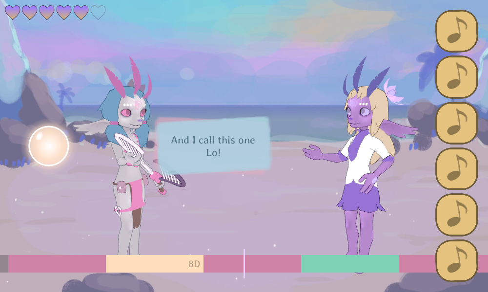
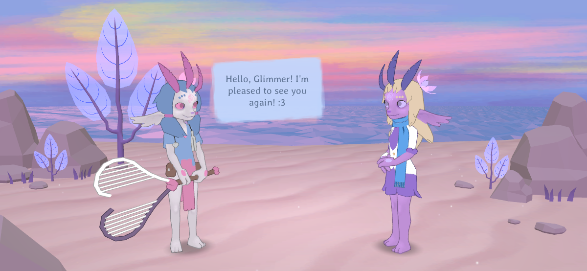
I made the character models months ago, but I've been using temporary 2D mockups for the stage backgrounds in all the screenshots and videos I've posted so far. Here's a screenshot from a post about the game at the end of January:
![]()
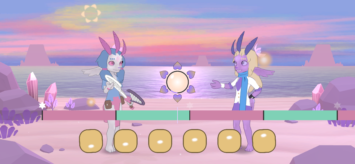
And here's one from this week:
![]()
Before I go on, a technical note: I've barely tested the game on mobile just because it's such a hassle porting it over (I've been meaning to look into this; someone mentioned Github ages ago), so when I tried that last weekend, I noticed a whole host of issues. The main one is that the timing is ever-so-slightly off, so it sounds jerky rather than completely smooth; a big deal for a music-based game. I'll have to see what I can do about that. Also, though, I have an iPhone X, which has a nub thing that extends into the screen on one side, which got in the way of some important UI elements. There's also a bar thing that's constantly present at the bottom of the screen - it's used for swiping out of the app - and in this it was interfering with the placement of the main music buttons. Plus they were quite close together before and it was easy to tap the wrong one. So I've spaced them out a bit. I'll have to play around quite a bit with such things, I imagine, before they feel just right, though I'll wait until testing to do that.
But yes, there's a 3D background now! A very
simple 3D background. I've never really had much interest in making environments in 3D, you see... All my 3D-game-playing life, I've looked at character models and wondered how I might make my own, but the environments were just
there, and I never gave them much thought at all. It's been the same with drawing, where I've focused most of my attention on drawing people and characters, and very little on backgrounds or scenery. Some artists specialise in landscapes, but it seems like far more are more interested in portraying people than places. Our minds are oriented towards social perception, after all; we talk of Mario and Cloud Strife and Insert Modern Relevant Reference Here, not of the landscapes they explore, no matter how beautiful they might be. We might marvel at a sunset, but it's rarely actually committed to memory or talked about with others.
So I've been putting off making environments for ages because it's not something I've practised, and I assumed I'd do a poor job of it, that I'd be clueless. I did do some research: I looked up a lot of
∞ low poly environment models on Sketchfab ∞, and I had a look at the environments in some old 3D games too (things like the PlayStation Spyro games, Wind Waker, etc). That's always valuable. In games like those, environments are largely one big model, and I thought - dreaded - that that was the path I'd have to go down myself.
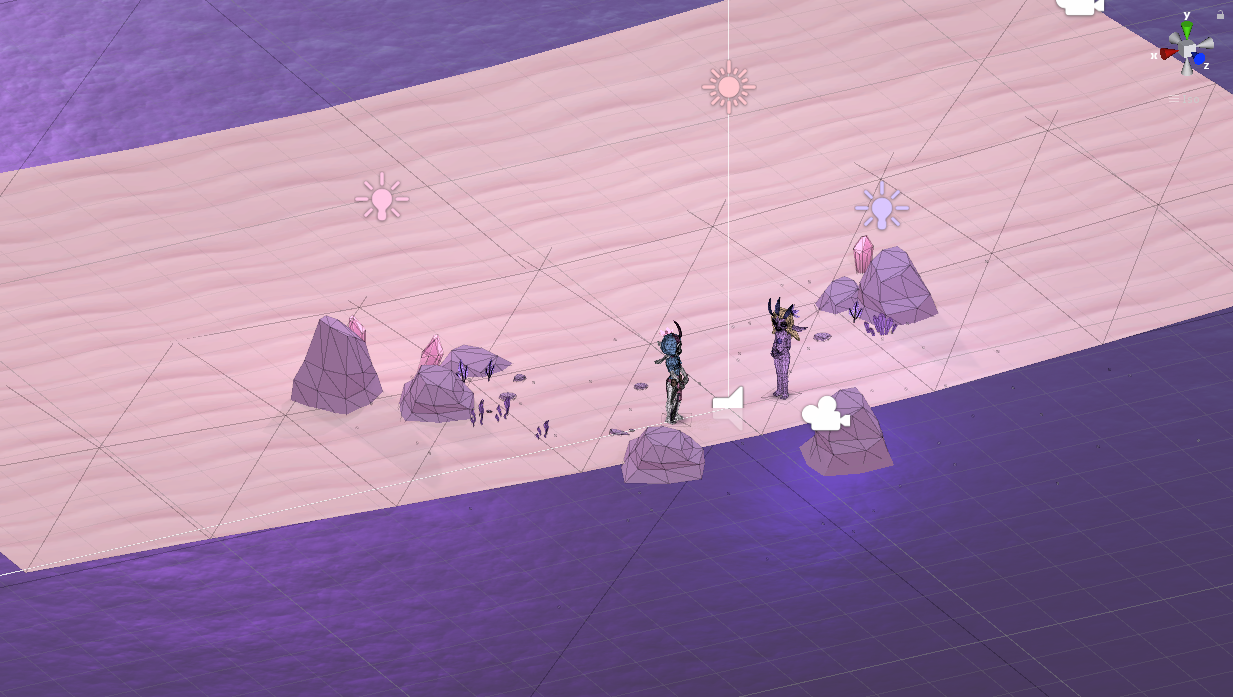
I've spent a lot of time with map editors in the past though, most notably the years I spent with Neverwinter Nights', and often areas have some fairly empty base mesh which is populated by various cloned placeable prop objects - with their own meshes - to provide detail and individual character. Like furniture in a room. When I first tried to make this area, I modelled each rock individually as part of the main mesh, but trying a prop-based approach instead made things MUCH faster and easier. Here, there are only five different types of prop (two types of rock, a crystal, a grass tuft, and an alien 'tree'), which are copied, scaled, rotated, etc on top of a single beach mesh, which is basically just a super-simple slightly curved plane. In Unity's editor, it looks like this:
![]()
It's incredibly barren! But since the camera is fixed, no more than that is needed. Because it's so simple, I was able to make environments like this for all six stages in a couple of days (though they're simple, they still take
some time), which is ideal really. I plan to keep tweaking them, which is easy because all I have to do is add or move/scale/rotate these simple props in Unity's editor.
Games typically use a 'skybox', a large cube - or dome - painted to look like the sky that surrounds the entire environment mesh. Since this camera doesn't move, I didn't even need that; the sky is just a single plane (or 'quad'; in Unity, 'planes' have more vertices than 'quads') way off in the distance with a texture for the sky. The distant islands are separate flat quads with their own tinted texture with transparency, scaled, horizontally positioned, and sometimes flipped.
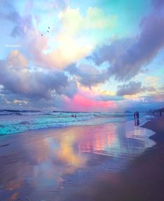
I haven't actually properly done any of the skies yet. I've been collecting beautiful sky images that I find online which have the kind of feel I'm hoping for; I've got a whole folder full of them (I've also collected images of low poly game environments). Here's one (from Google images) that I used as direct inspiration for Remedy's stage in terms of atmosphere; I feel it's soft and relaxing and feels 'half asleep', which is fitting for the stage just after Glimmer's awoken into the world:
![]()
The worlds in Alora Fane don't have a sun or moon, since they're not planets; they're like giant flat looping planes, in layout much like the world maps in early Final Fantasies (
∞ which would be a torus in 3D rather than a sphere ∞). They exist in their own 'pocket dimensions', apart from the 'real' one, after all. Since there's no sun or moon, the skies are instead lit by something called 'the aurora', which can look like whatever I want it to look like, really. "Otherworldy, aethereal, and beautiful" is the goal. Something that doesn't feel threatening, but it doesn't feel like Earth either. Another photo in my references folder has the kind of look I have in mind:
![]()
I tried to combine the two for the sky in Remedy's stage, but what's shown in that screenshot is just a mock-up that I don't feel quite works. It's a sloppy five-minute job, and it's massively horizontally stretched too because I originally misjudged the dimensions I'd need the texture to be. So what I really want to do is spend a day painting skies from my reference folder, then using what I've learned from that to paint the skies for all the stages in the game. I'll get around to that soon, I hope. For now, all the skies in these screenshots are temporary.
I've yet to mention the water, though, which is probably largely responsible for the overall feel of the scene. And it's irritating that it is, since I didn't make it! At first, I intended the water to have a low-poly, faceted look which you might have seen in other games. I thought it'd be simple and that it'd look nicely stylised, that it'd go with the low poly look of the rest of the game. I did try that at first, using a shader I found online:
![]()
It was
okay, I thought, but not quite right. Plus there were issues, like it requiring a plane with a ton of vertices to work properly - which I felt would impede performance, especially since the plane had to be huge to go off into the horizon - and there being no foam edge that resembled waves, which I really wanted there to be on a beach.
Unity has an Asset Store, where developers can buy assets made by other people. Personally I don't know how you could populate your game with assets from there and consider it your own, especially visual assets with a distinct personality, but for technical background things it can be useful. There are a whole bunch of water assets of varying complexity and price, and I decided to try one called Lux Water based on reviews and pricing (It was less than $10). I was very impressed! It surpassed my expectations - YOU COULD SAY IT BLEW THEM OUT OF THE WATER HA HA HA - especially since its edge foam looks so nice. You can't see it in a static screenshot, but the water laps along the coast and waves up and down in a way that looks convincing and not-distracting. It feels much more like a beach than the faceted water. It's fairly complex though, and I wonder whether it's overpowered, or whether it looks inappropriately high-quality compared to everything else. Plus it was just invisible on my mobile for some strange reason (though it's supposed to work on them; it's probably a settings thing). So there are definite kinks to iron out and decisions to make there, but I think it works for what I need.
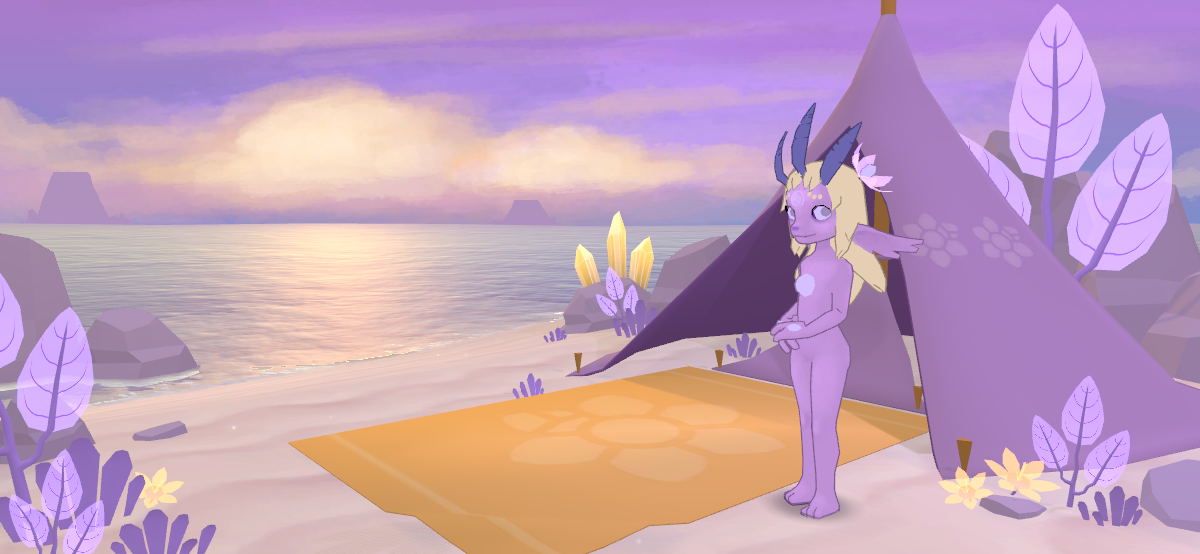
So that's Remedy's stage. Here's Glimmer's 'stage', where the initial cutscene plays as Glimmer awakens into the world, and where she has to retreat to introspect between each song stage:
![]()
She has a tent... which, ugh, has a way longer story behind it than it really needs to.
The game begins with a cutscene, as I said, where Glimmer wakes up into the world; you literally see the first time she opens her eyes. I felt that'd be an interesting thing to explore in terms of developing attachment to the main character, and portraying the entirety of life. Originally, Glimmer awoke as she was lying on the floor in Hearth's warm cave, as he kneeled over her, holding her up like you would someone who'd just fallen unconscious, or who'd just been stabbed or shot and was delivering their final declarations of love and/or vengeance before going suddenly limp as their ghost flew up to Heaven. This turned out to be way more difficult to do the poses for than I originally thought! I mean, it seems simple enough, doesn't it? One lying down and the other cradling them? But the arm positions to get that working, as one looks into the other's eyes in a way comfortably visible in a single camera shot, are just awkward, maybe not even possible in the way I was imagining. So then I wondered whether she could be lying on a bed-like slab in his house instead, as he stood over/beside her...
As I wrote about in one of the previous posts, though, I wanted to have some 'home' area Glimmer could return to to introspect, to talk with her own mind. Having her own place rather than using Hearth's felt more appropriate for narrative and gameplay reasons (would you have to click Hearth's node to return to the home area? What if you wanted to talk to or sing with him?). Sindrels don't live long enough to have developed a culture, so they don't have buildings; they're symbiotic with things called 'house plants', which are biological. They can however acquire artefacts like clothing from the 'shrines' that the Aolmna set up on each mesa, in exchange for 'offerings'. This had a gameplay purpose in
∞ the original barely-worked-on sindrel game ∞, but I feel it makes sense of some lore here too (how else would they have clothes?). The shrine essentially 3D prints objects, so I thought, what kind of simple objects could it produce that the sindrels could use - without relying on specific skills like carpentry - to make a house? Especially the wintrels, who are nomadic; they move between islands across the frozen sea each winter, so they'd be interested in having new places to settle down each time.
(I didn't want to make it a house plant, because even though that'd serve a lore purpose to clarify how they look instead of just relying on dialogue, it wouldn't make sense for it to be anywhere other than on top of the mesa. Plus if it was alive, it'd have sprouts for Glimmer to sing with, invalidating much of the point of the narrative, whereas if it was dead, she'd be living in a corpse and I didn't really want that.)
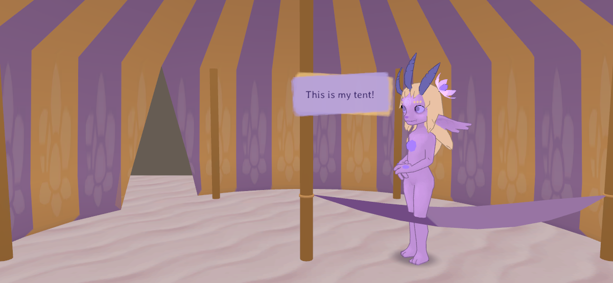
Tents have been used by nomadic humans, and they'd be easy to construct out of simple fabric, I thought, so that seemed the best course of action. I first made a tent large enough to fill the screen, so the whole scene was inside it. There was a hammock on which Glimmer would lie when waking and later while thinking. Annoyingly I don't have a proper screenshot of it; here's one of the model I currently have, but the texture isn't right (it was meant to be purple all over), and Glimmer's obviously not lying in the hammock:
![]()
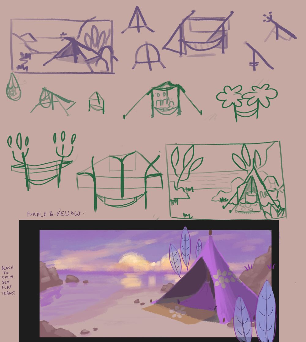
I felt that it looked like a weird circus tent though; it looks like one even more with this unintentionally stripy texture. Would sindrels bother setting up something so big if they meant to use it so rarely? Glimmer in the hammock also felt weird and was difficult to animate if the hammock itself was rigid and static. I felt that having an outdoor scene in which the tent was located would feel nicer and more, well, natural, especially if it was to be Glimmer's first look at the world, but I couldn't come up with a specific layout for the tent that I felt would work. I looked up a whole lot of tent reference images, and I have a bunch of crude, 'figuring it out rather than trying to show something pretty' sketches (which probably don't make sense to anyone but me, but here they are anyway):
![]()
I was set on the idea of the hammock and wanted to include that somehow, but nothing felt right, especially if I was going to have Glimmer lying in it as Hearth stood beside her and looked over her. Would he be seen from the back, then? Where would the camera go?
Eventually I settled on this cone shape, with a triangle of fabric attached to the middle pole that serves as a sort of 'pillow' while Glimmer would lie mostly on the floor, but sort-of sitting. This worked well because looking down on her as she lay flat on her back was tricky to do camera-wise and felt patronising or weird, plus it was hard to do the pose because of her hair clipping through the ground. I solved the issue of Hearth looking over her by deciding that she'd wake up and stand up alone first, then he'd walk in from off-screen, so she could use her usual standing pose and animations.
I'm mentioning all this because of the contrast between how little it matters and how much work it took to get it right. Things like this are surely common in games, where some designer will have to spend stressful days trying to come up with something the players won't think twice about... but which they
would notice if it was wrong. I'm reminded of a sound effects designer describing the quality of their work as inversely proportional to the attention it got: the less people noticed it, the better the work had been done. I bet that there are many young people who think "woo yeah I really want to make my own games one day that'd be so much fun!!!!", thinking it'd all be soldiers fighting each other with bigger and bigger sword-guns or whatever, and they don't imagine they'd spend huge chunks of time trying to figure out how to make a stupid tent. I'm just relieved to have something I feel works for what I need it to!
The other stages' backgrounds fell into place fairly easily, once I had a method established. They're all still quite rough, but I'll go through what I've got at the moment in the order that I made them.
![]()
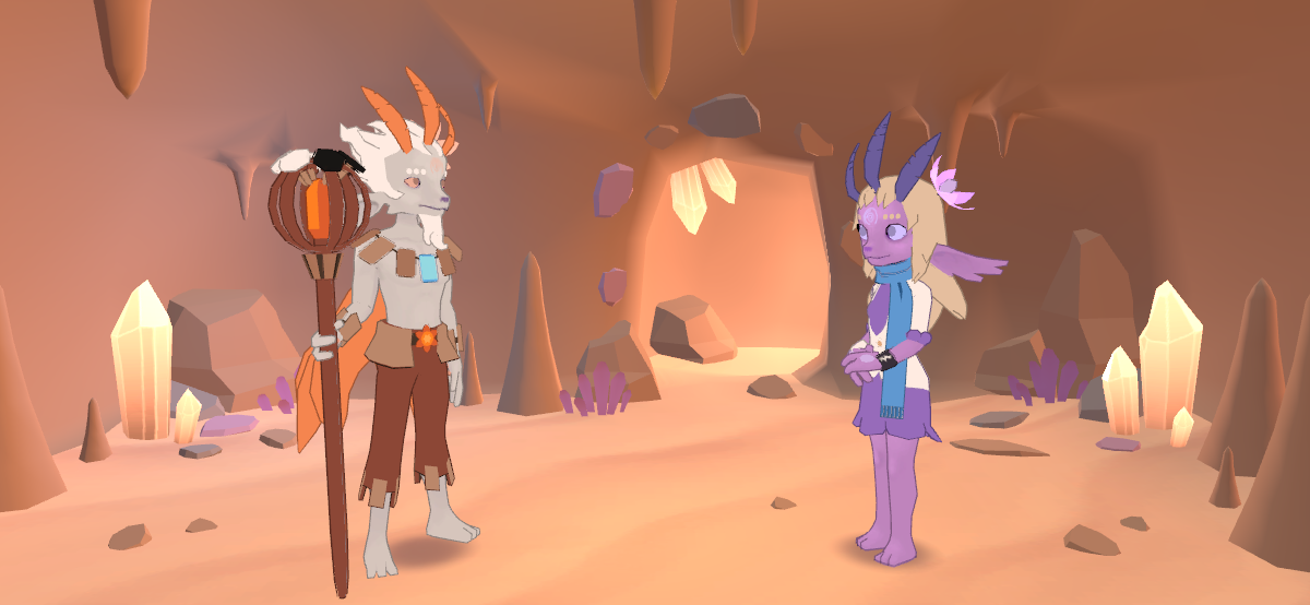
Melody's stage is really simple, to the point where it feels almost empty. But I like that it feels appropriately wide, open, and inviting, like arms held wide. She has a tent too; I felt that each sindrel having a tent would do well to explain why they hang around in their specific areas throughout the six days of the game, so that was a nice little bonus of deciding to add one for Glimmer (though Melody's is the only one that appears in her stage...). Crystals randomly scattered around feels like a fairly generic thing for bright-and-cheery stylised fantasy settings, and I felt they would be doubly appropriate in this because crystals (or gems) are already an important part of sindrels' anatomy. Some of the instruments she's made can be seen in the background to add a bit of character to the scene (I suppose Course felt particularly uncertain about her guitar, so it took a while to make one that felt right...).
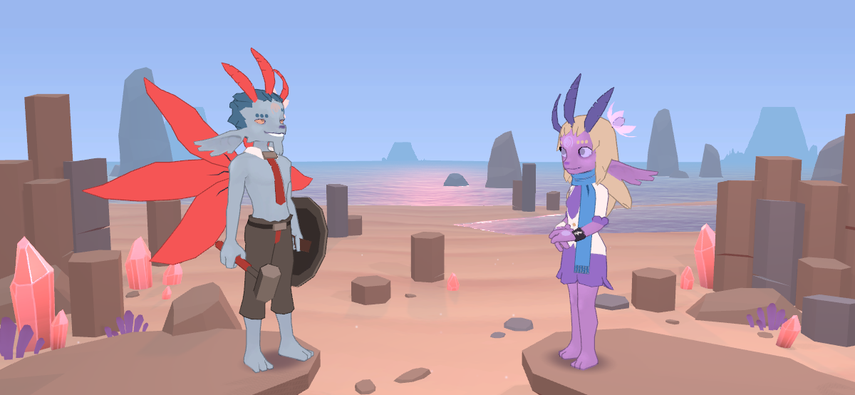
![]()
Hammer's stage is rocky to go with his Tough-rune-based personality, but instead of just using generic rocks, I've used basalt columns, like the ones at
∞ Giant's Causeway ∞. They're hexagonal to go with the number 6 motif, and I feel that rocks that rise into the sky and which look particularly impressive (as those in nature do even if the low poly ones don't especially) go well with his role as a high achiever. Both he and Glimmer are standing on elevated rocky platforms (though I'm not sure it's obvious they're elevated?) as I felt that made it feel more like a challenge, standing on a pedestal, something about victory and defeat which is what he's all about. He's right at the edge of his as if leaning forward in intimidation, too. There are all these little details that I think about perhaps too much, but which I feel I'm more inclined to do as someone making every aspect of the game than might someone making scenery according to specifications from higher-ups in a professional team...
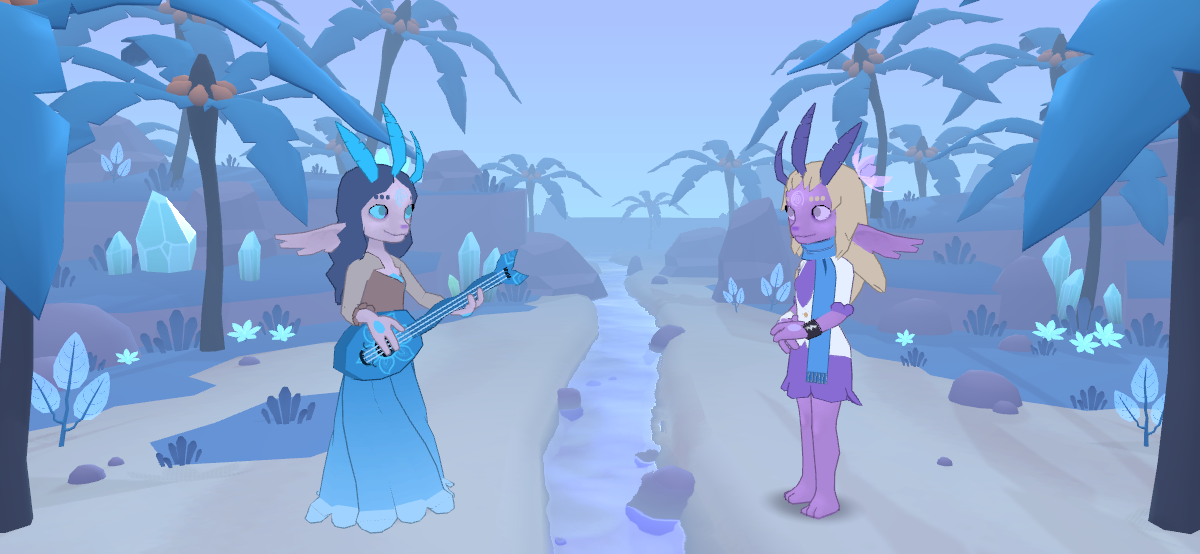
![]()
This one, Course's stage, is perhaps my favourite of these so far. It turned out so much better than expected! The Lux Water asset shines again - though again it's not obvious from the screenshot - because it has the option of flowing in a direction determined by a model's UV texture coordinates, meaning that this river looks like it's actually flowing along in the direction that it should, towards the screen rather than, say, side-to-side. I didn't want to include Earth-like palm trees since this isn't Earth, but I feel that the six-leaf'd layout works too well considering that recurring motif, and it really adds to the (sort of) tropical vibe. I at least added their fruit (of which there are also six, of course) above the leaves instead of below them like on an Earth palm, but I wondered while doing that whether it'd ever evoke a comment about my ignorance of palm tree anatomy. Such strange thoughts come to mind when making things like this!
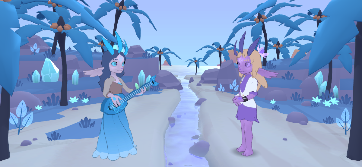
Lighting and ambient effects play an enormous role in how a scene feels, and they're used particularly heavily here. Compare that screenshot to this one:
![]()
That's the same area, but with the fog turned off. Everything looks more sharp and vibrant, but I think it's
too sharp and vibrant, especially the distant objects. It looks as if everything's the same distance away, which isn't how it works in reality. The oxygen in the sky isn't invisible, it's very faintly blue (as an aside, I'd never once thought of
∞ liquid ∞ or
∞ solid oxygen ∞ until a couple of days ago, but they're blue too). Distant objects - most notably huge things like mountains - appear blue because of the mass of the air between us and them, which isn't visible close by, but which is when it builds up at that range (the term atmospheric scattering pops into my mind, but that could be something else). I'd say it's one of the biggest things that sets apart an amateur landscape painting from an impressive one, this atmospheric fading of distant objects.
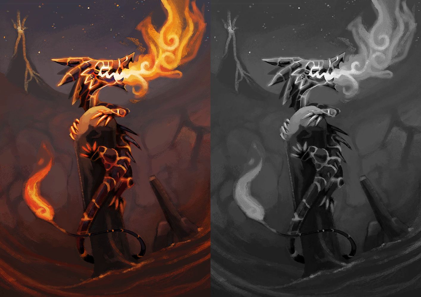
Apart from being a realism thing, it's also useful because it's important to give a visual scene a focal point for the eyes, so then they don't have to search around a chaotic mess, darting from one very visible thing to another. One of the things I learned ages ago about visual art was to use a greater contrast of values in areas you wanted to draw the eye to (value is the 'brightness' of a colour, from black to white). You'd use a fairly limited value range for much of the image (so colours that were between 40% and 60% bright, say), but in a part like the face, which you'd want to attract attention to, you'd use bright brights and dark darks (so a value range between 20% and 100% maybe). I distinctly remember first consciously considering it while making this image, way back in 2014:
![]()
The image on the right has the hue removed while retaining the values (which is what black-and-white is). See how the brightest brights and darkest darks are in the head, and your eye is drawn to that as a result. You'll see this often (done way better than this!) in the paintings by professional digital artists that you'll immediately recognise as 'good', along with things like heavy rim lighting and compositions based on dividing the canvas into thirds.
Back to Course's grove: Without the fog, my eyes are drawn to the sea in the middle of the scene, and they dart around looking at the details, mostly ignoring the two sindrels who are supposed to be the focus. The area behind Course's head in particular is really busy, so she doesn't stand out from it at all, especially since everything's blue. The fog also gives this sombre, wet feel that's fitting for the character and the song; the fogless version seems too bright and cheery. It's not perfect though. For the fog to be thick enough to obscure the distant trees, it must also darken the distant sea to the point where it's just a flat colour. I don't like that. I'll have to look into it to get it looking exactly like I want it to.
This is less of an issue when the camera moves, because you can distinguish the characters from the scenery by that movement, but when the background is static, it's more of a concern. I'm considering having the trees and grass sway subtly in the wind to make the stage feel more alive, which might alleviate some of these issues, though I'm not sure I'll be able to do that without too much hassle. It'd also be nice to have little crabs and things scuttle occasionally across the sand, birds fly through the sky, but the time and effort involved in that might not be worth it.
(I also need to swap the side of the symboliote flower on the wintrels' heads; Course's looks like crystals behind her here.)
![]()
This, Hearth's stage, is the first of two indoor areas, both of which I'm quite unsure about. I like how
warm this feels, but it doesn't feel quite right. The walls are very barren; I'll likely make a texture for them, probably something stylised rather than something that actually resembles real rock (like how the environments in Mario games are often stylistic representations of geographical features rather than actual depictions of them). Coming up with a fitting abstract texture will be a challenge; I spend a disturbing amount of time noticing and wondering about how to make abstract geographical textures, but little to no time actually making them! In every game I play that uses them, I make special note of how exactly they chose to do it, and I've been doing that for years now... There's a common and appealing style usually referred to as 'hand painted', which you'll see in abundance if you google "rock texture stylized", but something like that might be more complex than I need. I'll have to play around with it soon, and when I do this stage will look a whole lot different, hopefully better. It's amazing how much difference a texture can make.
![]()
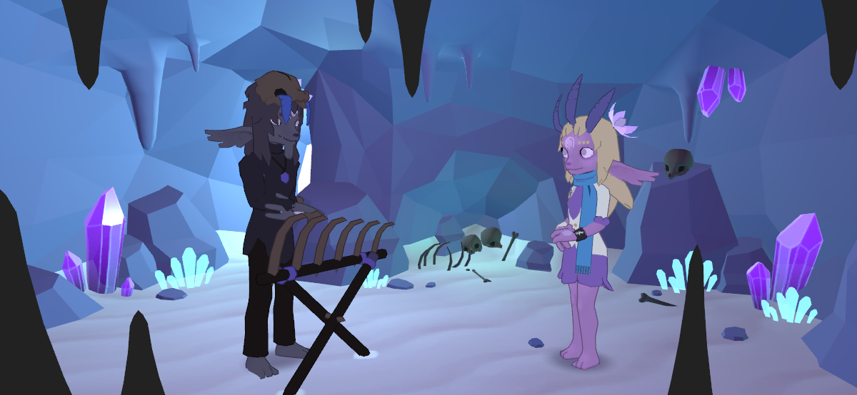
Finally, here's Dolour's stage, which I don't really like at all at the moment. Largely it's because of the chaotic lack of focus that I described earlier; it's fine around Glimmer, but looking at Dolour just feels uncomfortable to me. Maybe that's fitting for the character though! Ha... If I'm going to keep the bright door to the outside, then I should move it to the left more so then it's to the side of him rather than behind him. His cave is inside the island's mesa, which is made of crystal, so I wanted to go with a faceted look which is seen in a lot of these low poly styles. Actually getting the facets to look natural seems to be an art in itself though, one which I've definitely not come close to mastering... It looks wrong if they're too orderly and artificial, meaning facets can't just be simply added to the way that polygons would naturally flow in a sensibly-built model. My experience so far has been that a whole lot of tweaking is required to get it to look okay, so with stages such as this one, I'd look at the stage during gameplay, see a facet that looked wrong to me, then I'd switch to my 3D modelling program (Blender), make a tiny change, export the model, go back to Unity where it'd (thankfully!!) be immediately changed to the new model without having to restart the game, and I'd do that again and again, hundreds of times, and in this case, it still never looked
just right...
While doing that, I was wondering a lot: what does that mean exactly? That it doesn't look quite right? What 'right' am I comparing it to? I feel this is a common phenomenon for artists, where they keep tweaking their artwork until some niggle in their mind stops making it feel wrong to them; if you watch videos of drawing timelapses on YouTube, you'll usually see the artist fiddle around with some minor detail that you might not even have noticed or considered wrong or significant enough to tweak like they are doing, until a point which sometimes feels arbitrary, but something inside them saw it and decided that it needed to change, and only that much. That it wasn't close enough to some kind of ideal end result they had in their mind. Expect it's strange because it's
not as if we have an ideal form consciously in mind; we can't picture it explicitly at least and see differences between it and what we're creating. It's not a conscious thing. It makes me wonder how much of creation is actually
creation, and how much of it is transcribing some fully-existing form from the aether or something like that. But that's some crackpot madness for another post.
Also, I reused the simple grass tuft model here with a different semitransparent texture, to give the feeling of bioluminescence, to liven up the scene. I liked doing this rather than creating a unique model because it reminded me of my childhood playing with Lego, which was my favourite thing in the world before I ever had video games. I had enough of a passionate interest in it to have familiarised myself with most of the pieces (which were much more limited than they are now), and I have a clear memory of the feeling of getting a "Divers" set as a tiny child and seeing the familiar
∞ transparent orange flame piece ∞ given new use as
∞ transparent green seaweed ∞. I've always loved this idea of using one simple thing for multiple purposes rather than creating a whole bunch of specific single-purpose things instead. I've often wondered whether that's because I grew up poor and didn't have the luxury of having whatever I wanted or needed and had to think of how to use what I had instead, and how much of that has played into the way I try to do all the different parts of my games myself... I don't know.
(Dolour's not sitting anymore and I redid his xylophone... but now he feels too tall and imposing in a way he really shouldn't. Changing his posture should help with that. He doesn't even have a proper pose here; one hand's clipping through his arm, and I can't tell where the other one even is!)
I'm almost done now! Soon this madness will be over and we can all go home!!! Finally, there's the world map. For reference, here's how it looked before:
![]()
I
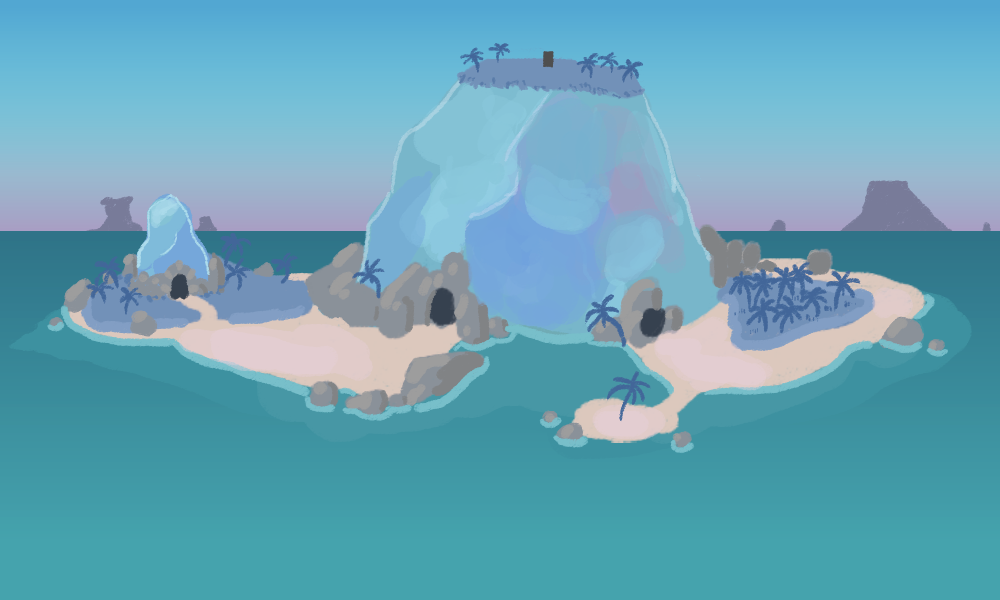
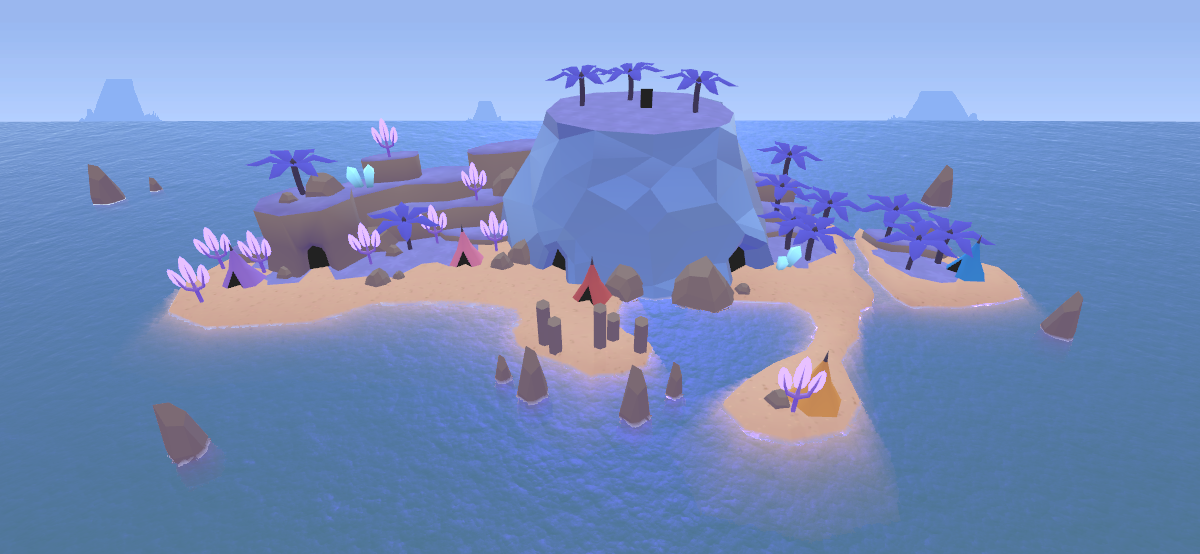
think that was the first image I made for the game, so I've stuck with it since the beginning. It feels weird, then, replacing it. I was fairly content with the layout and wanted to preserve it, but wow, this caused me way more difficulty than any of the other stages! Here's what I have at the moment, and I say 'at the moment' because it could very well change quite a bit, or not, we'll see:
![]()
Importantly, I wanted it to look less like a real depiction of an island, and more like a small model. I absolutely loved the world maps in the old Final Fantasy and Mario games (and the lesser-known first
∞ Wario Land for the Game Boy ∞, which isn't much older than those but mentioning it makes me feel ancient). Super Mario World is still one of my favourite games ever just because I found its world map so completely charming (the same goes for Wario Land, actually; I never cared for the other Wario Lands, though, because nostalgia is so important for these things). So I wanted something that wasn't a million miles away from that.
I didn't
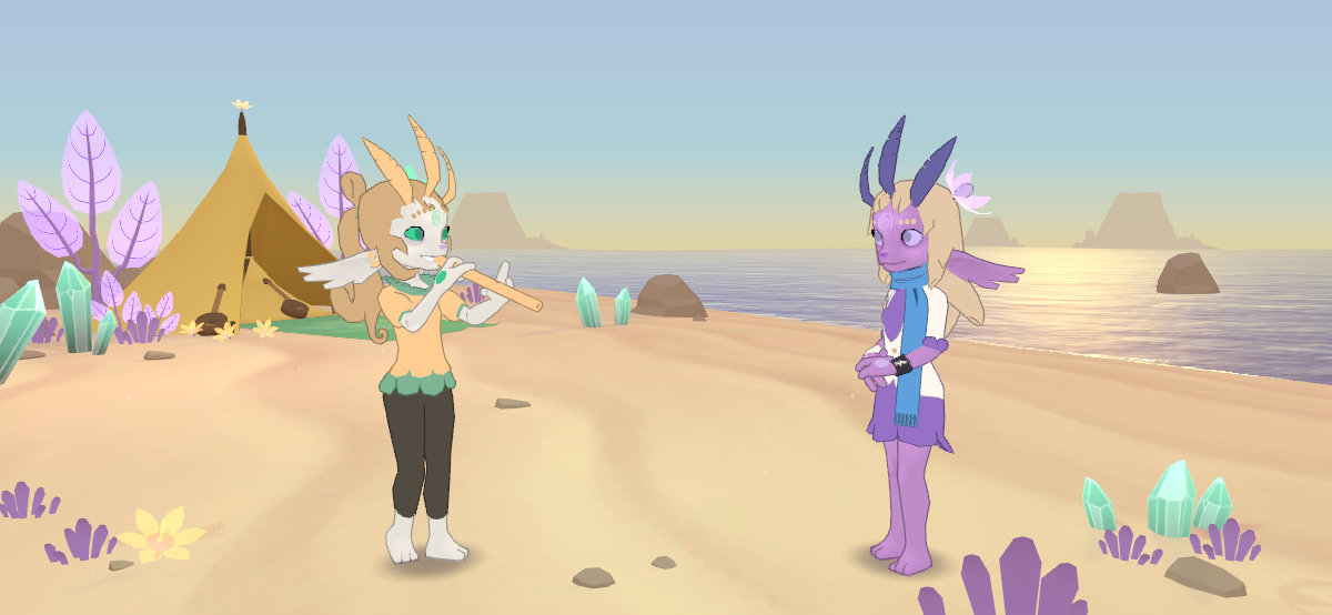
quite achieve what I hoped for, and there's something about it that doesn't look quite right to me. Maybe it's something about the 'busy' feel again, or the awkward faceting of the mesa, or the barely-discernible textures. Mostly though I feel that it's the colour palette. Here's the screenshot of Glimmer's tent stage again:
![]()
That, I feel, is a particularly good example (for me, at least!) of an image with a nice colour palette. It's purple and yellow, and obviously so. There are other colours too, like the soft teal tint to the sea, which break up the monotony, but for the most part, it feels like a warm and unified whole thanks to the limited palette. This is another big thing in making images look good. There's something called colour grading which is used heavily in films to limit their scenes' palettes; so many Hollywood blockbusters tint their scenes such that everything's teal and orange, for
∞ a bunch of reasons ∞. A film called
∞ Hugo (2011) ∞ sticks in my mind entirely because of its (perhaps excessive) use of this, which gave the film a really beautiful, almost otherworldly look;
∞ this busy scene is made a whole lot less chaotic because everything's orange and teal, for example ∞ (the lighting and composition also effectively draw the eye to the points it should be focusing on). I also remember seeing limited colour palettes being used as a challenge by the digital artists on deviantART and Tumblr a while back, which often led to quite striking results.
So I'm aware of things like this, but I haven't successfully managed to pull it off to my liking with this world map. Perhaps it's the blue that I don't like... Purple and yellow are the theme colours, Glimmer's in particular, so having the main world area use blue instead feels a bit off. The sindrels were originally conceived way back when Alora Fane first was as the Sorrow race, with their world petal associated with blue. I've intended the crystal mesas and the grass to be blue as a reference to that... but it's not like the sindrels themselves look or are anything like their original conceptions, so I don't know.
Pretty much all modern games achieve a dramatic look by relying on something called post-processing effects, which add things like bloom, colour grading, distance blurring, etc. I mentioned SketchFab earlier, and essentially all the models on that use post-processing, but interestingly you can turn it off and compare the final result to the base model. For example,
∞ here's a model better than anything I can make ∞. If you press "I", a menu should appear at the side with a bunch of options. If you select 'No Post-Processing', what you see isn't
bad by any stretch of the imagination, but if you toggle between the two, you can see that the Post-Processing version looks more dramatic, more vibrant, somehow more 'real'. As an additional layer of interest, if you select just Albedo, you can see how much of a difference the lighting makes in a scene too. Placing lights that work well is a challenge for sure! This monster of a post would be even more ridiculously huge if I were to try to explain how I've dealt with that! (You can also view a coloured wireframe using the buttons at the top, which has been invaluable for me while learning. It's remarkable how few polygons many models have without looking 'low poly' at all.)
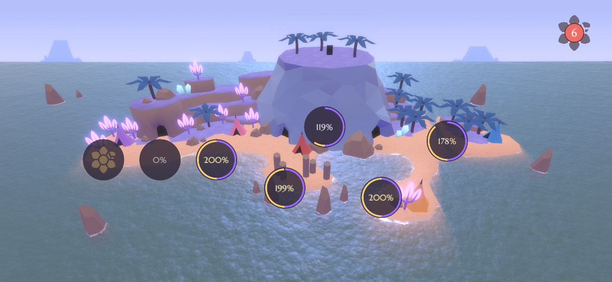
I mentioned post-processing because I tried applying it to this world map:
![]()
I did so quickly, without too much careful tweaking, but already it feels to me more dramatic and alive. The trees with see-through leaves glow/bloom, there's a subtle blurring of distant objects, everything feels a bit more like you're
in it somehow. I'd keep it like this, but I'm concerned about performance, or about it not even working on some devices at all, so I'll need to do some investigating and testing to see what I can actually get away with. I'm not even sure it fits with the kind of look I'm going for though; it looks too dramatic, maybe, rather than simple and cosy.
![]()
I know I've waffled on, but hopefully some of this was interesting to read about, especially if you're curious about how games are made but you're an amateur like me. Writing this has been a nice break this weekend, and I'm actually looking forward to getting back to doing more tomorrow. My aim and hope is to have it ready for testing by what my calendar tells me is apparently Easter Monday (the 22nd), but I'll have to see how it goes. My energy levels are still fluctuating a lot, and there's still a lot left to do.
I wrote most of the dialogue for the game, based on the plot I described in a previous post, in a single day, so it shouldn't take too long to write the rest. I also rethought something mentioned previously, where you acquire bits of backstory the more you complete of a character's stage; it's difficult to tell a story if some dialogue is optional, so I might have to limit or even remove that, putting a more condensed version of their backstory in their dialogue when you first meet them and when you first finish their song. You could also originally ask Hearth about any keywords (like 'owa', 'house plant') that you encountered in dialogue, but instead I've changed that so he just tells you one paragraph of narratively relevant lore a day, so that concepts aren't explored before they are by the story. Little things, but important for me as the developer.
I've no idea where this will all lead, but I'm just glad I've managed to stick with it! Thanks for reading!
(Also I wonder if my time perceptions are warped; I felt like my last post was a week ago, not two!)
![]()
EDIT: HMM.
![]()




0