DEVELOPMENT
4,494
Weekly Update 2020-4 (Development)
6 years ago - Edited 6 years ago
I started building the field section of Divine Dreams this week, and I've achieved a lot!
I was intending to focus wholly on story planning until the end of the month, but I was seeing diminishing returns from each session, as I think I said in a previous post. I felt I needed a break, a mental shift, so I decided to devote a couple of hours to programming stuff and got carried away! I've been so focused on it that I've had little time to even so much as think about anything else, which is a satisfying feeling.
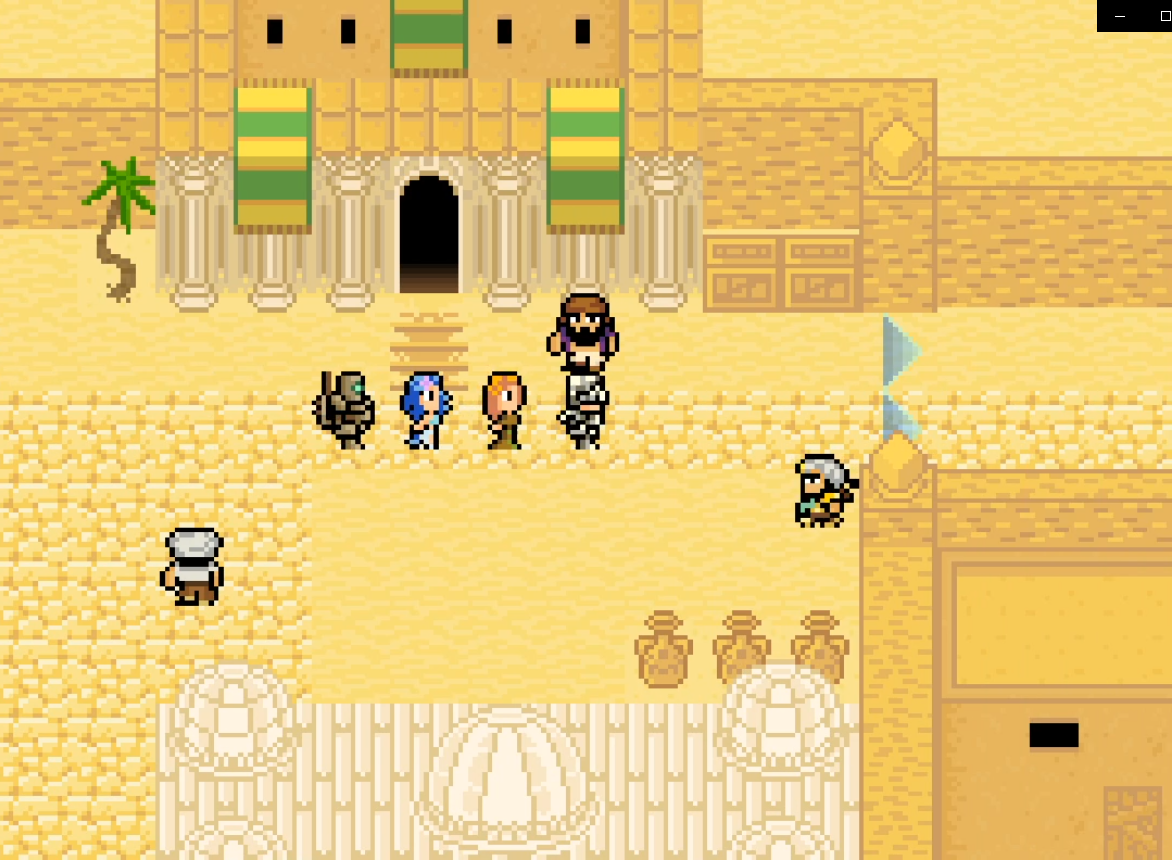
The 'field' is the section of the game that's not battles or menus, and I've been unsure how to handle it in this. Or rather, I'd not really given it any thought! MARDEK used a tile-based 2D map system, since that's what the games it was inspired by (such as the early Final Fantasies) used, plus it made it easy to make large areas relatively quickly.
![]()
Each 'tileset' only had a small number of tiles, many copies of which were combined into larger maps. I actually liked how repetitive it was, as it reminded me of the love for Lego I had when I was little. With that, many instances of identical blocks were combined into larger models, and each individual brick type took on its own qualities, such that it was exciting to see them used in atypical ways (eg a green flame block being used as seaweed). I think I've talked about that somewhere before!
I first experimented with a 3D variation of this tile-based map approach last year before I'd even really conceived of Divine Dreams, which I've talked about in other posts. I posted gifs like this on Twitter:
![]()
That directly mimicked MARDEK in that movement was locked to a grid, so you could only step in the four cardinal directions, one tile at a time.
The next evolution of this was the field of Belief, months later:
![]()
Since I was using 3D now, that afforded the possibility of extra elevation levels that I always wanted to include in my Flash games, but they were annoyingly tricky when everything was flat. So each map is made up of layers, with additional maps at fixed intervals (2 metres) above the previous one. The only way to move between the layers was to climb up or jump down special ladders.
Establishing area
boundaries is a pain which different games solve in different ways. Some use vast models with edges you can see but never reach, but that requires building all the non-explorable parts, which takes time and effort. In MARDEK, tiles beyond the map bounds were flooded with a 'default tile', which worked out okay because of the fixed 2D perspective and player-centred 'camera' that limited how many you'd ever be able to see.
![]()
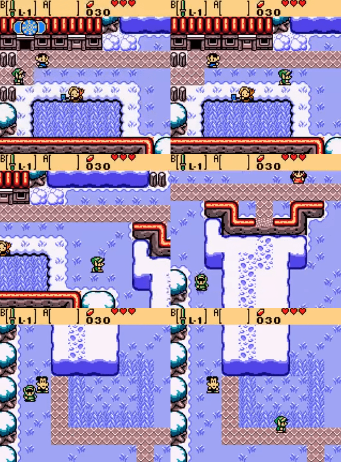
How to better handle this was something that I thought about a lot over the years, even when working with 2D. Something that I particularly liked was how in some old games like the Zelda ones for the GameBoy (Link's Awakening, Oracle of Time, Oracle of Seasons), you could only see one screen at once, with a transition to the adjacent one when you left an edge.
![]()
The areas were designed sensibly such that it never felt like you were walking blindly into the unknown even with everything so cramped. I particularly liked being able to
complete a map of connected 'rooms' like this, where visiting every room felt more feasible than, say, exploring every corner of Skyrim. It's a nice feeling of achievement and completion.
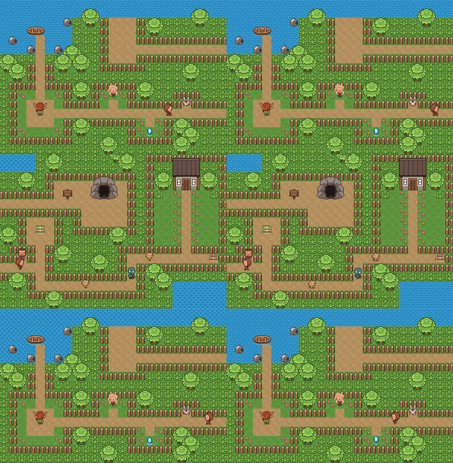
This 'grid of rooms' as a design concept was one I used several times in old games, like Clarence's Big Chance, and unreleased projects like Marooned and Alora Fane: Creation.
![]()
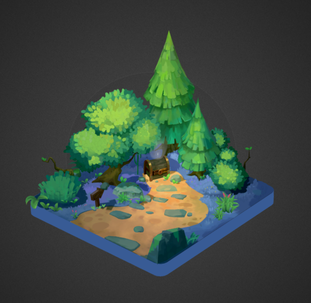
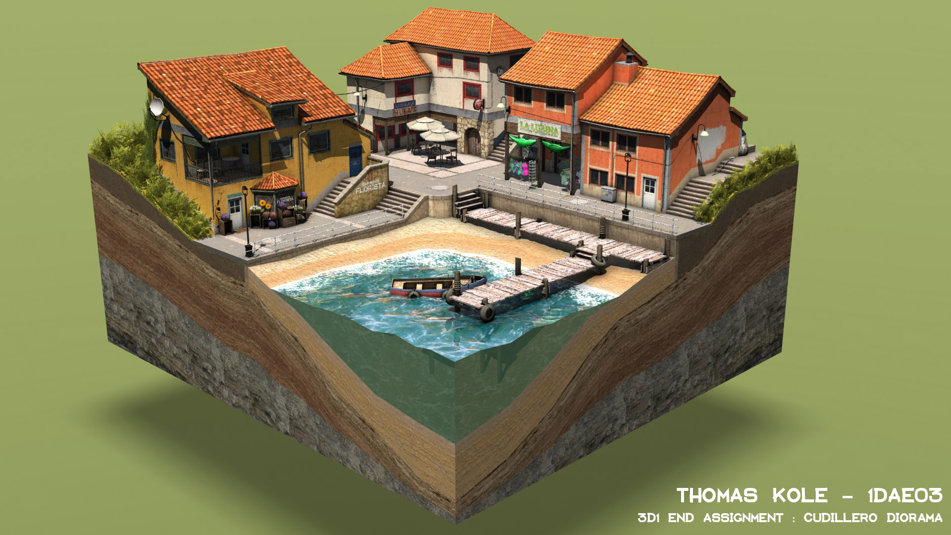
I also really like the look of
dioramas, which
∞ it seems 3D artists are fond of making ∞. Things like this:
![]()
![]()
There's something about that fishtank-like slice of a body of water that I've found extremely enchanting since I was little, for whatever reason!
I originally wanted Sindrel Song's environments to be dioramas like this, but the setting meant that the 'play area' being surrounded by an ocean stretching into the horizon made sense. I used an ocean for the same reason in Belief, but I can't really use an ocean for every area in Divine Dreams.
![]()
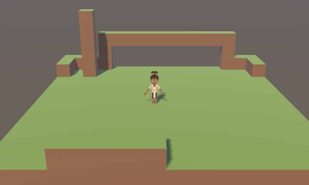
So those were my inspirations. On Monday, I made this in a couple of hours:
![]()
Mostly because I was curious to see the effect, I decided to go one step further than Belief with converting tile-based maps to 3D. Rather than layering maps above each other and connecting them with ladders, instead it's more like a true 3D 'voxel' map, of which Minecraft is obviously the most notable example. I wasn't exactly aiming to duplicate Minecraft - I've never even played it (I've just seen youtubers playing it) - but I thought it'd give areas an extra layer of depth which might be intriguing.
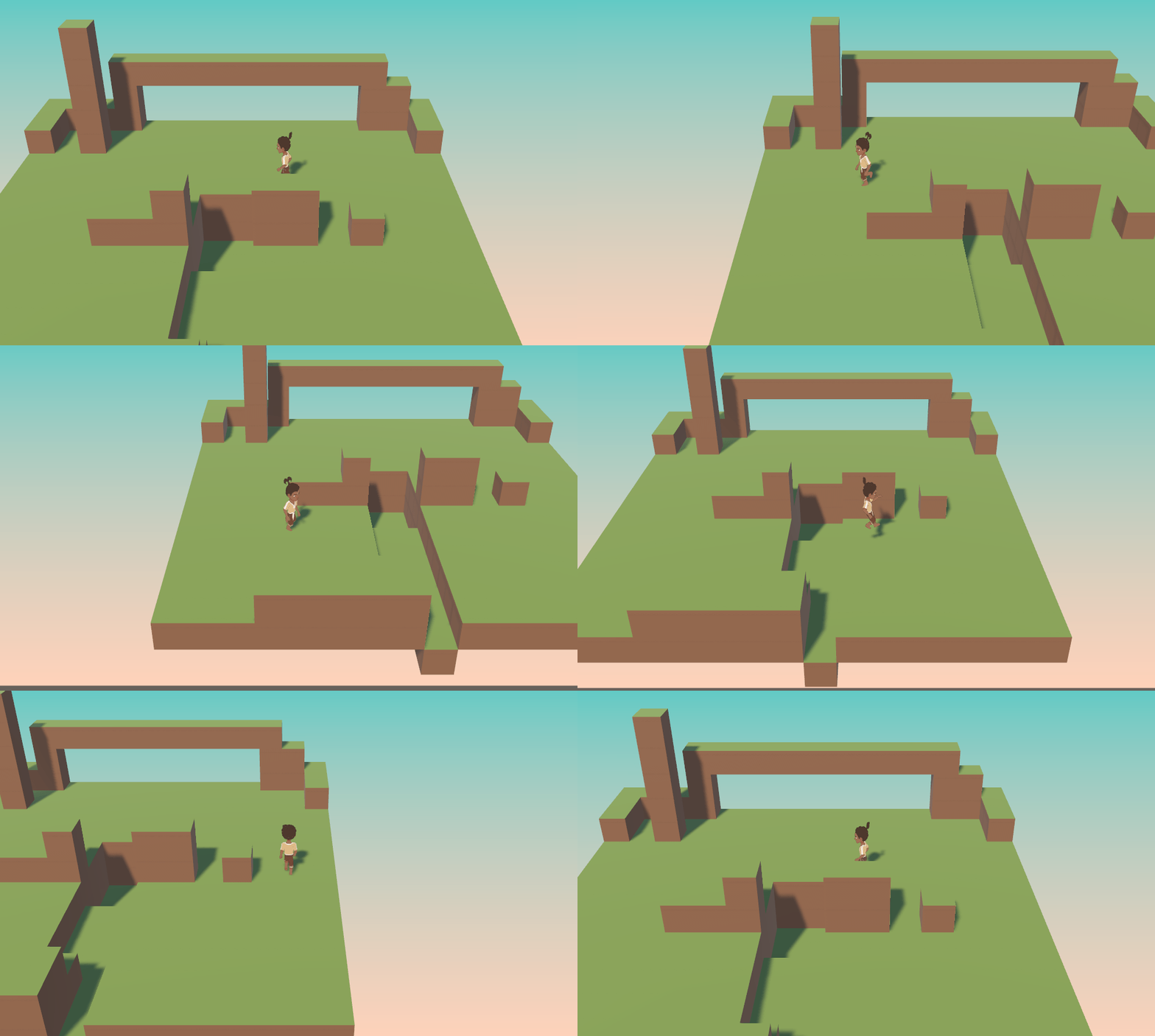
Because of the possibilities this opened up, I added a simple jump mechanic - along with free (rather than grid-bound) movement - on Tuesday:
![]()
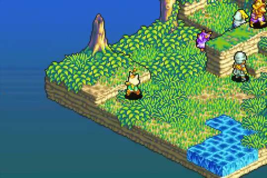
I added the gradient 'sky' background because a few other games (Final Fantasy Tactics and its Advance sequels come to mind) which use maps floating in a void use a similar technique. It was sloppily added though - it shifts around and is cut off at the bottom - because I wasn't intending to keep it.
![]()
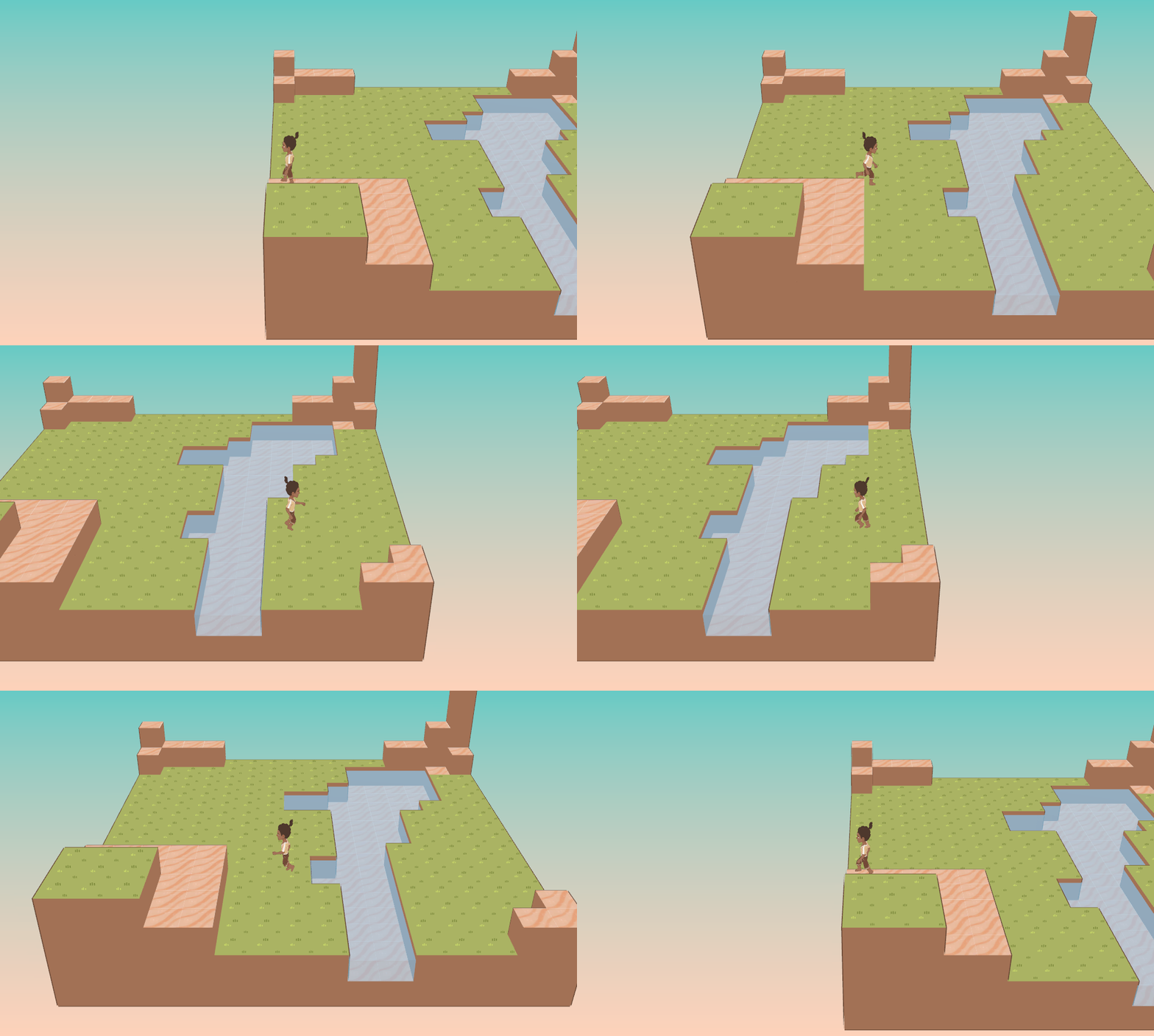
On Tuesday evening, I'd added some basic textures to the blocks, plus some rudimentary water, which really helped to bring things to life. I was also playing around with giving outlines to the tiles - like the characters have - for a stylised look, but decided not to stick with that.
![]()
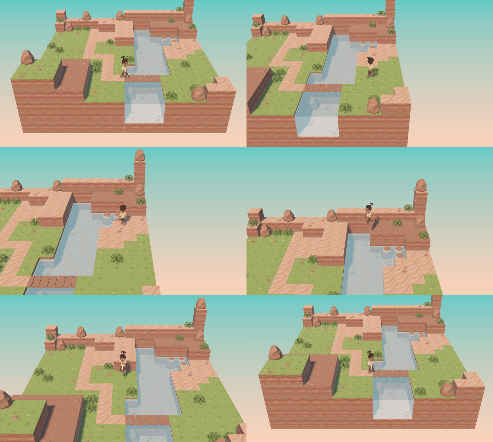
On Wednesday, I'd added some more detail, which I feel enhances the look and feel drastically! This little diorama was meant as just a way of playing around with the tiles, but I liked it so much that I wondered whether to just keep the diorama look for the final game.
![]()
Currently the tiles are very
cubular though, whereas the original plan was to add edge tiles to give a look similar to Belief, but that's a lot of effort so I've not done it yet. I wonder whether people's love of Minecraft would allow me to just get away with the cubes, saving me a lot of work... but I don't know, I'd like to at least experiment with the edges when I find the time.
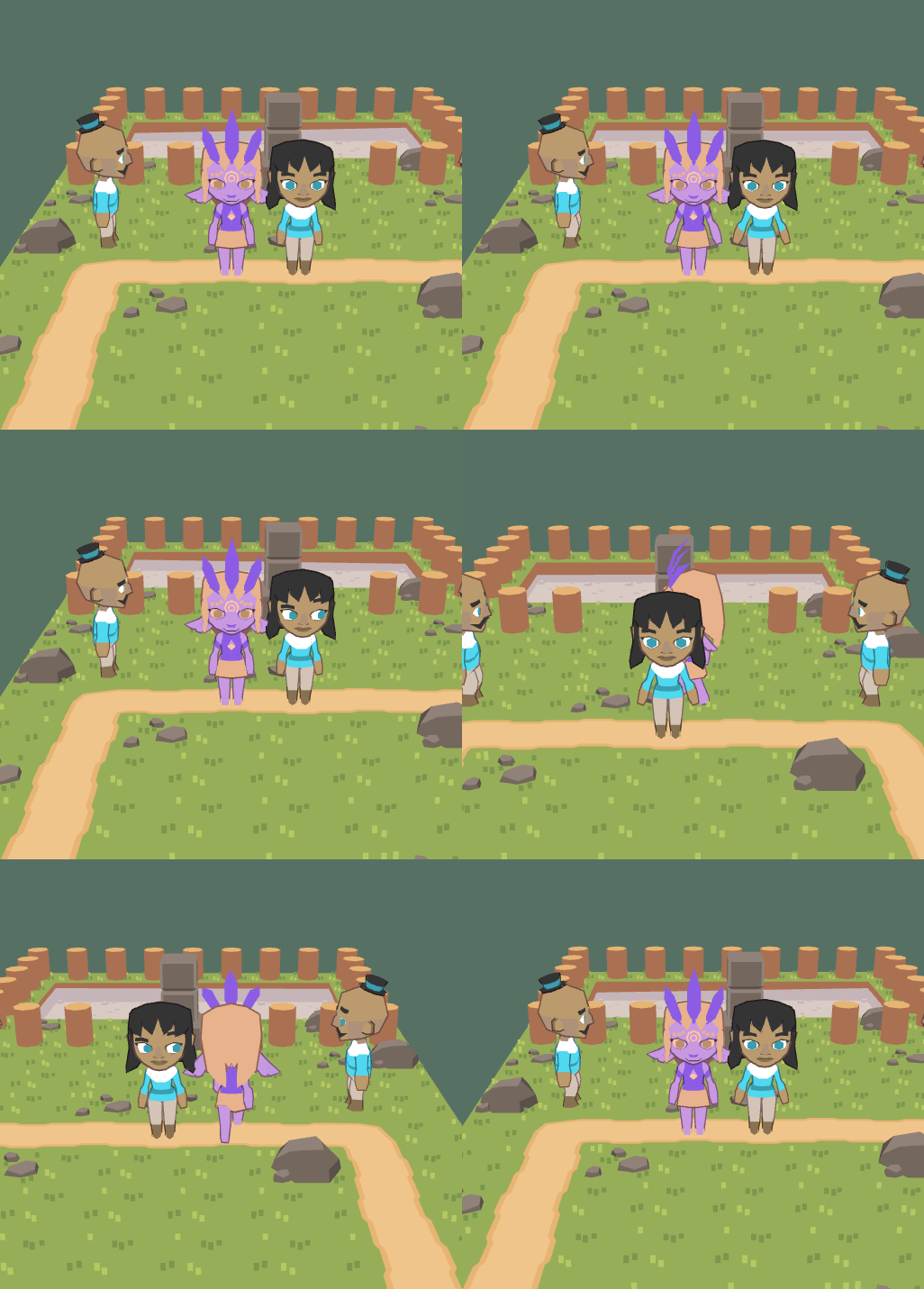
The areas were already built as 'rooms' of a grid like in AFC etc, so I needed to allow some way to travel between them. At first I wondered whether to add special exits to explicitly transition between rooms (so you'd leave one edge, then it'd either snap or quickly fade to the next, and you'd walk in automatically). However, the way I'd built things made it very easy to add seamless movement between rooms by just walking off the edges:
![]()
This disappearing rooms are really jarring, though, and completely ruin immersion. Obviously this wasn't good enough!
On Thursday, I attempted to improve it by doing this:
![]()
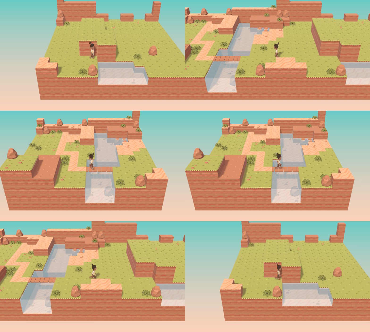
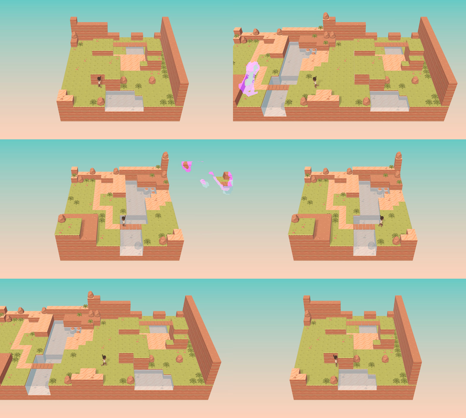
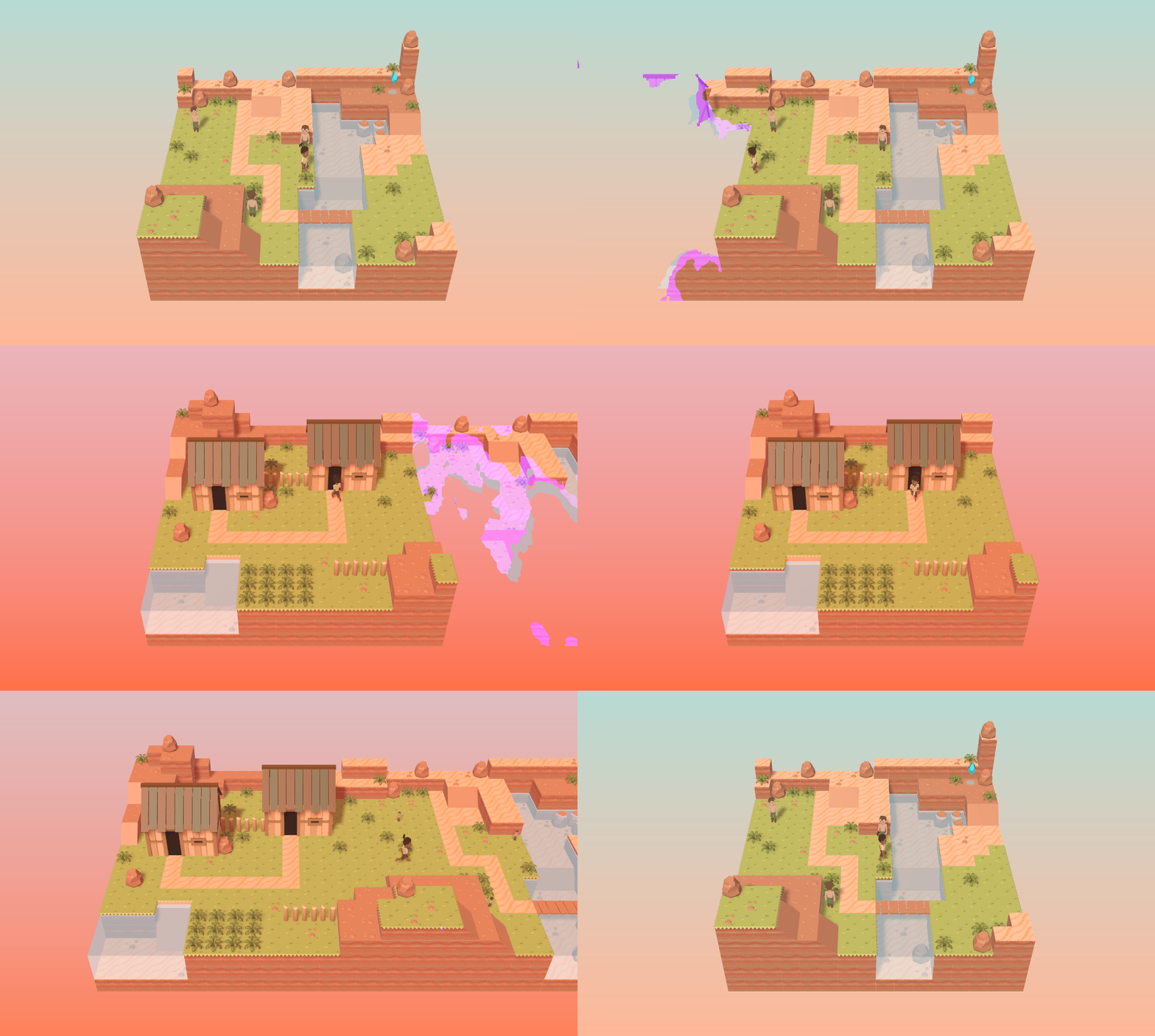
Here, the camera focuses on just the current room, but when you approach the edges, adjacent rooms dissolve in with a fancy shader effect I quite like (I've never done anything like that before, so it was interesting to figure out how). Then when you enter a new room, the camera quickly shifts into position.
The camera can also have two zoom levels. At this 'far' view, you can see more of the rooms from more of a top-down perspective. A nearer perspective focuses more on the current room, so it mostly fills the screen (though different screen resolutions would be a pain here).
![]()
Each room has an 'ambience' value, which determines the colour of the sky and the general lighting.
![]()
Finally, on Friday I added some miscellaneous things like sloped tiles, objects on the maps, and houses.
![]()
![]()
Overall, it's... interesting. I quite like the idea of using a very stylised way of portraying the world like this, both as a sort-of reference to old game-building techniques born of limitations, and as a way of giving the game a distinct look and feel which would set it apart from a more straightforward RPG.
I suppose there are two ways of looking at it. One is seeing it as a limitation; "I can't see what's coming next and I don't like that!", or "the space feels really constricted and small!". Which is fair enough. Another way though is seeing it like... each room is its
own thing, self-contained, kind of like a little world in itself (which is the feeling dioramas aim to inspire). And when you're within one of those little worlds, it becomes your focus, nothing else matters; the other aspects of the world literally disappear from awareness.
I've been wondering how I could tie it to the themes of the game, but it's a bit tenuous. Something about consciousness building the world, such that when it's not present, nor is the world. "If a tree falls in the woods with nobody to hear it, does it make a sound?". It's interesting how quantum physics experiments - the Double Slit experiment is a notable example - show that the presence of an observer really does alter outcomes, and there's another big quantum physics idea I'll be incorporating into the story/lore so I do like the additional connection there (I've not talked about that yet on this blog yet).
Mostly though, it makes it easy on me as the developer, since I can build these rooms as little worlds, complete in themselves, without having to fill in every detail of some enormous map. So I'd be content to stick with it for that reason alone, though I don't know whether I'd be able to get away with it.
I suppose it's not really possible to know how it feels to
play at this point though, so just keep that in mind; even I don't know for sure. You'd need to actually play a demo to see how comfortable or immersion-disturbing it is.
![]()
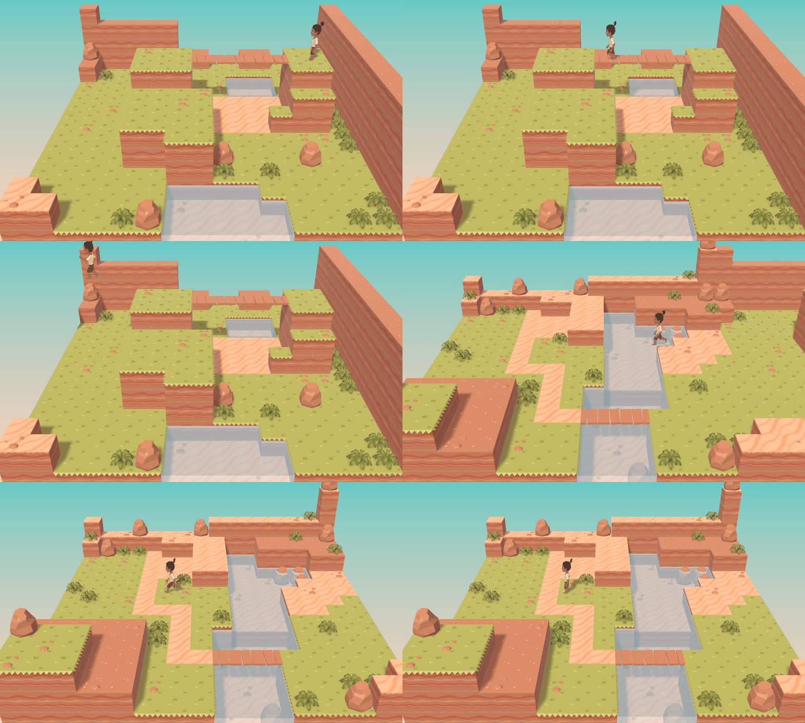
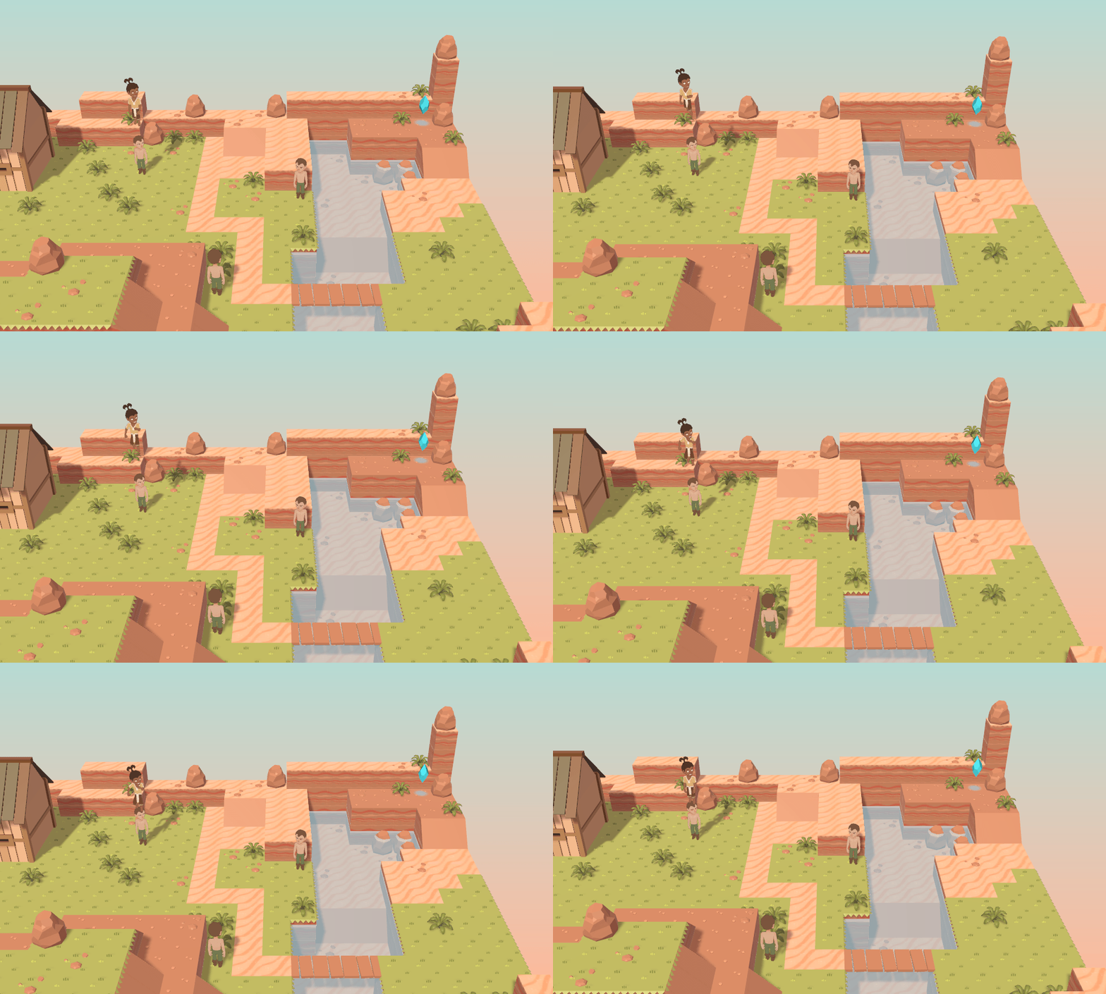
I am concerned about the free movement and jumping though. These maps were built to robustly test the mechanics rather than as representations of what the final game's areas would look like; I definitely wouldn't intend to have that much jumping around! But even having
some jumping around seems to add some potential actions that are surely amusing for the player, but difficult to know what to do with as the developer:
![]()
Honestly I'd rather constrain movement a lot more, perhaps even return to a grid-based movement system with jumping being limited to leaping off ledges or across one-tile-wide gaps or something, but I imagine players would prefer the free movement, so I'll have to think about how best to handle it.
I don't intend to make maps that are overly athletic though; it's still an RPG, not a platformer. I remember playing Final Fantasy games way back in the day and wondering - with some annoyance - why I couldn't jump in them. They're 3D! I
should be able to jump! But that's not what those kinds of games are about, and once you introduce the mechanic, it feels like you have to design game elements around it, which means more thought and work put into things that aren't even the main focus of the game...
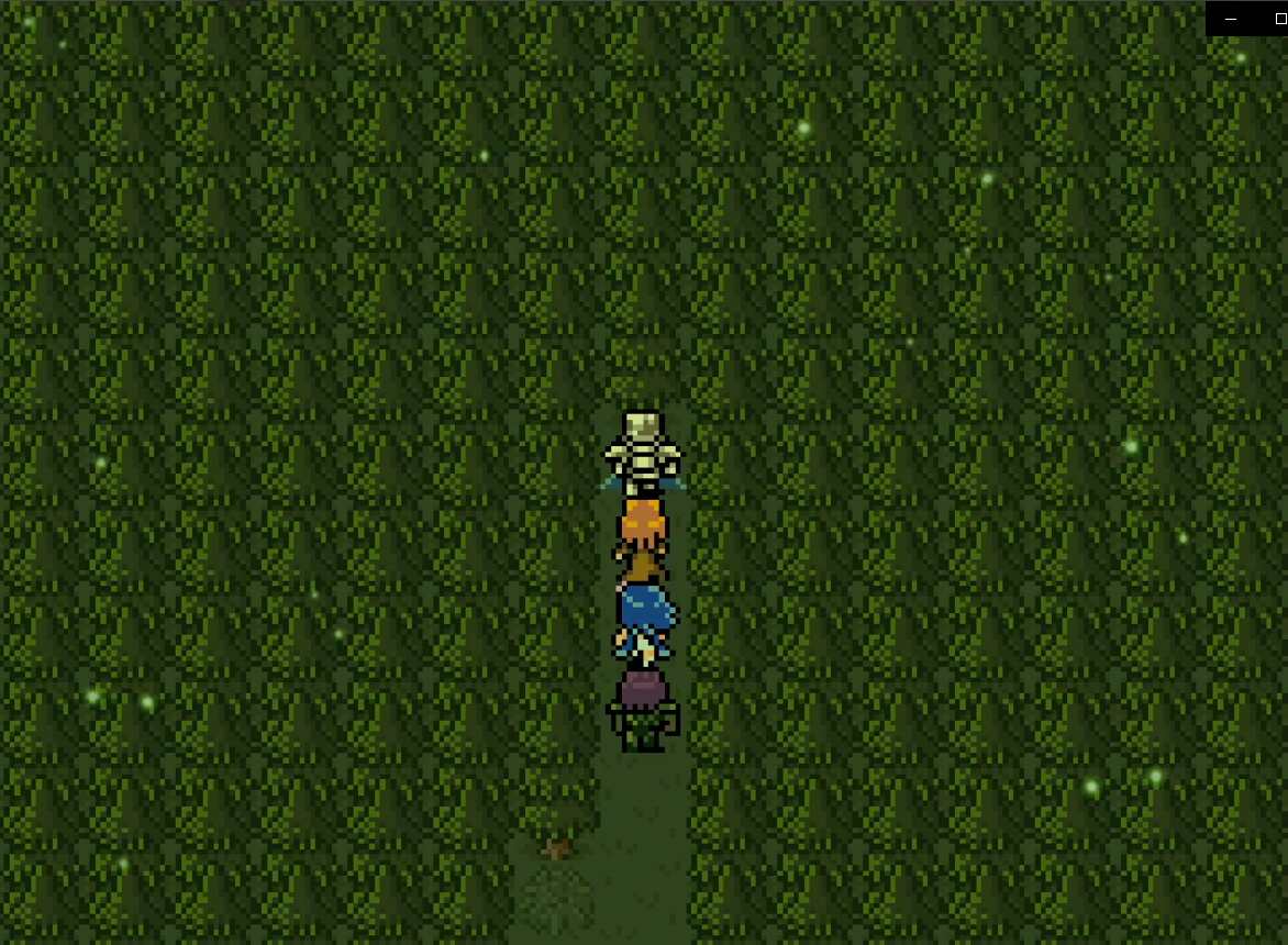
Also, in MARDEK, your allies followed you on the map (in a neat line; they were very disciplined), but that'd be much harder with this. Unity has pathfinding stuff I could use, but it's mostly for flat surfaces; having your allies jump around an area with elevations would be a tricky puzzle to solve.
Another possibility is to allow the player to switch who they're controlling at will, while your other allies are invisible. Like how FFVIII had your allies follow you, but FFIX scrapped that and had you just control the protagonist. FFVII was the same, and I remember getting excited as a child about sections where you controlled someone other than Cloud, but disappointed that I could never control my favourite character, Red XIII, on the field. I imagined that if I ever made a game, I'd allow the player to play as whoever they wanted! But then I went and made MARDEK where Mardek's locked in the lead the whole time. Pfft!
So if you had, say, Mardek, Deugan, and Emeela on your party, you could press a key to shift who you were controlling on the map. Then, to extend from that, maybe
they all had special 'field techniques' that they could use for different effects? Maybe Mardek slashes bushes with his sword, while Deugan can block projectiles that otherwise bar your progress down a particular path? Or maybe Mardek's the only one capable of jumping?
I know some other RPGs had similar things, and I feel it'd add a nice bit of icing on top of the functional field mechanics, kind of like how reactions add to battle attacks so you've always got something to interactively do.
![]()
I've shown a lot of images here, but most of what I've been doing has been behind-the-scenes stuff, like building a map editor for myself, and writing code that generates maps with fewer vertices from the tiles provided. It's a shame I can't really effectively show that, but I suppose a lot of the time spent making things like this isn't really showable to the player in an obvious way. As players, we focus on the 'what', but as the developer, I have to focus a lot on the 'how'. Figuring out
how to make 3D voxel maps is a lot harder and more time-consuming than just deciding to do it!
There have also been a bunch of irritating bugs and physics issues - like the player getting stuck at the top of slopes for no clear reason, or being able to stand on thin air before falling off edges because of how collisions work - which are largely unseen by anyone but me, but they're the primary motivators behind wanting to do something less
free with the movement. I'll need to spend quite a while looking into how to iron out those kinds of issues, which I can't say I'm looking forward to.
![]()
I'm interested in your thoughts, especially since we're right at the beginning here so it's really the only time for major changes, but keep in mind that seeing a few gifs and experiencing this as part of the game would be very different experiences!
I think my goal at this point should be to make an interactive demo sooner rather than later. I'll postpone finishing off the story planning until after that.
At the rate I'm going, I imagine I could easily get a demo done before the end of February. When that's ready, I'd look into how to do crowdfunding, I'd re-release the original MARDEK on Steam, and I'd get back to those character silhouettes as part of the hype-building!



45