Log In or Create Account
Back to Blog
DEVELOPMENT

33

3,384
Weekly Update 2020-5 (Development)
5 years ago3,720 words
Here's a brief review of what I achieved in January, a bit more about field mechanics, a model for Deugan, the conversation system, and some stuff about character progression (and menus).

It's February now! Already! I say, even though it feels like these weeks have actually stretched on quite a while for me, and I've got a lot done. Since it's the end of the first month, I thought it'd be interesting to briefly review how much I've done on Divine Dreams since the start of the year.


January Review

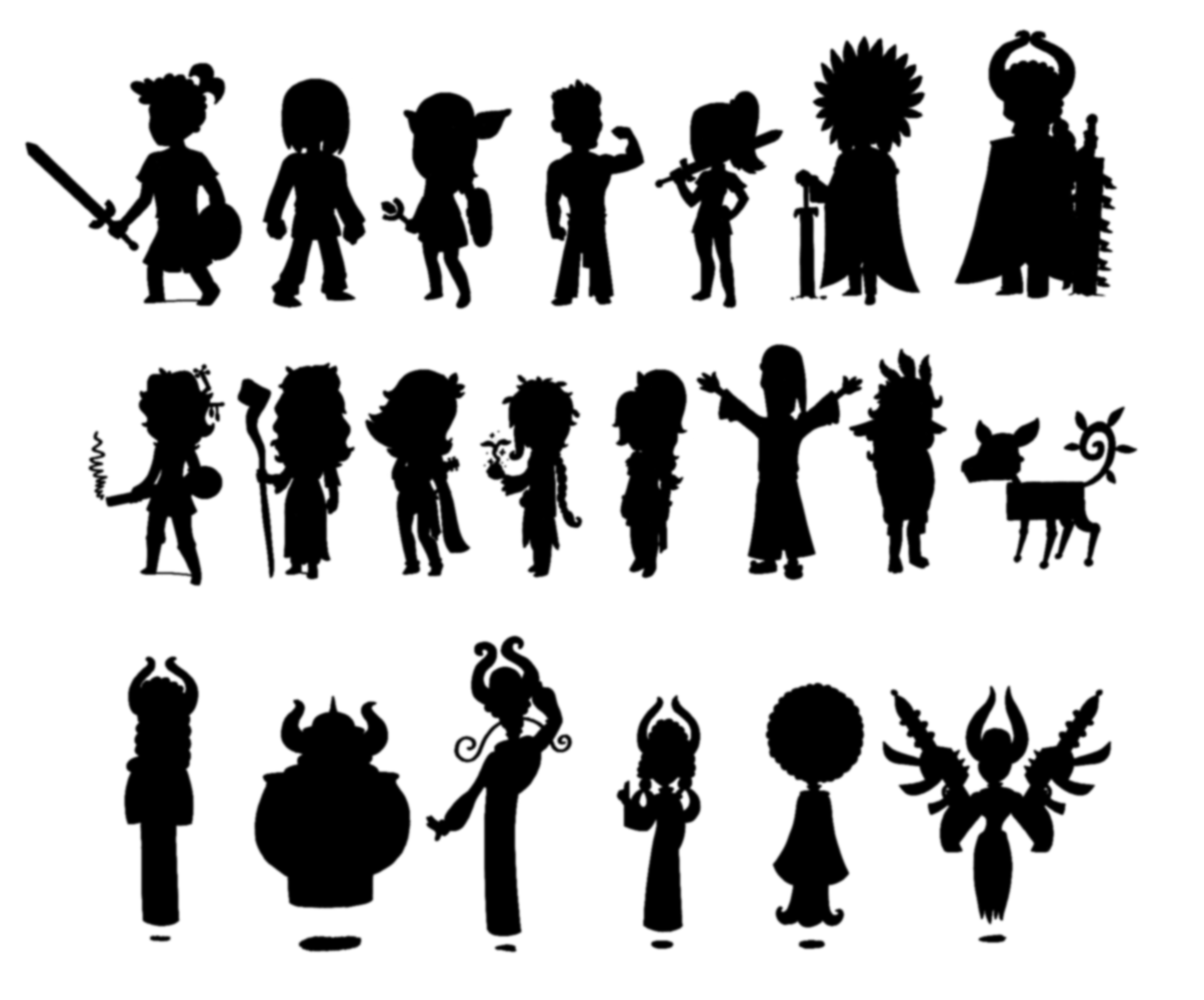
This started a bit before January, but I've mostly planned the plot of six reasonably-sized chapters, divided into two trilogies - Belief and Divine Dreams - the second of which I'll make first. I've got most of the characters planned, as seen in this set of silhouettes that I'll start revealing when I start actively trying to build hype for the demo/Kickstarter/whatever I decide to do:


I've built a traditional turn-based battle system, which takes stat simplification to an extreme degree (characters' Body and Mind determine attack, defence, and HP), and which expands on reactions from MARDEK.


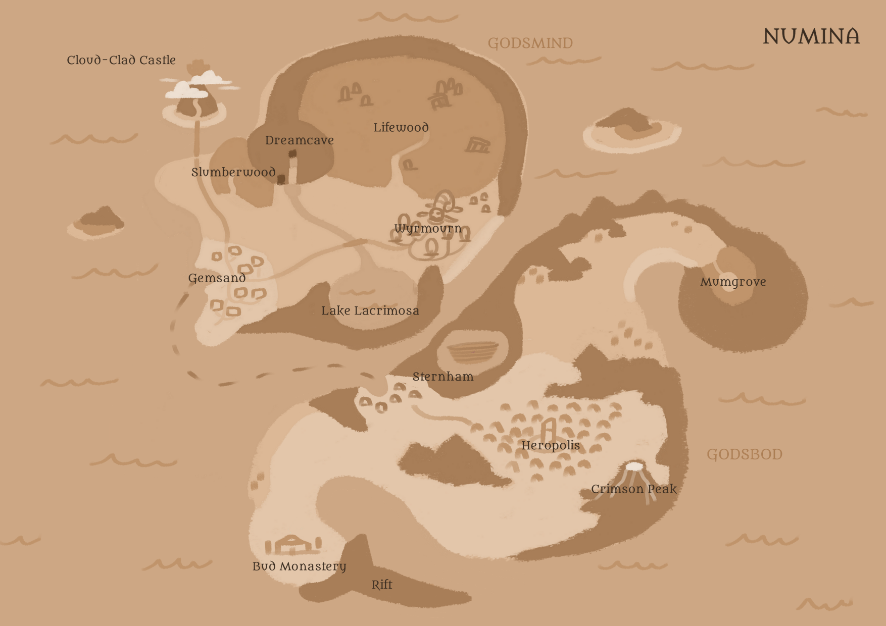
I've planned the world to some extent, though some suggestions for new place names weren't well-received. We can work on those at some point, but for now, I'm at least thinking of changing "Lake Lacrimosa" to "Lake Lachryma" or something.


I've started composing some of the music!! Yes!!!

And I've built some basic field mechanics, where areas are built out of blocks, arranged in 'chunks', but I've been unsure how to handle travel between these chunks.


That's quite a lot for one month considering I'm doing it all alone, I'd say! These things do take a lot of time.


This Week...

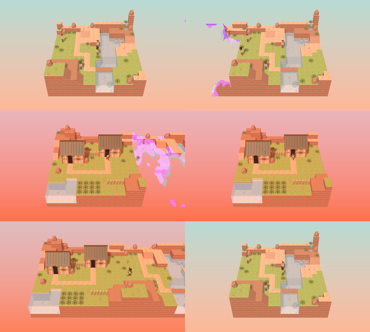
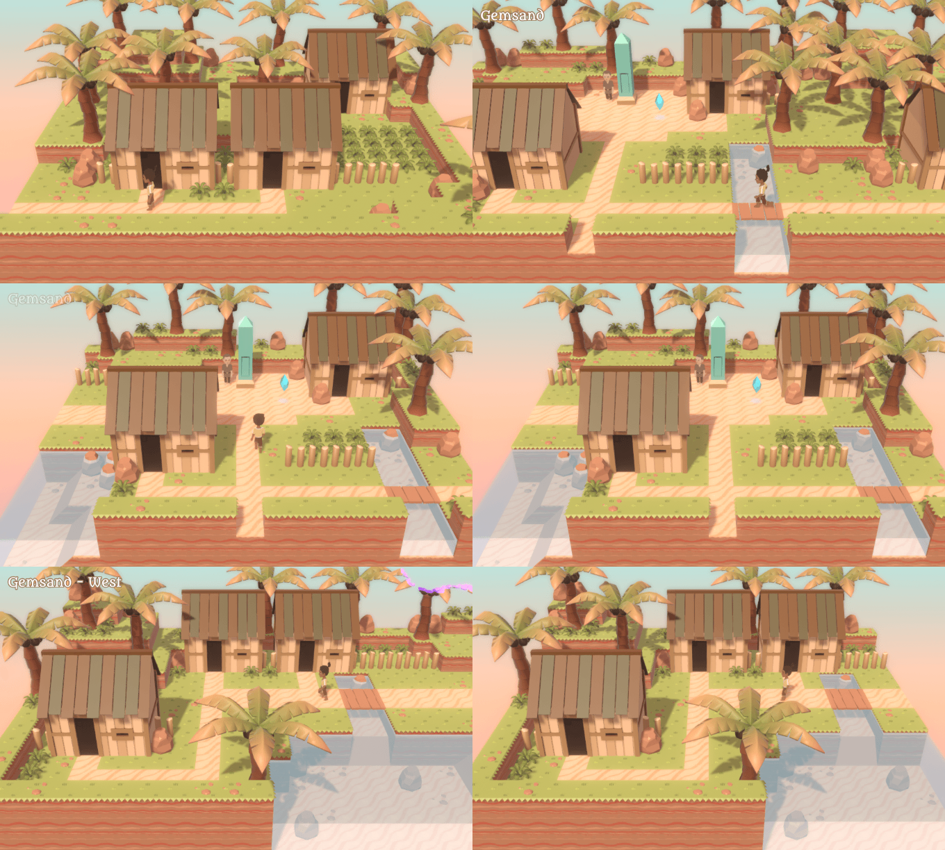
I've played around a bit more with the field stuff. First, I made some new tiles/objects, and this area, to demonstrate how the actual game areas (rather than just test ones) might look.


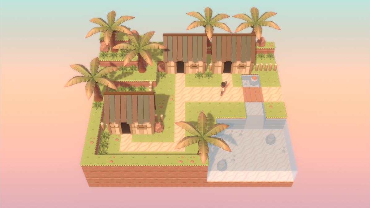
The chunks are now a bit wider than they were before, though not hugely so. This is the zoomed-in view, so they fill up most of the screen (with this resolution, at least). Here's how they look zoomed out:


I'm still interested in giving the tiles proper organic borders rather than keeping these hard edges (especially with floor paths), but I've not got around to that yet.

I do quite like those trees though; they turned out a lot better than expected! The same goes for the houses, which are directly based on ∞ the ones in Gemsand in Taming Dreams ∞ (though I want to make the smaller variations too).

Here's something that I experimented with:


This is the result of setting the camera to orthographic mode, which draws the 3D models without any perspective, so they don't even really look 3D. It simulates the look of early RPGs - and of MARDEK - in a way that could be nostalgic... though personally I don't much care for it. These perspectives were only used in the past because the alternative wasn't available, and it feels like a loss to give up on a feeling of a wider world when the potential is there.

A couple of people on Twitter suggested just including both possibilities with a toggle, but I don't want to go down that path. It's important to make a decision and stick to it, because all the areas would need to be built with it in mind. I don't like the "why not both?" path in general, since design doesn't really work that way. It's like if the developers of Wind Waker, uncertain about whether people would like the bold new graphical style, also included a toggle for a more 'standard' look. Would it have diluted the influence that style has had? Or would it have been praised for giving the option? I wonder. I do think it's best to decide on a direction and focus on it though (says I, the technically-unemployed artist/programmer/composer/writer/modeller/animator/whatever with a whole bunch of abandoned projects under my belt).

In that image, the chunks are also stitched together, rather than fading out and in while in view. This is definitely a possibility I can stick with, though the boundaries of the area leading to the void are of course still there. Either I could just leave them connected like this and keep the void surrounding them like this, or another possibility is that I build a large overworld out of many connected chunks that you can walk freely between on foot.

The way the game's structured currently, the game world is made of a bunch of objects called "Areas" that each consist of a 6x6 grid of "Rooms" (like in AFC, if you've played that). The intention was to use a separate "Area" for each, well, area, so a dungeon would be an Area, a town would be another Area, and you'd use a node-based World Map like in MARDEK to instantly leave the current Area and replace it with another. Or maybe it could be a more interactive 3D world map like in the early Final Fantasies.

I could restructure it though so that the overworld consists of one large Area, with dungeons also consisting of their own Areas. The overworld would be larger than a 6x6 grid, though I'm not sure how large. It would be of the northern continent seen in that world map concept ("Godsmind", though I'll likely rename them based on the response to those names). Maybe all the external areas (forests, towns, routes, the lake) would be part of the overworld, while areas like the Cloud-Clad Castle and the Dreamcave would be their own separate internal Areas. An ocean would surround the edges of the map, rather than a void.

(Or maybe - as a technical note-to-self - rooms could be stored with x, y, and z coordinates, meaning that caves or house interiors could be underneath the main overworld, meaning there'd only be one big Area for the entire world... HMM.)

You'd be able to freely bring up a node-based map as well for quick travel between already-visited places.

So overall, it'd be similar to the game world in Pokemon games.

I'm unsure about it, though. Travelling on foot between all the connecting areas would likely aid in immersion, but having to actually build and populate them all would be more time consuming and a greater challenge for me. It might also be like the jumping mechanic in that it detracts from the purpose of the game by cramming in stuff that works better in other genres... though it didn't distract from the primary point of Pokemon? It just made it feel more like an actual adventure, like you were really exploring the whole game world rather than just select bits of it.

Something I quite like is the idea of having "Godsmind" or whatever as this big overworld, but then in the next chapter introducing "Godsbod" as an additional overworld, with travel between them. Ever since playing Pokemon Gold and Silver, I've loved the idea of being able to revisit a prequel game's entire world (I imagine many people who played those would feel this way!), and this might be a way to finally make that dream come true. This was technically the case in MARDEK, but all the areas were just dots on a map so it didn't really feel like it.

Also, MARDEK had those connecting areas between Goznor and Canonia, which I was just going to discard as unnecessary in this, but they'd be granted new life if I decided to do the overworld like this.

The more I think about it, the more I like it, but I can't say I'm decided about it yet. I'm interested to hear your thoughts!


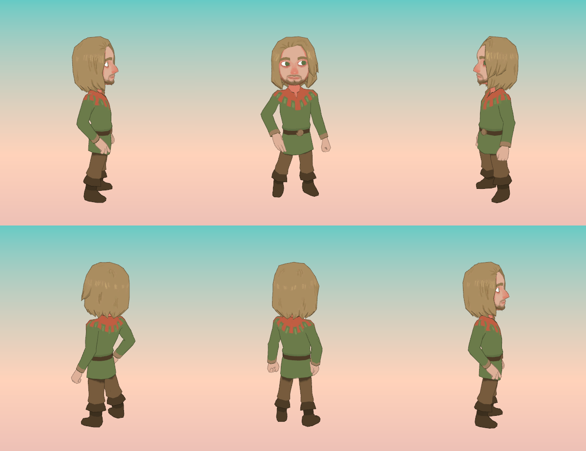
I want to have everything planned before adding more character graphics, but I'd already added Mardek and wanted a non-placeholder ally for him, so here's Deugan:


Unlike Mardek, his look has stayed mostly the same since MARDEK, though here he's given more visual personality. He's meant to look like a sort of nerdy 'beta male' type; the sort of person who'd never had success with women, but who believes that by being confident and protecting them he'll be a good and worthy person. Since I'm that kind of unsexy 'beta male' myself, he looks somewhat uncomfortably like myself in some ways, though - unlike a lot of characters I've written in the past - he's not supposed to be some kind of stand-in for me. He's the sort of person who's embraced being confident in a 'fake it 'til you make it' way, which I never have. He wears a mask, metaphorically, which I can't relate to, but which I imagine more people would be able to relate to than someone more based around my own bizarre insanity (I don't think there's anyone in this story who's very close to my own personality).

I'm unsure about the orange pattern! It's from Taming Dreams, where he was inspired by Enki's mhandisi design sensibilities, but none of that's relevant here. It makes his tunic look less plain, but maybe I'll think about what else I could replace it with that's more relevant to the character. Something he might have chosen to wear to say something about himself. As it is, this reminds me of a jester, or maybe it just looks mediaeval; I've seen the 'gear teeth' thing used as a motif in (fantastical) depictions of clothing from that time.

I like how as this model turns, it's as if he has two different expressions: smirking confidence giving way to the worry within. Not intentional, but a nice outcome!


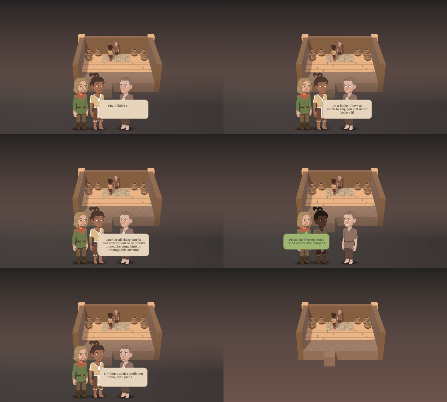
I've also copied over the conversation system from Belief:


(Also, the beginnings of an interior tileset. Lots of pots, like in my old games!)

I like this because you can see multiple characters' faces at once, which I think adds much more to the interaction than just seeing one character's, or even just seeing a static portrait for a character, or nothing!

My go-to thing when writing silly temporary demo dialogue these days seems to be absurd, inappropriate anger, for whatever reason; it's something I did several times in that brief demo of Belief (":D I'm Salvia!", ">8U Why?!?"), and here's another example. Deugan mentioning that he's Deugan makes me laugh because it's an irrelevant non-sequitur, but I get the feeling it's one of those things that'd be less funny to anyone who's not me.

It's interesting though that Mardek is a participant in this conversation, as shown by his facial reactions. There's potential to 'tell several stories at once' with this kind of thing, I feel.

I'm intending to add varied poses eventually. I've not got around to devoting time specifically to animation stuff yet! All the models have the same animations for that reason.

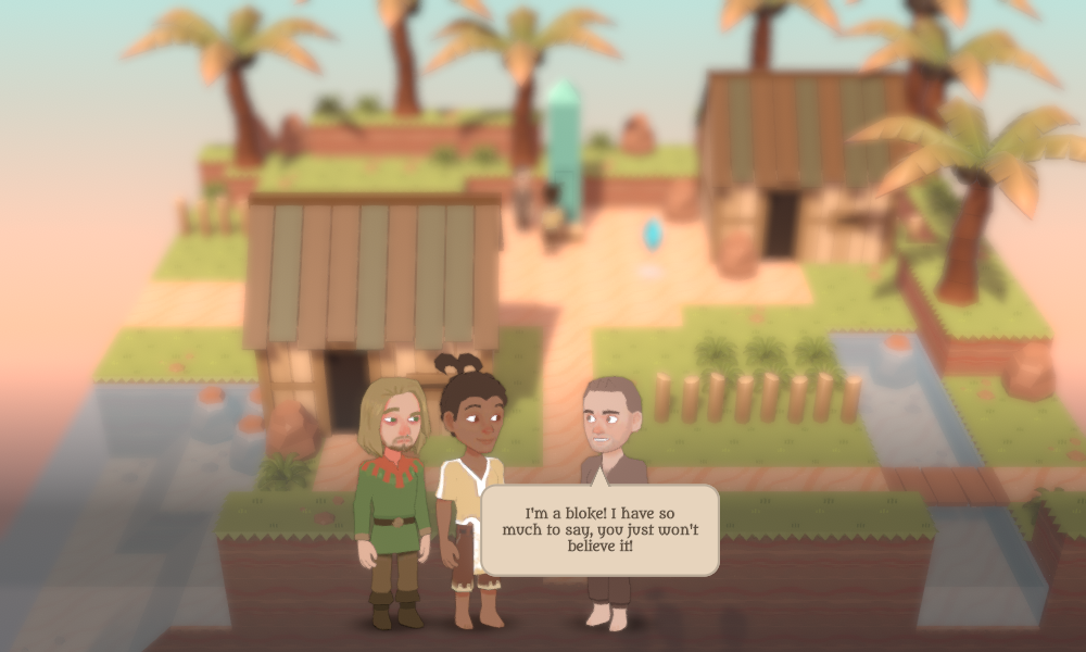
The game area actually blurs currently when you enter dialogue, to direct your focus away from it, but the gif of that was monstrously huge for whatever reason, so here's a static screenshot:


This Bloke model is just taken from Belief, by the way.


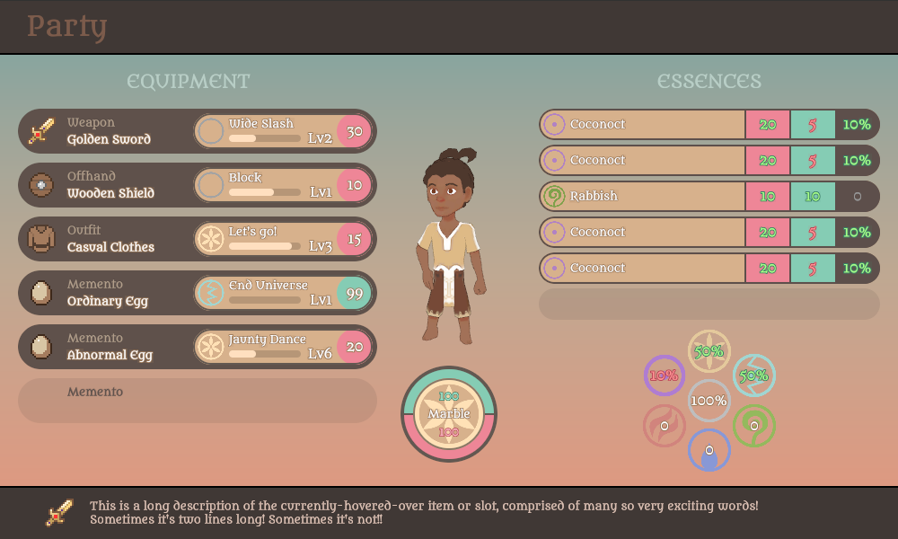
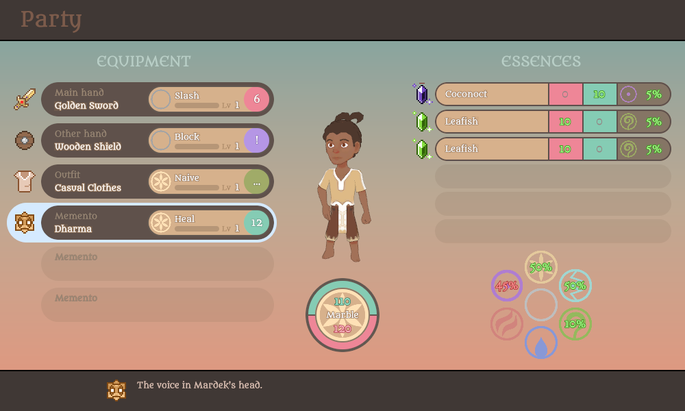
Finally, I've added some basic menus, which means also making decisions about the mechanics-based stuff that the menus actually display. I posted this on Twitter the other day:


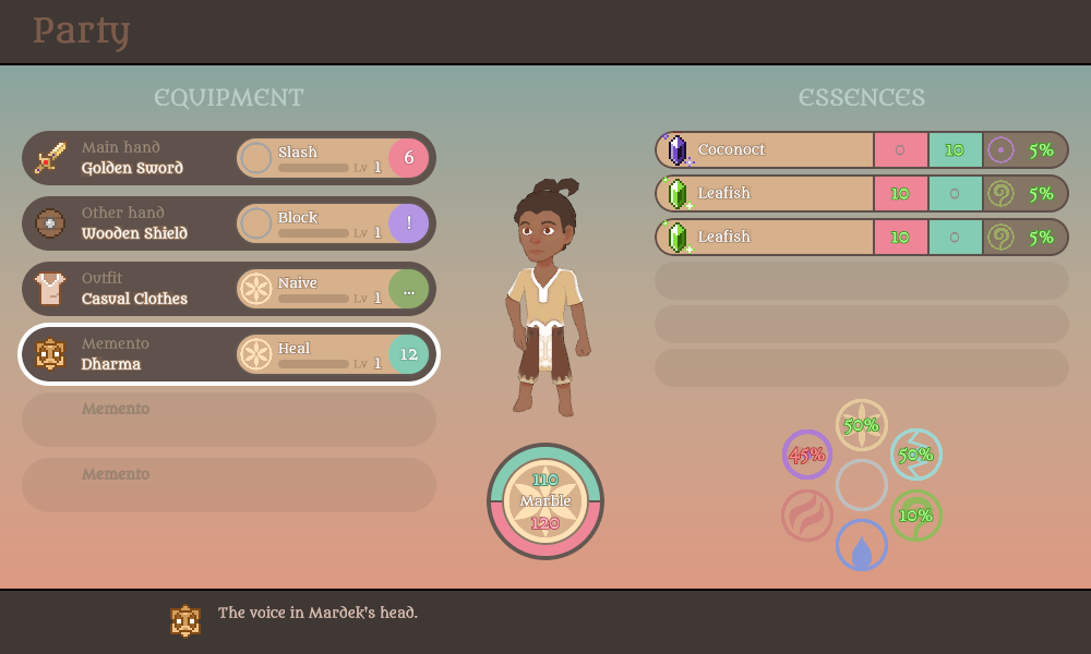
That was designed by assembling non-'working' game objects in Unity at runtime, but here's an implemented version of it (a distinction that wouldn't really mean anything to anyone other than me):


I'm not sure though whether I prefer that layout or this one...


...which has the item icons 'float' like in Taming Dreams...


...and AFC:


I've made many menus over the years, and I like how this one's turned out so far. I've been noticing how other games handle menus too; I particularly like...


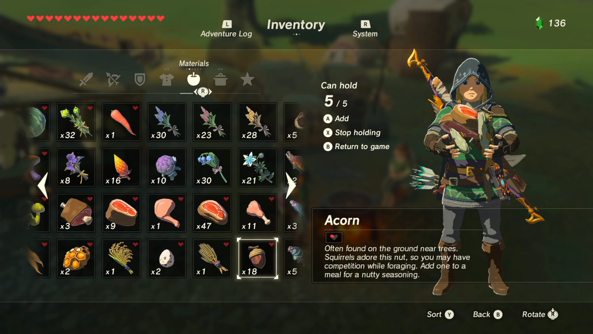
...the one from Breath of the Wild (very subdued, consistent rather than colourful, somewhat minimalist while also sufficiently complex, blur effect in the background to remove attention from the background without transporting you away from it completely, which I like and ∞ already did in MARDEK ∞ and will do in this too once I figure out how)...


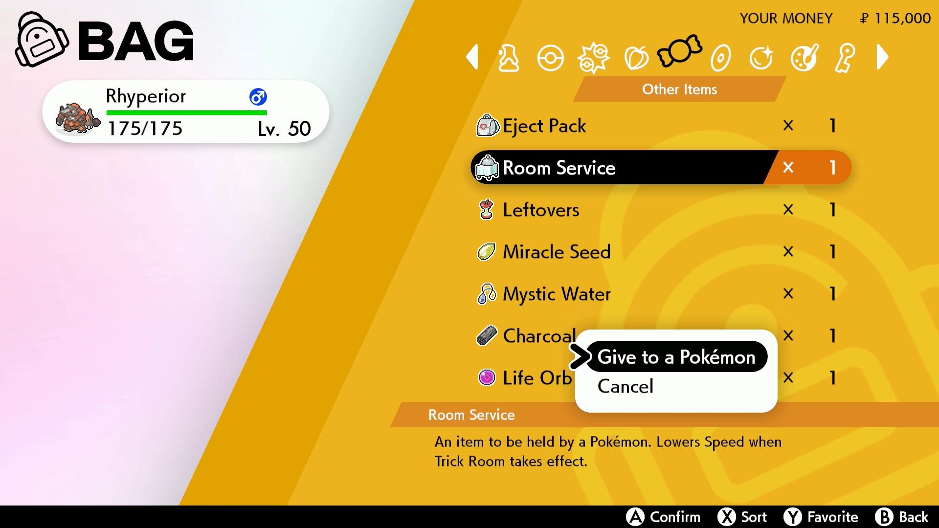
...and Pokemon Sword and Shield (bold, flat colours, different colours for different screens, a cool angle dividing with white to keep things interesting, clean iconic symbols, black and white with circular or straight edges for many menu elements; a lot more modern than some of the ∞ eclectic, colourful, all-over-the-place menu aesthetics from earlier games ∞).

I suppose mobile interfaces have been a big influence on modern UI design, especially with the clean pictoral icons and flat colours. I'm just glad aesthetics have moved beyond elaborate rocky textures, which I never liked and wouldn't have much luck reproducing!


Anyway, back to this menu I've made!


These item sprites are directly lifted from Taming Dreams for the sake of demonstration. I like how they look, since they're reminiscent of my old games and MARDEK's origins, but pixel sprites are annoying with non-fixed resolutions because they become very distorted with even a little bit of scaling. I have an idea about how to remedy that, but it's an annoying technical snag (essentially, enforce the absolute pixel size as a multiple of 16 in whatever screen space the player is using, meaning they'd take up slightly more or less space on different resolutions).

But that's just aesthetics. What you're likely more interested in is the mechanics these screens hint at, so here's what I have in mind:

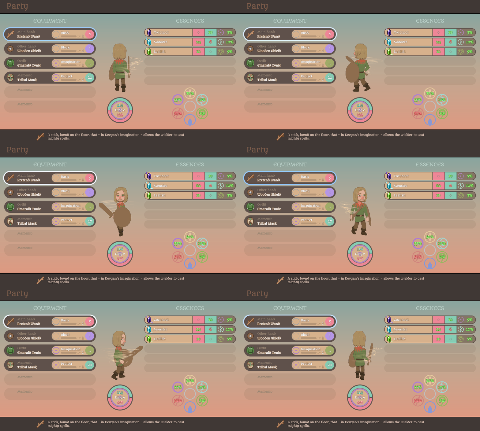
Equipment
The sole purpose of equipment here is to determine which skills the character can use. Characters could only use skills they had on equipment; they can't master them. All equippable items would be unique to a single character... maybe.

Weapons and shields don't alter attack or defence values; instead, they grant entirely different skills. As such, there wouldn't be many of them, just like how there are a limited number of swords in Zelda games before Breath of the Wild. Each would mean something to the character, then, and acquiring a new one would be a big deal; it wouldn't just be a case of buying a new arsenal in every new town and chucking your old weapons in the rubbish.

Outfits would change the character's appearance, but there wouldn't be many of them. They'd be mostly or entirely plot-related, with probably limited ability to switch between them (Mardek could change between his casual clothes and cherub uniform, maybe, but couldn't remove his seraph uniform and helmet once he has those).

Mementos are essentially accessories, but they're specifically items that remind a character of certain feelings, allowing them to channel those feelings into manipulating the miasma. So they'd all have connections to the character too rather than just being random things you could find or buy (though many/most could remind a character of things you've actually done rather than their unseen past; a boss might drop a memento that reminds them of defeating it, with a skill relevant to that boss, for example).

Here, you can see Body and Mind attack skills, like I showed in the battle demo a few weeks ago. One sword might have "Slash" which, say, deals 40% Body damage, but another might have "Silver Slash", which is Bliss elemental and deals 30% Body damage instead, or 60% against Undead. So it's not a case of being absolutely 'better', and more about increased choice.

"Block" here is a reaction skill, which would activate when you reacted to an enemy's skill. Maybe your reaction could apply to all incoming attacks, but some, like this, might only block Body damage, or Mind damage. I'm still thinking about this.

Skills marked with green and a "..." - like "Naive" here - would be passives, which would always be in effect. Outfits would always have passive skills.

Mementos could grant Body, Mind, or Passive skills. So the slots could be seen as: Main Attack Skill, Reaction Skill, Main Passive, + 3 additional skills.


Skill Development
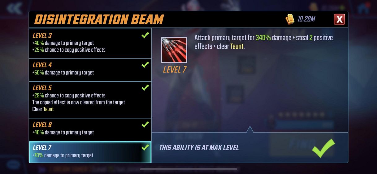
Skills could be levelled up to Level 6 to change their effects. Each new level might add a bit more damage, or it might add an a chance of additional effects. Like this (from Marvel Strike Force, the gacha game I spent too much of my life playing and have only recently quit):


I'm not sure yet how skills would be levelled up. In that, you used exclusively items to level up skills (and characters in general), but I feel that a big part of typical RPG progression is tied to actually using skills. _So perhaps using them could grant them 1 XP/AP/SP/whatever, and you need increasingly more for each new level, and perhaps you could also find fairly common items which can give points to specific skills. That seems like a nice and easy prize to put in chests or which could be dropped by monsters.


Essences
Since equipment doesn't directly affect stats, the "Essences" here present another possibility, drawing on some of my previous game design ideas.

Essentially, dungeons would have a limited number of battles, and such could be 100% cleared (this would also mean the number of battles was limited, though if I did the overworld thing, perhaps that could use random battles and dungeons could have the fixed encounters?). Each dungeon would have a limited number of monster species, and by clearing out all of that species, you'd acquire its Essence.

Each character could equip six of these Essences. Each one would grant a positive or negative stat change to Body and Mind, plus some degree of resistance to the monster's associated element (the numbers in the lower right are resistances). This would replace the typical level up progression.

One of the issues with MARDEK was that Mardek grew to a huge level quickly since you always had to have him with you, but other characters would join you at too low a level to be useful, and grinding them up would take a long time. Also, characters that you weren't using would fall too far behind for you to ever be able to switch to them.

One common solution to this would be to have characters join at higher levels, and for XP to be distributed even to non-participants. I don't like this though, because what then are XP level even representing? Why would a never-battled self-professed-pacifist inventor be on the same level of battle prowess as a trained knight? I know it's hardly the least realistic thing in the whole swords-and-sorcery fantasy setting, and I don't care much for realism generally, but it's just always annoyed me for some reason.

With these essences, character development becomes reversible and interchangeable. If you decide you want to use a different character, you can remove the essences from another to give to them. You don't have to make any permanent decisions about how you want your character to grow; you can change your mind as much as you want later. And there's a lot of potential for customising different character builds, since everyone could equip every essence.

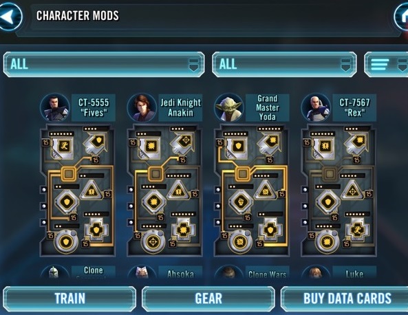
Star Wars Galaxy of Heroes - a gacha game very much like Marvel Strike Force - had a feature called 'mods', where you could attach six modifier items to change a character's stats.


It was - and is? - widely reviled. That seems to be due to the random nature of these mods though; like in all gacha games, you have to rely on a lucky 'pull' if you want to have the optimal mods for a given character, and of course those use up resources that are bought with real money or accumulated very slowly for free...

I mention that just because it's the first thing that came to mind when I started describing what I have in mind for essences, so I thought other people might think of a similar thing, though I do feel that the non-gacha aspects of it make it completely different. There's no randomness anywhere.

Lore-wise, in a typical RPG progression system, a few monster fights means your swords somehow deal hundreds or thousands of times more damage than they did when you'd just started. What, in those cases, do those numbers even mean? Becoming twice as strong after a long adventure might make some sense, but thousands of times stronger? With this, perhaps the essences could be explained as fragments of elemental power that the characters can call upon to literally alter the fabric of reality, which is how they're able to adjust their own stats and resistances.

When I made Taming Dreams, something that I wanted to do was to keep the traditional dungeon loot chests, but to make them all matter, and to reward finding as many as possible, since that's how I typically play RPGs. I also wanted each monster species to really count for something. Both of those have influenced this idea. I didn't want to have characters actually equip or summon the monsters themselves like in Taming Dreams (even though I really like that system!), but this still gives the feeling of 'capturing' monster species that I quite like.

I've been planning to have at least one character whose main combat role is summoning monsters as additional allies (maybe they could summon just one at once, and it stays until it dies or it's replaced), so perhaps that character could summon any of the monsters they had equipped as essences.

It's still all very conceptual at this point, and I'm curious to hear your thoughts about this!


Finally, here's Deugan (or rather "Dingle", since I've definitely and permanently renamed him to that now) with temporary abilities, Mardek's battle pose, and placeholder equipment, spinning nauseatingly quickly while trying - not very successfully - to maintain eye contact with the camera!

33 COMMENTS

MarninPL33~5Y
The amount of work you have put in this project over the last month is amazing! Keep doing what you do. Here comes some (hopefully constructive and useful) feedback!

So, first of all I really love the menu - especially the fact, that you decided to use pixel sprites for items. Nothing better that a bit of retro feeling, and I hope to see more! (Maybe for some battle actions, like ability icons?). Altough, it could really use some background. Second of all, the dialogues look really good. The fact that you can see everyone's faces is a very nice touch that indeed does reveal many possibilities to tell a story. Also, I would want to see how interacting with doodads (like doors or markings on the walls) would look like!

However, I'm afraid that stat system might me... A little to simplified. Of course, there were waaaay too many statistics in MARDEK, to the point that you kept on discovering new ones 5 years after completing the game for the first time (like it was with me). However, "mind and body" system that you came up with can be too simple for its own good. The way I personally see it is that it can limit your options for exciting upgrades that player could possibly find along the way. Altough the idea of items providing you with skills is the one that I endorse, I believe that essences can be made a little bit more interesting. I dunno, maybe you could 1-3 "sub-stats" to make them vary more. Or if you don't want to add more stats, you could give those essences some individual quirks. For example, an essence from Courage-Type Sorcerer Monster could grant its wielder, apart from basic mind bonus, additional damage for Courage-Type spells they cast? Maybe it could even deplete body per round, which could make it a risky but also more interesting. Then it could be combined with another essence which regenerates health! Thats just my proposition, though.

When it comes to the field I'm amazed when it comes to how good this looks. When it comes to camera angle, I would say that the ortographic mode looks the best. It just looks more fitting in my opinion. On the other hand, all-surrounding void is still a little bit off-putting. I don't know what are you able to do about it with your current tools, so I will restrain myself from giving any suggestions (although I believe just placing additional, "filler chunks" on the edges would be easier in ortographic mode. Damn! I couldn't restrain myself after all!) Finally, I would like to highlight that dividing all towns and other zones into different areas is immersive enough! Not only it would not cause such issues with optimalisation, but also give you more freedom to add more zones in future chapters, that lore-wise would be next to already existing zones. Also, showing the entire contintent as it really is could make it feel a little bit small.

Okay, thats all from me! I will say it again, but I'm really amazed and passionate about your work. I wish you luck on your development journey.
1
Tobias 1115~5Y
Thanks for your feedback!

I'm planning to have a blurry version of the field behind the menu, like in MARDEK and the Breath of the Wild screenshot here, so that should address the 'needs a background' thing.

I understand your concerns about the simplicity of this system, and if it doesn't play well, I'll definitely try to add more complexity if appropriate. Personally I like simplicity and find overly complex systems irritating - as I've talked about in previous posts - so in my eyes, the simpler, the better. But I don't intend it to be so simple that it's inane and there are no interesting decisions to make. My main aim is just to remove unnecessary clutter so as to streamline things and make them more appealing. Why have two different stats when one will do?

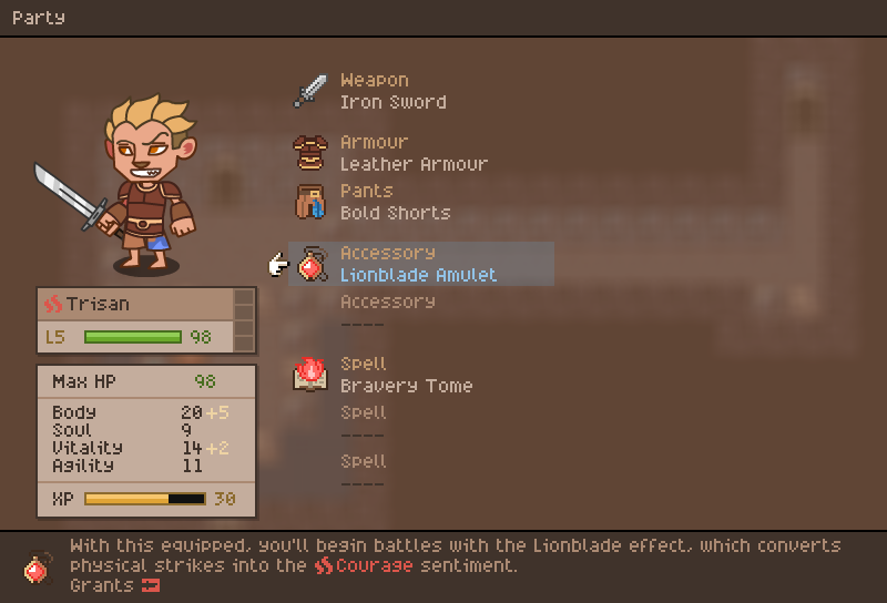
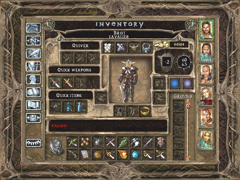
Comparing just the look of the screenshots of other games I included here, do you prefer the Baldur's Gate 2 one, with all its complexity, or the Breath of the Wild one, which is simple without being overly simple? Everything's subjective and we're not all going to like the same things, but personally I consider the Breath of the Wild approach (or compare Skyrim to Morrowind) a huge improvement because it streamlines a lot of things. I'm not drawn to fiddly complex systems at all and tend to just feel frustrated when I play games that use them, like they're obstacles I have to unpleasantly endure if I want to stick with the story until the end.

I am interested in feedback about the mechanics though since I feel like other people care more about that stuff than I do! I think we need to get to the point where there's something to play with before finding out whether it's fun or not, though; it's so hard to judge when just imagining it in the abstract.
0
astralwolf92~5Y
I like the map style!
I feel the menu system doesn't fit with the overall aesthetic of the overworld and conversation system, the latter looks like a PC game but the menu system gives off a 'mobile game' vibe.
I don't have any suggestions tho! Maybe it's completely fine and I'm just nitpicking because there isn't anything egregrious to say about it, ha!

The battle system was the heart of Mardek, so in any case it should still be fun to play. I'm a bit skeptical of the changes but I'll trust you'll keep the overall system fun yeah!


Hyped for more!
0
Tobias 1115~5Y
I'm curious about your use of 'mobile game' here. Do you dislike mobile games, or anything that brings them to mind? And if so, why?

Also, do you think that the menus from Breath of the Wild and Pokemon Sword and Shield - which I compared mine to in the post - look like mobile games? If not, why not?
0
JohnnyBoi45~5Y
First off, I hope you're proud of all you've achieved in this past month. It's really fantastic, and I am *excited* to see this keep growing. Ok, now for the rest of the post:

- I like the potential change to "Lake Lachryma," it has the same general vibe while being more pleasant on the tongue.

- The zoomed-in 3d chunks are great! That was almost exactly how I envisioned it in my comment on your last post.

- I prefer the 3d to the orthographic style, so in my opinion you don't need that as an option, but I also really like the multiple chunks in zoom-out mode, which I would love as an option.

- For these overworld possibilities, what comes to mind for me is how Octopath Traveler handles it: multiple separate zones that can also be traversed on foot. This way, you get the feeling of a large, explorable overworld, but you don't actually need to make every single part of it. That said, I think your concept of a full overworld is great and worth the effort.

- Menus! I like the second option with the floating icons myself. Some transparency would be ideal but it also looks solid as is.

- I am all for meaningful equipment, as I believe my first massive comment on this site was mainly about making meaningful equipment choices. I do think we have slightly different definitions of what that means, but I'll get to that at the end.

- Skill development: I like these ideas a lot, I think skills should definitely develop because thus far there has been a lack of concrete "growth" that a player can experience from what I've seen. I don't recommend leveling them up via usage though - you've put so much effort into avoiding grind-based gameplay that it seems weird to put it in here.

- Essences also provide that sense of "growth," and in a way I hope they scale with the monsters you fight and get "better." Or perhaps there will be a system to combine essences? The idea of reversible and malleable growth is fantastic though.

I bring these things up because while I do think you're going in the right direction with equipment choices, I do also think it's important to sometimes have things that are just "better." People play pokemon to try and catch all the different kinds, but also to evolve the ones they already have. I also don't think all equipment should be character locked. It's another layer of gameplay to not just decide what equipment to use, but who to use it on.

I can't really say more about that because this system would have to be playtested by many people to find out it's strengths and weaknesses so these are just my preliminary thoughts on it. I just imagine that there is a happy medium between "chuck away your old equips at every new town" and "you can only progress sideways." A good part of Mardek was occasionally using equipment that was objectively "worse" because it provided a specific benefit you needed for a fight, but then you also had to deal with the consequence of not having the other option, and I feel that's worth investigating.

Edit: I do want to elaborate a bit on what I'm saying. Basically, I see 2-ish possible scenarios with the system you've suggested. These are based on the idea that equipment choices will be more or less "equivalent," which is a takeaway from your post I hope was correct. In both, it seems that the only growth "up" is filling out all your equipment and essence slots. Any choice after that I'd call "sideways" growth. The difference is in how long that takes to happen:

Scenario 1: You fill your equipment slots quickly due to a fairly large pool of item options, causing a rapid advancement in the early game that plateaus afterward. Sometimes a new option comes along that might be better for a scenario, but people will likely stick with what they already have, especially if they've sunk levels into those item skills. This scenario seems more likely if items can be shared between characters.

Scenario 2: New items are acquired very rarely. New items really mean something, because you won't even have your memento or essence slots filled for the majority of the game. In this game, the player experiences long periods of stagnant gameplay with a few power spikes. However, there's also very little element of choice in setup. This seems a more likely scenario with character specific items. This also seems to be the track you're closer to taking.

These are fairly extreme scenarios, but my point is that most "upwards" growth for a character effectively ends when they fill out their equipment slots, but if that takes too long to do, then there's actually very little choice involved. This is mostly applying to mementos & essences which have multiple slots - weapons and outfits are theoretically already in the state of no upwards growth if they work in the way you've described them.

I do totally get why you want to take the route you're starting on, and again, I can't know that I'm correct in my assumptions because I haven't played this system, but I just have a gut feeling that players are going to want something that's occasionally more explicitly "rewarding." Especially considering that new items are theoretically "worse" due to their associated skills starting at a lower level. If a player plays through a whole dungeon or quest etc, only to end up with an item that is at best equivalent to what they already have (something that actually happens very often in RPGs), it's kind of a letdown. If these new items only appear rarely, you probably want to make them feel like an improvement.
1
Metrux3210~5Y
I... Really disagree with your view on items. Especially because, to me, in most rpgs items are just there when you need to upgrade, they don't really feel like progression, they just feel like something you have to do to beat certain parts, a chore.

Having your skills get exp is interesting, though it can make people want to stay with their old ones... So maybe it can be more dinamic. A couple of ideas: the exp doesn't increase the skill itself, but a reaction, and you can use diferent reactions even with the same weapon, so although the skill itself has changed, you also can choose the reaction that fits best for you. Or, alternatively, the increase could be for skill/weapon types. This is not a finished idea, just food for thought.

Also, when speaking of weapons, I kept thinking while reading of a specific idea: what if the weapons each person can use are not types of weapons, but tied to the skill/reaction uses that fit the char? As in, let's say, Mardek could have mostly diferent ways to deal damage, or with diferent elements, while Deugan has mostly diferent debuffs with his attacks, showing part of their personality and how they deal with their problems.

Growth is always nice in rpgs, and I feel you want the essences to be your growth, so maybe add some other bits to them, instead of only stats and resistances?
0
JohnnyBoi45~5Y
I've always felt upgrading via items is a fun thing, especially when the good items are hard to find. Yes, it's a chore if the best weapons just cost a ton of money you have to grind, but if they're hidden in puzzle dungeons or secret passages or from a really specific npc etc, that's an opportunity for interesting and exciting gameplay.

I imagine Tobias will make the weapons each character can equip have a sort of individual "set" of traits as you describe, as that seems the kind of detail he would include.

Based on Tobias's response to my comment, it does sound like the essences (and potentially other equipment) will have at least some amount of the growth I'm hoping for.
1
Tobias 1115~5Y
Thanks for your positive comments! Things like that are useful, encouraging, and motivating.

I'm going to play Octopath Traveler soon, so I'll have to pay attention to how that handles area traversal.

I definitely didn't explain this well, but I don't intend for there to just be sideways progression, you might be relieved to hear! Many essences will definitely be absolutely better than others that you get earlier; beginning ones might grant +10 to a stat, while later ones might grant hundreds or even thousands.

Today I planned monsters to include, and I've been looking back on old monster/miasmon designs to reuse, many of which have evolved forms. So I might include some kind of monster evolution - and more potent essences of those evolutions - though I'm unsure of exactly how to go about that; I've not given it any deliberate thought yet.

I don't want weapons to be equivalent exactly, but I don't want there to just be a clear upwards progression either such that old things become completely obsolete. Maybe each character could only get two or three weapons per chapter, but the ones acquired in the next would just be better than the previous ones. Something like that.

It'll definitely take some direct playing around with a working system to really iron out all the kinks and ensure it's fun though, and I'm very open to completely changing everything if we get to the point where there's a demo and it's just not fun. For now, I'm mostly just trying to add experimental mechanics so then there's something there and I can finish building all the foundations until there's a working demo.
1
JohnnyBoi45~5Y
Thanks for the reply! It's great to hear the further explanation - it sounds like we're actually on relatively the same page, as I definitely don't want the kind of progression that makes most things obsolete either. Only playtesting will tell what kinks need to be worked out, but on paper this system seems really solid to me.
1
astralwolf92~5Y
Also: perhaps changing the title of these posts would make people more inclined and thus invested in ur work once u strike gold!

Right now, weekly update 2 2020, weekly update 3 2020 are all super boring to look back on! May I suggest:
Feb 2 - *COOL FEATURE, ETC* (Dev)
So like
Feb 2 - Character Equipment! (Dev #5)

Maybe the number at the back can indicate what Nth post this is

Just a suggestion! Cheerio!
4
Tobias 1115~5Y
I definitely agree and I'll keep that in mind for the future! I don't know why I've been doing it this way, honestly; it's a bit stupid!
0
ChuckNorris18~5Y
Yeah I agree with this 100%.
0
Ampersand68~5Y
I really like the sound of these new mechanics you're putting into the game, especially the idea of capturing essences! Skill progression may be a bit tricky with fixed enemy counts, though I think a "special" dungeon with randomized encounters could be a good way to allow for some degree of grinding if a player really wants to upgrade a skill. Alternatively, there could be a "sparring/training" mechanic where teams of party members fight each other (or even groups of monsters whose essences you have captured) where you could test out and master skills, which might be a "neater" way to do things without compromising on the fixed-enemy concept. I don't think an overworld with randomized enemy encounters would be a good idea, though- I think random encounters, if any, should be voluntary, as much of the frustration inherent in them is that as you're walking to and from destinations you get interrupted by battles you may not necessarily want to fight.

As for completionism- is there any intention to make "special" content for a 100% run, like a "true" end or bonus content? The idea of capturing all the various essences of monsters does seem like it could have some thematic resonance to it.
2
Tobias 1115~5Y
I'm no fan of any kind of random battles, so I'm not planning to include those in any capacity! Currently what I have in mind is having monsters appear on the field like Pokemon trainers, and if they spot you, a battle begins against them. If I do include an overworld, then battles won't be random; they'll just refresh, unlike dungeons' battles (unless dungeons' monsters did refresh as 'ghostly' versions you could choose to re-battle or not).

I am a fan though of post-game content, and consider it a disappointment when there isn't any. I like games where you can exceed 100% completion, so I'll be keeping that in mind! Everything takes time and effort though, and I don't want to get carried away with that sort of stuff if it'll delay release. We'll have to see whether I can spare the time for it (or maybe if I do a Kickstarter, it could be something the stretch goals could be for.)
2
JohnnyBoi45~5Y
I'm very glad you're planning to ditch the random battles - they're one of the things about JRPGs that I really don't get, they either happen too often (when you want to travel) or not often enough (when you want to farm or fight) so changing to a fixed but respawning system seems like a great improvement. Of course, because there won't be traditional levels, there's also not the need to grind. Everybody wins!

And yes, post-game/sidequest content is the best. It doesn't even need to be too much for this first chapter - a single boss or dungeon would likely suffice, maybe a little quest if you're feeling spicy. Mardek 3 had a plethora of side content which was *wonderful* but you can save that for the second and third chapters.
2
MarninPL33~5Y
When it comes to starting encounters, I think the system used in Deltarune would fit. Also, do you plan to include varying difficulty modes? I think it's nice to have an option in this matter!
1
Tobias 1115~5Y
I've never played that, how does it work? (I probably should, but I've been putting off Undertale for ages for reasons I've talked about before in this blog.) I've given no thought to details like difficulty, so we'll see!
0
MarninPL33~5Y
In Deltarune all the mobs basically exist on the field, and when you are near them they run to you and once they catch you the encounter begins. Sometimes it allows to completely evade fighting, but most of time they catch you no matter what you do. (Also, why have you been putting off Undertale? I can't seem to find the blog where you explained it. Is it because of the fandom?)
1
Tobias 1115~5Y
Have you ever done any creative stuff yourself? A common thing among creators is comparing ourselves to others on similar paths; if you ever see two artists drawing together, it's really obvious they're constantly comparing their work and that the one who considers themselves 'worse' feels absolutely terrible about it.

There's more I don't know about Undertale than I do know, but one thing that I know is how enormously successful it is, and I've been told it's similar in a lot of ways to what I've tried to make myself. But obviously I've not been successful. So playing it for me would be a reminder about my own relative failures, and that's an emotionally difficult thing.

My perspective's changed since I started making my own games; I can't really see any as just a player anymore! There's always the comparison.
0
emmanueld1~5Y
This is looking awesome, can't wait for kickstarter/demo, I hadn't checked your blog in a while and lost track of it (subscribed now), but talked about flash games this week and it reminded me of MARDEK. Keep up the good work :D
1
MaxDes45~5Y
Honestly, at first I was very against the appearing and disappearing chunks that make up the map but they've really grown on me since the last post. I'm not sure if I prefer them over just having a straight up coherent map without chunks, though... I like the chunks in this village setting but I feel like it wouldn't work outside civilization. The small map chunks are kind of reassuring since focusing on one chunk at a time makes everything super visible. It's specifically stops the feeling of be overwhelmed for me, which might be a bad thing to have in the wilderness if you're going for an atmosphere with a lot of tension.

When you showed a gif of what a coherent map without chunks looks like I was put off but I think my distaste stems more from the orthographic view you set up... I really love the view with perspective and setting the camera to orthographic just takes away so much. I feel like the orthographic mode simplifies the game way too much, stripping away quality and making it resemble a mobile game. The orthographic mode doesn't seem right for this type of art style. I don't know how to describe it better than that. I just love how it looks with perspective.

Someone else also said the menus match the aesthetic of mobile games, and I kind of agree. Personally, I think they're just way too simple, and not displaying enough information. Mobile games have a history of taking complex games and dumbing them down because they're for more casual people that don't have the convenience of a keyboard or controller to use over their touch screen. That's the vibe I'm getting from this menu, since it feels like there's too much empty space and it's not saying too much. I'm not arguing that you need to introduce unnecessary stats that dilute the game just for the sake of tradition and adding fluff, though. I'm also speaking as someone with no experience at all using these menus, so I could be eating my own words once I get to actually use them.

I'm pointing out some bad things I've noticed, but honestly, this prototype has turned out incredibly well! I'm really excited to play it in the future! (Also, I'm leaning towards keeping the sprite icons in the menus without backgrounds)
3
Tobias 1115~5Y
I'm curious about your comparison to mobile games, since another person did the same, as if there's something inherently unappealing about mobile games and any association with them is a bad thing. I've heard that some PC gamers hold a negative opinion of anything 'casual'; would you say that's true for you?

I'm asking because it's something I've only ever observed from a distance, and I'm curious about the mentality behind it, and how to build this thing in a way that doesn't trigger that aversion.

I'm also curious how you feel about the Breath of the Wild and Pokemon Sword/Shield menus I included here. I don't consider them any more complex than my own, but is there something about them that makes them register differently to you?
0
JohnnyBoi45~5Y
Here's my take on the menu comparison - it's not about just the style/complexity, it's about the fact that people are looking at it as the "only" menu screen. It's true, this menu does not display that much info in the grand scheme of things. But I'm assuming that there will also be a map screen, a quest log, and separate skills and inventory pages, so this is just the "character page" portion of the menu. If that's the case, this menu has plenty of info - equipment, stats, and skills. That's really all you need for a character page.

I see why people think it looks like a mobile game menu - all the buttons look very touchscreen-friendly, there's a lot of empty space, and yes, the system has been simplified. I have made my own points previously about not oversimplifying the system but I also understand that's the direction you want to go, so I'm cool with it.

However, that direction will be reflected in things like the menus, which will further the belief of some people that this game has been "dumbed down." You can't really avoid it without changing the game, so I'd honestly say don't sweat it too much.
1
Tobias 1115~5Y
It definitely isn't the only menu, and it seems strange to me that anyone would assume that it is! Maybe I should have clarified that though.

I also wonder what menus people have in mind as 'good' and not reminiscent of mobile games, especially since I included a couple of examples in this post (Pokemon and Breath of the Wild) which I feel have similar aesthetics. It also seems odd to me that 'empty space' would be seen as a bad thing, though I suppose as a designer I've seen a lot about how it's generally a good thing to have a lot of that.
1
Maniafig222~5Y
I look forward to the character reveals!!

Hm, the obelisks in Taming Dreams and AF:C had runes on them, did they not? The one here is just perfectly smooth though. Perhaps it's just a beta model though, right?

The trees do look nice! I do agree that the orthographic view is less interesting, but perhaps being able to play around with the camera like this could make for interesting dungeon gimmicks? Like rather than giving players the option between what camera to use, the camera is different in some types of area, like a spooky forest might be more zoomed in to make things seem cramped, a sterile temple might have a clean orthographic view, stuff like that?

Personally I prefer the system of areas connected by nodes over having one big world to explore, where everything needs paths to connect each other. It's more familiar since all your other RPGs did the same, including the Pokémon-inspired Miasmon).

It would also save you the effort of having to make transitional areas between different biomes! It's easy to plop someone into a volcanic area, it's harder to design a path from a desert gradually converting into a volcanic area.

If you use a world map, I would prefer a world map like the one from MARDEK and Taming Dreams. World Map traversal in FF games tends to just be a chore filled with annoying random encounters!!

I did feel like exploring the chapter 2 continent in chapter 3 felt like revisiting an old region! The NPCs were all still there and had new things to say, some characters have grown up and gone on to do new things, some NPCs suddenly get new relevance... I really liked that!

MARDEK 3 did have that pass between Goznor and Canonia. There was also the guard checkpoint in chapter 2, and this intersection connecting the Sun Temple, Warport and Aeropolis that actually housed the Bone Demon boss in chapter 3. I kinda like those areas being there though, it felt like a good compromise between not having to work in an entire system of connecting rooms, but also having some of those connecting paths in there to make it feel like they do in fact exist.

Curious about Enki's Mhandisi design not being relevant for Deugan. Does Enki still exist? Is Enki one of the Magisterum? Enki was this figure shrouded in mystery in MARDEK and Taming Dreams. I wonder what his role was going to be, and what he'd think about his son being possessed by Rohoph.

Characters getting suddenly unreasonable angry did feature in some of my quests too, it's kinda funny seeing characters randomly explode in a nonsensical outburst!

I am curious about the combat, what is supposed to be like the 'selling point'?

MARDEK was inspired a lot by FF and the like, so it had a lot of interlocking systems, varied party members, the ability to configure your own party and whatnot. Lots of formulas and numbers and skills and equipment! People would have actual discussions about their party configurations and why X character is very good and Y character is over/underrated! For the record, Verhn is the most underrated character!! It got people to do challenge runs, it had weird and niche skills like Elwyen's Songs or Barkskin, stuff like figuring out what the optimal move for Legion to use would be and exploiting the hell out of Meraeador's inventions.

Meanwhile, Taming Dreams is very much simplified and removes all of the numbers in favour of a totally unique system revolving around consonance. There's no attack stat, or levels, or anything like that. Instead it's matching runes, sentiments, moods and managing excitement, and all actions are strongly integrated with the game's narrative. Despite the seeming simplicity, the gameplay feels very deep and you can pull off some insanely powerful combos if you master it.

So, where does the remake fall in all this? It sort of seems to combine MARDEK's traditional flavour of combat with the simplicity of Taming Dreams? I'm worried the result will feel bland compared to them, like combat wouldn't really be engaging like it was in the other games because it lacks the nitty gritty granularity or the strong narrative integration and refreshing uniqueness of Taming Dreams.
2
Tobias 1115~5Y
The runes would be on a texture, which I couldn't be bothered to draw yet because I thought "who'd notice anyway?", ha!

That's an interesting idea, about different areas doing different things with the camera. I've noticed in Yooka-Laylee that there are some places with camera gimmicks that I suppose keep things interesting. There's a bit with fixed-camera floating-in-a-void areas that I've been intending to mention on this blog.

I don't think there are any biome transitions actually; the top continent is mostly grassy and foresty, the southern one's essentially all desert, since the Lifewood's in the north now. I'm still thinking about what to do with the connecting areas; I like both options!

Enki's been renamed and redesigned to the point where he's not really the same character, but I feel like I've done more interesting things with him in this! Kind of like an extra step from what I already did with him in Taming Dreams. This time, rather than just being some mysterious hero or whatever, he's the most renowned Seraph ever, and that's why Deugan looks up to him and wants to join the seraphim himself. He's still missing at the start, though, and Deugan still pretends to be him in the fantasy sequence. His relationship with Dharma is planned to be an interesting one!

Honestly I'm unsure about all the battle mechanics stuff, since it seems like other people have always cared more about that stuff than I do. I want to make something functional and interesting without being overly complicated, but it's likely something we'll all have to talk about together to get it to that point. It's difficult at this point to plan it, because I haven't really seen it in practice yet. I imagine it'll continue to develop and hopefully become more refined as I - and eventually other people - can play around with what I build for the demo.

A few comments have compared what I've shown of the menus/mechanics to mobile games as if that's a bad thing, like simplicity = casual = bad. That gacha game I only recently quit had a very active subreddit full of strategy discussions despite its simplicity though, which I find inspiring. And Pokemon's battle system could hardly be called complicated! Actually maybe that's a good thing to compare to; I'm hoping to make something as simple but potentially interesting as Pokemon's battle system.
2
JohnnyBoi45~5Y
I think a big part of the reason people seem to care a lot more about the various battle mechanics is that, though I could be wrong, this site's community is mainly old Mardek players and therefore approach this game from the standpoint of an RPG player. At the end of the day, turn-based RPGs' main draw, in my opinion, is the complex and often strategic combat. I mentioned Octopath Traveler in my other comment but this makes me even more interested to know your thoughts on it, because it's a game that bills itself on the story, but the best part is definitely the combat, which, while very understandable, definitely is on the more complex end of the scale.
1
Tobias 1115~5Y
I'll probably play Octopath Traveler when I've finished Yooka-Laylee and when I actually have the time, so I'll write about my impressions of it when I do!
1
Metrux3210~5Y
I kinda... Already put my ideas into another post, so I'll just use here to say: this is looking great, I keep hyped, thanks for the hard work and keep it coming ^^
1
purplerabbits148~5Y
Having read the comments, I have my 2 cents on mobile games and why a majority hold it with disdain. Part of the reason comes from the sheer number of those games that are just there to drain money from the player with a billion ads. Essentually, games with no soul. Another reason comes from how they pay to win model basically creates games where the player is not even playing the game, you just wait for animations to run and then hit 4 buttons then it's back to waiting.

If the mobile game isn't an idle or gacha game then it will be a game that manipulates the outcome so that the only way to proceed is by spending real life money to have a 5% chance at completing the stage. (looking at you Candy Crush)

The worst offenders would be the games that you see that pop up as ads (Sand balls, Pull the Pin, Color Bump... ect just to name a few) Those games are basically the same 10 stages on repeat, each stage ends with an ad, each stage has an ad that covers something critical to playing the game so you restart and get hit with another ad, and at the end of the stage there's a pop up that's manipulative to seem like there's no way to continue playing without getting a subscription. For that type of game, it almost seems like everything came from a premade assests from different sources so ot looks just flat out awful on top of being a money sucker.

Now, not all mobile games are like the above, Monument Valley is one example. However, that is in a overwhelming minority of mobile games. I think the only one that I have any enjoyment on the whole is from A Girl Adrift. Even though this game does fall into the idle category, it's a very active idle since there is so much to do instead of just waiting from the get go.

Another would be Tap Dig My Museum, that one can fall into the manipulative territory. However, I still had fun and not every stage needs an ad to complete it.

All in all, I think that it's the degree of control that a player can have while playing the game that determines what is a bad or good mobile game., especially with how often the player gets an unskippable 30 second ad.

1
Tobias 1115~5Y
That does make sense! It's such a shame that those exploitative practices are actually profitable - moreso than console or PC games - so there are all those predatory developers trying to leech money off victims with shoddy products, many of which are just clones of popular games with actual heart put into their development.

It's a shame about people thinking less of other games that bring to mind those kinds of games. I'm not sure what to do other than hope it's clear from the game as a whole that it's not one of them!
1
purplerabbits148~5Y
From the way how I see it, I think that most people are making a comment on how it reminds them how it looks like a mobile game with the menues, not nessesarily the game as a whole. I think a way to alleviate the worry about ckmparison to mobile games would be to show that tuere can be complexity. ~

I think Pokemon would be a good example of a game that has simplified controls but has a layer of complexity. If one really thinks about it Pokemon is essentially a more complex form of Rock Paper Scissors with hp bars. Furthermore, if you take the competitive scene for pokemon then it becomes even more complex with needing to factor in Natures, EV's, IV's, Hidden abilities, and even weight. Now, the main games doesn't need all of those to beat the game, but for the competitive people all of those are necessary in order to win against other people who have used the above to their advantage.

On a tangent, I don't think having a 3 stats to affect the player is a bad thing. Elder Scrolls Online (I'm ignoring the argument that it's an mmorpg with a Skyrim skin) simplified their stats so that you only have Heamth, Stamina, and Magika. However that game has the complexity with the skills and champion points to really customize the player.
1
Dingding32167~5Y
I'm in the minority that I do actually like the orthographic view-- mainly because I can see things much better, and visuals don't really make as big an impact on me as they seem to for other people. This does depend on how these "hidden optional secret" places are planned in-- I think I prefer orthogonal just for the ease of finding those "secret chests" that forms a big part of my enjoyment for these games. I can see the the design problems (and additional work that could come) with having a toggle, but would still prefer the option-- you could even add a disclaimer to say that the immersion option is recommended. Stitching the world map together or having discrete chunks would both be reasonable, and mainly depends on your preference/ technical issues, I feel!

For the overworld question-- I like the idea, but am worried that it'd become too time-consuming and turn into feature creep fodder, especially as it's not a technically essential part of the game.

Conversation and menus look good to me! The menus are clear and to the point, and conversations are much more dynamic with facial expressions. Summoning reminds me of Legion and the host of personalities it has!

A comment mentioned oversimplicity, which could be a worry but would really depend on the how the demo plays and probably not a top concern right now.

You've made amazing progress! Try not to get too bogged down by tiny details, though I know perfectionism gets into the way quite a lot--sometimes even objectively "better" outcomes aren't worth the time and effort sacrificed. Work, but also try to keep your life balanced outside of it (even if it's just by taking those walks and listening to podcasts you mentioned before!) :)
1
Log in to comment!