DEVELOPMENT
3,555
WU 2020-6D - Dreamcave Demo Plans and Progress
6 years ago - Edited 6 years ago
I'm at the point in development now where the initial burst of enthusiasm has likely run its course, so productivity should be more gradual from now on. Most of the major features exist in some basic form, and my main goal now is assembling them into a working demo.
I've been unsure about what to build the demo around though. I considered building something entirely new just for the demo, so then I wasn't beholden to any of it, but that'd mean a lot of time would be spent on something that couldn't eventually be used as part of the final game. Making one of the game's six chapters seemed like a more efficient use of my time. It still runs the risk of being less interesting if people play the demo then the same bit in the final game, but chances are it'll change a bit between the demo and release anyway, so that should hopefully keep things interesting enough.
I wrote in previous posts that the game will start with a chapter based around MARDEK 1 and 2. It'll be divided into six parts, and I'm not sure whether to use 'Episodes' for the releases and 'Chapters' for the parts, or vice versa. The original MARDEK was divided into separately-released 'Chapters', so it'd make sense in that regard, but 'episode' seems to be more commonly used to mean 'separately released thing' (eg episodes of a TV show) while 'chapters' are parts of a whole (eg chapters of a book); the Star Wars films used 'episodes'. So I'm leaning towards making six
Episodes with six sub-chapters, but a Twitter poll leaned in the opposite direction, and it's not hugely important either way so we'll see how it goes.
Anyway, the six chapters/episodes of this episode/chapter are planned to look something like this:
![]() 1 - Fantasy Intro
1 - Fantasy Intro
Like the one from MARDEK 1, though - like in Taming Dreams - Deugan's hero form is Mardek's father, and you face 'The Devil' at the end.
2 - Slumberwood
This is similar to the intro forest from Taming Dreams, which was itself an elaborated version of MARDEK 1's forest. Mardek and Deugan team up with Meryth in pursuit of Steele, and you encounter Dharma at the end (though it all goes differently to both MARDEK and Taming Dreams). Mardek and Deugan - who are fully grown here - are recruited into the cherubim.
3 - Dreamcave
This is based on the Gem Mine incident from MARDEK 2. Rather than hunting down bandits, though, you're after a cult with strange beliefs, which has been recruiting a concerning number of people. You control Mardek, Deugan, Emeela, and Steele - all four of them - and the boss is the cult leader, Murias.
4 - Lake Lachryma
This is based on the Lake Qur section from MARDEK 2. I've hinted at it in a previous post: Mardek, Deugan, and Emeela join Elwyen under the lake, and eventually face her Nightmare, Haggird.
5 - Lifewood
The end of MARDEK 2 had a few back-to-back long dungeons which have been compressed into two more story-rich parts. This section has you exploring a forest which takes its name - but nothing else really - from the location in MARDEK 3, and the ruins within. I won't spoil it, but it involves this story's version of Moric (who's not called that anymore).
6 - Climax
This includes an area that's a cross between Moric's Battleship and the catacombs; you'll need to see it to make sense of that! Many of the story beats are similar to MARDEK 2's final act, and you'd probably be able to do all the optional stuff before facing the final dungeon.
![]()
Originally I was thinking the demo should be the first part, the fantasy intro, since that's what opens up the game, and it's fairly self-contained. But the more I think about it, the less appropriate it seems, since it's not very representative of the game as a whole. The other possibility I'd considered was the second part, in Slumberwood...
But Mania suggested on Twitter that perhaps I could do the Gem Mine bit instead, or rather the Dreamcave bit as it is here. The more I thought about it, the more appealing it seemed. You control what I consider the three 'main characters' (Mardek, Deugan, Emeela) plus Steele, and I'm planning to introduce another two or even three protagonists as well who may or may not join you for a little while.
The Dreamcave is somewhere that shamans visit because they believe it has a connection to the drealm, or at least you can get a glimpse into the drealm on the surface of a pool called The Dreamer's Eye deep in the cave. So it'd give a good opportunity to explain some of the important lore. Murias is also quite a silly villain, and having Steele on the party should involve some interesting interpersonal stuff, so it seems to hit a lot of varied notes that I hope the final game will. It'll be a good part of the story to gauge reactions before writing the rest.
So that's what I've decided to do. I'll make this Dreamcave chapter, then release it as a demo! There's a lot to do, though, many assets to make, so I can't predict how long it'll take. Longer than any other chapter, since a lot of what I make for it (eg character models, mechanics stuff) will be used in the rest.
![]()
The first order of business is making an actual Dreamcave area that I can run around in, so that's what I've been working towards. I think it's interesting to walk through the whole process rather than just showing the end result, so let's do that!
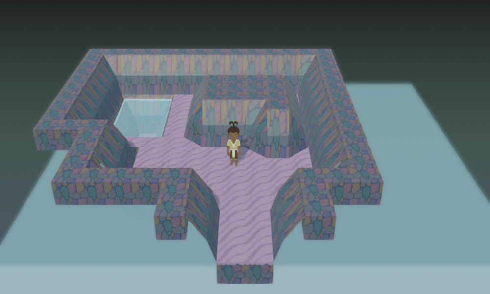
Here's the oldest screenshot that I have, from the distant era of three whole days ago:
![]()
That's quite ugly! I was experimenting with some (very rough) non-cubular edge tiles, but I didn't like these for a bunch of reasons (more about edge tiles later). I did like the multicoloured rocks texture, though - it felt
unusual in an appropriate way - and I liked reusing the abstract sand tile from the outdoor tileset, but tinted a different colour.
I originally coded water to draw as a box that filled the whole room bounds, but found that that wasn't going to work if I was doing these floating-in-the-void areas.
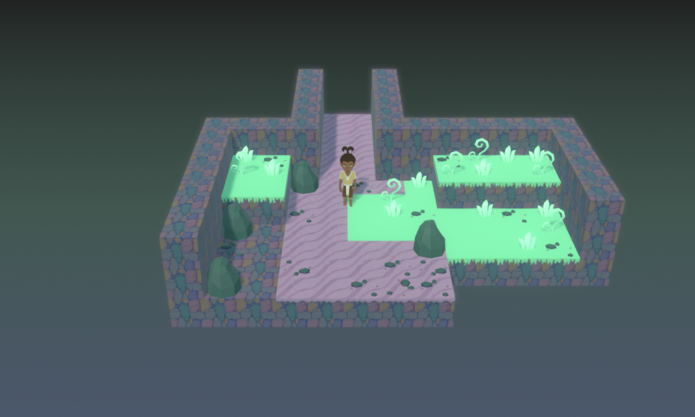
![]()
I decided to stick with just cubes for a while, no edge tiles, to see how it'd feel. I wanted the cave to feel alive with vegetation, unlike the traditional all-rocks caves, to set a certain mood, and I thought maybe the grass could be bioluminescent, but I don't like how it's portrayed with the sparse, inorganically-placed plants and flat colouring of the 'grassy' floor here. The dark teal of the rocks didn't work, and the pebbles are too sparse and gritty-looking. Trivial details most players wouldn't care about or even notice, but I have to!
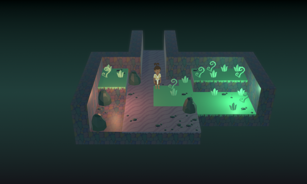
Overall it feels sort of... sherbet-y to me (strange comparison that jumps to mind), and not like a cave at all. I thought maybe it was the lighting, and did a quick experiment:
![]()
That looked a lot better! So I thought I should continue in that direction. I coded some actual torches, which I could set to a variety of colours:
![]()
I do like the torches, but the overall feel this has for me is clownish, like some kind of zany toy shop from a Tim Burton film or something. There are too many different colours of lights, and I don't think the purple ones in particular work for the intended ambience.
I never used to worry about
colour palettes when drawing and creating assets in the MARDEK days, and I didn't know anything about colour theory or the psychological effects of colours. It's something that's been on my mind constantly when designing anything these days though. I try to limit the number of colours in a image or character's palette, to convey a certain mood and to keep things harmonious rather than cluttered.
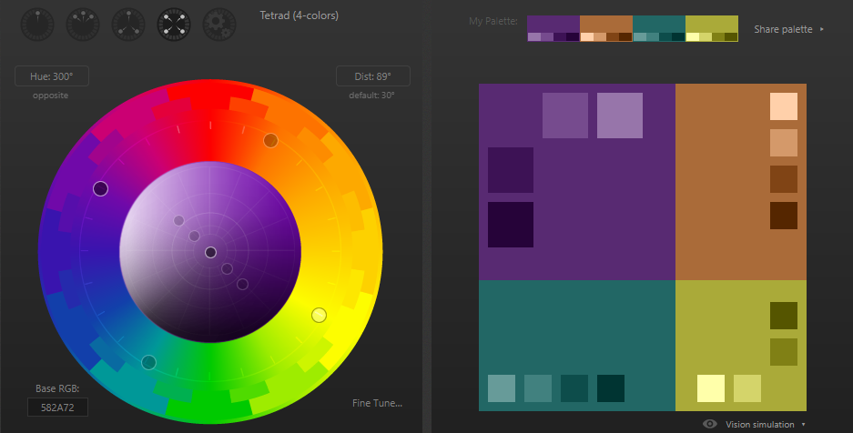
There's a specific palette that I've been considering representative of the drealm and general 'mystical weirdness' in this setting: teal, purple, and orange. Both teal and purple have been my favourite colours at various points, and both have been used as the key colours of my websites/'brands'. They were the colours of Aether and Fig respectively from MARDEK too. Orange can be desaturated to produce shades of brown or beige that I like, and which I feel go well with both teal and orange (like the background of this site).
As it happens, these three colours make up 75% of a 'tetrad' palette:
![]()
That is, four equidistant hues on a colour wheel are purple, orange, teal, and a kind of sickly yellow-green I don't care for. So that's pleasing to me as a designer. Teal and orange are a well-known complementary pair
∞ used excessively in Hollywood films to give a striking look ∞, so I knew they'd work together, but it's nice that purple can be added to that in a theoretically consonant way.
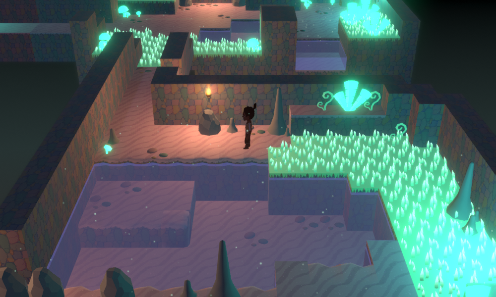
Since the Dreamcave has a connection to the drealm, I wanted it to have a prevailing teal, purple, and orange overall look. I actually experimented a bit trying to find the
exact shades of these that worked best in a palette...
![]()
...but ultimately that was sort of a waste of time, and I found it best to just play around with the colours of the actual assets.
![]()
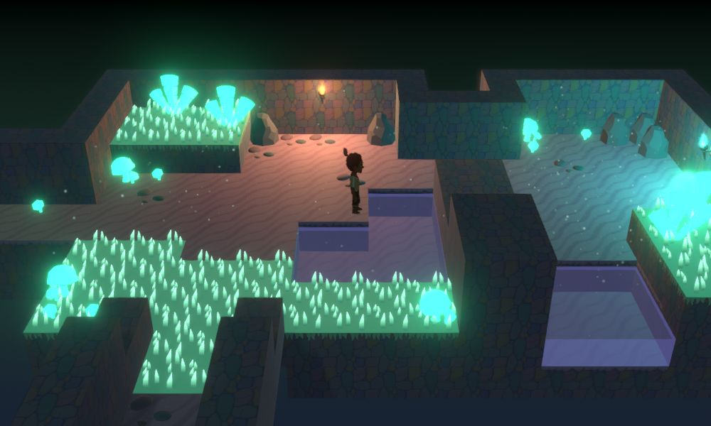
Here, I'd added teal luminescent grass blades, purple-tinted water, and torches limited to orange and teal - with the tiles still coloured purple under the darkness - which I think does communicate a dark teal+purple+orange palette. So that's nice.
I experimented with shifting all the hues so that the grass was purple instead, but the results were ghastly:
![]()
At this point, I played around with some temporary areas to see whether I could make them
work as a cave with this blocky tileset, and what moving around them would feel like.
![]()
I've also used purple and green lights here, which produce a mood that reminds me of the early Oddworld games (they used purple heavily in a way I found deeply alluringly alien), but which I don't feel is appropriate for this particular dungeon.
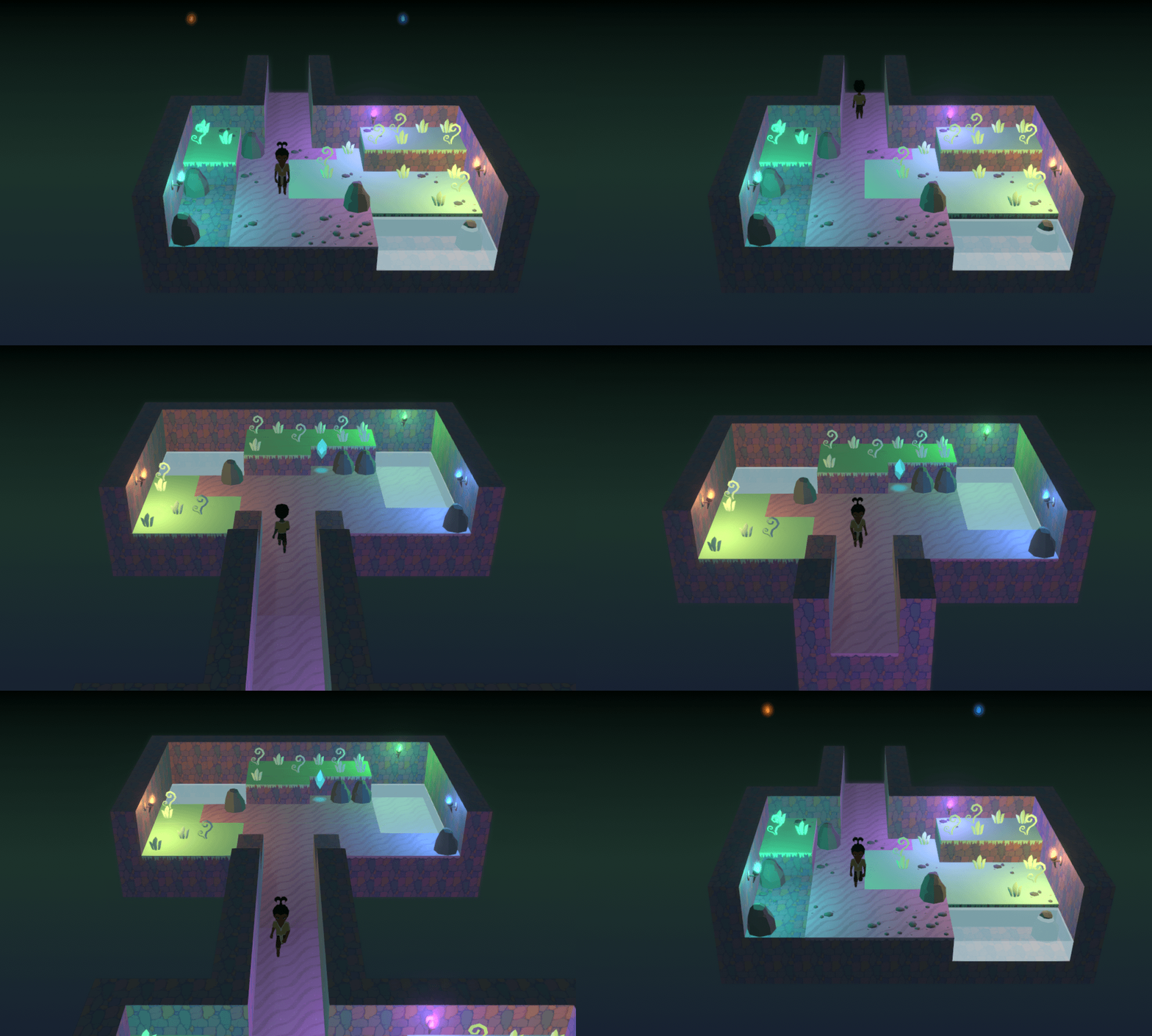
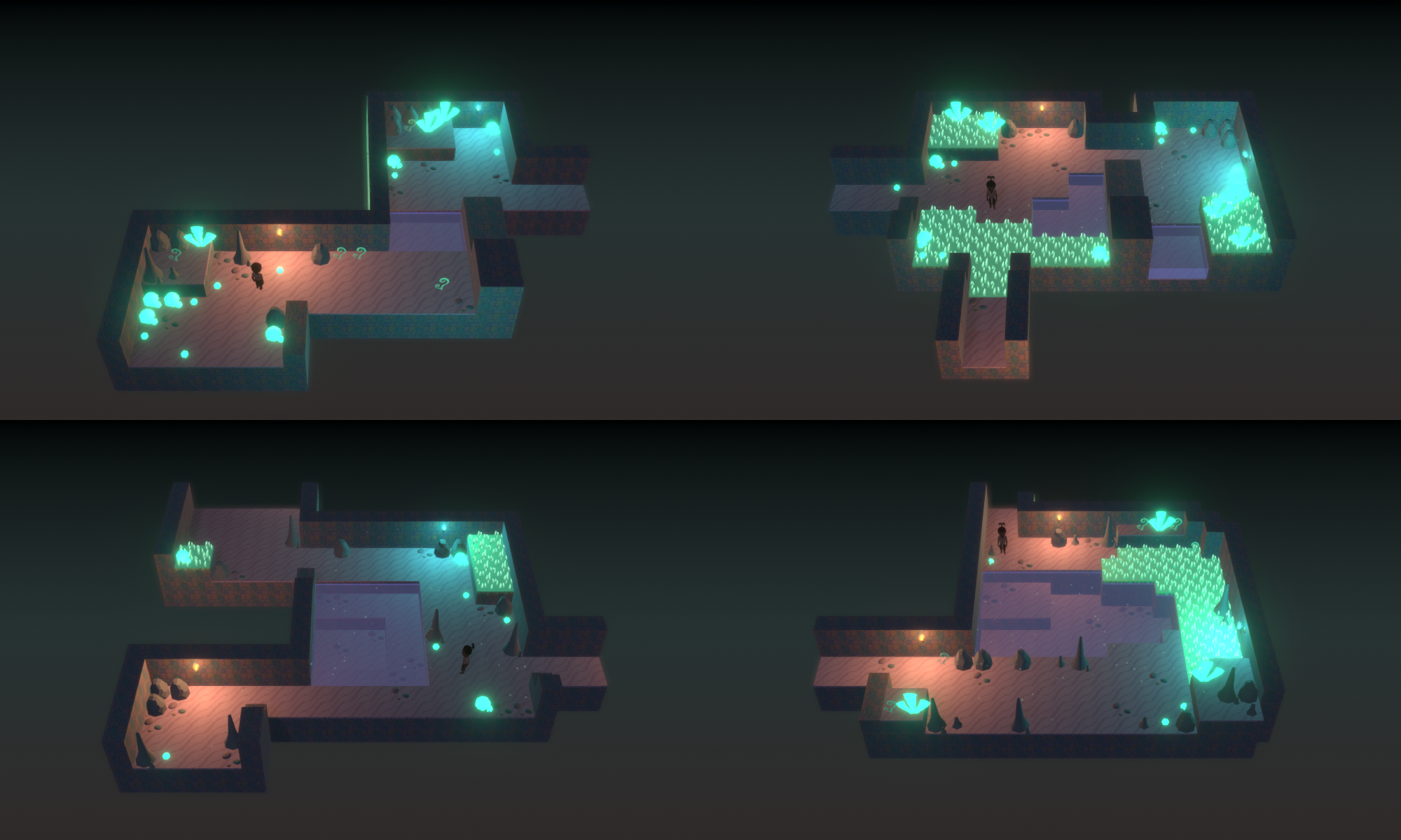
Here's an image I apparently made of all four of these (temporary) rooms together:
![]()
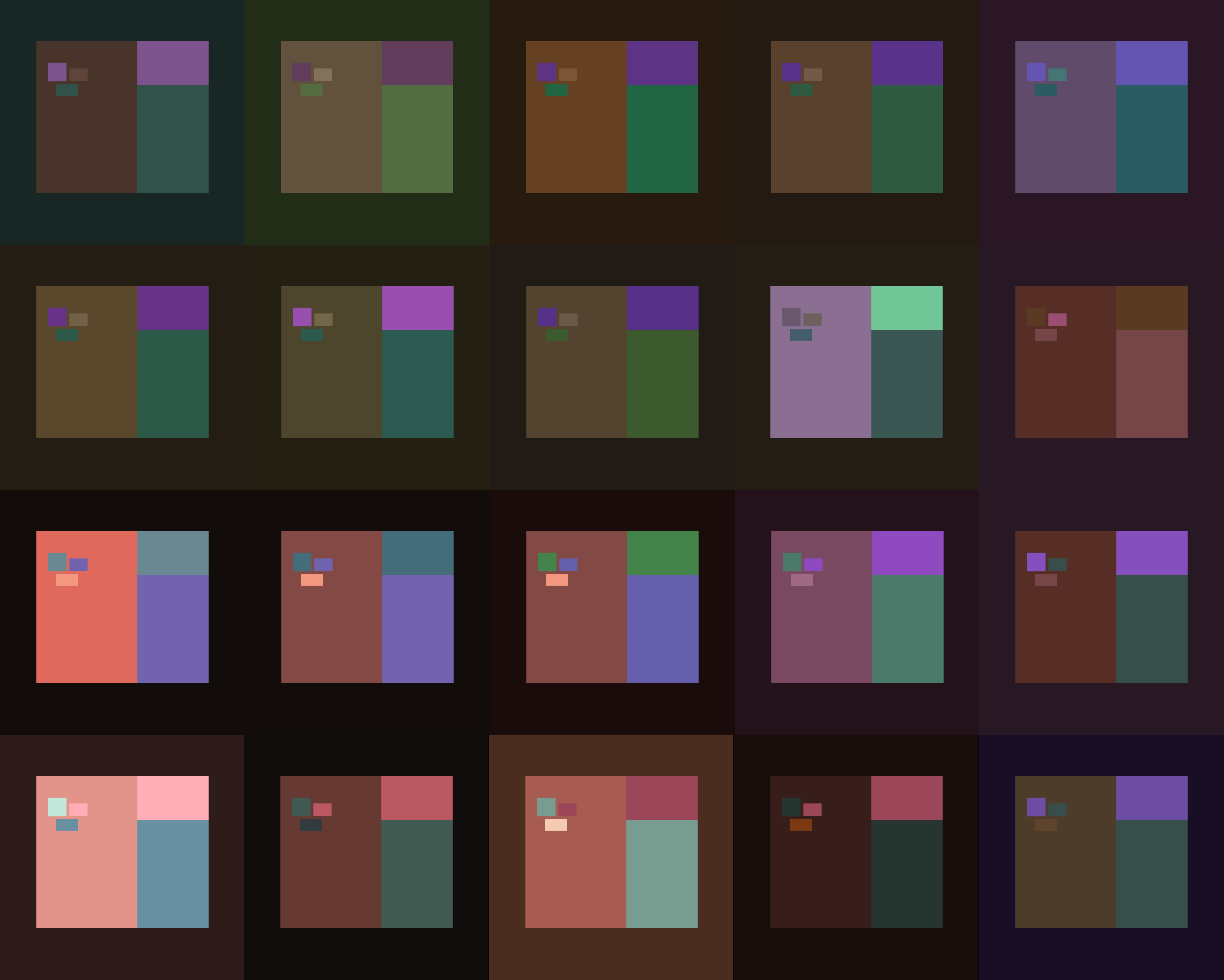
I think the palette is quite clear, and it it's interesting to me how these rooms simultaneously look almost garishly bright, but also more desaturated and 'mature' than the colours in, say, MARDEK.
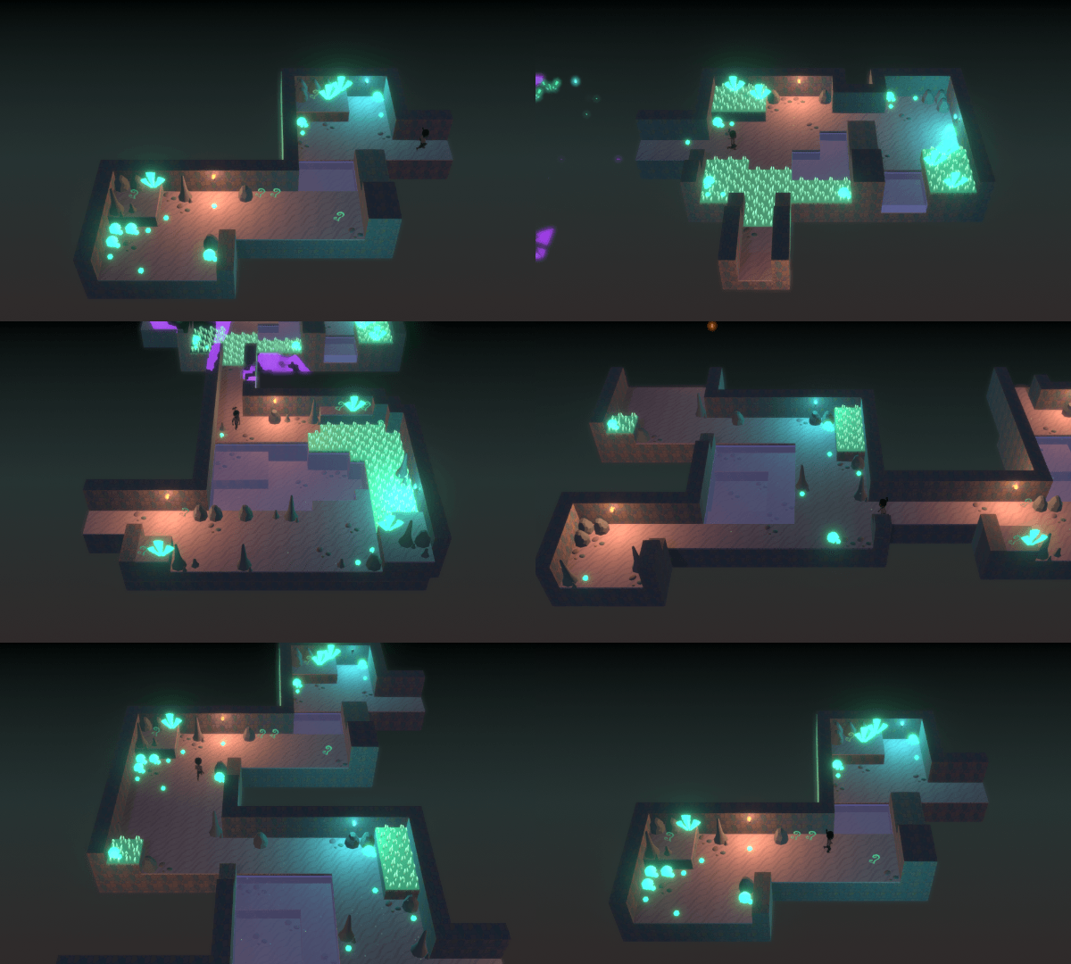
Another gif of these rooms being traversed:
![]()
I have to be quite brutal in cutting down these gifs' sizes so then they'll fit under Twitter's 15MB limit. That's an exercise in itself, trying to figure out what to cut or how much I have to scale it down!
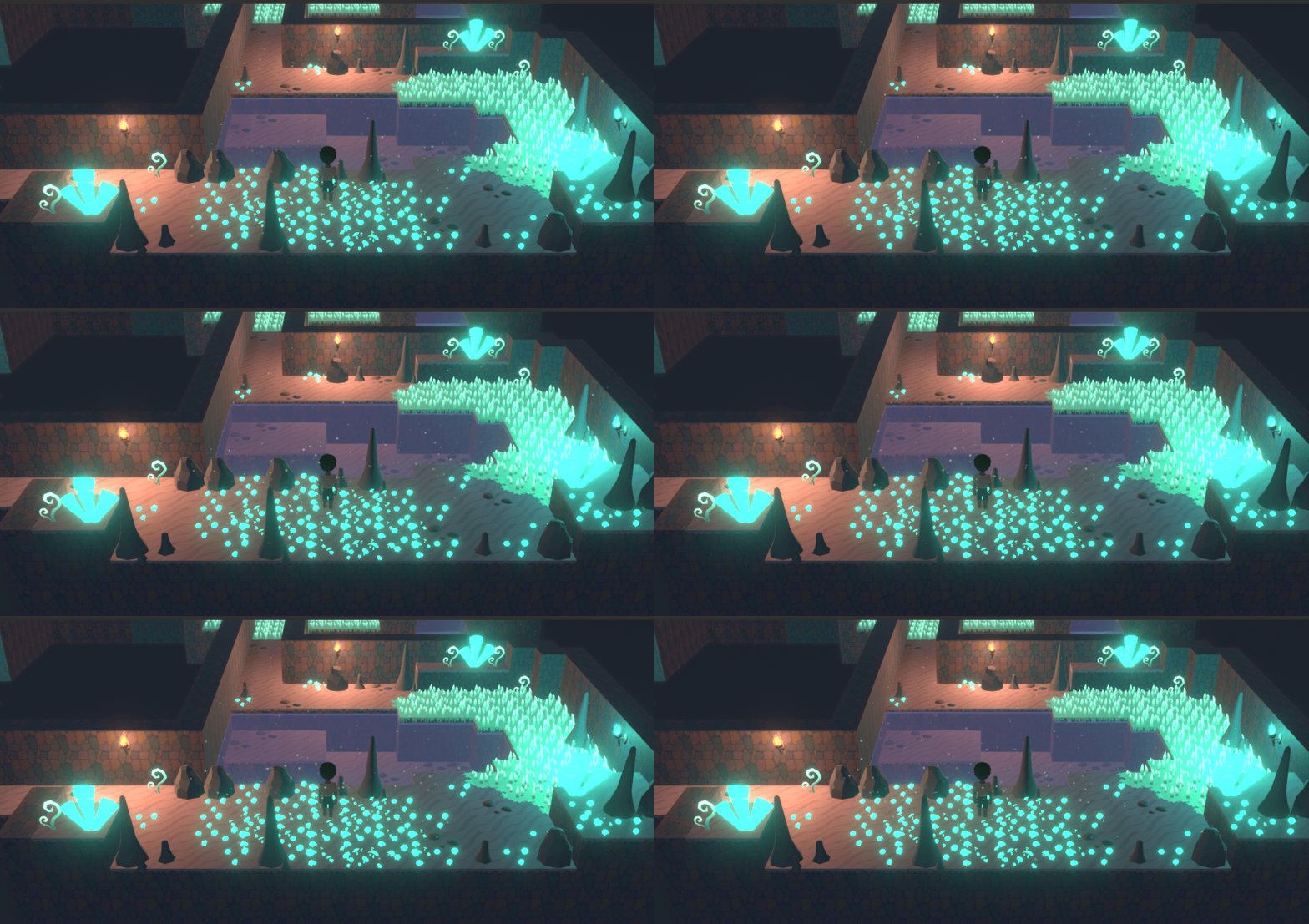
This one's 20MB anyway though, since I don't have to worry about it on this blog:
![]()
Previously, water was bound to each room: rooms had simple 'waterSurface' and 'waterDepth' integer values, and when a room was drawn, if the depth wasn't 0, then a polygon was procedurally drawn width the width and height of the room and a vertical position determined by the surface value. It clipped through all the ground tiles, so you could only see it in any 'holes' where they weren't present.
Now, rooms can each contain several 'pool' objects with specified coordinates and dimensions. It's a little technical behind-the-scenes change that won't mean much to players, but it's pleasing to me because I can just figure out how to do things like this in a few minutes these days, whereas I might have stressed about it for ages and read a bunch of tutorials trying to figure out what to do when I was starting several years ago.
Since I'd already done that, I used similar code to allow me to add volumetric effects like these motes in the previous image, which also had their coordinates and dimensions defined in my custom-made map editor. I think they really add a lot of atmosphere!
![]()
Also, I felt that luminescent mushrooms were an appropriate feature for a psychedelic cave, though I'm unsure how well their silhouettes 'read' clumped together on the floor like that (maybe they just look like blobs).
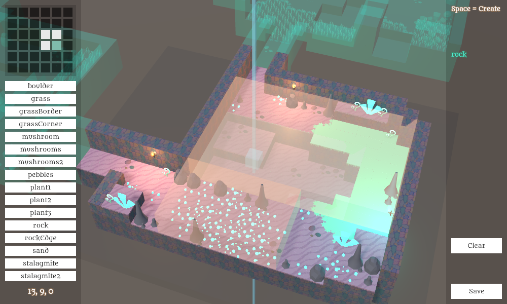
So that's what I've got after a few days of working on this. I do like the result, but I'm also aware of how inorganically blocky it is, and I'd like to change that... but it's difficult, as I shall now explain!
![]()
I'm building these maps out of blocks partly for pragmatic reasons, and partly as a nostalgic nod to MARDEK and the other 2D games that inspired it. Those each had different design approaches to their environments, despite the same essential technology. Let's look at how a few of them tackled caves.
There seem to be two different techniques used: connected rooms in a black void, and large rooms with plateaus.
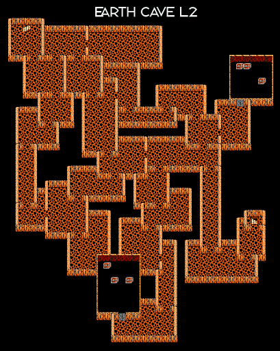
Final Fantasy I, for the NES:
![]()
This is an unusual example of the rooms-in-a-void technique, though here they're overlapping with those narrow walls. There are no decorative tiles to speak of, and the whole thing looks very inorganic as all the rooms are rigidly rectangular.
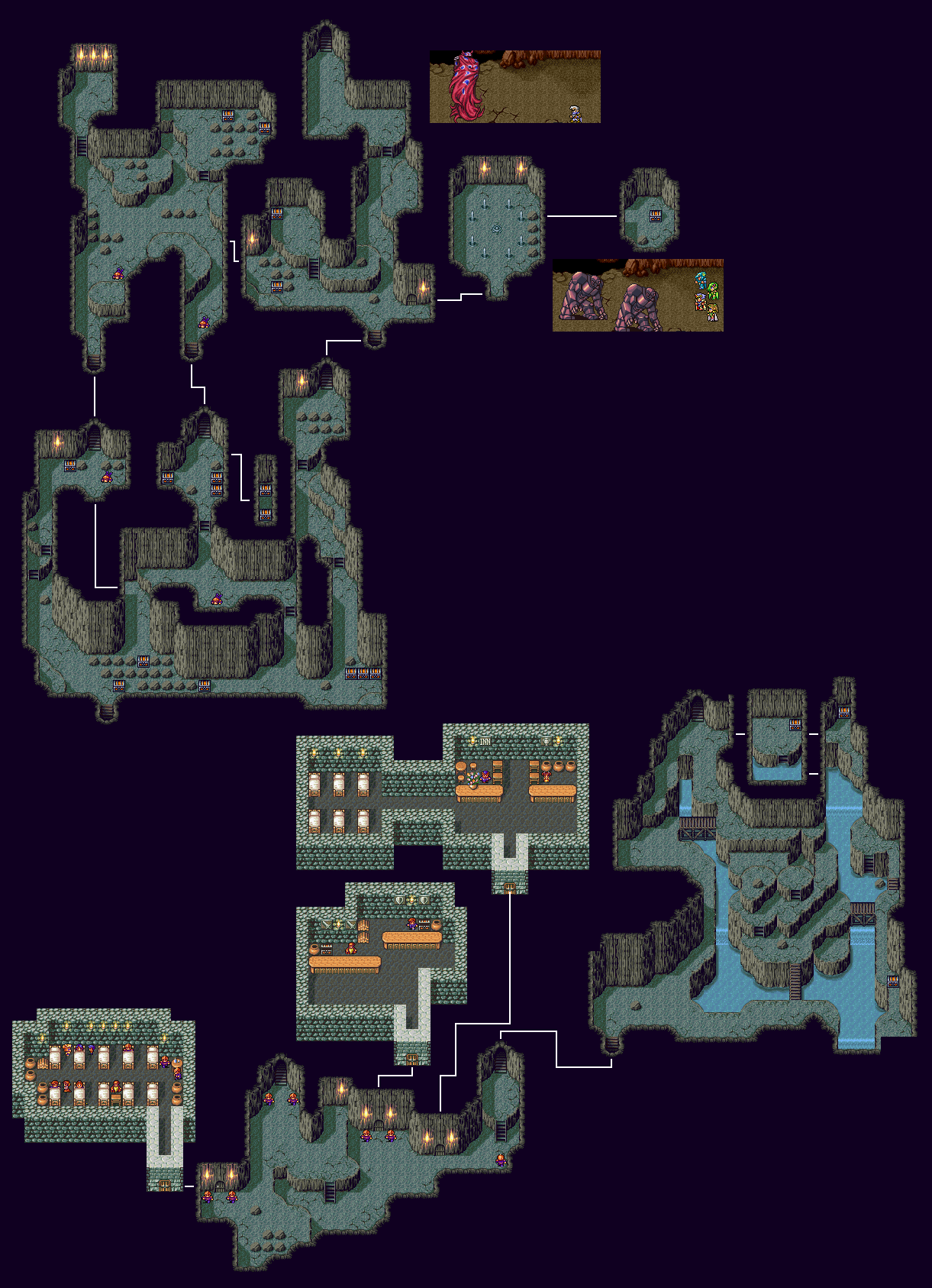
Final Fantasy IV, for the SNES:
![]()
This varies and combines the rooms and plateaus techniques in a pleasing way. The walls are tall, the edge tiles are fairly complicated, and the borders organic, contrasting with the more blocky architectural areas also seen here. You can see the 'bottom' walls in the architectural areas, but not in the caves. There are distinct 'border' tiles separating the terrain from the void.
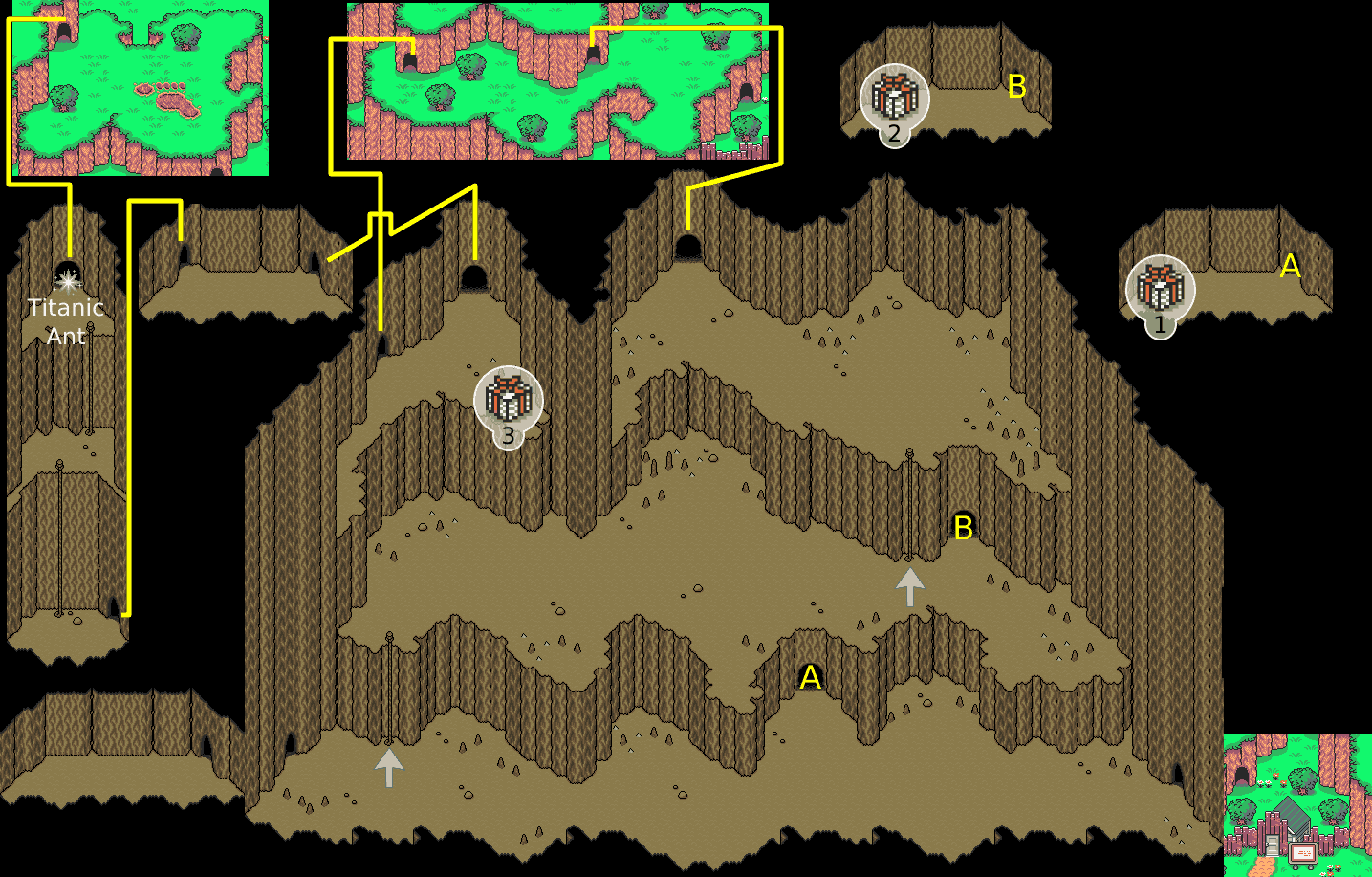
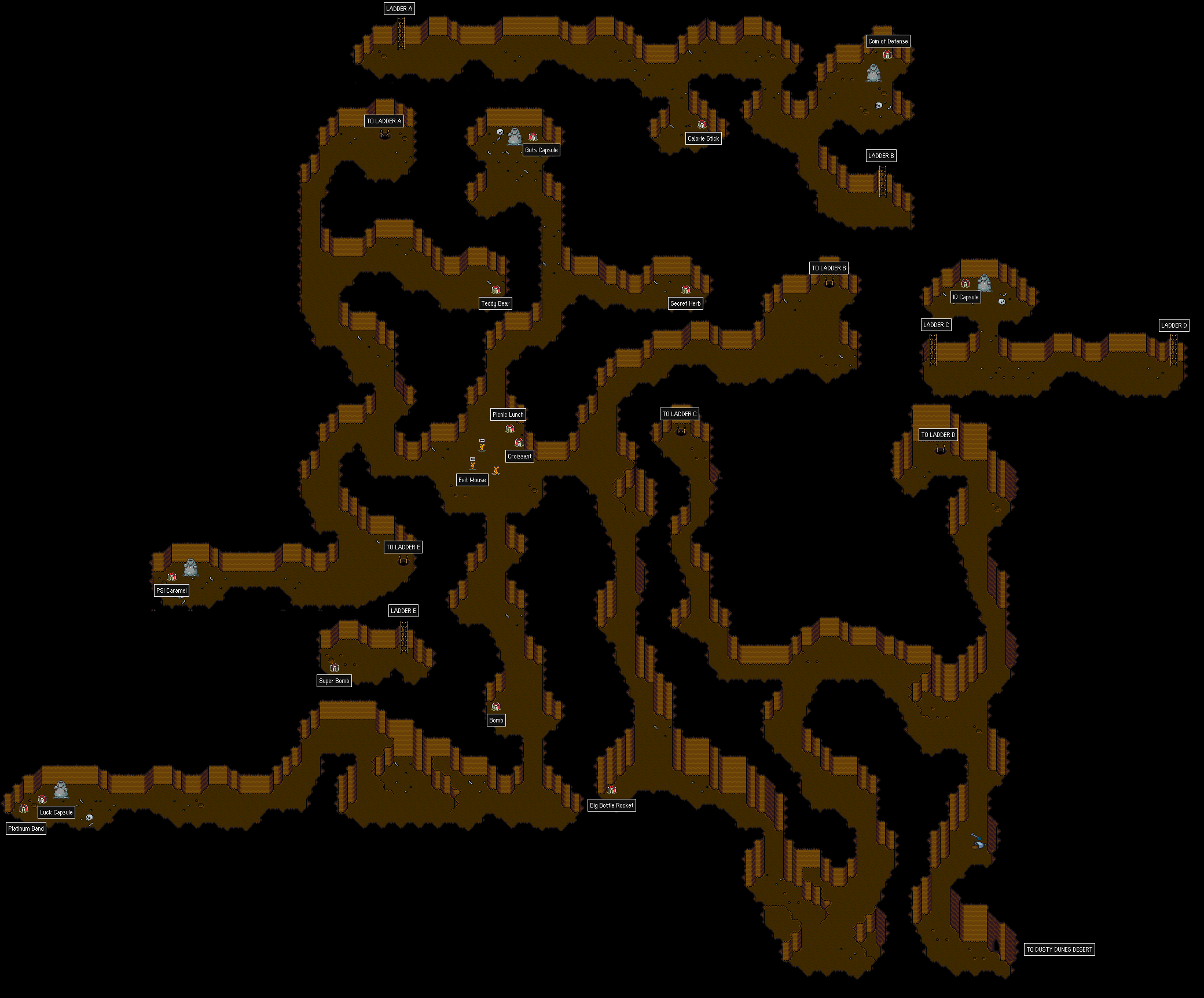
Two examples from Earthbound, for the SNES:
![]()
This one has mostly one large room with
very tall plateaus, connected by climbable ropes. There's spartan decoration in the form of little stalagmites, and no texture to the floor, to match the game's overall aesthetic. There's texture to the walls though; they seem to be made of 'pillars', with constant organic variation, no straight horizontal lines (but perfectly straight vertical ones exclusively). There are no 'border' tiles around the void.
![]()
This is the 'rooms in a black void' approach, but everything's kept completely organic, despite the tile-based nature of the map. Sparse floor decoration again, and abstract patterns for the walls. There are rounded 'pillar' corners, but not always; some are longer flat slope sections, or extended flat planes, unlike the other cave.
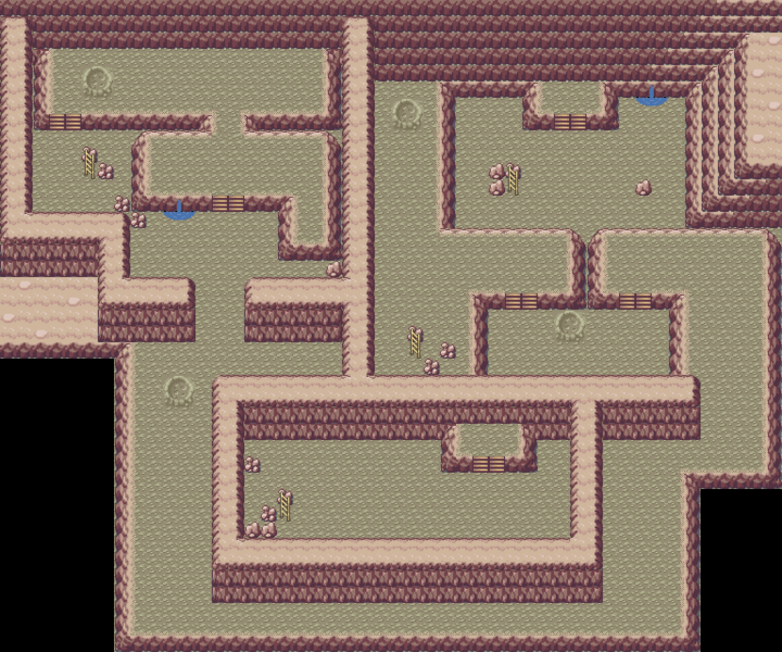
Pokemon Fire Red/Leaf Green, for the GBA:
![]()
Sort of the big rooms with plateaus thing, though less organic, more blocky. Essentially no floor decoration, just two varieties of rock (both of which look a bit odd) and some mini waterfalls and craters (for the whole 'moon' motif). Interesting features: that southern room is surrounded by walls with no blackness separating it; the southern area outside that room is bordered by void but not by any visible walls; there's an inaccessible patch of 'rock top' beyond the walls on the left there for reasons unknown. The old Pokemon games had a distinct 'layering' to their cave areas which you can see in the upper wall, but there's only horizontal layering in that bit in the upper right. It's distinctly pinkish, and very
bright for a cave!
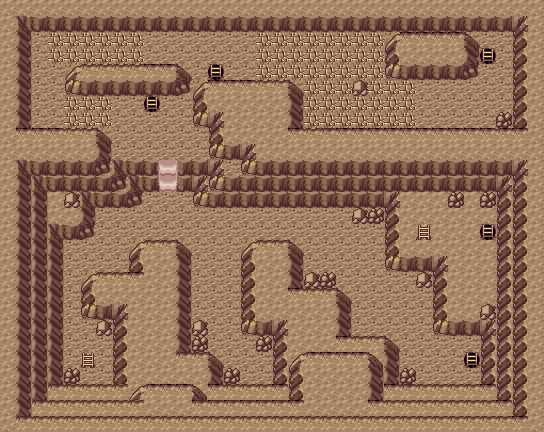
Here's another example of that layering in Pokemon RSE:
![]()
It means that plateaus can both be used as inaccessible terrain separators and as separate walkable spaces, and it gives the illusion of a 3D space with 2D tiles. This particular cave feels like a wide open room, and I think many of these cave environments extended their 'cave top' tiles infinitely rather than using a black void. Again, two types of rock, the same general shapes as the FR/LG screenshot, and no decoration beyond that. I particularly like the plateau corner tiles - there are a bunch around the mud slope - which look very rocky, organic, and solid. The tiling horizontal bits have a kind of zigzag to them; they're not highly stylised or excessively organic.
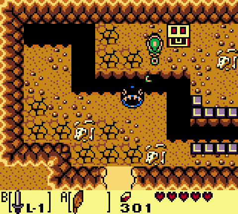
Link's Awakening, for the GBC:
![]()
The most distinct thing about these Zelda maps is the odd (and completely nonsensical) perspective, where you can actually see the face of walls in all four directions. It certainly creates a unique look (by contrast, the FFVI and Pokemon FRLG caves show only the back wall, the Pokemon RSE one shows the side and back but not the front walls). These walls have a very jagged, abstract look to them, and by varying just four ground tiles (dirt, pebbles, skeleton, cracks, though the latter is functional rather than decorative), this crams a lot of variety into a small space. It's very blocky due to the small number of tiles allowed on screen.
MARDEK, some obscure game made in Flash:
![]()
I very much went down the 'rooms in a black void' route with caves in this, so there are just wall tiles for one direction, and other tiles describing a 'border' around the explorable space. The wall tiles have special terminator variants at a wall's horizontal edge. The border tiles were placed manually - remember that! - and you can see next to the right torch here that I missed one. There are rock tiles, but the contrast on them is poor because I stuck to too limited of a palette. I'm surprised by how well the main floor tile repeats, without making it obvious that it is just repeating.
The reason I'm showing these is because they each have different approaches to
edge tiles, which I've been trying to figure out how to do with my new engine. In case it's not clear what I mean, these are the edge tiles for the cave plateaus/layers used in the Pokemon RSE map:
![]()
There are eight 'surrounding' tiles, plus two others used for south-west and south-east 'inner corners'; northern versions don't have special tiles because of the perspective.
With my 3D block maps, I'd need to make twice as many edge tiles because they're in 3D. So say there was a stack 2 blocks tall, the edges for the bottom block would need to be different to the edges for the top so then the top block has a kind of 'lip' that blocks underneath it wouldn't have. For example, I did do a bit of experimenting:
![]()
The sand has edges where it borders the water here. They're subtle, but I think they add a lot. I couldn't use those same tiles directly underneath though, as you can probably see.
I mentioned that I manually painted the edge tiles in MARDEK (which led to missing a few). This took up most of the map-building time, so in later projects (like Miasmon, I think?) I actually automated it by writing an algorithm to generate appropriate edges. I want to do the same with this for the sake of my sanity, but to do that I've been trying to plan the most efficient way for edges to be procedurally built.
It's technical and complicated, and I'm not looking for suggestions just because so much of it depends on how the code already works, and I can't be bothered explaining it! It's probably what I should work on next though, as I'd like for the caves to look at least a bit more organic.
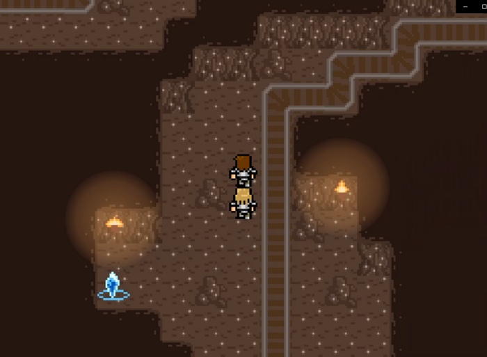
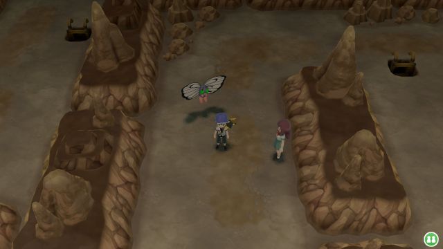
I've had a look at how other 3D games do it; for example, here's Pokemon Let's Go Pikachu/Eevee:
![]()
I can't tell if that uses actual tile-based maps or just simulates them though; I'm inclined to assume the latter, which would remove a lot of the limitations and awkwardness I have to concern myself with.
I've mentioned this in so much depth because it's such a stupid, trivial thing, barely related to the player's experience of the game at all, yet it's one I have to devote so much time and thought to! There are a lot of things like this in development, and they all need to get done, unexciting as the toil behind them is. It's not all about devising exciting battle systems or weaving fantastical stories or whatever! It's entirely possible to spend an afternoon of focused attention trying to get a rocky corner to look right, only to fail and be back to square one by the end of it...




12