Log In or Create Account
Back to Blog
DEVELOPMENT

34

4,027
WU 2020-7D - Followers, Defence, Monsters (and my favourite Pokemon designs!)
5 years ago - Edited 5 years ago2,869 words
This week, I've made the cave tileset more organic, added following allies and some changes to the combat mechanics, and I've been designing miasmon (which is what the monsters are called in this)! Also, a bit about my favourite Pokemon designs from all eight generations.

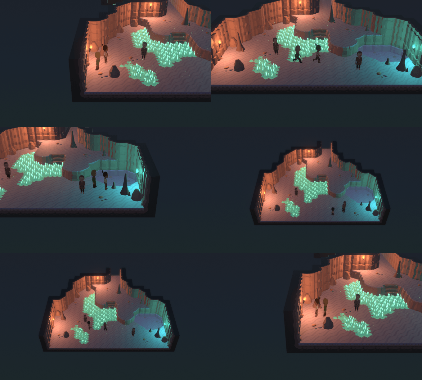
I talked a lot about more organic cave tiles last time, and here's what I managed to come up with after playing around with that for a bit:


It's definitely an improvement, though there are still bits about it that bother me, though I don't know if anyone other than me would even notice the bits that make me think "UGH I NEED TO JUST START OVER FROM SCRATCH!!" Probably not! (I don't like how obviously tiled vertically-stacked screen-facing walls are.) I'll just keep it like this for now; I can always tweak things later if I make a few rooms but really can't stand what I have.

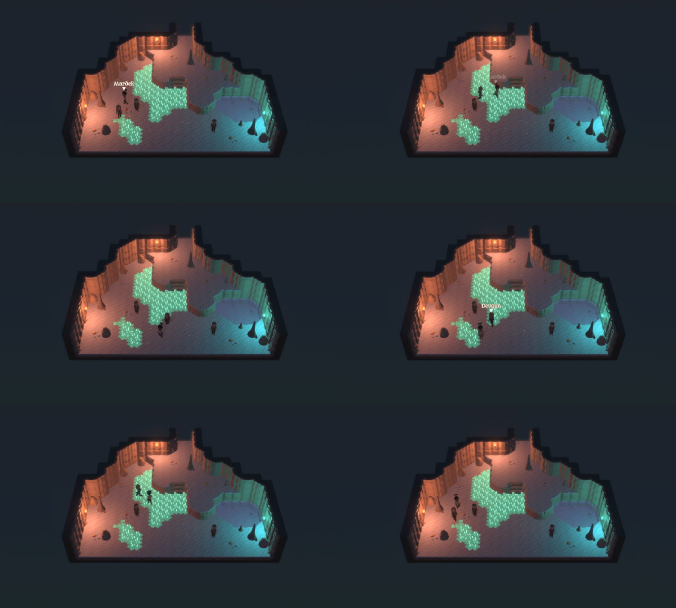
That screenshot also shows Deugan following Mardek. Here's another with three Deugans following Mardek:


Silly.

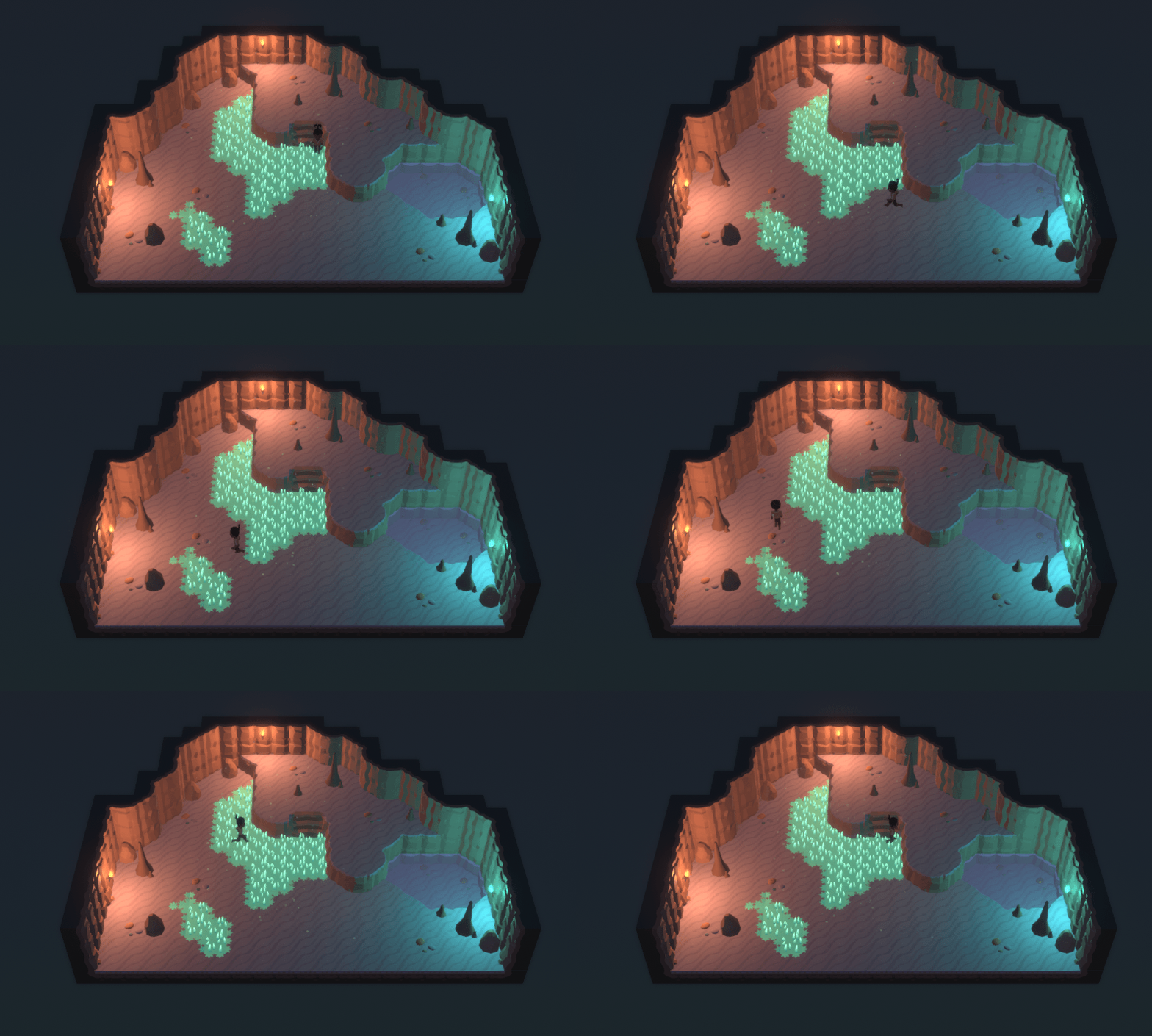
I put off adding this for a while, since I wasn't sure how to handle the follow AI, especially when travelling between rooms. Anticipating issues, I even experimented with this tile-locked walking system like the one in MARDEK, so then I could use the same follow mechanics from that:


As it turned out, though, the AI problems weren't as insurmountable as I thought, due to a fairly recently made Unity add-on. Hopefully that won't become horribly obsolete half way through production.

You can also switch who you're controlling at the press of a button:


This would be for using their individual field abilities, or perhaps NPCs might occasionally say something different to certain characters. Not to the extent where everyone would have a whole different conversation for everyone one of your characters - that'd be ridiculous - but something more like MARDEK, where having certain characters on your party was necessary to unlock certain events.


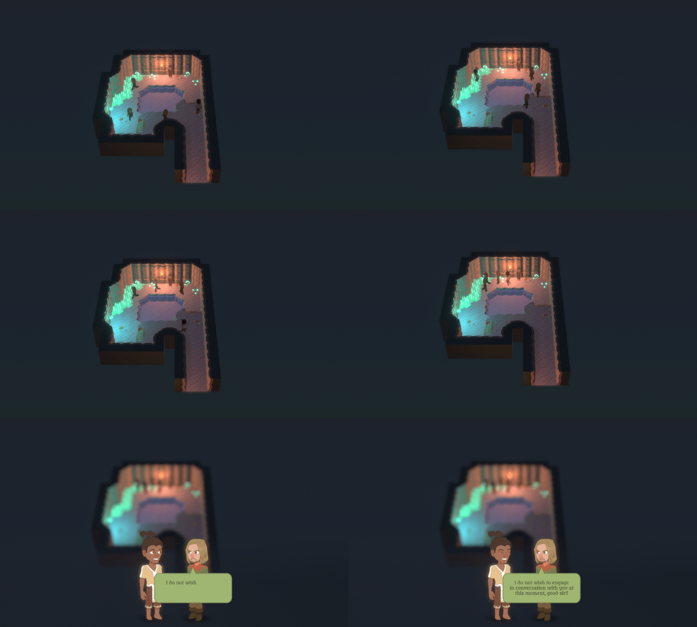
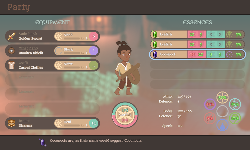
If you've been following development, you'll know that I've drastically reduced the number of battle statistics that characters have to just two: Body and Mind. Some of you have expressed reservations about it being too simple, which I felt after a bit more experimenting probably was the case.

So I've added separate defence stats. Essences now grant both power and defence for both Body and Mind, and the status menu now shows all these basic stats, plus speed, in a typical JRPG sort of way.


The background also has the blurry environment effect that I planned to include before but didn't get around to; maybe that helps it feel less like a mobile game?

Characters also have a seventh fixed 'innate' equipment/skill slot. I did this because I'm planning to have characters' unique field skills also usable in combat, and this ensures that they'd always be available in both without filling a slot. Plus it made sense for Dharma (the Rohoph of this reimagining) to be a permanent addition to Mardek's arsenal rather than something you can remove.

I've yet to actually plan what the characters' skills will be, and I don't know how Heal could be a field skill; that planning will come later.

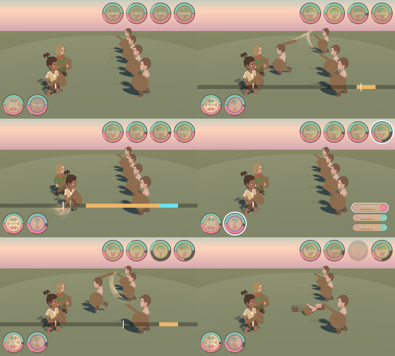
But back to defence. Defence is a fairly standard stat in other games which I personally feel isn't given all that much attention; it's just sort of there, behind the scenes. Here, I want every point of defence to feel significant. As such, it serves as a straight reduction of incoming damage, and it's marked on the character's 'status circle' as a thin line above/below the main 'HP' bars (these bars were previously used for Body and Mind XP, which you'd accumulate through use to increase the stats, but that's made redundant with essences so I've scrapped it).

The influence of defence is shown every time an attack lands, like for example:


When an attack hits, a bar (coloured according to that attack's element) appears around the target's 'status circle'. Its total size shows the damage relative to the target's 'HP' (that is, Body or Soul, as appropriate) bar, but there's a darkened section the size of the defence showing how much of the damage was absorbed.

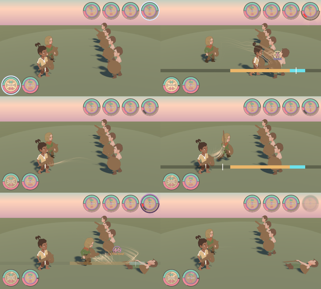
It can lead to enemy designs like this:


Here, these Coconocts have more defence than they have total HP, so you'd be aiming to deal enough damage to get through their armour and make a mark. It's what happens in (some) games like this anyway, but I personally like having the visuals like this, since it also opens up the potential for abilities that alter the defence of allies or enemies in a visual as well as purely mechanical way. Changing the strength of a clearly visual 'shield' like this seems more appealing to me than just altering some hidden numbers.

How well it'll work in practice remains to be seen, but I'll continue tweaking things like this as I - and eventually beta testers - play through some actual gameplay and see how it all feels in practice. We're getting closer to that point!


Maybe that's the most interesting bit to some of you out of the way, but I want to talk in a bit more detail about monster design, since that's going to be a big part of what I need to spend my development time on. I wonder how players perceive this; maybe they just take it for granted that every dungeon's going to be full of baddies, and don't devote much thought to how they were put there by the developers? Since I do have to worry about the details of that myself, it's something I've given a lot of focus to over the years. It's going to be a particular concern with 3D, where each new model will take a lot of time and effort to make and won't be easy to drastically change once it's done.

MARDEK's monsters were fairly ordinary, inspired by the sorts I was used to from games like Final Fantasy, maybe X in particular? In that, there were a handful of monster 'species' which each had several different members that shared animations. It was practical to do things that way, but it led to a lot of forgettable ∞ "Lava Goblin" ∞ kinds of 'designs'.

In later projects, most notably Miasmon, I looked to Pokemon for design inspiration. Pokemon designs - beyond maybe the first generation - have a lot more care put into them because players are expected to potentially spend a lot of time with each individual creature, and to develop emotional bonds with them as well. Many of the designs are clever, multi-layered, meaningful.

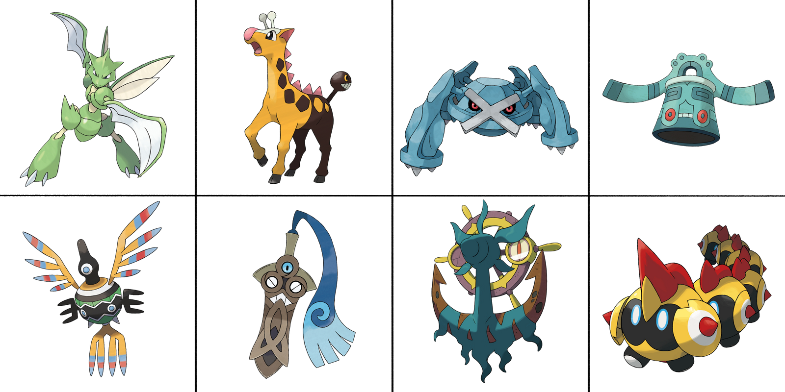
Interestingly, Google was running a poll (until?) last week asking people to rate their favourite Pokemon in each of the eight generations. I was curious to see what mine were, since I feel my opinions clash to some degree with those of the hivemind. It seems like many people consider Generation I the untouchable best, with everything since then going downhill, and there's common revulsion for designs like Trubbish and Vanilluxe because apparently Pokemon based on 'objects' is offensively wrong or something like that. Personally, I'm drawn to weird designs, and the eight that I chose were these:


That's Scyther, Girafarig, Metagross, Bronzong, Sigilyph, Honedge, Dhelmise, and Falinks.

My preferences are those of a designer rather than of a player; these aren't chosen because they're 'powerful!!' or whatever. I suppose Metagross is a pseudo-legendary, but that's not why I chose it. Mostly I just like them because of how they look, though the inspirations behind them plays into that as well.

Scyther and Girafarig are favourites due to childhood fondness and memories; I'd call Girafarig my MOST FAVOURITEST EVER Pokemon largely due to nostalgia for a specific team I once had in my first Gold playthrough. Kabutops and Houndoom were close seconds, but beyond those there aren't any that I really love from those first two generations. I like most of Gen 2 and find a lot of Gen 1 annoyingly bland to the point where Let's Go just felt like a chore, but overall most just don't stand out to me as personally exciting.

Gen 3 and 4 were tough decisions; those have the same 'like but not love' feeling for me as a whole. I appreciate them all, but none stand out for me other than these two. Metagross and Bronzong are the same types and similar colours, and I like both due to their general alien oddness. I also like Lopunny from Gen 4 because I think it's hilariously out of place (it's essentially a Playboy bunny in a child-friendly game), so that'd be a runner-up.

I like most of the Generation V Pokemon, and narrowed my choice to 17. When I play a new generation of Pokemon, what I like to do the most is form a party from pokemon I've never seen before, so Gen 5 was amazing for me. This seems to be an uncommon view though, from what I've gathered? Was the reaction to that generation negative because people couldn't use their old favourites? I chose Sigilyph because I love that it's based on ancient 2D depictions of birds which were familiar to me, but with what was intended to be a side-on bird head in those glyphs transformed into this one-eyed thing instead. So clever! So bizarre! I also really like the words 'sigil' and 'glyph' in general (though this makes me annoyed when people say "Siggle-iff" or even "Siggle-aif"; as annoying as turning the pleasing arcane + canine into "ARCA-nine"! Bluh). Runners up were Sawsbuck and Deerling, Golurk, Chandelure, Trubbish, Vanilluxe, Hydreigon, and Musharna.

I chose Honedge rather than Aegislash for Gen 6 even though I like both because the details of this design are just so appealing to me! The lines on the blade forming eyes and teeth through holes in the sheath is just so inspired! It's a wonderful design touch that you couldn't really describe in words as a concept (unlike, say, "a big sword that also has a shield!"); you have to see it executed for it to really have its effect. I also like the design of Binacle and Barbaracle, because of the clever oddness!

Gen 7 was also difficult; I really like a lot of those. Dhelmise, Golisopod, Charjabug, Crabominable + Crabrawler, and Araquanid + Dewpider (though why isn't it called Spidew urrrgggghh??!?!?) are all almost equal, though Dhelmise won because it's teal and bizarre. It's huge too, which I didn't know at first, and which only adds to its odd appeal for me. I love how the whole shape hints at a pirate face with a fanged grin, beard, and eye patch, but it's subtle enough for it to just feel like a non-anthropomorphic alien. Plus the lore behind the Pokemon just being the amorphous algae really adds to the 'ooohhh' factor for me.

Gen 8's the newest, and the party I ended up with was Orbeetle, Centiskorch, Grimmsnarl, Corviknight, Flapple, and Falinks. I like all of those a lot, but I settled on Falinks because when I found it (in game, since I avoid learning about any designs before I play), I thought "what on Earth is THAT??" and had to look over it a bit to make sense of it. "So weird!", I said to myself a few times; that - rather than familiarity - is the feeling I most enjoy experiencing.


I've talked about this in more detail than I intended to, but since Pokemon's more successful than anything I make ever will be and many of you'll have your own favourites, maybe there's some interest in seeing mine! I also wanted to show and explain them to give an idea of what's driving my own creature design decisions.

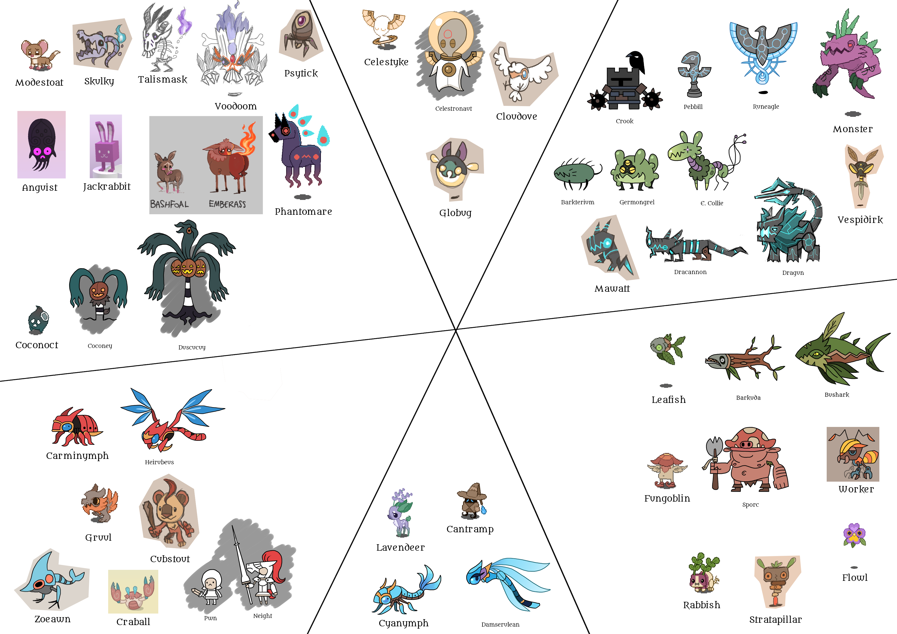
I've made a whole bunch of miasmon over the past few years, for different projects that I haven't finished. I want to reuse at least a few of the designs in Divine Dreams, so a couple of weeks ago I compiled as many of my old designs as I could find into this image:


Those are divided into what their elements might be if they were included in Divine Dreams; clockwise from the top: Bliss, Destruction, Creation, Sorrow, Courage, Fear. There are a lot more Fear and Destruction than Sorrow and Bliss, which makes sense since they are monsters, so it's easier to imagine things inspired by those more hostile elements.

Like in Pokemon, many of these were meant to evolve, and I gave some thought to how to approach that in Divine Dreams. Do I keep evolution in some form? What form? Would you evolve essences? Could you summon monsters in some form, such that you'd be able to see whatever they evolved into?

Ultimately I realised it'd definitely be too much work creating evolutions for many or all of the monsters, so it'd probably not be a good idea to go down that route. I do have another idea, though.

I've said this in another post, I think, but each dungeon will have a set number of monsters, such that you can 100% the dungeon by defeating them all. They'd come in a number of species, and defeating all members of a certain species would reward you with an essence of that species. I'm thinking six species per dungeon, what with that being the theme number and all.

You wouldn't need to clear all the monsters, of course, but if you did choose to and got 100%, then perhaps that could unlock an optional/secret boss which would be an evolution of one of the dungeon's species. People do seem to like hidden bosses like this, and you'd be rewarded with its essence afterwards so it seems like a good way to go about it. It also allows me to design some evolved forms without having to worry about designing some for every monster.

The planned story also doesn't really have many - any? - "and you have to fight a big, story-unrelated monster to pass" moments, so having something like this is a way of adding that to the game without having to cram any into the actual storyline. (It was also inspired a bit by Yooka-Laylee, which has bosses for every level but they're all optional.)

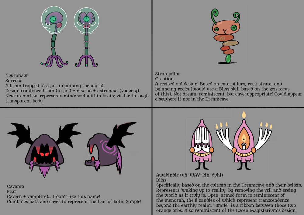
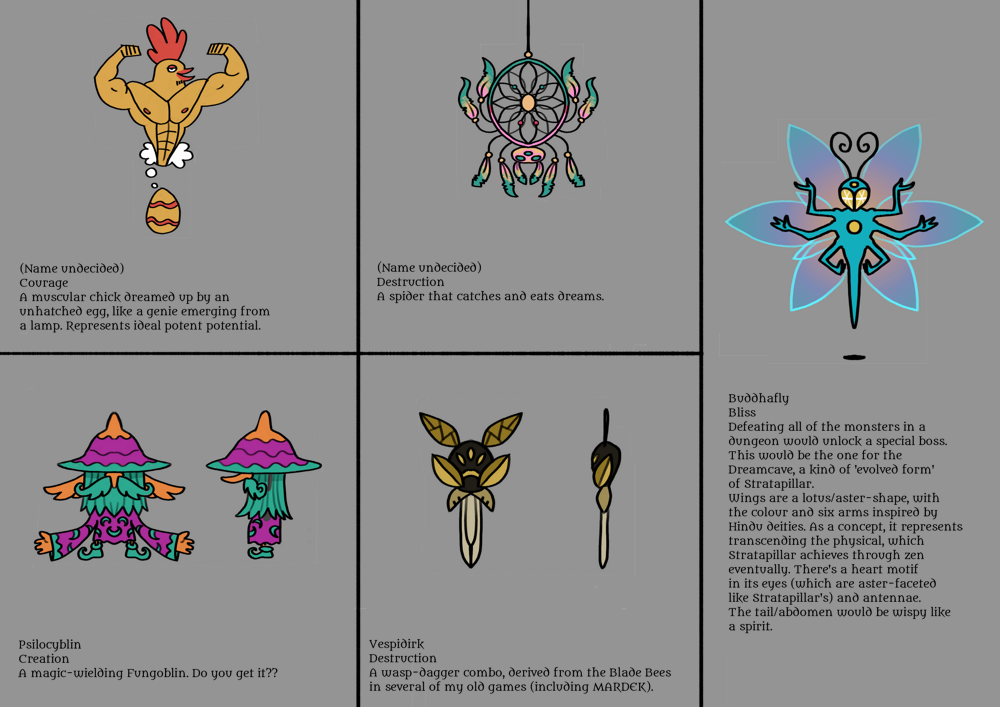
I've designed eight monsters for the Dreamcave area, though I'll only be including six. Plus the optional boss. Here's what I've got; descriptions are in the images:


I'm thinking of covering all six elements, so I'll likely go with:

Neuronaut, since I like the design and it's the only Sorrow one;
Stratapillar, which would be the one that evolves;
Cavamp, though I've redesigned this a bit since this image;
Awakindle, since it's related to the cultists and as such has actual story relevance;
the unnamed buff chicken thing, since it's the only Courage one;
and Vespidirk, as a reference to my old games like MARDEK (though I don't think there were any bees in the Gem Mine?).

I really like the Buddhafly! That's the kind of design I feel really proud of. The others are mostly passable/okay, but I shouldn't spend too much time trying to aim for a kind of perfection I couldn't ever reach. I'm just one person trying to do everything, so obviously my designs aren't going to be on the same level as Pokemon or anything.

Oh, and the buff chicken thing was derived from an idea suggested by Mania on Twitter, though I don't know if it looks anything like he was imagining! I might give some more attention to it, and I'll need to give it a name.

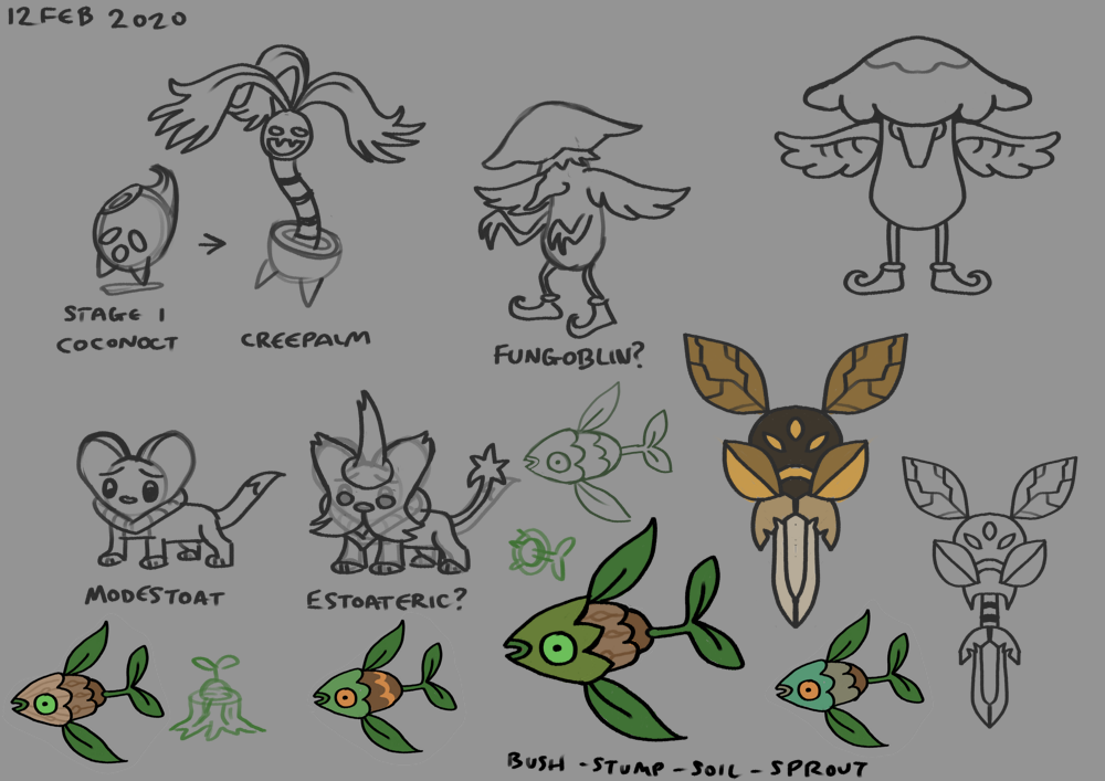
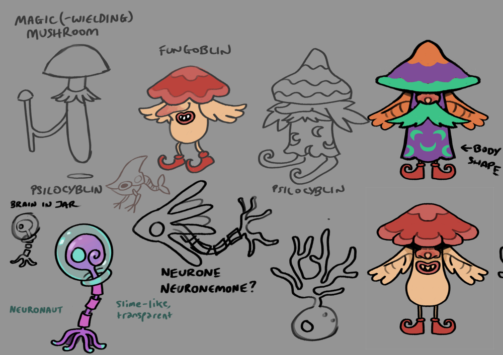
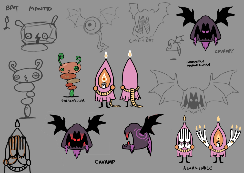
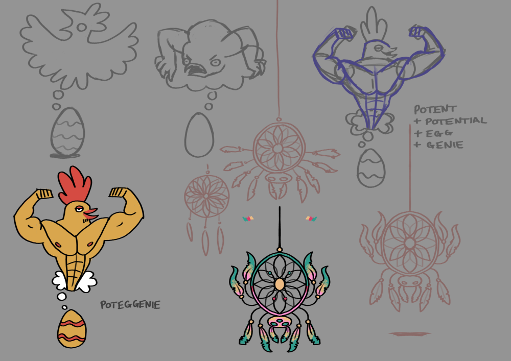
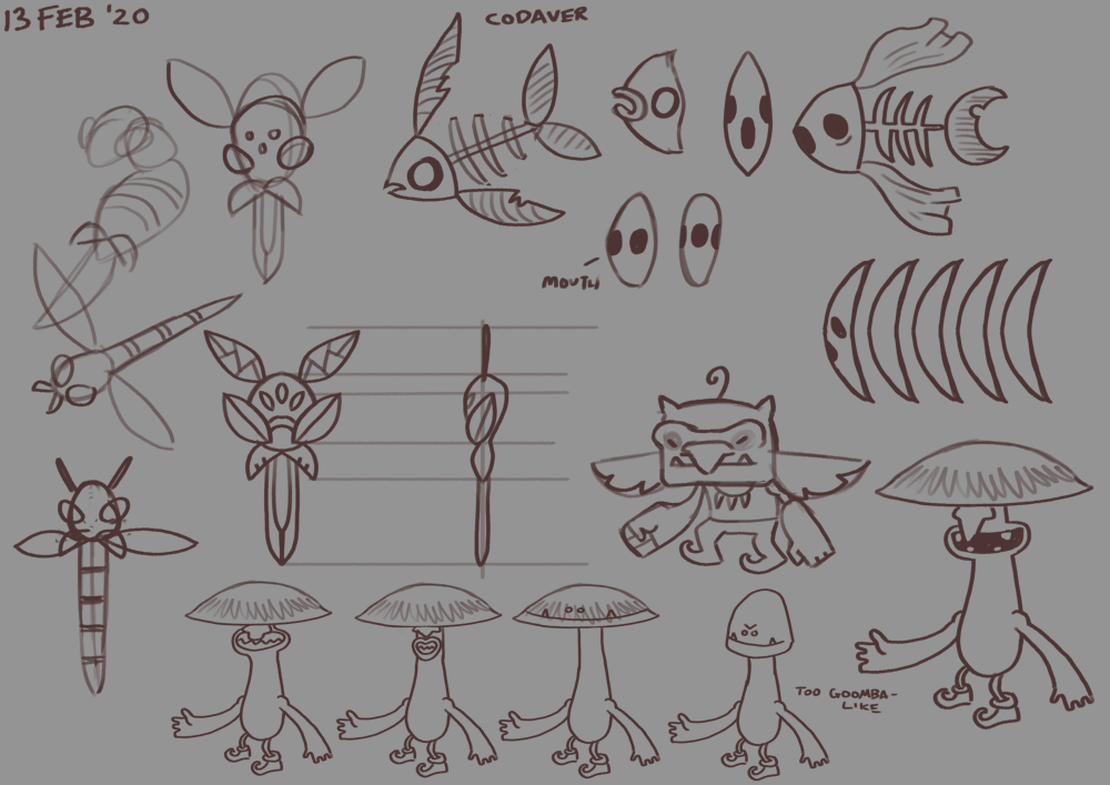
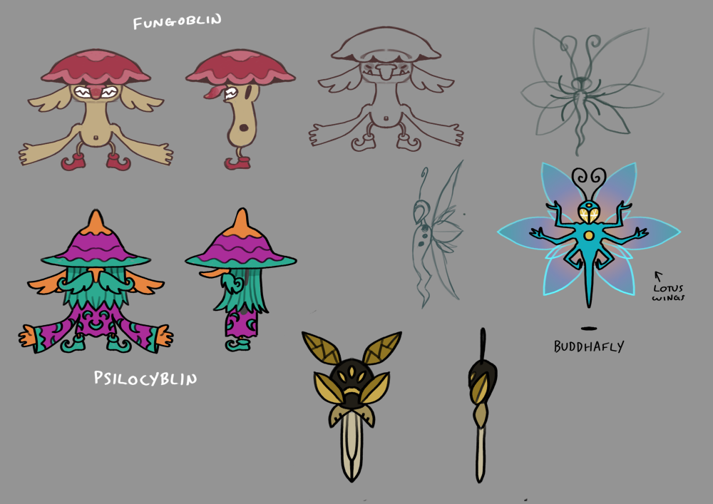
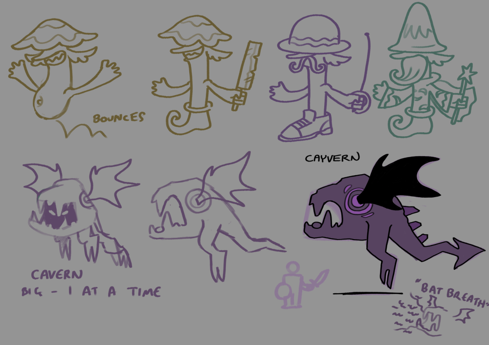
Those are just the final images from the design process. Here are a few pages of more conceptual sketches, where I was trying to figure stuff out:


As you can see, some designs - like the Buddhafly - come quickly, almost fully formed, whereas others - most notably the Fungoblin - have gone through a bunch of very different concepts without a clear final decision. I want to include Fungoblins since they were in MARDEK, but I wanted to try redesigning them a bit, and... eh. I'm still not happy with what I've got! There are some designs here reminiscent of the silly Happy Johnny MARDEK monsters, some based on the Alora Fane: Creation goblins, and others with Aardman-animation-style mouths that probably don't match the rest of the visual style. I'll probably have to keep playing around with that before I can come to a decision, but it won't really matter for the Dreamcave so I can worry about that later.

I'll likely spend the next week making a bunch of models; there are quite a few I need to make for the demo area. Monsters, characters, a battle background... That's probably the bulk of work I need to do actually, but it shouldn't take too long once I put my mind to it.

34 COMMENTS

JohnnyBoi45~5Y
I love these monster designs! They really look like something born out of the subconscious, with just the right blend of whimsy, humor, and looking like they can mess you up if you aren't careful. I hope the unnamed dream-eating spider and the psilocyblin also show up at some point, because those are also interesting designs.

I think your choice to adopt separate defensive stats is a good choice. Between physical and magic attack and defense stats plus elemental resistances and speed, you basically have all the stats that really mattered most of the time in Mardek. There are still also opportunities for unique memento-only stat buffs like elemental empowerment or status resistance, so this definitely feels like a good amount of complexity.
4
MarninPL33~5Y
Love those designs - especially the fungoblins! I'm glad that you decided to keep them, especially since I really liked how they kept reappearing in different locations, but in different variants. Some would call it lazy design, but for me it's really interesting to see how monsters that we know can change with the terrain around us. Also, the fact that every monster has it's lore is simply great!

However, I also think that there is something that can be slightly improved. Your designs are really, really creative - sometimes so much, that it's hard to identify what element are they attoned with! For example, if you showed me "(Name undecided)" spider monster I would have guessed that it is sorrow, not destruction. What I think would really help is picking color palette for mobs from each element and sticking to it while creating designs (For example, destruction could focus on purple and dark colors, but it doesn't have to be boring like that. Of course, there could be some exceptions, but moste of the time the rule would be applied). I think it would not only make every element more unique, as it will add to their identity, but also make monsters a little bit more consistent when it comes to looks!
4
Tobias 1115~5Y
But which fungoblins?!?!?1

I get where you're coming from re colour-coding. I've been trying to make use of old designs that came from before these elements, so they were never designed to have them in the first place; that's a big reason why many of the old designs in the collection image here don't seem to match the elements they've been sorted under. Even with the newer designs though, I've been starting with concepts rather than elements, only to find that no element really fits at the end. Neuronaut's the best example here. Why would that be Sorrow exactly? I added the face to its jar to make it clearer, but it definitely isn't unambiguous. Maybe I could make it blue, too, but... eh. I'll think about it.

Why would the dreamcatcher seem Sorrow to you though? Again the concept for that came before the element, but I decided on destruction because it destroys dreams; it's less about passive loss and more actively aiming to end them. Or is it just about colour?

The colours of these elements are:

Courage = red
Fear = (dark) purple
Bliss = (light) yellow
Destruction = cyan
Creation = green
Sorrow = blue

Maybe a darker colour would make more sense for destruction, or even red or something, but they're already used by Fear and Courage. I've used cyan for it because these four colours are all equidistant on the colour wheel (60 degrees of hue separation each), and a sharp, bright, lightning-like cyan seems more active than a deep, scary darkness. It's a bit of a stretch, but it's what I've got.

So those colours are definitely going to be in mind when designing monsters in future, but I don't want to be beholden to any if it means sacrificing important parts of the design. Lavendeer, for example, is my favourite Sorrow design so far (it's from Taming Dreams, but I want to use it in this too), but it being lavender - rather than blue - is crucial to its design.

Ultimately it's likely to be like Pokemon, where a whole lot of designs have colours that match their type, but there are others where it's not as straightforward (Falinks doesn't look Fighting at all, to use an example mentioned in the post).
1
MarninPL33~5Y
Yeah, dreamcatcher's colour reminded me more of Sorrow than Destruction. Design is fine and really fits, but for me it lacks the connection to it's element. Unlike, for example, poteggenie, cavamp and stratapillar who despite limited colour palette convey their element more effectively. If you didn't said straight away that dreamcatcher and vespidirk are of the same element, I wouldn't have guessed that. This is because despite both being connected to "destruction", their designs don't have anything in common. Which is a shame, because without links between monsters of the same element it's relevancy dimnishes. I think focusing on it from now on will bring many positives.

However, this doesn't always have to be the case. Lavendeer connects well to it's element, despite not having green colour in it's design. This is because it still connects with nature, as it is a forest animal. I think that although using limited color palette attached to an element is great, in some isolated cases it is not necessary as you can connect to the element in other ways. This would be a lot harder for destruction, for example, as it is not directly related to "RPG-elements" like other main 3 (it's not yellow or lightning/air related) but maybe it could be changed? Maybe if Bliss and Destruction swapped their colours, it would be more clear and consistent? You know, Bliss would be cyan and kept white as its colour, and destruction would become yellow/black/brown oriented? I dunno. It's just my suggestion.

And when it comes to fungoblins, I enjoy designs from the last picture the most! For me it just a great potential to add more goblin sub-species, like in MARDEK (even if it differs a bit. That's because old fungoblins didn't have arms, which made them silly. The last one keeps that sillynes by giving them only one leg, at least this is how I see it). Oh, regarding that I would also like to point something out. You seem to be very critical of MARDEK games and design choices that you used back then, even after you played them once again recently. I would like you to know, that people don't only look back fondly on MARDEK because of nostalgia, but also because it was simply a great game! For example, me and my friend played the games not really that long ago, and despite being already adults we still loved every aspect of them. So, I just wish that you would appreciate your old work a little more! But still, this post is lenghty and broad in terms of topics I've covered, so I will end it here. Keep up your excellent work!

(Also, when there will be a post regarding story/music? And do you plan to use some of more typical fantasy monsters like dragons? And what about gruuls? Ugh, I have way too many questions I would like to ask, but this is not a right thread I think)
1
Tobias 1115~5Y
Lavendeer is sorrow, not creation, so its elemental colour would be blue!

Imagining Bliss as anything other than a bright, golden yellow just seems completely off to me! Maybe that's largely because I've had this system for several years though and I've always used these colours. When I made MARDEK, I used green for earth and yellow for air, of course, but I've noticed that a lot of games do it the other way around (I think Final Fantasy often does?), where earth's yellow and wind's green for whatever reason. I suppose all these decisions are at least a bit arbitrary, but we tend to get used to them just by immersing ourselves in the world over time. I think that's likely to be true for this; any initial "this feels a bit off" feelings would likely transform into familiarity and recognition after an hour or two playing around with them.

For example, Pokemon uses yellow for elecricity, so in my mind that's just the colour that electricity is. But if you google 'electricity', that's not the colour you see. Real electricity is more like cyan! So why did they use yellow? If you really think about it, there's no good reason at all.

I'm glad you and your friend get something out of MARDEK! If I seem critical of it, it's only because I've grown a lot since then, and it's by seeing how things could be better that we're actually able to become better. And of course being the creator gives me a different perspective to a player since I actually have the power - or even the responsibility - to alter things. I still have a positive impression of it overall though after replaying it myself a few months ago.

This post was about music! [LINK]

I've not actually composed any more yet though because I've been so busy with all the other stuff. More should be coming soon!

I'm avoiding talking about plot stuff because I don't want to spoil things!

Gruuls are planned for the first dungeon!!
1
Maniafig222~5Y
I'm glad following NPCs seem to be working now!

I don't think I understand how exactly defense or the visuals work? Is it like armor where it's extra HP, or like a % reduction to incoming damage or is it a simple linear decrease in incoming damage? Does 50 defense mean 50 less damage, 50% less damage or 50 extra damage you can take before fainting?

MARDEK did get pretty creative with the enemy variants at times! You did have your generic stuff like Green Slime/Blood Clot/Lava Bubble, but some variants were pretty distinct such as the Gruul being reused as Crow-like beings in the Fire Temple, while some variants were amusing (Poshgoblins, Posh Zombies). There were also some oddballs, like the Temperament Totems, which came in four variants but all shared the same name.

Every enemy should just be a Goblin variant really. And the main gameplay should change to a dating simulator JRPG combat system. I think this would appear to a very broad audience.

I did one of those Pokémon picker tests to see what my favourites are, so it compiled this list of 50 favourites. They're not really in exact order, but it should get my general preferences across: [LINK]

I forgot to select gen 8 though, so I'll just type out the gen 8 mons I do like a lot: Scorbunny, Sobble, Inteleon, Wooloo, Hatterene, Barraskewda, Polteageist, Rolycoly, Impdimp, Centiskorch, Applin/Flapple, Dragapult, Falinks.

Sadly overall I did find it a step down from gens 5 through 7, just as I thought 4 was a step down from 3. I do agree the series has overall gotten better designs over time, gen 1 has a lot of plain and boring stuff between the interestingly bizarre stuff and gen 2 has even more plain and boring stuff, though less "generic animal with a random forehead horn/gem strapped on" designs.

Of course, Impidimp is by far the best of them and easily my fav design of the generation because it's a lovely Goblin.

I also like Falinks a lot, it looks like it belongs in a Kirby game more than a Pokémon game! Very weird and charming.

Does Dracannon load cannonballs inside of its butt? Noice.

I think it's a good idea to put in one Miasmon for every sentiment! Personally I like the Dreamcatcher more than the Vespidirk, I think the latter would make more sense in an area like the Lifewood, whereas the former fits perfectly in a Dreamcave! The Stratapillar also probably fits better than the Goblin, much as it pains me to not pick the Goblin.

The chicken is very close to how I'd imagined it! The only thing I imagined differently was that it would have little chickenfeet which would let it hop in place, mostly because it'd look silly!

I NOTICED THAT AF:C GOBLIN. That should clearly be the final boss of the series! The AF:C Goblin designs are my favourite permutation of the Goblins, they're very cute!! I like the Fungoblin variant you drew here, the one where the eyes are just visible beneath its fungus cap. [LINK]
3
Tobias 1115~5Y
Defence is just a flat damage reduction! So 50 defence means 50 less damage. So I'm imagining defence would be slow to build, and increasing or lowering it by a few points would be a common and important part of battle.

Are there any dating simulator JRPGs out there? I'd be surprised if there isn't!

Those are some interesting 51 favourites! Most of them would be on my list too, though there are some surprising ones like Dunsparce and Audino! Maybe I'll do that myself at some point.

Impidimp is one of the Gen 8 Pokemon I saw and thought "I must have this!!" straight away, and I caught a bunch to get the best nature I could for it. The one I kept is called Mr Fiendly, and while I don't dislike Grimmsnarl at all, I do think Impidimp's the best of the line! I like its noodly limbs!

I'm also pleasantly surprised to see Falinks getting a good reception! Since I'm out of touch and have no idea what other people like, I tend to assume other people won't like the Pokemon I do since that's happened in the past.

I'm likely going to use the dreamcatcher spider here rather than Vespidirk!

I didn't give the egg feet so it'd look more like a genie's lamp! Yes, that's the reason rather than just because I forgot. (Hmm, maybe it should have a pattern reminiscent of a genie's lamp... But then would it look too artificial and miss the whole point of the thing??)

Ha, I thought you'd notice that AFC goblin! I was thinking of you when I drew it. I'm still not sure what to do with the fungoblins though; the AFC-goblin-inspired one doesn't feel quite right to me, but none of them do!
1
Maniafig222~5Y
Honestly I can't think of any dating sim JRPGs off the top of my head, or at least any ones that apply JRPG mechanics to dating! I would like to play one though, I like gamified non-violence in JRPGs!

Dunsparce is relatively popular for what looks like such a forgettable Pokémon precisely because it's so dopey and a little bit pathetic! Same with Stunfisk, too. They're very charming designs!

I just had a silly idea, that the evolved stage of the chicken egg encountered later would be the buff chicken from the dream, but it's now Sorrow: lethargic, miserable and having a mid-life crisis and constantly dreaming about the GOOD OLD DAYS of being an egg. The name would be "Totally Clucked".

I do hope some version of the Fungoblins make it in! I just hope it doesn't have that unsettling claymation animation mouth if it does!
1
purplerabbits148~5Y
The moster designs are looking pretty awesome. Maniafig's egg idea drawn out made me chuckle.

I have the feeling that favorites with the "Gen Wunners" seem to forget that Grimer and Muk were pretty bland pokemon design wise.

For me when I play pokemon, I used tk just pick 6 pokemon you can find in the first 3 routes and then just stick with them for the rest of the game. However as time went on I was not as happy with my party and eventually changed out the party later on.

When it comes to my favorites, I had to make a distinction between my favorites designwise and favorite wise.
Gen 1
Design : Vaporeon, You got the fins that make a crest and a ruff on the head.
Fav: Dragonair tied as my favorite for gen 1

Gen 2
Design : Bellossom , looks like an adorable hula person
Fav : Espeon, Umbreon

Gen 3
Design: Beautifly its based off of my favorite butterfly, the swallowtail butterfly
Fav : Gardevoir, Flygon

Gen 4
Design : Cherrim/Empoleon hard to pick between the two, Empoleon takes the upperclass ness so far that it has a crown on top of the fancy suit. While Cherrim's sunny form' s petals are in the shape of actual cherry flowers while having a sunny personality
Fav : Magnezone

Gen 5
Design: Unfezant, The sexual dimorphisim is practically on par with real life birds
Fav : Litwick, Swadloon

Gen 6
Design: Dragalge, even though I find the colors pretty ugly, The colours do play a part in the different kinds of seaweed that are found in the ocean, red , brown, and green. (which is pretty cool for me studying Marine Biology)
Fav : Fennekin, Honedge

Gen 7
Design : Wishiwashi (schooling form), Primarina, The schooling form of wishiwashi is pretty amusing for how many images of mini wishi washj you can find. Primarina's design Brings to mind the image of a mermaid princess
Fav : Vikavolt, Mimikyu, With Vikavolt is is amusing that it is a railgun combined with an insect.

Gen 8
Design: Toxtricity, I find it amusing that both forms relate to different types of guitars.
Fav : Appletun, Galarian Zigzagoon

I don't see any commonality of what pokemon are my favorites.

I wonder what 6 pokemon you see as representing yourself.

I see myself with these pokemon:
Litwick
Gardevoir
Trapinch
Toxtricity (Low key form)
Swadloon
Appletun

Litwick is a duality between life and death and a representation for my depression. The ghost typing represents the negative, while fire is representing life. However, Litwick is based off the will o wisp that takes souls away whixh is perfect for me when I feel dead inside.

Gardevoir represents how far I'll go in order to defend the people close to me, and the empathy I have for other people

Trapinch represents how I tend to wait for things to fall to me.

Toxtricity symbolizes how even though I'm an adult, I still feel like an angsty teenager at times, though not as angsty as the ones who are anarchists.

Swadloon represents how I just want to hide in a blanket and stay that way

Appletun represents how I love food, specifically sweets.

And with that tangent, let's bring it back to Divine Dreams. I hope that the lavendeer shows up in the game proper, its one of my favorites.

The Creepalm's design reminds me of Alolan Executor and that puts a smile on my face.


2
Tobias 1115~5Y
Interesting hearing about your favourites, and your reasons for them! I didn't know Vikavolt was based on a railgun, likely because I didn't know what one is (I still don't despite looking them up; whenever I read that word before I assumed it was referring to a gatling gun).

Also interesting hearing which ones you feel represent you; I can see how all those fit from what I know of you, and that's a good exercise I wish I had more time to give some thought to! I don't want to just pick some out of the aether right this second, so I'll give it some thought. Oh, or maybe I'll just say Trubbish is the only one that truly represents me. Because my teeth are made of broken glass. Yes.
1
Tama_Yoshi82~5Y
Awakindle is amazing. There's something really cute about seeing a set of candles awkwardly hiding behind its hands, and then going "Waaaaaaahh!"

I'm really worried about the headaches of the AI queue you're using right now. I'm seeing a big problem with maps with alterable features (e.g. blocks that become hard as you hit a switch). There's potential for your AIs to get stuck in solid spaces, and there's potential for players to "break" puzzles by switching to a member that's inside an otherwise blocked path. The latter problem would be fixed if the position of the active AI was always that of the player (I've seen player queues where the switched characters would spin and hop to each others' positions), whereas the first problem would only aesthetical (but could be partially fixed by a timer warping the character near the player, with a similar "hoping" animation).
4
Tobias 1115~5Y
I hadn't given this any thought this early on, though I've been assuming I'll be implementing some kind of warp-to-leader system eventually since those seem common. I'm not sure about door-based puzzles; I know MARDEK had those, but I've not had any specific intention of adding them in this. They're the kinds of things I'll get to eventually though; I'm still working on laying a foundation at the moment!
1
Metrux3210~5Y
This seems really nice, although some of the choices for your pokemons are trully weird (heh...) I can see the appeal in them. Especially Falinks, this one I also adored from the first moment I saw it in-game and understood it is actually several pokemon.

For some reason the first of the cave images seem a little *off* to me, though I can't pinpoint out why. But the others seem great, and the combat appearance looks just really nice, though it's better to see these kinds of things in-game, since they feel different in this way.

I like the monsters and the designs, though this first boss to me doesn't feel like an evolution from the rock caterpillars... It seems completely unrelated, although still very cool and peacefull. As in, it has nothing to do with pillars or rocks/stones, it has nothing to do with the cave, and seems more in line with the blade wasps loosing their angst (read, edge) than the caterpillar becoming this butterfly. I'm sorry, but this is just my opinion, though since the designs aren't finished, and you are mostly very thorough, maybe you already have plans for tying better these two together?
1
Tobias 1115~5Y
Stratapillar is based on a caterpillar first and foremost! It's actually an old design from a different project years ago which looked more caterpillar-like originally (it crawled on the ground), though I liked the idea of using the 'pillar' bit to make it look like, well, a pillar. Maybe the original caterpillar-ness is lost though? Hmm.

Have you ever seen 'balancing stones'? It's worth googling if you haven't! Those are made as a meditative exercise, they're associated with things like zen focus and mental peace. Stratapillar's based on those, so it essentially represents developing that zen tranquility to the point where it transcends its physical form and becomes something greater, which is also what the whole caterpillar-to-butterfly metamorphosis is often metaphorically used as.
1
codyfun12329~5Y
Ooh, flat damage reduction. This would add a layer of depth to abilities that hit multiple times in one turn, if you were to opt into adding that as a feature, since MARDEK never had those (except in the weird case of combining all-target attacks with Ballad of Balance).

But, it seems a bit clumsy to add a new bar to the UI only for the brief moment that an attack registers. I feel like the use of separate "damage that made it through" and "damage that was mitigated" colors could all be done in the health bar itself, so the player doesn't have to do any mental arithmetic to compare the bars. Admittedly, that leads to some lost information if the raw damage before defense is applied exceeds the target's current health, but wouldn't that already happen now if you did 2x the target's max health in damage?
1
Tobias 1115~5Y
I'm assuming the main purpose of the bars will be to explain why your attacks aren't doing much - or anything - if that's ever the case; in normal practice they'd likely just be ignored. There actually is something like you described already, I think? If you hit a target at full health for half, half of their actual bar turns red and fades, but the wrap-around bar also shows how much your raw damage was before defence. So the fading red bit and the non-darkened chunk of the wrap-around bar are of equivalent size. Maybe it's all needlessly complicated, but we'll see how it feels in the playable demo!
0
Spectre35~5Y
Nice work. I love the design of monsters, especially for Buddhafly, unnamed spider, Vespidirk and Cavamp. The 'Monster' miasmon looks a lot cuter than the one in Mardek. I love it.
Monster design aside, congrats on the successful attempt at making other characters following the lead character. One quick question, are you going to implement free roam in this game?
1
Tobias 1115~5Y
Thanks, I'm glad you like it!
I'm not sure what you mean by 'free roam'!
0
Spectre35~5Y
Free-roaming means you can travel all around and not bound by grids or tiles like old Mardek.
0
Tobias 1115~5Y
In that case, yes, I've already got that!
0
Falcon64~5Y
I feel like there being specifically one monster per element in every dungeon might feel too contrived/mechanical, and potentially also limit design creativity. Your train of thought in the blog post seems to suggest that you made this decision after designing the Dreamcave monsters, and it just so happened that there was at least one design for each element, but in the future you might be forced into designing additional miasmon for specific elements rather than exploring other interesting ideas, if you go that route.

For the Dreamcave specifically, I feel as if the dreamcatcher spider and the Psilocyblin are better fits than the Vespidirk and Poteggenie. The Vespidirk in particular feels out of place in a cave! You seem to want to include it because it is inspired by a MARDEK monster, but I'm sure it could fit better into other dungeons—the Lifewood, perhaps?—while I find it hard to imagine a better place for a dreamcatcher spider than a Dreamcave! Both the spider and the goblin also have colour schemes reminiscent of the palette you've selected for the Dreamcave and thus seem explicitly fitting for this particular dungeon.

I definitely find the idea of 100%ing a dungeon and unlocking an optional boss appealing, and the Buddhafly's design evokes the themes of the game—this way, it feels "meaningful" despite being an optional boss! I do want to ask, though, what is the significance of the holes in its head and torso, if any? Emptiness of mind/emptiness of heart? The first seems fitting, but the second is generally associated with callousness and other negative things, so I feel like I'm off-target with this interpretation...
3
MarninPL33~5Y
I personally agree that you should not stick with "every element for a dungeon" approach. Not only it limits you, as Falcon said, but sometimes it is just more fitting for a place to be dominated with one or two elements. In MARDEK there were elemental temples, and although it is taking it to an extreme, those places were unique. They really showed what elements represent in that world, which should be even more crucial in this project!
1
Tobias 1115~5Y
Oh, I wasn't clear about the one-of-every-element thing, apparently! I definitely don't intend to do that for every dungeon; one of the dungeons is set in a lake of sorrow, so it'd be silly if most of the monsters weren't of that element there. It could be a good decision for this area though since it'll be used as the demo that people will play to get a feel for the game.

I think I will go with the dreamcatcher spider rather than Vespidirk, after I've given it a bit more attention and a name! I'm still undecided about the (still not properly named) chick/egg thing and Psilocyblin.

The design of the Buddhafly also wasn't clear! Those are gems on its forehead and chest, not holes, though they're similar enough to the background that I can see how you saw them that way. The forehead one is a 'third eye' - which will come up a lot in the game as a whole - but the chest one was just filling up empty space really. I suppose it could be said it's got something to do with the heart chakra though, or something spiritual like that!
1
Dingding32167~5Y
It's good to see your substantial progress even with your episode of depression!

In terms of movement and Tama_Yoshi's comment on characters following Mardek, you could potentially only have one of them show up (or even none, though I understand that would feel substantially different) instead of a whole line of them, and have them follow more closely, which might mitigate part of that problem? I wouldn't know about the technicalities though.

I personally find the line on the circle for defense difficult to see and understand, and would probably not notice it was there and/ or ignore it-- being able to click on enemies to see their stats would be much more valuable to me.

I like the dungeon completion boss idea, and especially your Buddafly! The dreamcatcher (spider + idea = spidea? spydea?) and neuronaut are close behind. I do worry about some of the names being too focused on its punniness and being difficult to pronounce/ remember, though, especially if the audience doesn't know the etymology behind them. For example, I don't actually know how vespidirk got named and had to search up psilocyblin, while poteggenie doesn't sound "smooth" in my head since the g in egg and genie are different! (I've been trying to fit together heroic + egg but it just looks weird on paper even though the sound goes together! Heroigg?)

Keep up the good work! :)
1
Tobias 1115~5Y
I haven't even tried to name the dreamcatcher spider yet, but I'm likely going to use it, so I'll give that some thought! I should totally just go with Spidreamcatcher. Clever.

Poteggenie is very much a plaholder name; it's really ugly and, like you said, the g's aren't the same. I need a better name for that!

I'm not trying to be too obscure with the names, but I am trying to use portmanteaus since the alternative ("Blade Bee") feels too bland, and sometimes no better alternatives present themselves. If there was a great way to combine the words 'dagger' and 'wasp', I'd gladly use that! Instead I went with the (sort of) synonyms 'vespidae' and 'dirk' since nothing else came to mind.

I suppose a lot of Pokemon names are like this too. I mentioned Arcanine and the pronunciation "ARCA-nine" in this post; I suppose a lot of people don't understand that it's a blend of arcane + canine. Something that's been stuck in my head for a few days actually is reading the Bulbapedia entry for Blacephalon, specifically the name origin. It accurately said it's based on blast + cephalon (head), but there was also a bit about how maybe it's based on a distortion of 'face + balloon', because its head blows up. Bizarre, but it made me wonder how many people unfamiliar with the word 'cephalon' read that name as "blace-fallon" and assume it's something like that (or aren't even aware it's based on actual words at all).

(Also, I don't think Blacephalon is a good name at all.)

I'll be trying to come up with the most accessible names possible, so hopefully I'll be able to in most cases! I really like Buddhafly for this reason. That's such an amazingly elegant fit.
1
vladandrei199647~5Y
Quite the progress! You should stop being that harsh on yourself when talking about MARDEK's monster designs. They never felt repetitive, even if there were some re-used animations because you added just the right details to them, we thought they were subspecies or mutated variants.

The game looks pretty good for now, I love your art and this is no exception. Poteggenie's concept and art is silly yet very effective and well thought, I adore this combination of style.
4
Tobias 1115~5Y
Seeing how far you've come is an important part of growth! But I'm glad you liked the MARDEK monsters anyway, and these new ideas too!
1
Astreon152~5Y
Never played Pokemon, but hey hey, isn't that an Ojibwe ? [LINK]

And i also glimpse a Pothenshell and a Cavula ?

Gotta clash'em whole :)
2
Tobias 1115~5Y
Ooh, I like Pothenshell! I'll consider that, though it's a shame it has no clear link to 'genie'. Ojibwe would be perfect for the dreamcatcher spider, though that seems to be the name of the language rather than what they're called in that language? Cavula is sadly lost on me though!
0
Astreon152~5Y
Yeah, i couldn't find a way to integrate the djeenie part in the name :( I tried with rooster or cockerel, but then it's the "potential" part that didn't fit in.

My bad for the spider, i read the article too fast i guess. The name seems to be "asabikeshiinh" in Ojibwe ? I'm also a bit confused by the phrasing of the article so i'm not sure, but if it's right then i guess that name's a no-go ? Seems totally unrelatable and in discordance with the other names.

Cavula = cave + dracula. Thought that instead of focusing on vampireS, you could focus on THE vampire ;-) Same logic, since everyone knows dracula is a vampire.
Dracave would work, but might be confusing with drakes ? Or just call it batcave for the hell of it (and because, well, it litteraly looks like a bat fused with a cave).


2
Tobias 1115~5Y
Damn, now I'm sort of wishing I went with 'Batcave'! It's too late now; I've called it Cayvern (cavern + wyvern + cave), since it's a big thing inspired by dragons as much as bats!
0
ChuckNorris18~5Y
I check in on this project every month or two and the work you've done so far is very impressive. These gameplay/interface samples are looking great and the miasmon designs are excellent. Including your in-progress designs was a good move as it gives an insight to the creative process. Hope to see more of this kind of thing in future.

Keep up the good work! Are you on Patreon?
Chuck Norris

P.S. Any plans to implement an enemy offensive skill that temporarily switches a target's Body and Defence stats? It would make your character almost invulnerable... unless the enemy was able to pierce their enhanced armour (say if their health had already been reduced or the enemy lands a critical hit) in which case they would probably go down instantly.

P.P.S. You may have already thought of this, but what do you think of the idea of including 'retreats' in certain (hidden?) areas of the game, where certain characters can meditate (or ingest entheogenic substances - I see you there, Psilocyblin!) to activate a minigame/puzzle state where they can earn Mind points or skills?
1
Tobias 1115~5Y
Would you support me on Patreon? I technically have one, but I've not updated it in a long time. I've been wondering whether to revive it, and talked about it in an earlier post here, but the feedback was mixed; some people might be interested, but it's also true that I'm quite obscure at the moment. It's something I've been thinking about though.

I'll definitely play around with some interesting skill effects like your idea here once I get more deeply into things! A mistake I always made with previous projects though was what's called 'feature creep': I'd try to include as many ideas as I could, and ended up with bloated projects I couldn't finish as a result. So I'm trying to avoid that with this by devoting more attention to the bits that really matter. "Non-essential" things like minigames could maybe be added in episodes beyond the first if it does well, but for now it takes all my time just to do the main features so I'm trying my best to focus on those!

Thanks for your interest and ideas!
1
ChuckNorris18~5Y
Hi Tobias,

Sure - I'd contribute a bit to see the next instalment in the Mardek series, and I reckon I'm not the only one. I recommend that if you do revive your Patreon (or similar), then post a short article about it here, and maybe market it wider as a 'continuation of Mardek' even though it will ultimately be released under a new title.

I liken it a little to the hugely-successful revamp of the God of War series in 2018. The developers really added a lot of new aspects and a completely different feel to parts of the game, while still keeping the heart of it true to the original games.
1
Log in to comment!