DEVELOPMENT
3,765
WU 2020-8D - Character and monster models!
6 years ago - Edited 6 years ago
I've mostly made models this week! Two characters and two monsters!! Wow!!!
Creating the game's graphical assets is perhaps the biggest barrier in the way of having an appealing demo. Even if I had a solid, functional gameplay system, I feel like there'd be minimal interest if it only used placeholder graphics, whereas I can probably get away with some gameplay roughness if the visuals look pretty enough.
I know that's not true of every game, but I feel you need completely novel (and fun!) gameplay to get away with crude or missing graphics. I'm hoping to make Divine Dreams a solid member of the RPG genre, but it's still a member of that genre, so I'll need to add some care to the visuals and story if I want it to come across as remarkable (though I suspect 'a reimagining of MARDEK!' will be a big part of how I present it anyway).
How long would you guess it takes to make a 3D model of a character, though? Honestly, I have no idea myself. I did a course a few years back about video games art, and experienced developers from companies like Lionhead came in and talked about their work. I remember one of them saying it took around six weeks to finalise a player character model in a AAA game, and that's with each job (modelling, rigging, animation, texture painting, others) being done full-time by separate specialists.
I have around 20 models to create for the demo, including both humans and monsters. Well, fewer actually, since that includes Mardek and Deugan, which I'd already made. Or more, since some require variations like multiple outfits. Something like 20, anyway.
"I can do that in a week!!!", I thought, naively, and set out to do just that.
I didn't achieve that lofty goal though, shockingly. I thought maybe it was possible because I managed to make four Belief models in a single day in preparation for
∞ the demo video of that a few months back ∞, but I suppose the models were more complex this time around and took longer as a result.
It seems I'm able to make one or maybe two models a day, but that's not including animations, which take longer. It's difficult to predict how long it'll take to finish all the assets at this rate. Another two or three weeks maybe? And that's just the assets. There are still other things like music, writing, and a lot of mechanics fiddling around that still need doing.
But anyway. Onto the actual models!
![]()
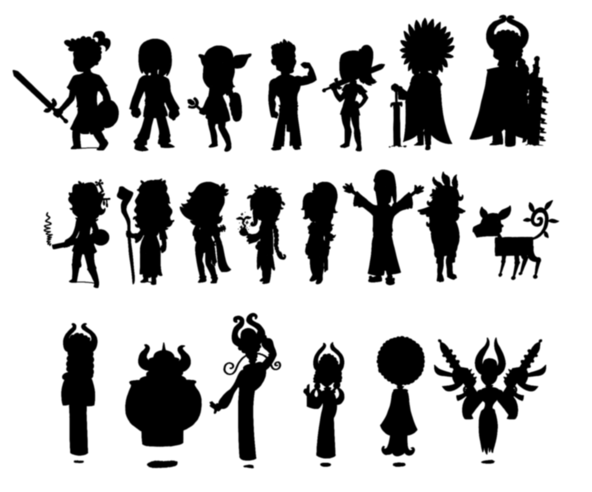
Oh, first, a while back I included this sheet of silhouetted characters, which I intended to reveal one by one in the build up to the demo release to build hype:
![]()
I haven't forgotten about or changed my mind about that, but it presents a bit of a conundrum. I've already posted gifs of the models I've made on Twitter because I want to keep up interest in the project, and being able to post those does give me a goal every day (even if they only end up with like ten likes), but of course I can hardly do any kind of ~grand exciting reveal~ for any of them later if I've already released them now!
I think with the remaining character models, I might just colour them pitch black for their 3D turntable gifs, until I reveal their silhouettes eventually. Maybe. It shouldn't be
too long until I start doing that. I could also 'reveal' these four characters when I do that anyway since I've got posts written about each of things like their creative origins etc, which could be interesting even if you know what they look like.
Anyway. The Dreamcave section of the game that I'm working on for the demo is based on the Gem Mine section from MARDEK 2. In that, recruits from the 'Royal Guard' - the name for trainees of the 'Royal Knights' - explored the mine in split-up duos, with Mardek, Deugan, Emela and Steele teaming up to battle Muriance at the end. In this, the 'Royal Knights' are now the 'Seraphim', and their trainees are the 'Cherubim'. Like the Royal Guard, the Cherubim wear matching uniforms, though rather than the oh-so-fetching vomit green and metal codpieces look, they're blue tunics with wings on the shoulders. Donovan and Sharla have been completely cut from the story because they're not interesting enough to keep, so now Mardek, Deugan, Emeela, and Steele are the only Cherubim on this mission, and it seemed more interesting for them to just stick together as a group rather than splitting into pairs. They do still split up at some point in this chapter, but for different reasons to MARDEK 2.
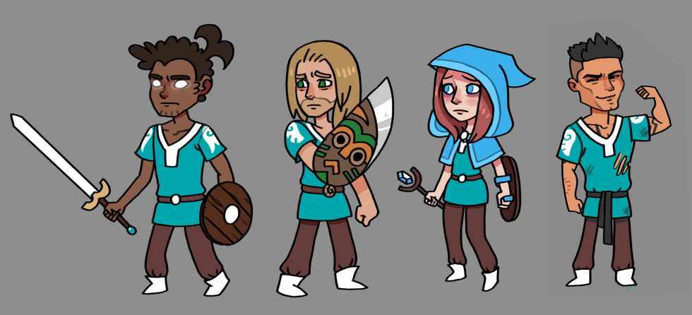
So I needed to make Cherub versions of each of those four characters. Here's the concept art from late December 2019:
![]()
I
think I've shown those drawings of Mardek, Deugan, and Emeela before, though maybe just on Twitter? I can't remember! I think the Steele one's 'new' though. My art's fairly meh in general, but I like how that one turned out. His Chadly face amuses me.
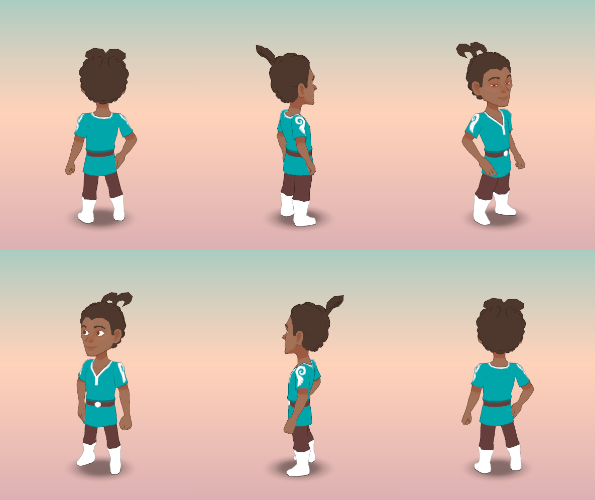
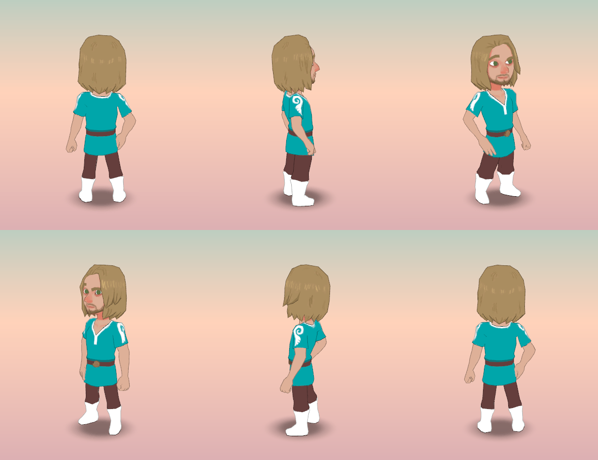
I already had models for Mardek and Deugan - they're included in previous posts - so making cherub uniforms for both of those only took about an hour in total. Especially since I essentially just copied-and-pasted the outfit from one to the other. I've thought a few times that it'd be great to have completely unique models for everyone, with subtly varied proportions to really add to the uniqueness and character, but I doubt most people would notice or care so it's just not worth the effort. I'm planning to have all the human(oid) characters inherit from the same base rigs and models (a male one, and a female one which is itself a variation of that male one), though their individual animations will be different. There's just no point doing the same job multiple times, and this is standard for 3D development anyway.
![]()
![]()
Well, I said they'll have unique animations, but Mardek and Deugan are in the same (unmoving) pose here since I've not devoted time to animation for any of these characters yet. Annoying, but one thing at a time!
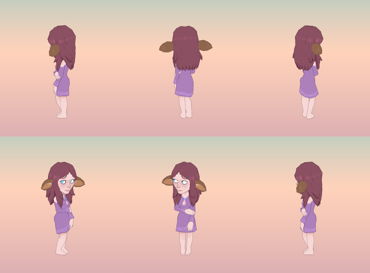
Next, the first female character added to this game, Emeela. Though her 'casual' appearance won't be seen in this episode/demo, I wanted to make it first since it felt strange to make it a variation of the Cherub model rather than vice versa.
![]()
I really like how this turned out for the most part! She really looks like who this character's supposed to be, at least in my mind, though I know someone who's just played MARDEK would have their own conception of her based on that rather than the years of development that came after it, for things like Taming Dreams, where I revised her character a bit. Like in Taming Dreams, she's of the 'Meek' race here (most of the other characters are 'Bold'), and as such has these deer ears and paler skin.
It got a notably quiet response on Twitter though, less than I was expecting, which made me insecurely wonder about the reasons for that. I could speculate here, but I've done enough of that in my head. It is what it is.
In previous designs and the concept I have for her from December, she's wearing a blue skirt and a lavender top, but I made it into a long dress here for a couple of reasons. One's mostly technical; it was just easier to model this way! But I also like the simplicity of it, since it looks elegant and priestess-ly but no-nonsense. She's spent most of her life sequestered away under a lake, so I imagined her being most comfortable wearing something easy to put on and sit around in without being aware of how it might be perceived by others.
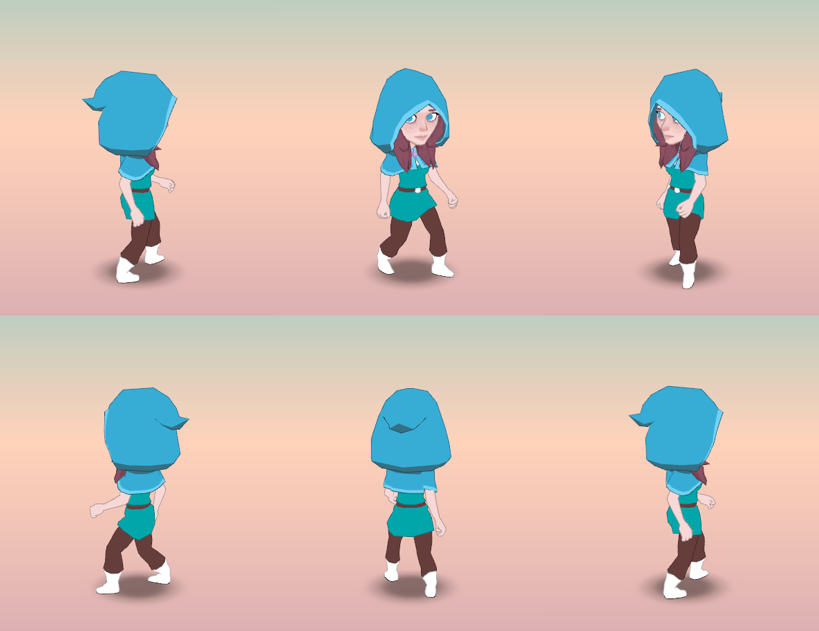
Here's her as a cherub:
![]()
She wears a hood to cover the deer ears, since Meek aren't ever really seen in the Bronze Archipelago and she doesn't want to be seen as a freak for having them. Character stuff, which I find interesting to explore even though JRPGs typically have bands of armed-to-the-teeth bizarrely-clad monster-people wandering around rifling through commoners' underwear drawers while they look on without comment.
As a side note, I've drawn her with this hood a bunch of times since I came up with it for Taming Dreams years ago, but I could never really wrap my head around the exact
form of it - or hoods in general - until I made this. The same goes for the hoods of the Governance de Magi - and their newer incarnations as the Magisterium - so this was quite valuable to make! I've learned a lot about the forms of thing in general by making 3D versions of them.
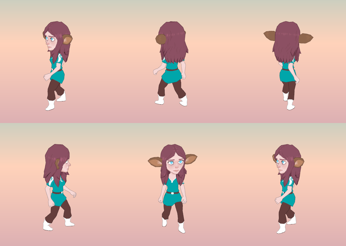
Because of how the models are set up, it's possible to 'unequip' that hood to reveal her 'normal' hair while retaining the cherub outfit:
![]()
I could easily have every piece of equipment dynamically alter characters' models, but I chose not to because I feel it reduces the visual character and makes everyone more homogeneous. It's a decision I made in MARDEK, too; I'd made games before it (eg Deliverance) with full character customisation, but it felt wrong in such a story-and-character-driven experience.
I'm planning for characters to be able to change parts of their appearance, but rarely, and often they'd be locked into one for story reasons (eg Mardek being unable to take of his helmet once he starts wearing one). So - like with what I said about weapons in a previous post - hopefully each appearance change would feel quite significant.
I'm unsure about Emeela's hair here. There are some spiky tufts at the ends to add a bit of visual interest, but I can't decide if it's having that effect or if it's making her look too wild and dishevelled. Hmm.
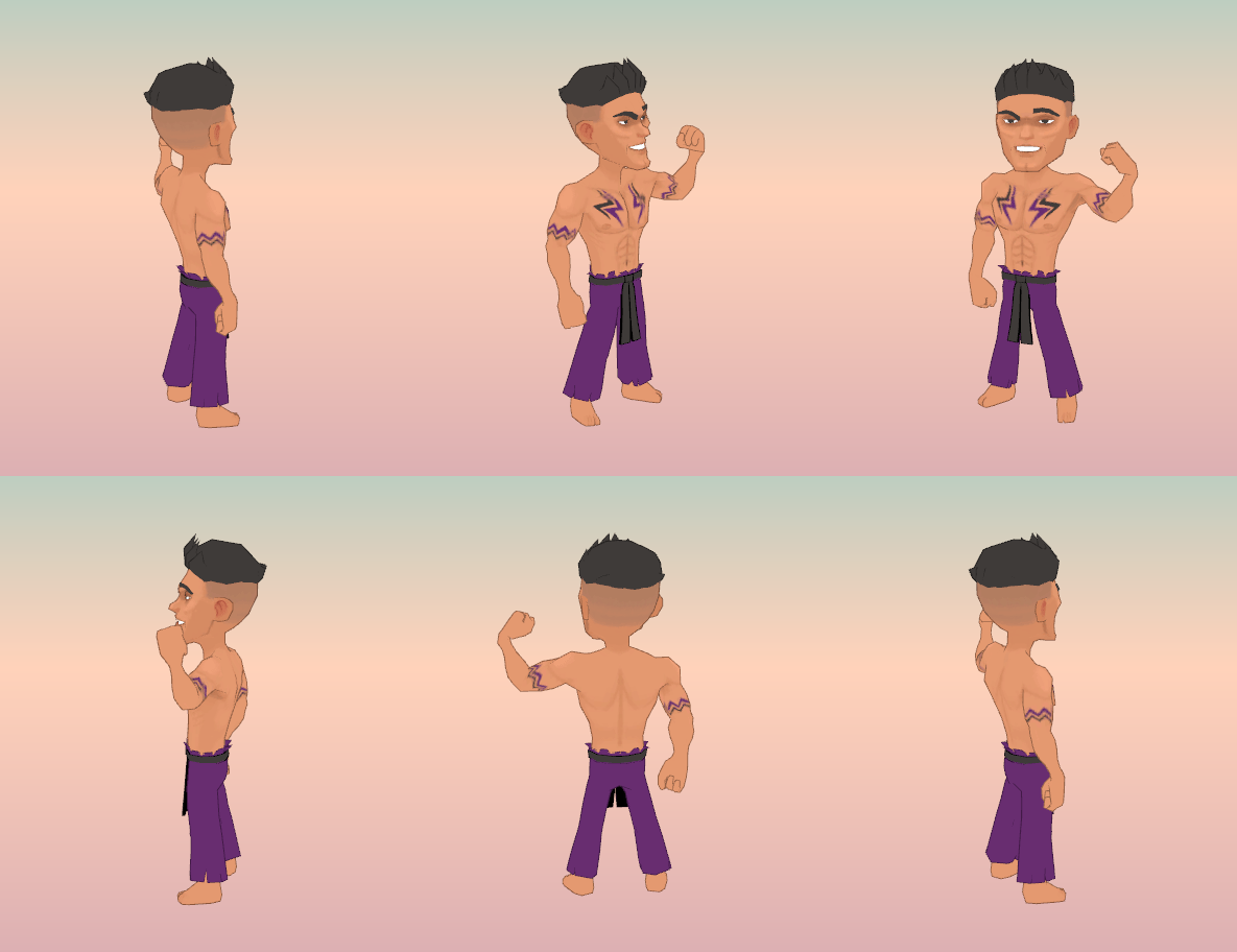
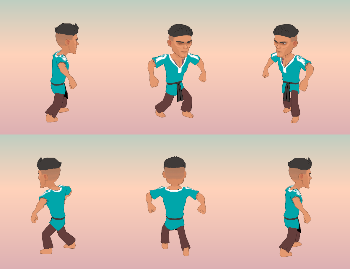
Next up is everyone's [PROFANITY]in' favourite character, Steele!
![]()
Steel was a complete monster in MARDEK, with no redeemable qualities and barely any personality. In Taming Dreams, I gave him more personality and plot significance, by for example having him replace Mugbert in the intro childhood scenes. I've built on that even further this time to make him at least a slightly more interesting and less completely repulsive character. I'd say more, but I don't want to spoil the story before you get a chance to experience it directly!
The term 'Chad' wasn't around when I made MARDEK, but now that it is it's a fitting descriptor for the kind of appearance I was going for here. It's nothing new, of course; often it's the wimpy, 'beta' guys (like me) who get into creative pursuits, and they end up drawing upon the sorts of macho guys who bullied them in school - or at least got all the girls while they remained alone - as inspirations for (usually) villains. The Disney character Gaston comes to mind. I wonder how it'd be perceived in the current cultural climate of 'toxic masculinity' and such, but we'll see.
His element is Destruction, hence the lightning tattoos. There's a concept I explored for a few years where people in Alora Fane had two coloured band tattoos on their biceps to mark their lineage (one from each parent), and while I'm not doing that anymore, the arm tattoos that he has here are reminiscent of it. I also find it amusing thinking that the ones on his chest are an S for Steele, like Mardek's M motif. His pants are purple because his appearance in MARDEK 3 was purple (or rather, the completely unrelated 'Mystery Man' character was, and here it's completely arbitrary since those characters had nothing to do with one another, I wonder who he was, hmmmmm). He's topless because I found it funny, plus he's a narcissistic fist fighter so it's not like it doesn't fit.
I wonder how dated this hairstyle will be in ten years!
While I'm using the same base model as a general rule, this one's actually a buffer variant which required rig adjustments like a longer chest, wider shoulders, and bigger hands. How interesting.
Here's his cherub variant:
![]()
He had this cocky, aggressive,
silly wide-armed stance in MARDEK, which - from what I can remember - was born of a desire to give everyone distinct body language so then they could be recognised even if you encountered them in a hooded robe (like a scene in Kingdom Hearts 2 where you encounter Riku in an Organisation XIII robe, and it's obviously him because of his stance).
I really like this image comparing the new Cherubim to the old Royal Guard (and based on the Twitter response, other people did too):
![]()
I think that image is probably the best one I've got so far that demonstrates what I'm trying to do in a nutshell. The characters are more varied, more emotive, more vibrant, but they're still essentially the same characters (though you'd have a hard time telling with Mardek). It's like the old, just
better in so many ways.
Also, I know that the stylised proportions I'm using for these characters won't be everyone's cup of tea. I didn't know anything about human proportions when I made the originals, but they turned out not-too-unrealistic anyway, somehow. I
do know about proportions now, but I deliberately chose specific exaggerations with the 3D models to create a stylised effect. Personally I really love how they turned out - I greatly prefer this style over AAA realism - so I hope you like them too! They're fun to make, and don't take as long as something more complex, but they don't look like super blocky Minecraft-style barely-human figures like I see in some indie games. So yes. Good. I like. Am proud.
![]()
I talked about monsters - and included concept art - in the previous post. I wanted to make all seven (boss included) for this dungeon this week, but I only managed three, which is better than nothing!
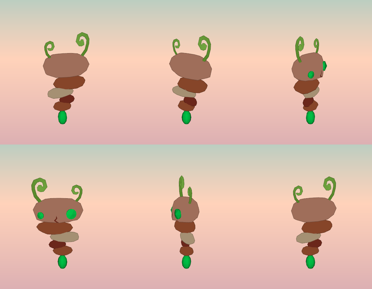
I started with Stratapillar, since it seemed the easiest:
![]()
It's...
fiiiine, though it doesn't look quite as I'd like. I need to decide what to do about the shaders (code things that determine how objects are rendered; complicated stuff I had no idea about just a couple of years ago); ideally I want the eyes and the bottom stone to look like gemstones (the eyes faceted, the bottom one smooth), so I'll probably need to play around with that. I also need to make some decisions about the visual style of the game as a whole and how it relates to texturing things like this. Do I paint a stony texture, or leave it with just flat colouring? I'm going with flat colouring for the most part on everything else, but I've shaded parts of the characters like their faces since it looks too weird otherwise. Decisions, decisions.
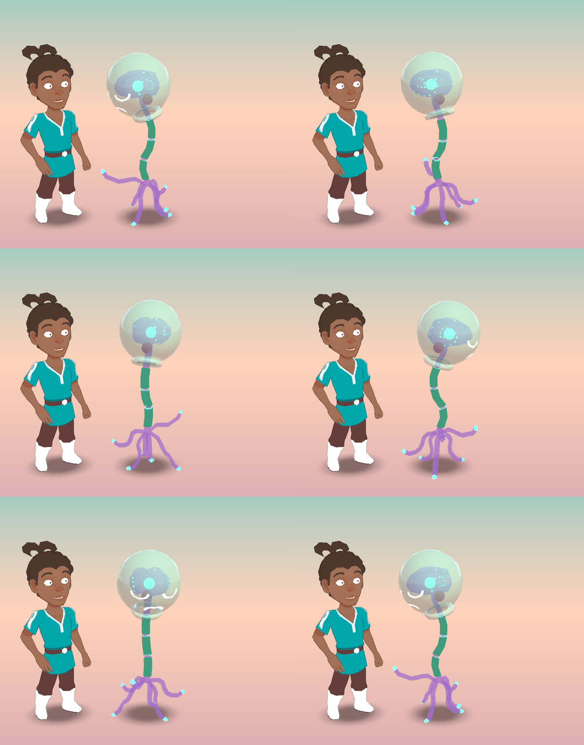
Next, Neuronaut (with Mardek as a size comparison):
![]()
Again, shader stuff remains to be figured out here. You might notice that Mardek has an outline, which isn't a trivial thing to do in 3D, and I don't think I can get the system I'm already using working with transparent models, which this Neuronaut very much is. I've been meaning to look into a different, improved outlining method anyway, though it's quite an undertaking so I'll need to find the time for that when there aren't more important things to focus on.
(There's also some weird subtle rendering issues with this that I don't fully understand, but WHATEVER!)
It does look like the concept art though, so it is what it's supposed to be! It never gets old seeing my 2D drawings turned into 3D models like this.
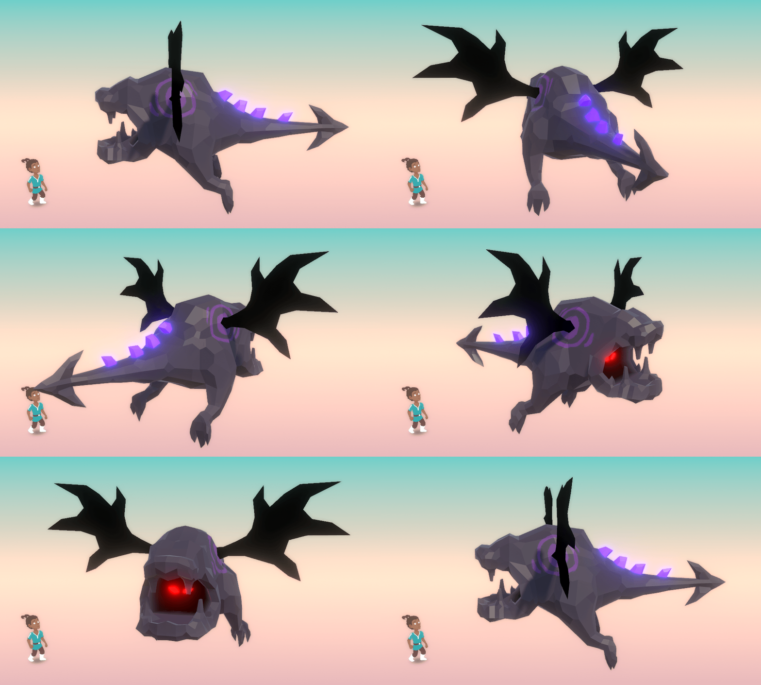
Interestingly, this next one took less time to make than that (though I still managed to make both on the same day):
![]()
This one's called Cayvern, a combination of cavern + wyvern + cave. Originally designed as 'Cavamp' and imagined as something that'd appear in groups like swarms of annoying bats, it seemed more interesting to make it huge and dragon-based like this. Like actual caves you could get lost in. I can easily imagine it using a skill called 'Bat Breath', where it vomits out a cloud of black bats to damage the entire party, like a combination of what dragons and caves do.
Apart from a few scattered early experiences, I've only really been modelling for a couple of years or so, and at first I was so unsure of everything. Making anything felt like a mind-bending puzzle, and the results were always very poor. I was concerned about that when it came to making monster models; I've managed to get better at modelling humans through many repeated attempts, but these body types are novel so I really have to work out how to tackle them based only on my own judgement.
So it was really satisfying to make these without too much trouble, and to get exactly the results I was aiming for with a few flairs (eg nice topography) that allow me to say I'm really quite proud of the results! Obviously they're not going to compare to something a team of professionals spent six weeks on, but considering I'm doing everything myself in less than a day, I'd say they're definitely passable. Hopefully the sight of them doesn't make you vomit in disgusted rage
too much!!
![]()
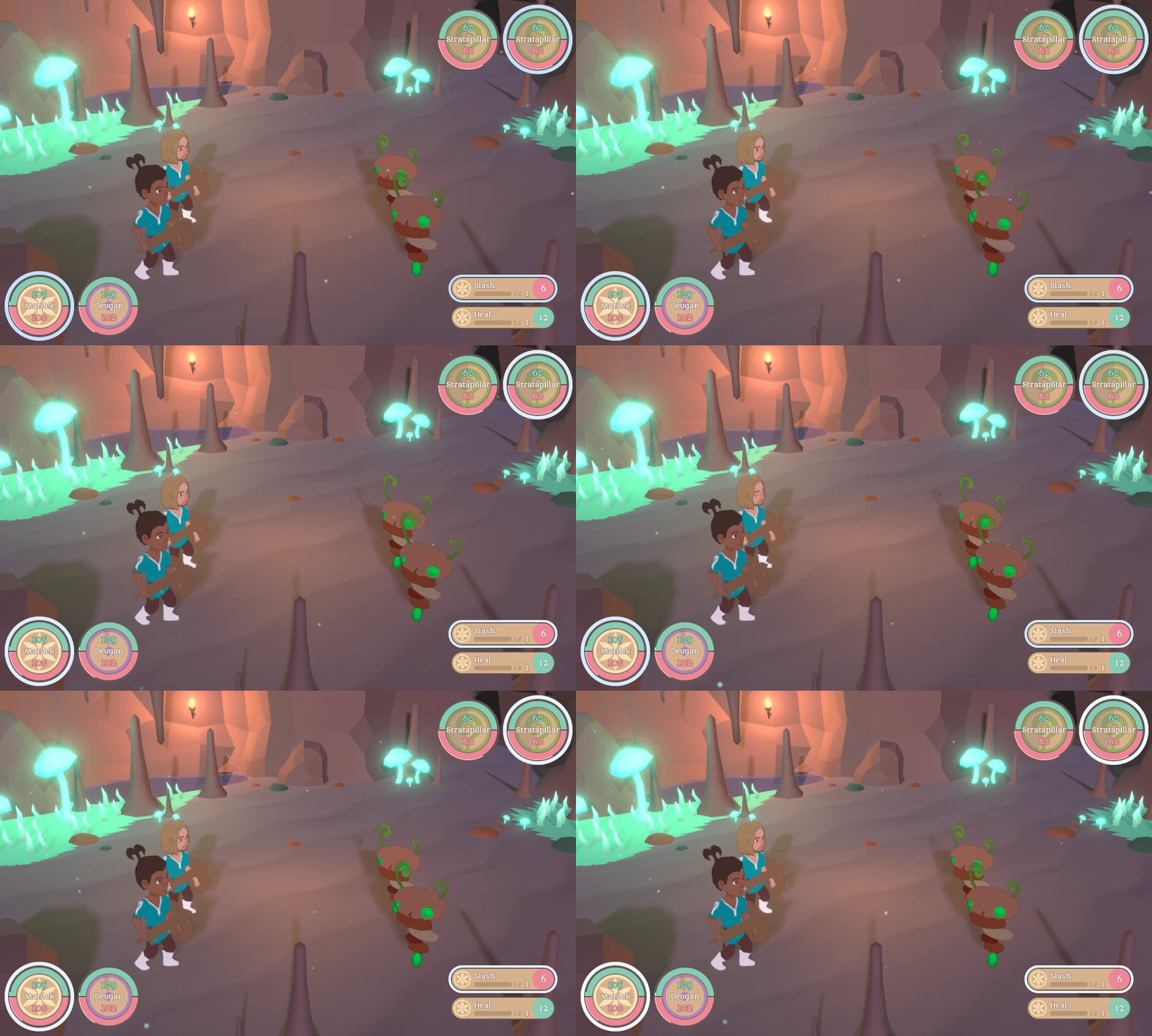
Finally, I needed an arena to battle these things in; previously I just had a placeholder green plane. So, long story short, I made this:
![]()
It definitely makes the battles feel so much more like they're part of an actual game!
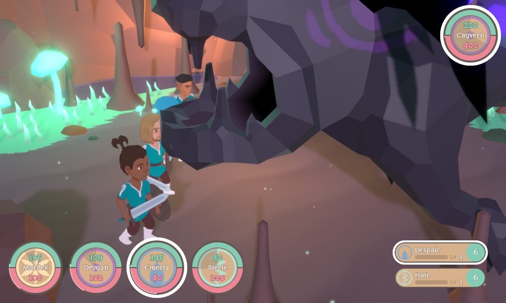
However, here's what happened when I tried to set that huge Cayvern as an opponent:
![]()
HMMMM.
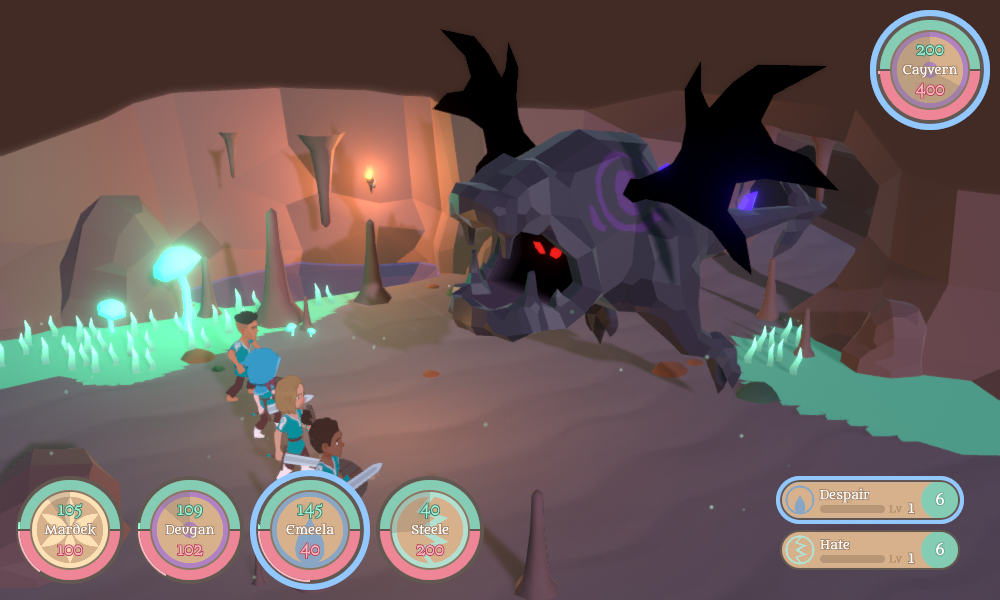
In MARDEK, battles had several possible arrangements for the enemies, so big bosses spawned in a different position to enemies that appeared in groups. I'll need to do something similar in this. Something like this:
![]()
But as you can see here, the backdrop that I made cuts off. It was designed around the fixed camera - there wouldn't be any point modelling bits you wouldn't even be able to see - but different camera angles mean I'll probably need to expand it.
I'm not sure what other, similar games do with regards to this though. Do they make their battle arenas circular, so you'd always be able to see modelled scenery no matter what angle the camera pointed? Or do they have three 'walls', so some change of angles would reveal previously unseen geometry, but there's still a big chunk that's not modelled since it'd never be seen? I've tried to look at videos of other games to get an idea, and to look for ripped models, but it's still not clear to me. I'll need to experiment, probably.
![]()
I was going to keep going with the modelling until I get all the ~20 done, but I think I'll leave this for now and spend the next week animating what I've got (they don't have any animations yet), and getting to a point where they all have skills I can have some battles with. That'll mean a focus on mechanics next week, so that's what the next post is likely to be about!



14