Log In or Create Account
Back to Blog
PERSONAL

13

2,184
Dhelmise Is Totally From Alora Fane
4 years ago - Edited 4 years ago343 words
This Pokemon's design is weirdly similar to stuff I make!


This is a fairly random post! I've been playing the Pokemon Sword/Shield Isle of Armor expansion recently (I don't think I've talked about that game on here? I like it), and instead of using the same Gen VIII team I had for the main game, I decided to train up six of my (available) favourites from previous generations.

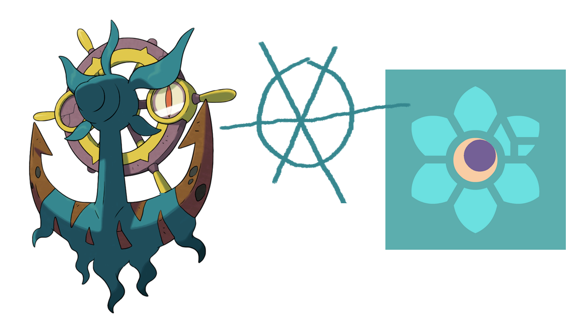
One of them was Dhelmise, which I've loved since I first saw it in Sun because of how strange it is. Its body is essentially a clump of algae; the (surprisingly huge) anchor is just a prop it's clinging to, hence its weird Ghost/Grass typing with an ability that empowers its Steel moves. I love things like that. As a whole, though, it looks like a grinning pirate's face, with fangs, a beard, an eyepatch, angry eyebrows, and a demonic eye, all from a flotsam-and-jetsam-style hodgepodge of nautical paraphernalia which is essentially a ghost ship in an abstract nutshell.

So I've loved it for those reasons from the beginning, but while using my latest one, I noticed some strange, striking parallels between its multi-layered design and my own creations. It's primarily teal (my favourite colour!), with a six-pronged circle as a motif - seen both in the grassy bit and the ship's wheel - just like Alora Fane's aster symbol. In addition to that, I've been using the colours purple and yellow heavily in recent work - I've recently been wondering whether to incorporate both into the Alora Fane icon, as seen here - and Dhelmise's wheel uses both of these colours! How strange!

I can't imagine that noticing a Pokemon design has strange parallels to important recurring motifs in your creative body of work is a totally relatable experience or anything, but it felt weird enough that I wanted to say something about it!

Obviously Dhelmise is a terrible design compared to, say, the creative masterpiece that is Nidoking though, because Pokemon's really gone down hill over the years.

13 COMMENTS

Slothboy2531~4Y
This Pokemon's wheel has six spokes, and it's teal, AND it incorporates purple and yellow? Why, it's like they've been reading your mind and copying your thoughts ;) Maybe it's more to do with those things being strongly on your mind at the moment, that's not something where I'd directly think "Oh, that Pokemon reminds me of Alora Fane!" Also, isn't that grassy bit five-pronged?

The purple in the Alora Fane logo would make it look a bit creepy imo, looks a bit like an eye.
2
Tobias 1115~4Y
I don't mean it like some weird conspiracy or something if it came across that way; I just thought it was a funny coincidence!

The sixth prong of the grassy bit would be the main part of the anchor!

And the dark bit in the logo concept is supposed to look like an eye, though I'm not happy enough with it to use it.
2
Natrythe2nd2~4Y
Finally some recognises the perfection that is Nidoking! Since I haven't played the new Pokemon, may I ask how the difficulty is in gen VIII and the isle? I figured with mandatory Exp Share it would be a real snooze cruise unless you jumped through hoops to create some difficulty.
2
Tobias 1115~4Y
Difficult isn't something I've ever thought about when playing Pokemon games, really! I'm not interested in the competitive battling side of things, so I don't know how it is with that mentality. I didn't struggle at all with a very mediocre team, but I like that I can choose Pokemon based on looks rather strength!
2
Maniafig222~4Y
See, Impidimp and Sableye are Goblins, and I use Goblins a lot in my quests. Truly, it must have been destiny.

And now I want to see Impidimp and Sableye in the AF:C artstyle!!

I've yet to play a gen 7 game, but Dhelmise is something I'd consider putting on my team. I do think it's weird that after 5 generations of no Grass/Ghost types we've gone to having three families of them in two more generations.

But yes, it's a Pokémon based on an object rather than a vague kaiju or a bird or a dog so it's BAD.

The purple and yellow in the Nexus looks like a crescent moon to me!
2
Tobias 1115~4Y
I've been wondering since posting this whether it looks like I'm saying something as tenuously paranoid as that, but I do think the weirdly specific similarities here are remarkable! Maybe it's just me being literally insane though.

It's supposed to look like both a crescent moon and an eye (looking up, thinking or dreaming, but also at Fracture), though Alora Fane doesn't even have a moon so it doesn't really make sense!
2
Ampersand68~4Y
This isn't related to anything, but remember to set a discount on MARDEK! The Steam Summer Sale has begun!
1
Tobias 1115~4Y
Damn, I just tried, and it told me I can't set a discount 'this close to [my] release'. I don't know if that means it's because it's not been out long enough, or because the sale's already started. Thanks for reminding me though!
1
Ampersand68~4Y
Aw, that sucks. Always next sale!
0
Violet5~4Y
"the creative masterpiece that is Nidoking"

Woah woah, are we questioning the genius that is Generation 1 pokemon design? It's not like the later games where they ruined pokemon by basing them off of random objects. Never mind the angry pokeball or the literal pile of sludge.
1
Ptyrell37~4Y
TIL the Pokemon designers played Mardek.
1
kidupiscean37~3Y
Just discovered that the Pokemon blog tag is displayed as "Pokémon" on your website. Maniafig's comment above has a similar issue.

Not sure if you can read my sentence above correctly, so here are some Google results on the issue for your reference:
[LINK]
1
Tobias 1115~3Y
I've been aware of this for ages and know what I'd need to do to fix it, but it's one of those little things that's inconsequential enough that I can't be bothered! Maybe I'll try to remember it for if I'm already doing other stuff with the site's code.
1
Log in to comment!