GAMES
2,581
Bravely Default II - First Impressions, Comparisons with Atonal Dreams
5 years ago - Edited 5 years ago
I've just played about 50 minutes of this game, and I want to write out some thoughts about how some design aspects compare to Atonal Dreams.
I must have spent hundreds of hours on Bravely Default and Bravely Second years ago, but I can barely remember them. They were enjoyable enough, I suppose, and I still occasionally listen to some of their music, but I don't recall them having compelling stories or characters or anything. They were just fairly forgettable RPG fare; acceptable, a distraction. That's pretty much what I was and am expecting from this newest entry in the series.
I'm still in the intro, but so far that's the impression I'm getting. Characters have talked among each other, but I don't know or really care who any of them are.
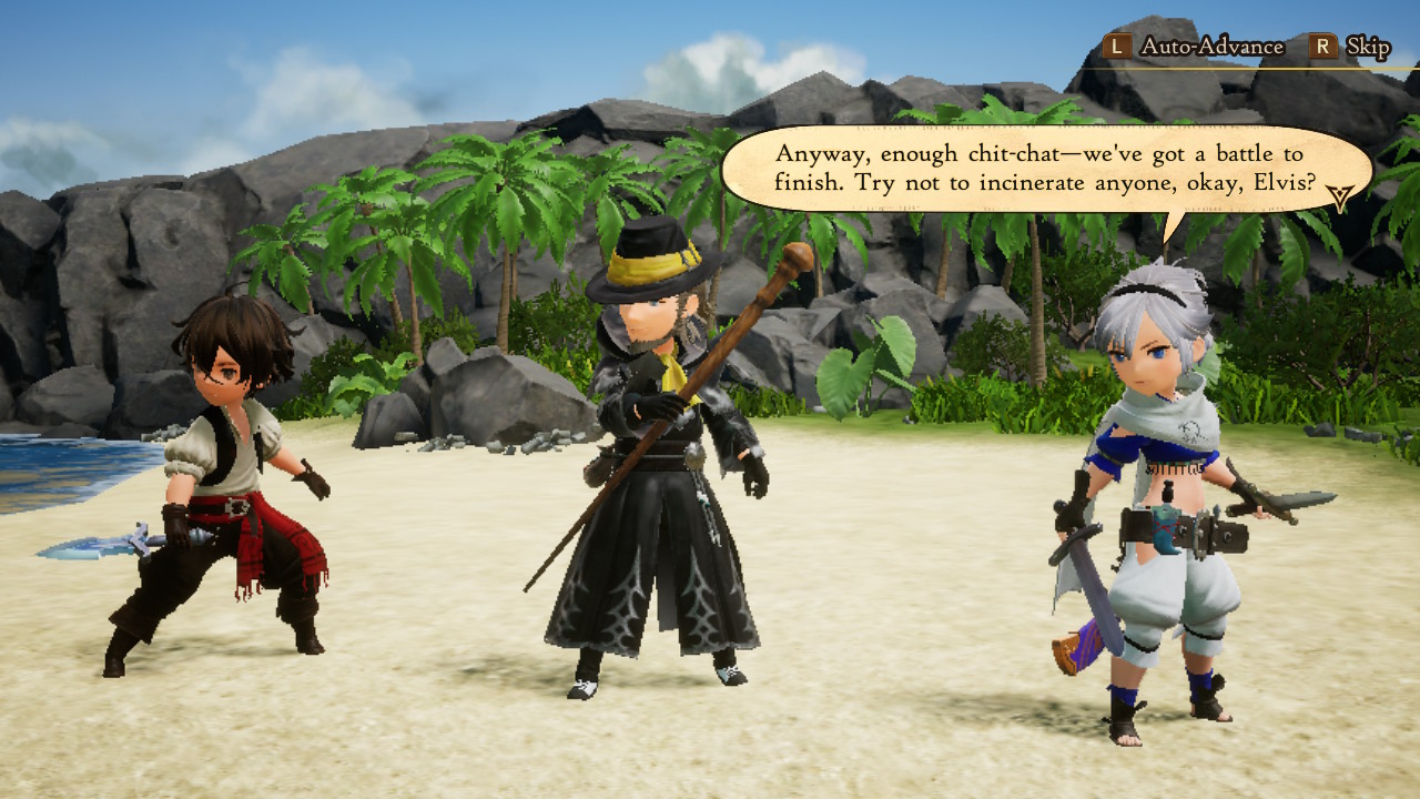
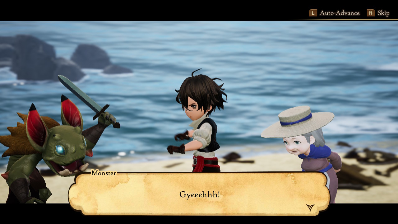
The characters I'm assuming are the main protagonists all just kind of met up for no reason and now are travelling together without even clearly deciding on that? The bland standard anime-esque guy wandered to a beach for reasons I lost track of, then the other two just randomly showed up to help him in a battle and... that's how friendships form, apparently?
![]()
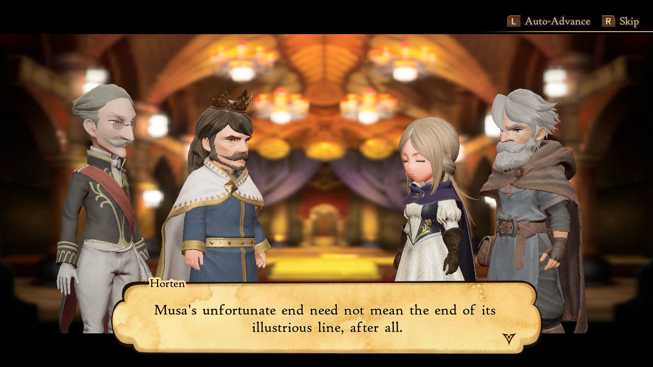
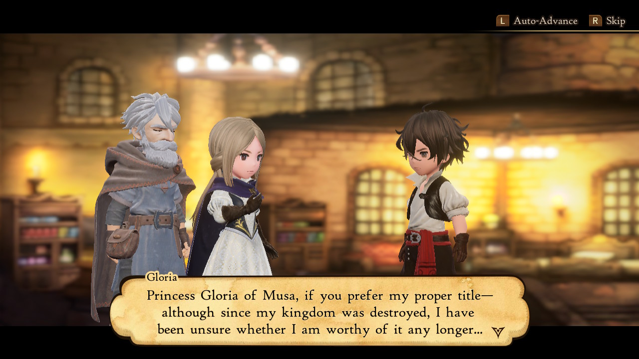
There have also been scenes with other characters talking about what feels like wider-picture stuff - politics etc - that I feel never works well before the player has had a chance to familiarise themselves with the world. For example, this scene dragged on because I had no reason to care about what they were talking about; I hadn't even got a chance to really roam around yet.
![]()
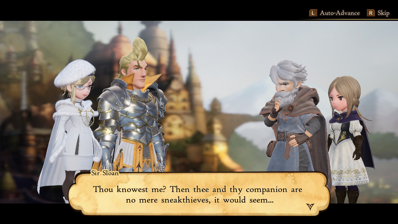
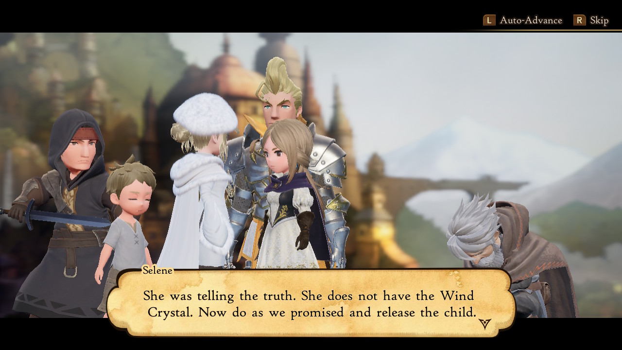
These characters started talking out of nowhere about I'm-not-sure-what; it turned violent and involved a hostage or something, I don't know. The design of this inexplicably Australian blonde Bartholio guy amused me though!
![]()
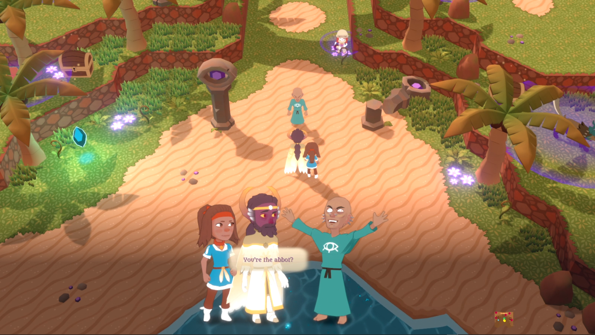
With Atonal Dreams, I've tried to focus the start on a tiny number of characters - just Savitr, Collie, and Pierce - and while they mention some other stuff outside their immediate mission, mostly what they say establishes personality traits or their personal stories. Here, I've watched a lot of characters talking but feel like I've absorbed very little of it. Makes me wonder though whether Atonal Dreams will feel just as hard to follow to players; perhaps the only reason it doesn't to me is because I know a lot of backstory details.
![]()
I wanted to comment about some details of the presentation of those dialogue scenes, since they're similar to the ones in Atonal Dreams.
![]()
I've put a lot of thought into how the characters emote in those, and it's interesting seeing what's similar or different in this game's approach to it.
For one thing, BDII's dialogue scenes fill the screen, and they seem to play like cutscenes, as distinct events, rather than just being a conversation system that's summoned up by talking to an NPC on the field. They use a single blurred image as the background, the characters' feet are hidden, and there's a single dialogue box shared by everyone.
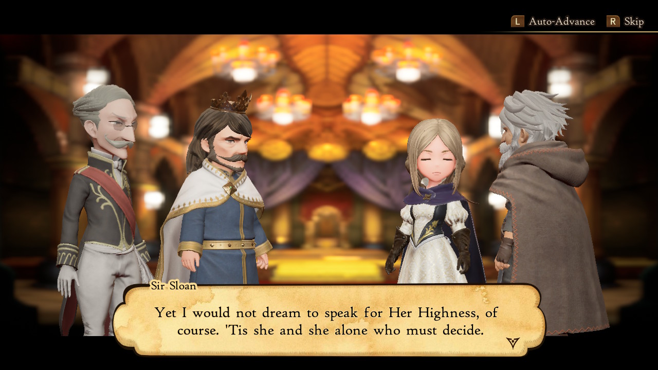
In my system, the characters are locked into one of eight 'slots', four per 'side'. BDII's allows characters to walk off screen, or overlap, like this:
![]()
So I suppose that's more versatile. Blonde Bartholio here also had an animation where he punched Grey Savitr in a way that made contact, which I found remarkable since it's tricky to get models to interact directly like that, though I suppose animations like that aren't going to be common.
Like in my system, this one allows characters to play emote animations for different dialogue lines. In mine, each line has a list of associated emotes, meaning those emotes can only change when the line changes. Here, the animations seem to be able to trigger mid-line, though the lines are also generally longer.
Some of the facial emotes seem odd to me, like the characters lack situational awareness of the others in the scene. For example, if you look at the Atonal Dreams screenshot there, both Collie and Savitr are - I think - obviously looking at Pierce, but would you say these two are looking at each other here? To me it looks like they're staring unfocusedly into space.
![]()
All characters seem to close their eyes occasionally as if they're all narcoleptic, and I've noticed that the talking mouth movements often stop before the voiced line ends.
Due to the art style used in this and the previous games in the series, most of the characters have this flat, almost vacant expression on their faces at all times, whereas I was trying to allow for cartoonish variety. I've noticed some changes in their faces, but they're subtle.
In these scene, this guy turned to face the background, which seemed weird to me:
![]()
Little things that I'm only noticing because I'm comparing to my own efforts!
I like the character proportions, and the variety of facial structures between the male characters. The female ones mostly have the standard round neotenous face though for the same reason
∞ that's the case in a lot of media ∞.
![]()
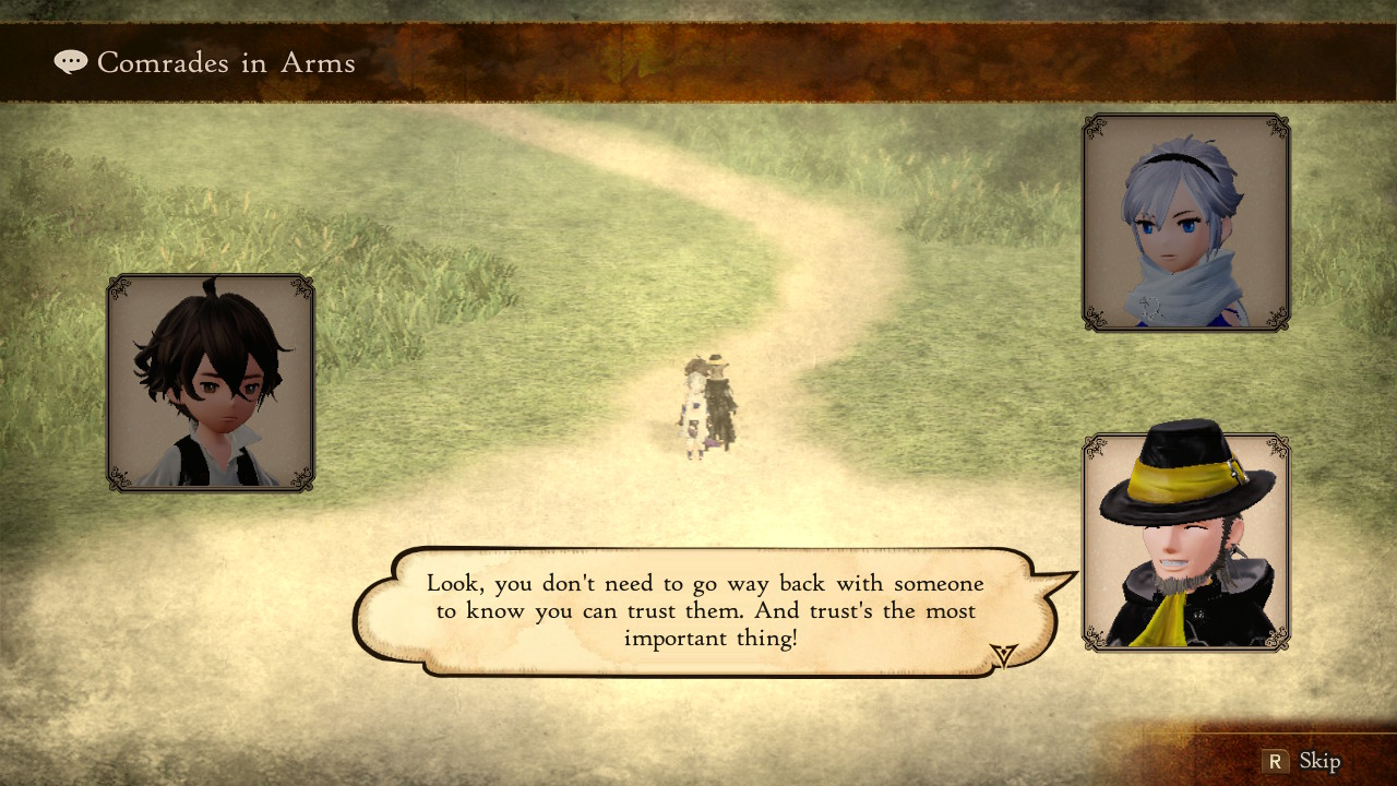
There are these optional party dialogue scenes that the other games in the series also had, but for whatever reason they use a layout like this:
![]()
I think that's consistent with the others - though I haven't played them in years, so I've forgotten - but I wonder why they didn't just reuse the full-body scenes for these. Seems like wasted potential to me.
![]()
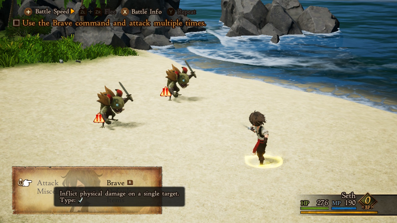
I've only had one battle so far, though I did notice some things:
![]()
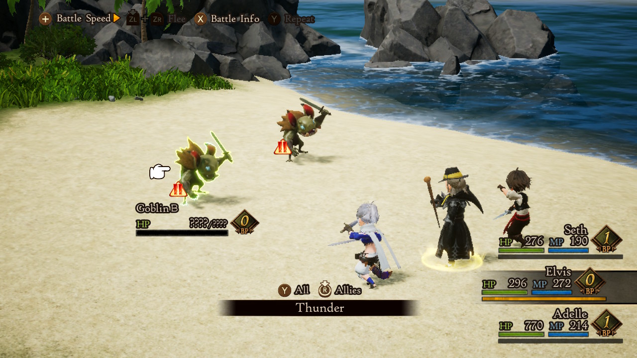
I'm impressed by this interpretation of a generic goblin monster! And who doesn't like goblins??
The battles seem to change between fixed camera positions (contrasting with Atonal Dreams', which is usually moving in some way). This seems to be the choosing-actions view, which feels very traditional and pleasing, but which I wouldn't want to use myself because you can't see the characters' faces.
![]()
The cursored-over monster has a rainbow-shifting outline, which I like!
![]()
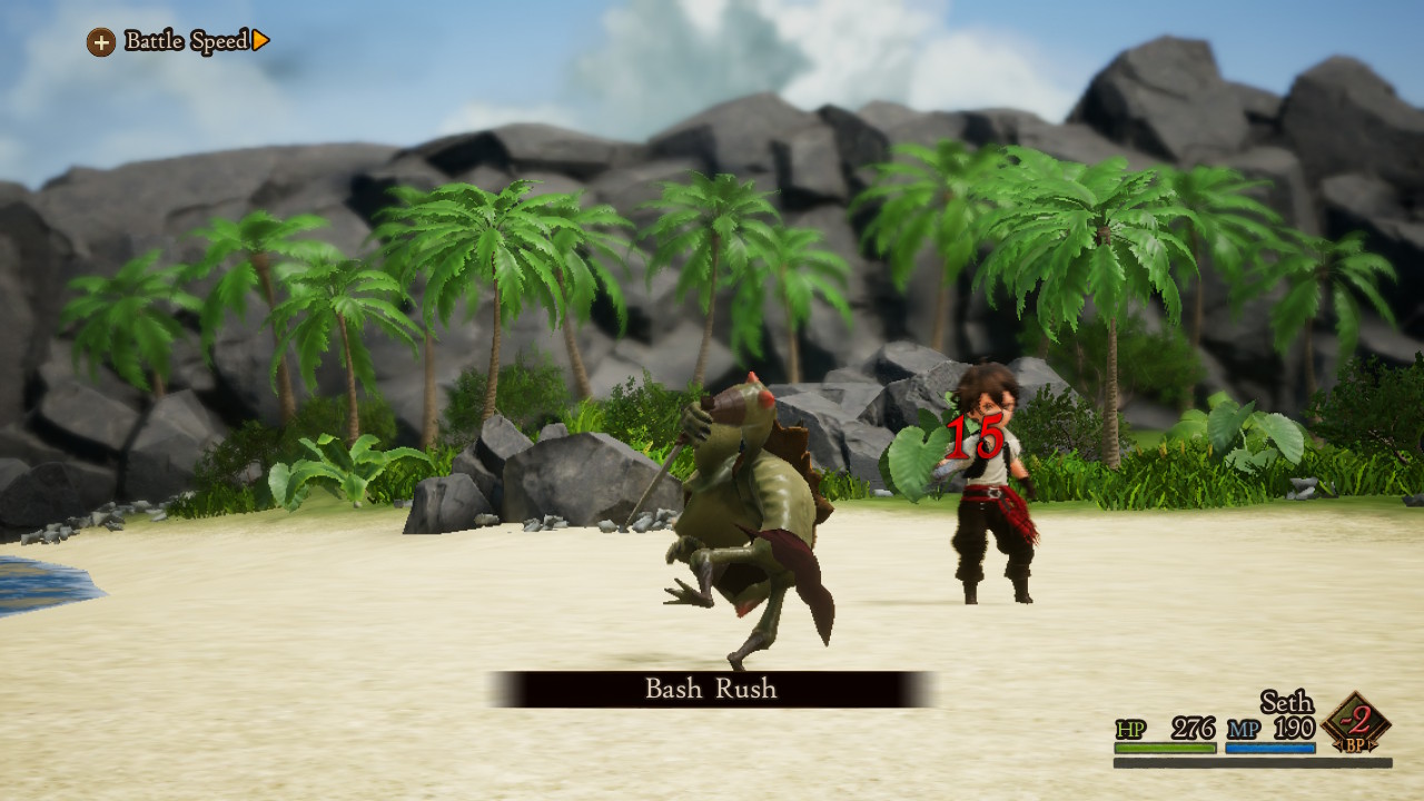
When a monster attacks, it shows the monster in isolation from behind as it animates. A great way of avoiding clutter and focusing on what matters at the moment. The positions of the monsters seem to be shuffled around for this to work, whereas I'm using fixed arena positions for each combatant.
![]()
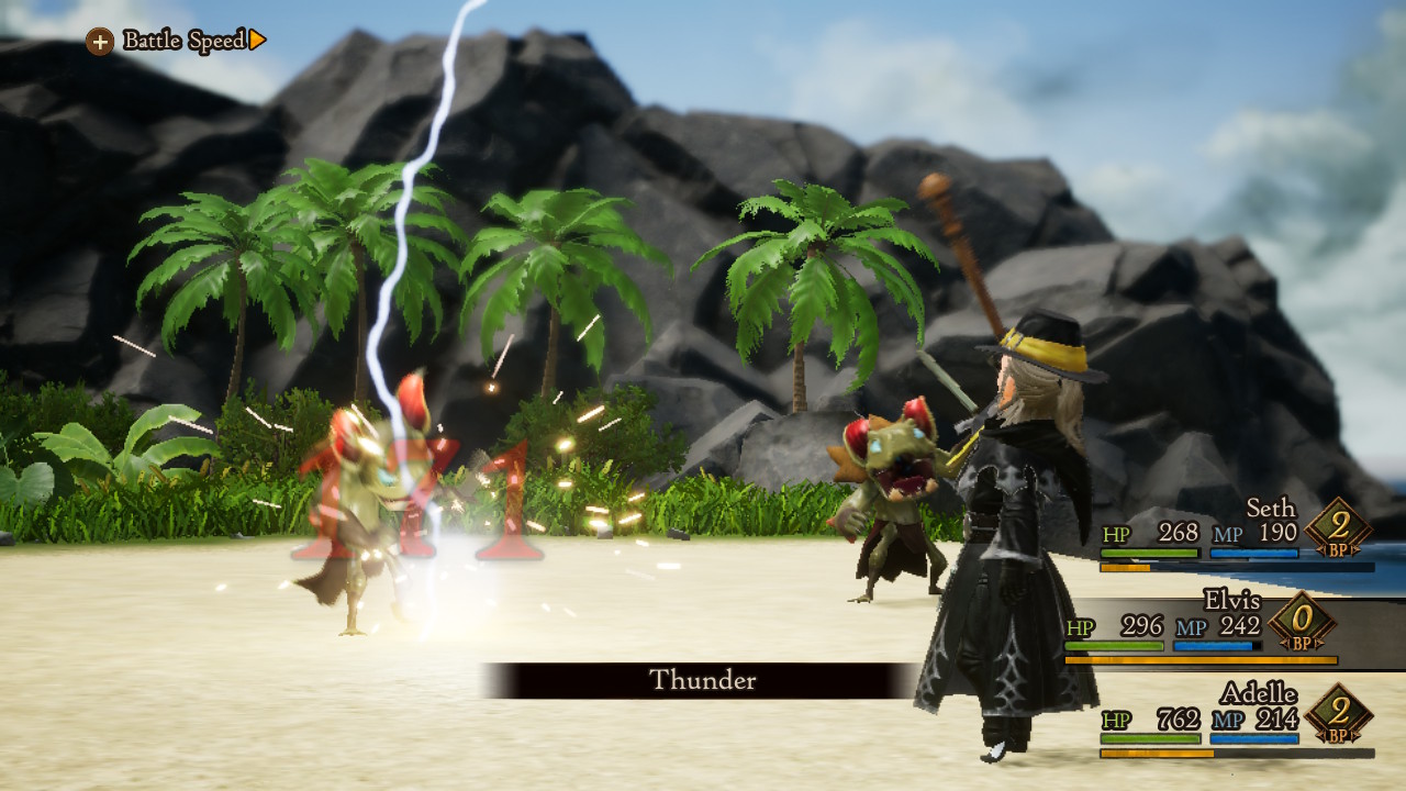
It seems to be similar when a character attacks; just the attacker is shown, but all enemies are.
I also notice that there's a battle speed thing there, though I haven't touched it yet. Worth noting since people mentioned this a while back, and I couldn't remember ever seeing such a thing outside plotless mobile games. Maybe the others in the series did though and I've just forgotten.
I've also been noticing in games recently that showing the buttons you have to press as a consistent part of the UI is the norm.
![]()
I don't like this! The black info box explaining the currently-selected option, I mean; it covers up most of the other options! I would have put it above that box or something, though is this information really necessary here? Maybe it's only here for this first battle though, I don't know yet.
![]()
Everything else seems like fairly straightforward and familiar JRPG stuff, which I've not explored much of yet but I can't imagine I'll be either frustrated or excited about.
![]()
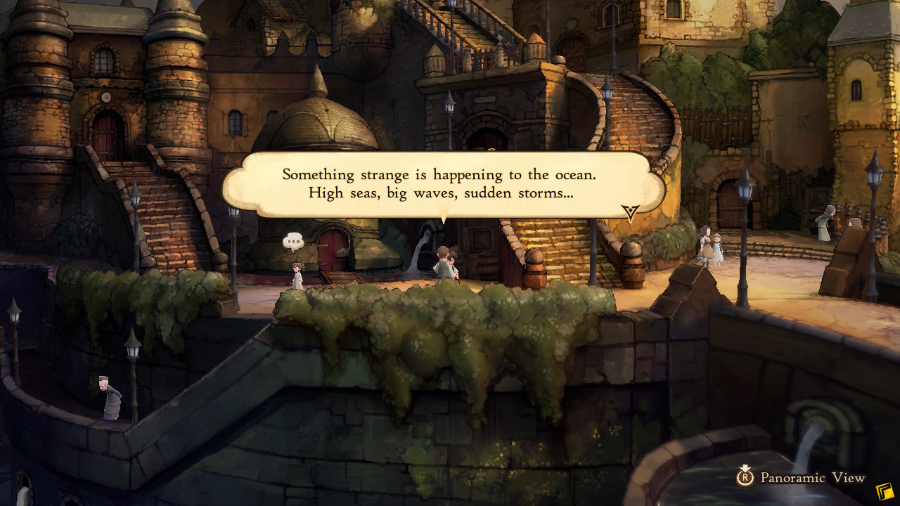
I find the graphical style of the towns interesting; it's difficult to tell what's a flat painting and what's a 3D model with a painty texture. Definitely distinct, and I think it matches the look of the others in the series. Reminiscent of other old RPGs like the PS-era Final Fantasies, too.
![]()
So yes, I just wanted to make a note of these things, mostly for my own benefit! I might use some details like this to revise some of Atonal Dreams' design decisions.



3