DEVELOPMENT
1,746
Weekly Update - Splendid Savitr, Kingdom Hearts Details
5 years ago
I've almost finished the intro, but not quite! One thing I've yet to do is finalise a design for 'Splendid Savitr'. Also, I started playing Kingdom Hearts this week, which features more frustratingly aimless backtracking than I remember!
I'm writing this one earlier than last week because
∞ aliens are for sure going to make contact tomorrow ∞... or rather, because leaving it until Sunday evening last week wasn't a great idea! I mean it's not as if anyone's compelling me to write these updates or punishing me if I don't, but the thought that I 'have to' write one every weekend does keep me on track.
Well, kind of. This week's been
yet another where my productivity's been impaired by depression manifesting as constant fatigue and severely reduced motivation. It's frustrating, but I've talked about it a whole lot before. I've been thinking - hardly for the first time - about what I could do to alleviate the symptoms a bit, but it's a long process, not something I can fix in a day.
I intended to finish the intro bit and to have a video of it this week - and said as much in the last post - but I'm not there yet. I almost am! The intro's mostly complete now; I can run through the whole thing, but I need to do some polishing, aesthetic stuff like animations, plus I need to clean up the very rough dialogue lines.
![]()
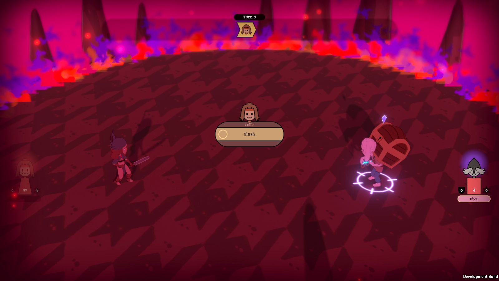
I'd been using an unfinished battle arena for ages because I felt so unmotivated to make it properly, but had the idea to just make it more abstract, since this is a dream, after all. Now it looks like a
∞ houndstooth ∞ chessboard (canine and chaotic, light and dark), to go with the various chess motifs (FUN FACT: I don't actually know how to play chess).
I did make a video - it's 5 minutes long, though that's with dialogue boxes lingering longer than most players would likely let them - so I think that's a good length? Instead of showing the video in its unfinished form though, I'll either hope I finish by next week and I'll show it then, or I'll just save it for the next test phase so players can experience it as it's meant to be experienced. Hopefully that won't be too far off.
![]()
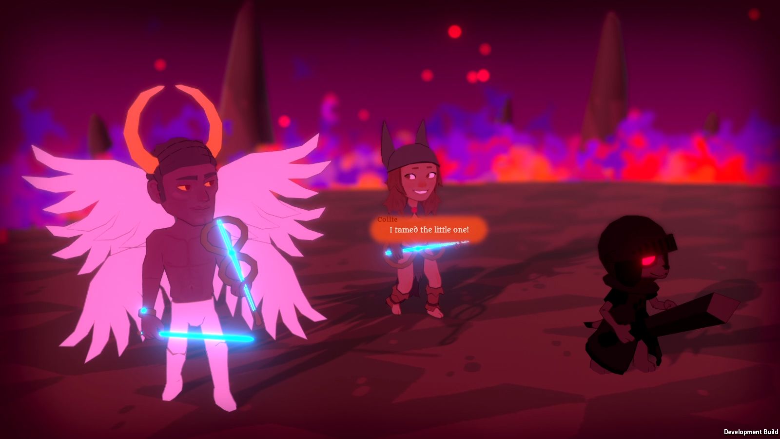
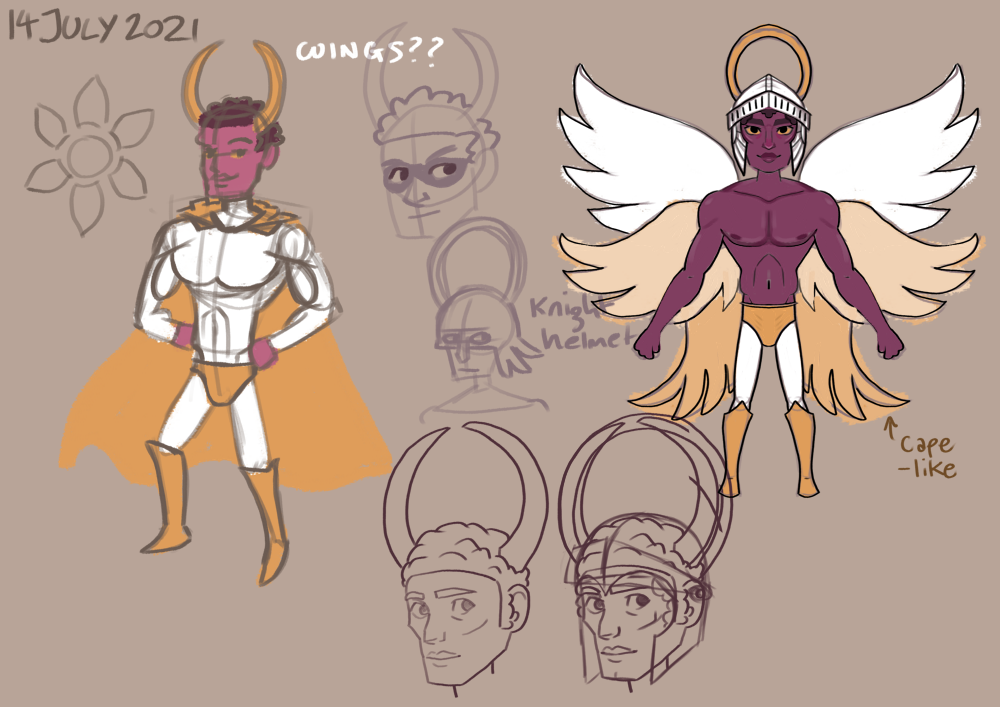
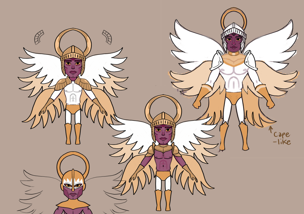
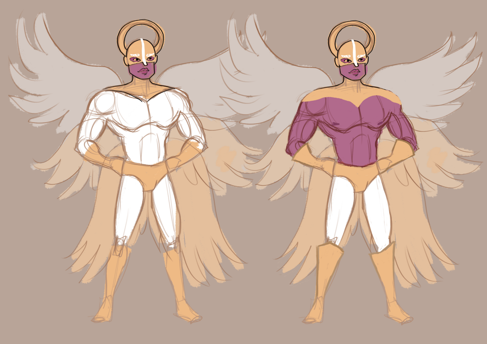
Oh, one other thing I need to do is to design 'The Splendid Savitr': Savitr as a sort of superhero, who comics are written about and who Collie becomes enamored with. I've been using this older 'Dreamy' design I came up with a while back, but it doesn't exactly bring to mind stereotypical superheroes. Here's some concept art for designs that might:
![]()
![]()
![]()
I haven't decided on a final design yet though. It should be a combination of angel + knight + superhero, but it seems to be tricky to combine them in a way I'm happy with! I thought having a Mardek-from-chapter-3-like helmeted look might be an interesting parallel, but I don't want to cover his face. I'll need to do some more design work, anyway (when I can muster up the energy to draw at all).
![]()
I was going to write a separate post about this, but since this one's short...
∞ I started replaying the Kingdom Hearts series the other day ∞. I grew up with them and know them well, but I suppose it'd been several years since I'd last visited them, so it feels like I'm seeing them with new eyes now. I wasn't planning to write analysis posts as I went on or anything, but a few things stood out to me and I wanted to mention them somewhere!
![]()
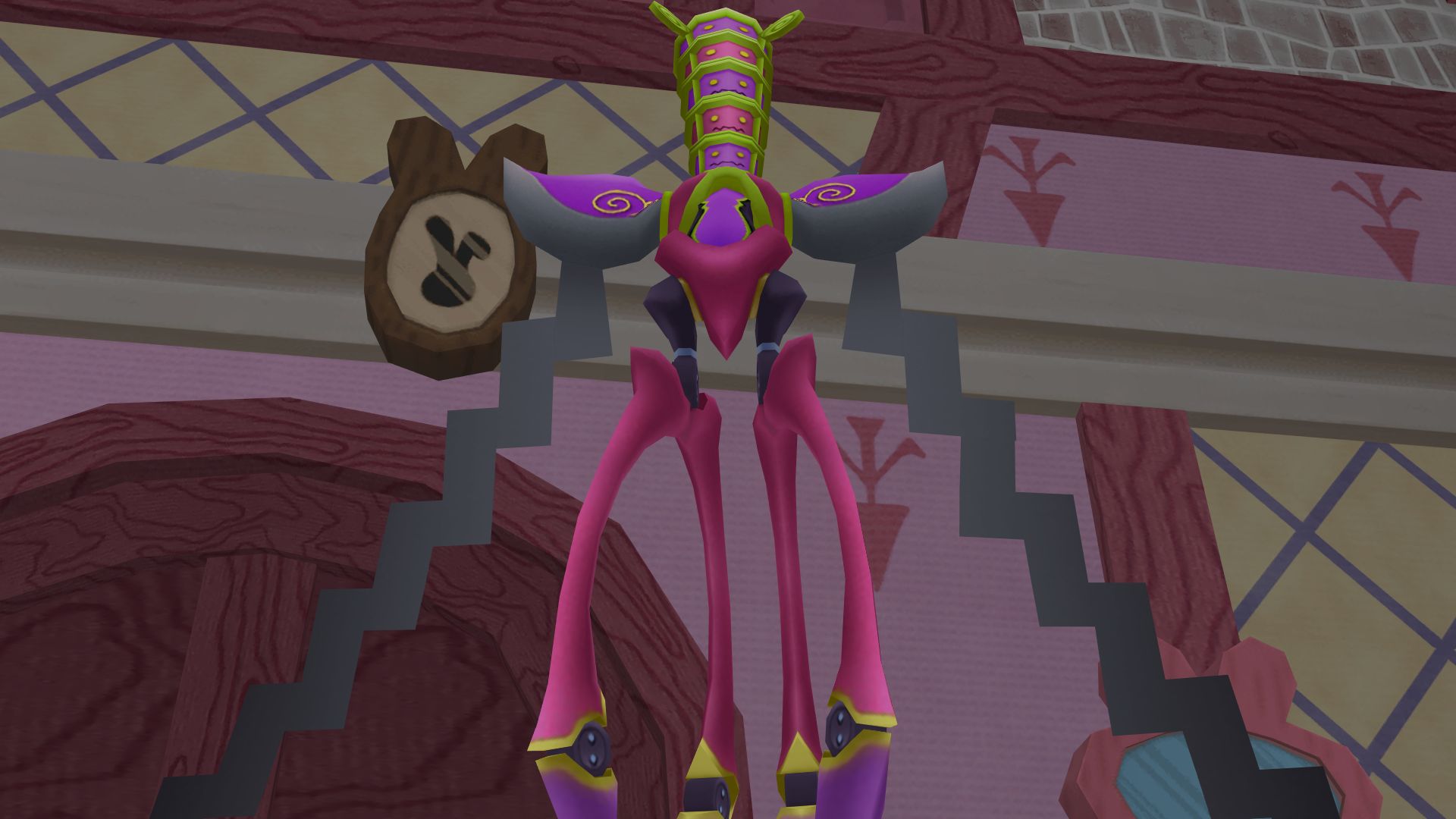
I'm assuming this is because I'm playing the Final Mix version, but all the bosses are garish palette swaps, which I'm not exactly a fan of. I also don't know whether this version made significant changes to the difficulties of the bosses, or whether my
gaming skills have just really degraded with age, because I died against this one in particular like a dozen times! I didn't have any difficulty with the others though, so maybe I was just approaching it stupidly.
![]()
The structure of the worlds is... interesting. Each is made of a series of fairly small rooms, each its own 3D model, which is something I can appreciate; having to worry about distant objects is something I've thought about a lot lately while making 3D games, and this solves that issue.
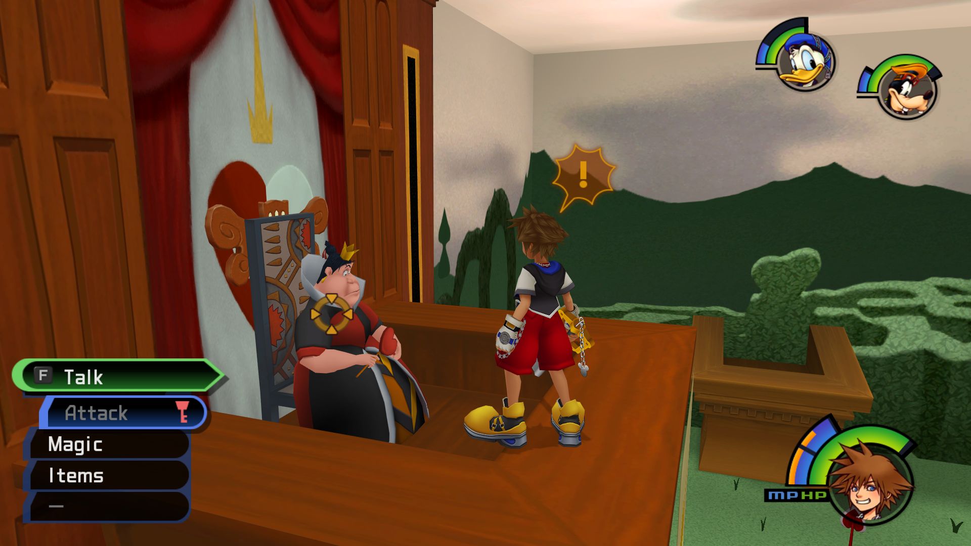
The rooms in Wonderland in particular stood out to me even as a child because they're mostly boxes with their surroundings literally painted flatly onto them; a great time-saving technique that the nature of Wonderland gave them an excuse to utilise (though I never cared for the result myself).
There's very little in the way of direction though! Seems the way to get through the worlds it to aimlessly wander around back and forth between the rooms until you just happen to enter one that triggers a cutscene. Then you have to repeat that several times until one of those cutscenes is the boss.
![]()
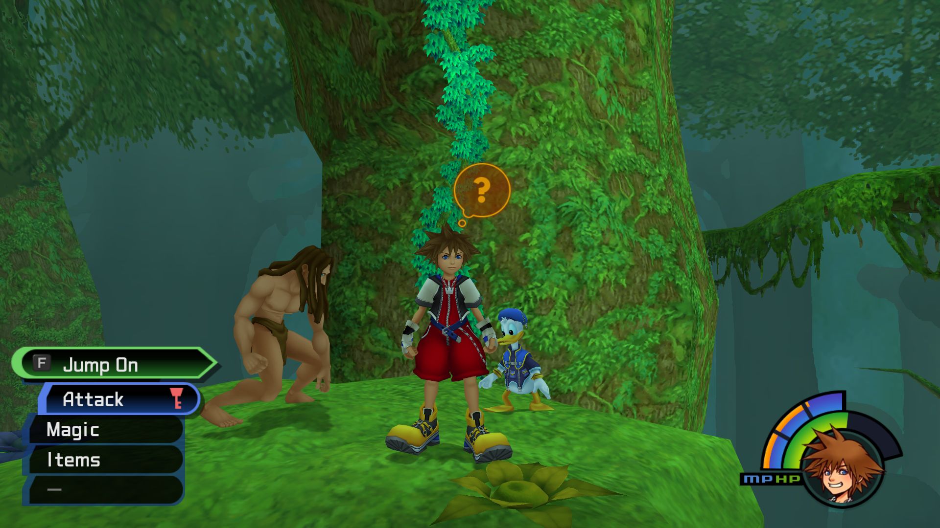
I've only got as far as finishing the Tarzan world, but that one was a particular pain because I kept walking past this not-at-all conspicuous climbable vine that led to where I needed to go, so I kept going back and forth and back and forth trying to figure out where to go, which was very frustrating (a shame, since Tarzan was the Disney film I rewatched endlessly as a child so it has a special place in my heart). I think I approached this world the same when I was a child, too?
It got me thinking about the value of free exploration, and how it suits some games but not others. Generally I'd prefer something far more linear, or if it's about letting the player explore by themselves, then I'd rather the game was built around that, like Breath of the Wild. I suppose this is mostly a case of game design trends changing over time though. This game's old now!
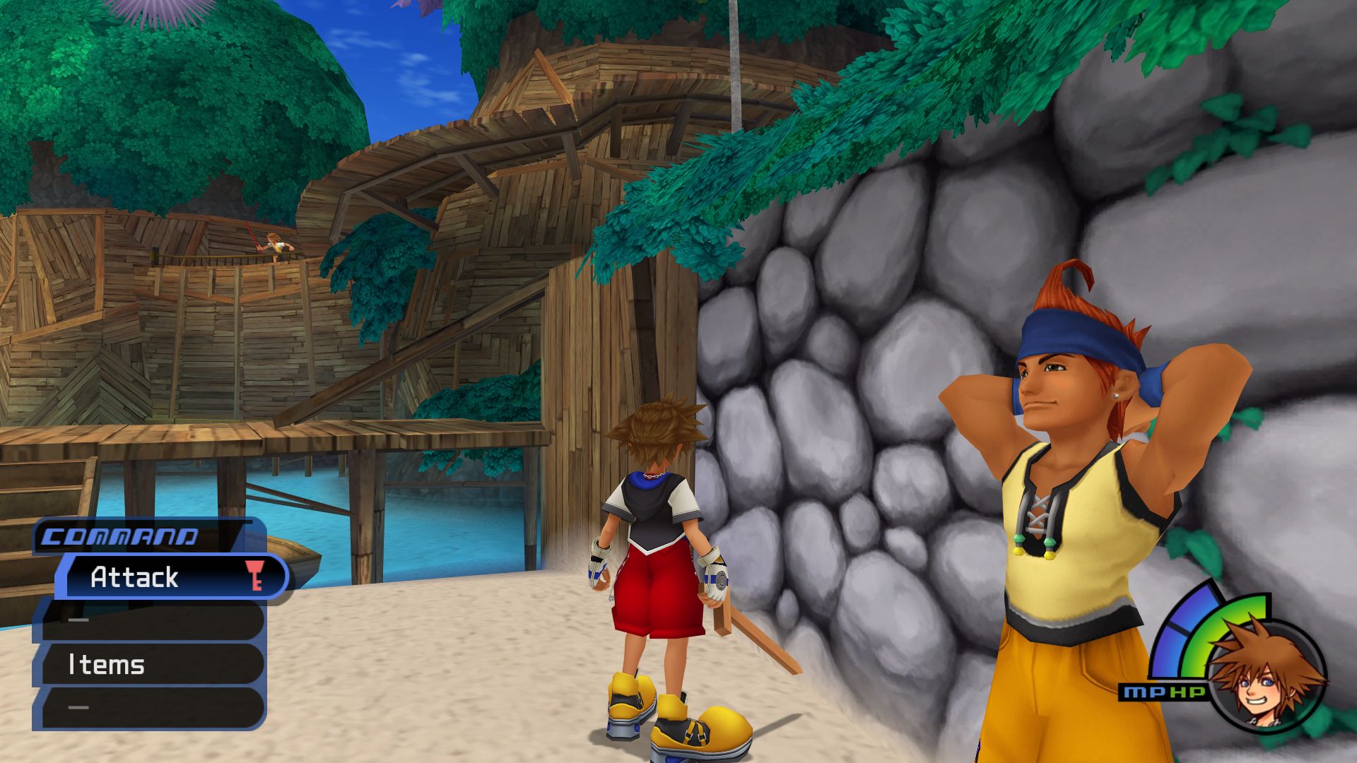
On a technical note, since I've started making 3D models for my own games, I've had to repeatedly deal with certain frustrations like how to model shoulders or bums in a way that's cleanly deformable, or I've had to worry about avoiding one bit clipping through another during animations. I've been assuming that 'real' games had solutions to this, ways of looking completely polished, but I've been glad to see those errors in this!
![]()
Look at Wakka's armpits here, for example. Posing the arms raised like that is extremely tricky, and there's some obvious (to me as a modeller, at least!) deformation messiness and polygon clipping. It's just reassuring to know that I'm not oblivious to some secrets or something, and my best efforts aren't too far off those in 'real' games!
I've also noticed that a lot of the emotive facial expressions and animations look eerie to me, unnatural... but they never did when I was a child, so I wonder whether my concerns about my own animations' inadequacies would be unnoticed by others.
![]()
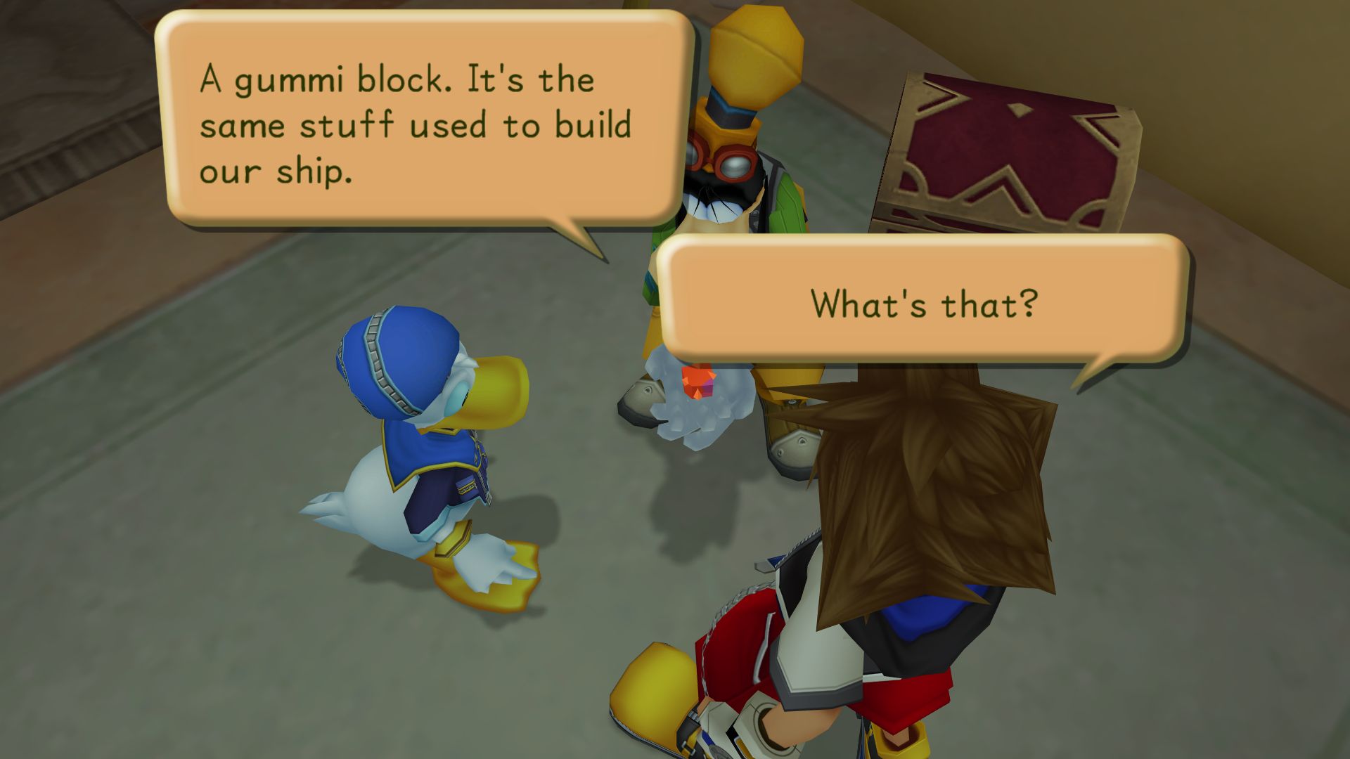
Also, I'm noticing how few lines of dialogue there are, and what lines there are tend to be very short, just a few words. It feels like Atonal Dreams' intro contains more words than maybe this game's whole first half! But it felt like enough to get the point across? Maybe? Or I suppose it's fitting for something that's ostensibly meant for children to play for fun, rather than some deep dive into philosophical and psychological wondering.
![]()
Anyway,
if aliens don't make contact tomorrow, hopefully I'll be able to finish the intro of Atonal Dreams next week. There are still a bunch of things I need to do after that to be ready for the next playtest and all that'll come after that (Kickstarter, marketing efforts, etc), but I'm getting there, slowly but steadily!



1