Log In or Create Account
Back to Blog
DEVELOPMENT

14

1,615
Weekly Update - Buffs, Affinities
3 years ago2,374 words
I revised some stuff related to stat buffs and equipment this week!

Was it just last week where I shirked work entirely? Feels like forever ago... I've been productive again this week, or at least it feels like I have been, though I always end up feeling like the stuff I've actually done hasn't got me significantly closer to the finish line despite the time and effort spent...

I, like millions of other people, have also been playing Pokemon Legends: Arceus (which I thought had an 'of' in the title and the colon in a different place - Pokemon Legends Arceus: of, obviously - but apparently not), paying particular attention to its gameplay mechanics and UI. Overall I'm very impressed; the Pokemon games have loyally stuck with archaic gameplay born of the limitations of the GameBoy from a very different period in gaming history, and this feels like a much-needed modernisation of those, what a Pokemon game should be. In particular I've been appreciating the revisions to moves, stats, status effects and buffs, which have inspired my own revisions to Atonal Dreams' mechanics this week.

Though I've not changed things just because I played that game, to be clear. While playtesting, certain implemented mechanics have just felt unpleasantly clunky for a long time, and my work over the past few weeks (or months, probably) has largely been about tidying them up until I feel they're where I want them to be.

One of the remaining issues was how (de)buffs worked. Some skills could grant flat numerical (de)buffs to either the Attack or Defence stats for a fixed duration, so "grant +4 Attack for 2 turns", for example. It made sense, but felt sloppy somehow, or those skills were barely worth using because the buffs expired too quickly. It'd been annoying me for a while.

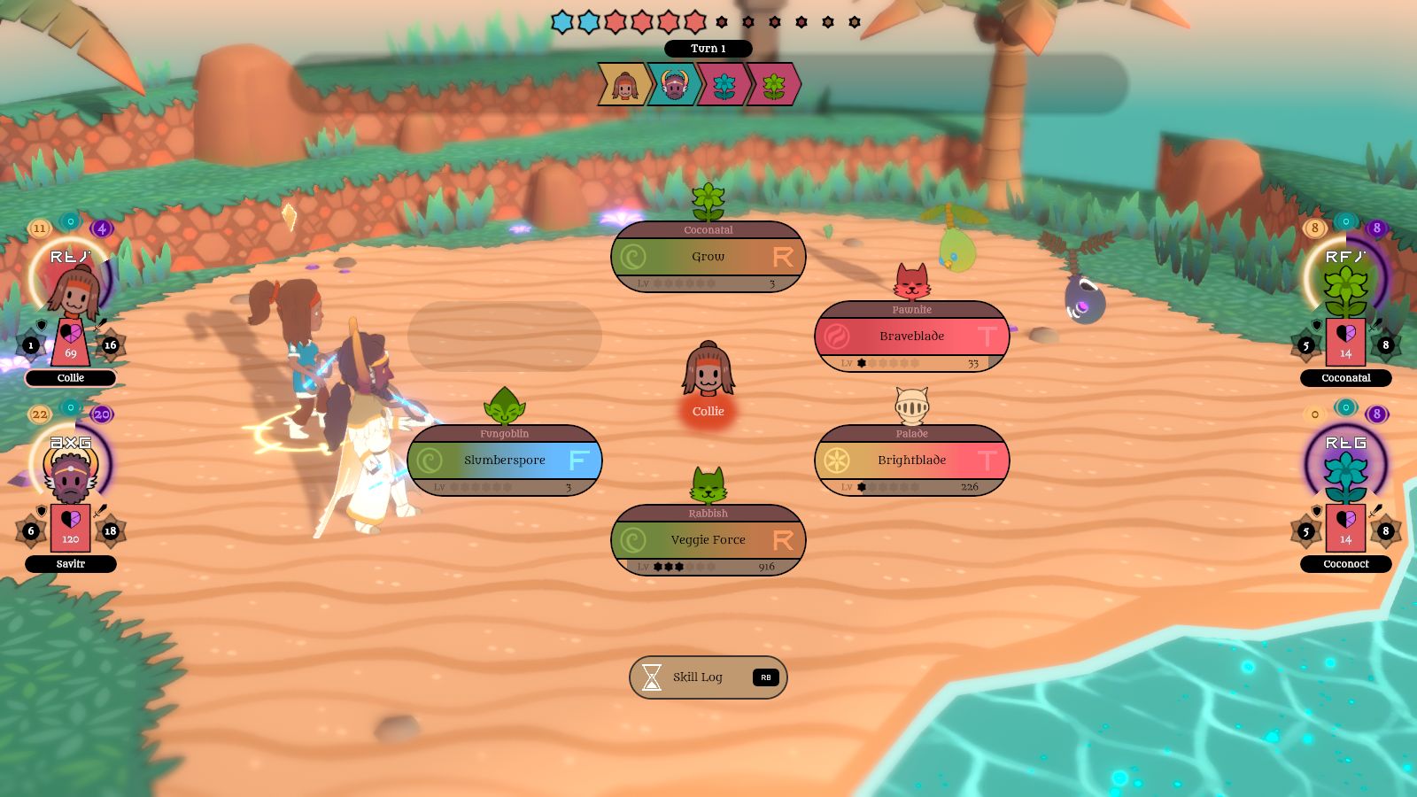
The 'original' (will new main series entries keep those mechanics or not?) Pokemon games dealt with stat (de)buffs by giving each stat a buff modifier ranging from -6 to 6, so the increase or decrease was always scaled to the base stat, meaning a skill that raised or lowered a stat by one stage would be (somewhat/theoretically, if not practically) useful even in the late game. The number 6 is a motif throughout Alora Fane and the games I'm making set in it, so I essentially stole that idea here (even though Of: Legends Arceus Pokemon seems to have massively simplified buffs to just general attack/defence up/down that expire after a few turns):


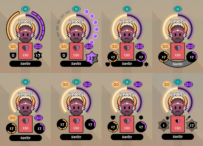
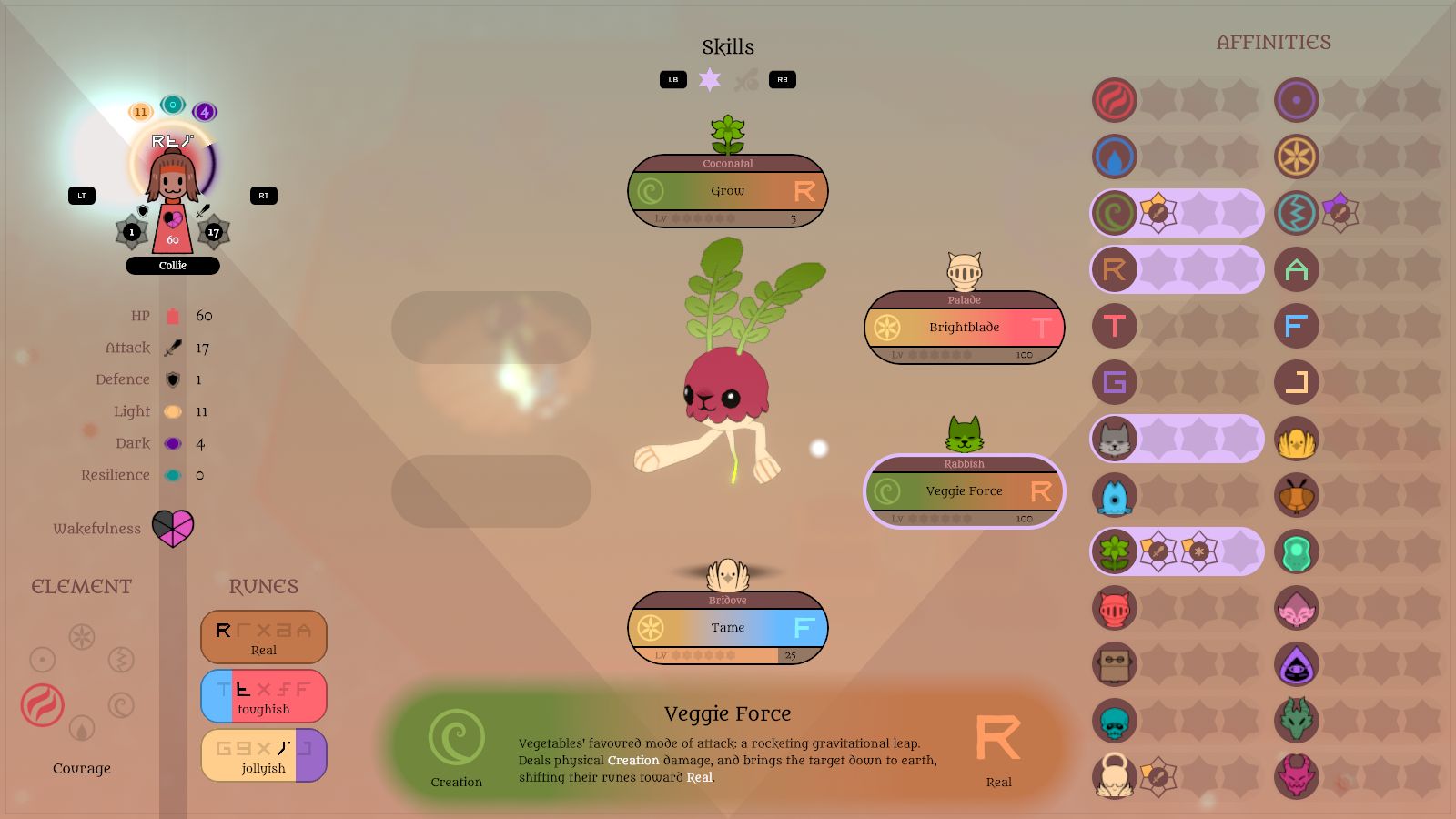
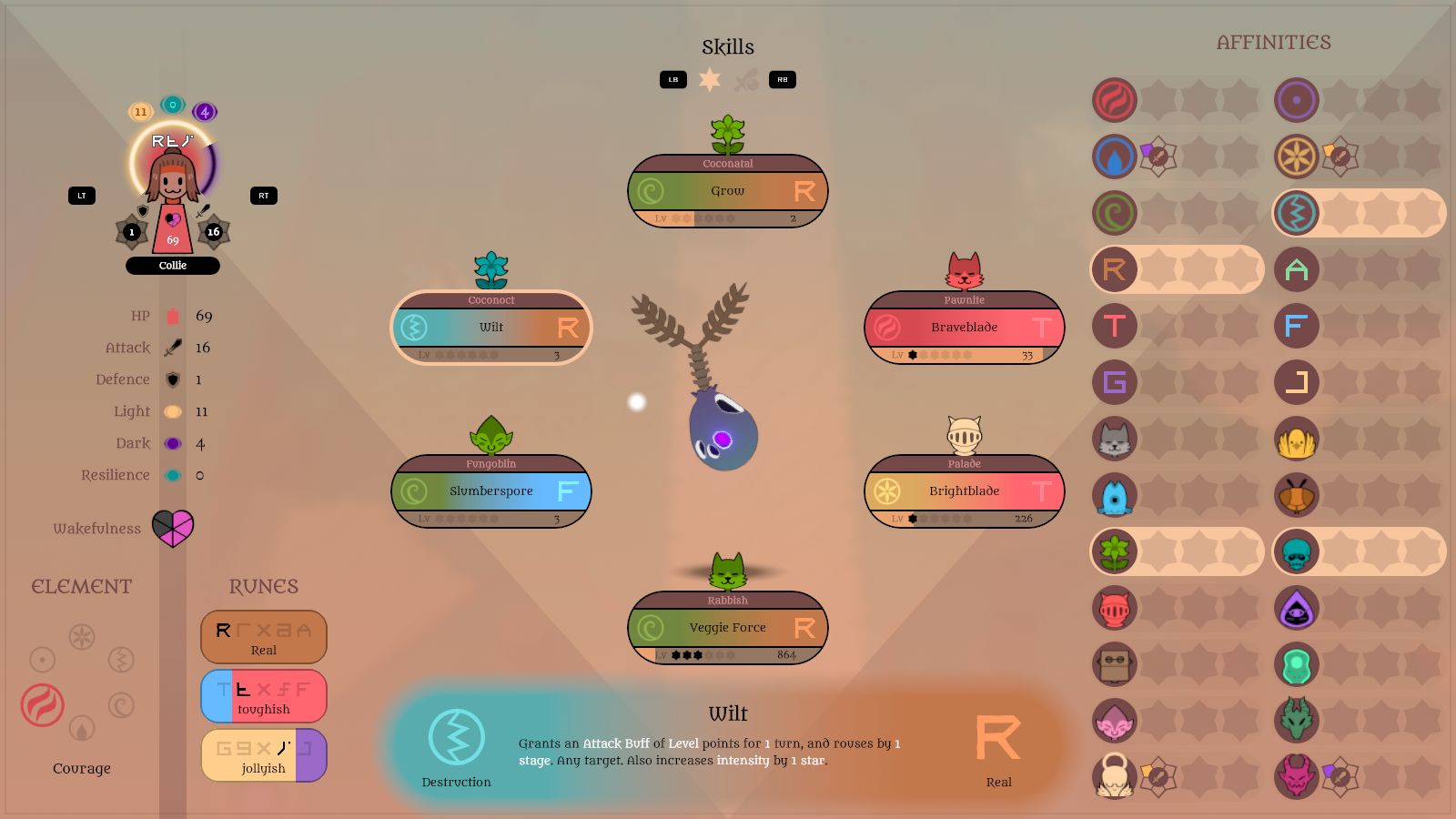
Now, the Attack and Defence stats can be buffed or debuffed by -6 to 6 stages, which multiplies the stat and lasts for the duration of the battle. It's represented on the UI 'statue' displays by an aster (six-pointed star) around the stat, which felt fitting.

I also moved the Dark and Light stat icons on the 'statues' to the top, next to the magic defence ('Resilience') icon; grouping them together made more sense. Previously, some skills - eg Tame - used these stats offensively instead of the Attack stat, but I felt that just overcomplicated things without adding anything meaningful, and I've revised all skills to use the Attack and Defence stats. No separate magic stats. Light and Dark are still used to determine side-switching, though, and the Resilience stat is used to resist that.

I like designing UI elements, but I don't end up at the solution right away. I experiment a lot to end up with something I like. Here are some steps in the refinement process:


Skills also have levels, which grow through XP equal to the damage you've inflicted with that skill. Ages ago, skills had an initial level cap of 10, which could be increased to 20 after taming or killing all instances of the associated figmon in an area. Characters would gain a 'boon' - a permanent increase to a stat - for each 10 levels of a skill; this was the primary means of increasing stats.

I later changed this, though, to a level cap of 60 from the start; you'd still get a stat increase for every 10 levels. But I wanted levels to actually have some use, and thought adding them to the skill's power would work. So a damaging skill would use the actor's Attack + the skill's Level as the starting number in the damage calculation, and buffing skills would buff by an amount equal to the skill's level. I fairly quickly realised this would become ridiculous when you were buffing stats by +30 points or whatever and dealing +30 damage with your skills. Level 60 was so distant, too, that you could probably just stick with the same set of skills through the entire game and you might never even master them.


So I revised that, too. Now skills have six levels (the motif again), starting at level 0. They're shown on the UI as stars, which feels more impactful to me than a little number. They still add their level to damage, but I'm unsure about whether they'd add it to buff potency since +6 is the maximum anyway (imagine if a Pokemon move could buff Attack by 6 stages with no drawbacks). Each level is more difficult to achieve, but not so difficult that mastery is frustratingly distant. I'll continue tweaking numbers like exact XP costs as I go on; ideally a relatively casual player should be able to master a few - but not all - skills by the end of the game, but none in the tutorial dungeon.


Another thing I wanted to address this week was equipment and loot. Something I've wondered about a lot since the MARDEK days is what to put in dungeon treasure chests so that they actually feel worthwhile to open. A lot of JRPGs just have boring healing or status cleansing potions that always just cluttered up my inventory, barely used, and I've been wanting to avoid doing that. I've also been unsure about how to handle equipment for a while, since I wanted that to do something more interesting than just increasing stats by a few points.

Something I liked in other games enough to incorporate into MARDEK was weapons or armour that either granted a bonus to or resistance against certain creature types, like a Silver Sword that boosts damage against Undead by 20%, say (or whatever the exact multiplier was in MARDEK). (I wonder whether I was inspired to do this by the mechanics of Vagrant Story - which I discovered as a child and replayed a couple of weeks ago - where there's a heavy focus on equipments' 'affinities' for various creature types and elements.) MARDEK's characters and creatures also all had resistances or weaknesses to all the elements in the game.

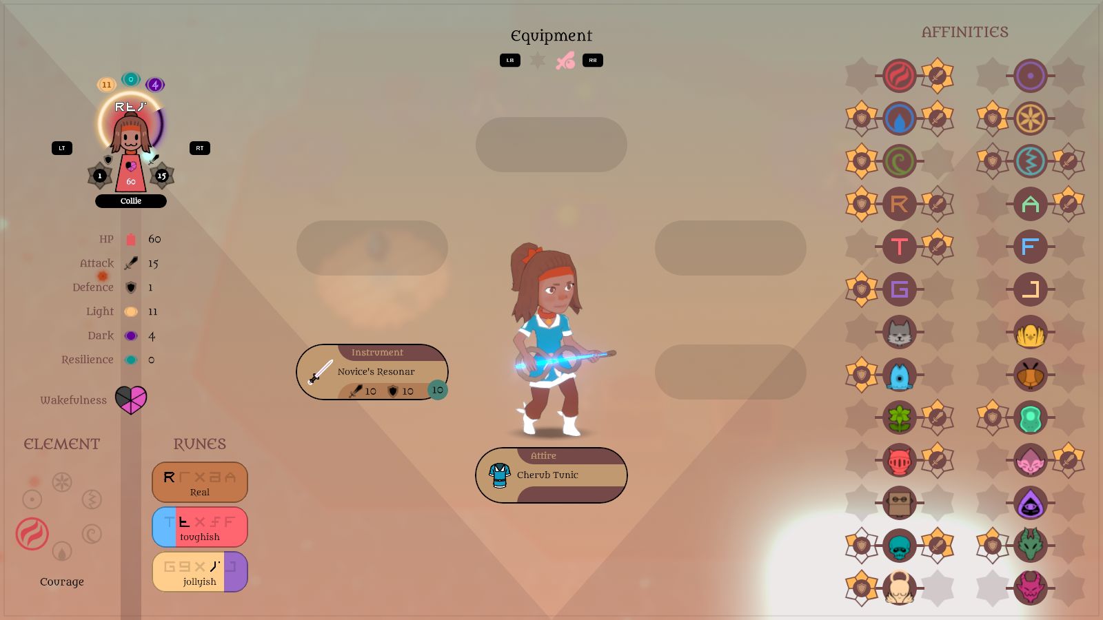
I decided to experiment with an Affinities system of my own. Essentially, each piece of equipment can grant either offensive or defensive 'affinities' for each of the elements, runes, or creature types. So a Creation resonar ('weapon') might empower Creation-elemental skills and do bonus damage against Plantoid figmon, for example, while a piece of armour might increase defence against Tough skills and Beasts.

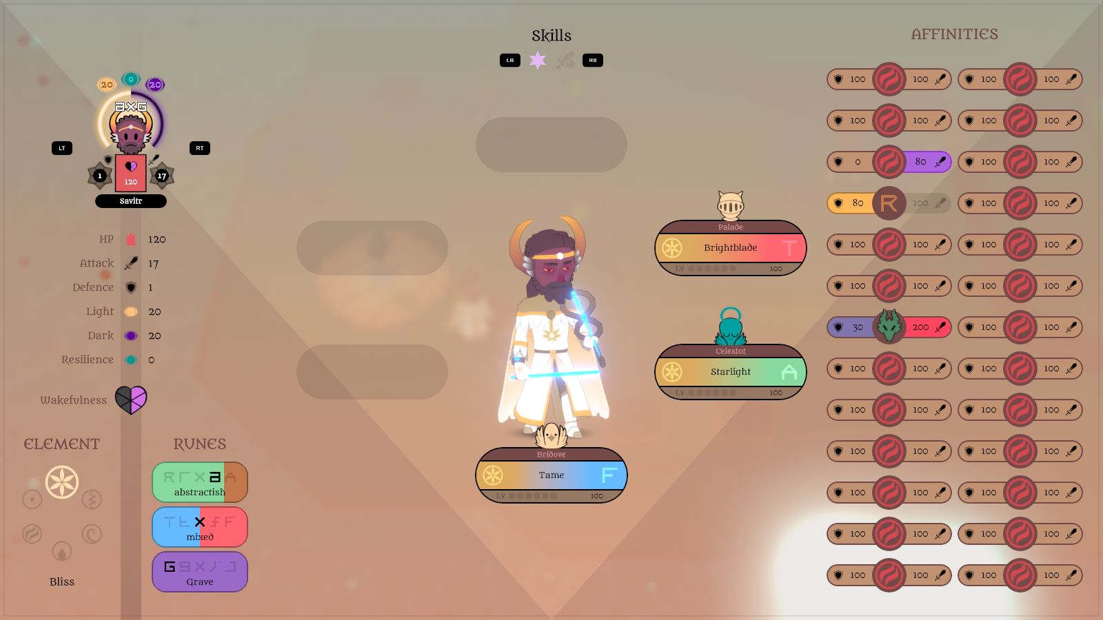
I started with this mock up layout, to get an idea of how many there'd be (and whether they'd all fit on this screen) and how each one would be shown; I thought percentage numbers at first, like the resistances in MARDEK:


An annoying thing about taking screenshots is capturing characters mid-blink!


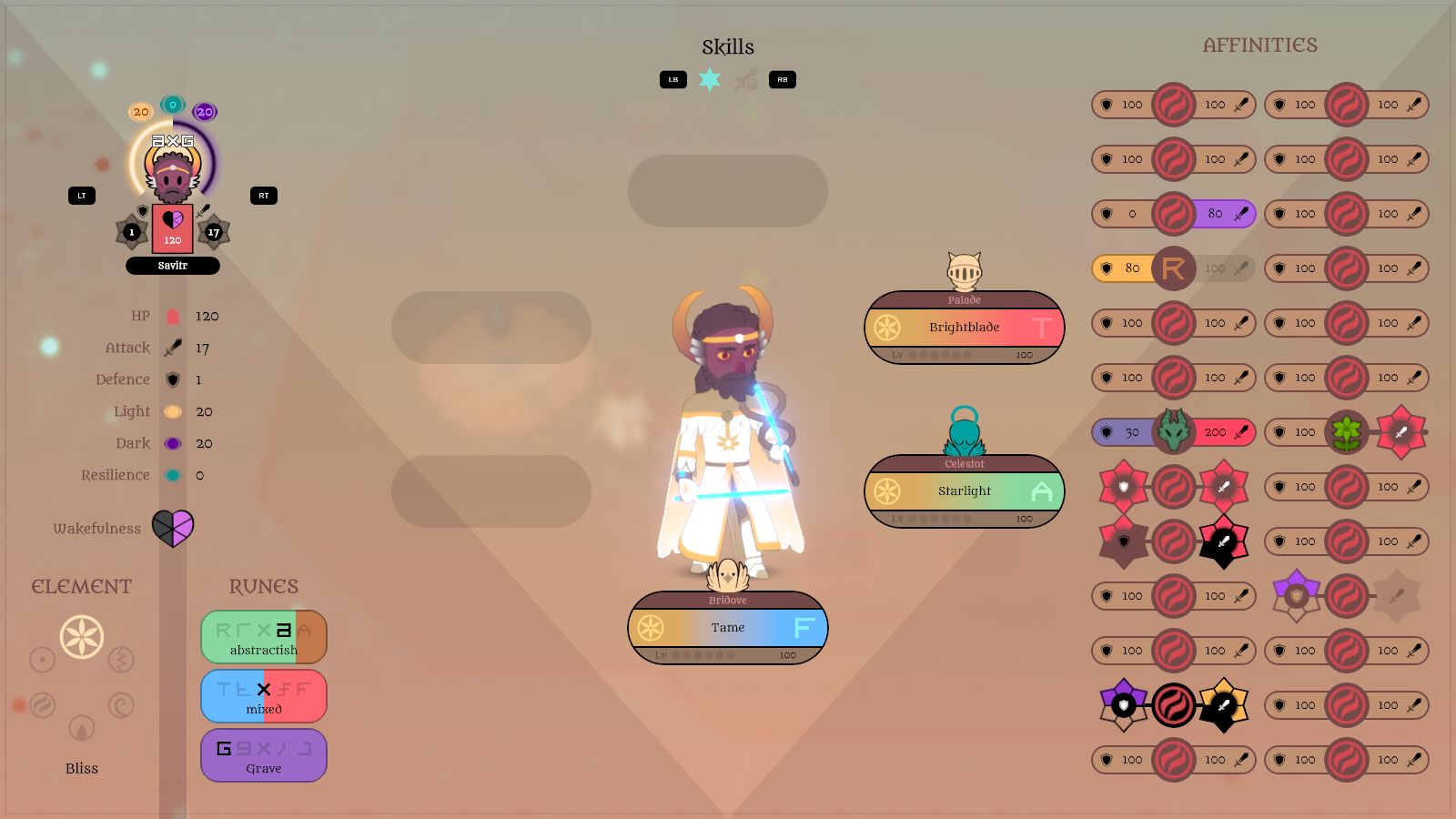
I thought, though, that it'd be pleasantly harmonious to use the same six-stage aster system that I'd used for the (de)buffs, and experimented with a few variations:


I implemented it, kind of, such that the different types are shown, but the aster values are being set randomly:


I was also experimenting with a possible layout for equipment slots, which I'll get to in a minute.


I got wondering though: what does an 'offensive' affinity mean, exactly? Defensive seems fairly obvious: if you have a positive affinity for Creation, say, you'll take less damage when affected by a skill of that element. But if you have a positive offensive affinity for Creation, does that mean you'd do more damage when USING a Creation skill, or when DAMAGING a Creation-elemental target? Both?


I had to move the skill description box and figmon model from where they were before to make everything fit.


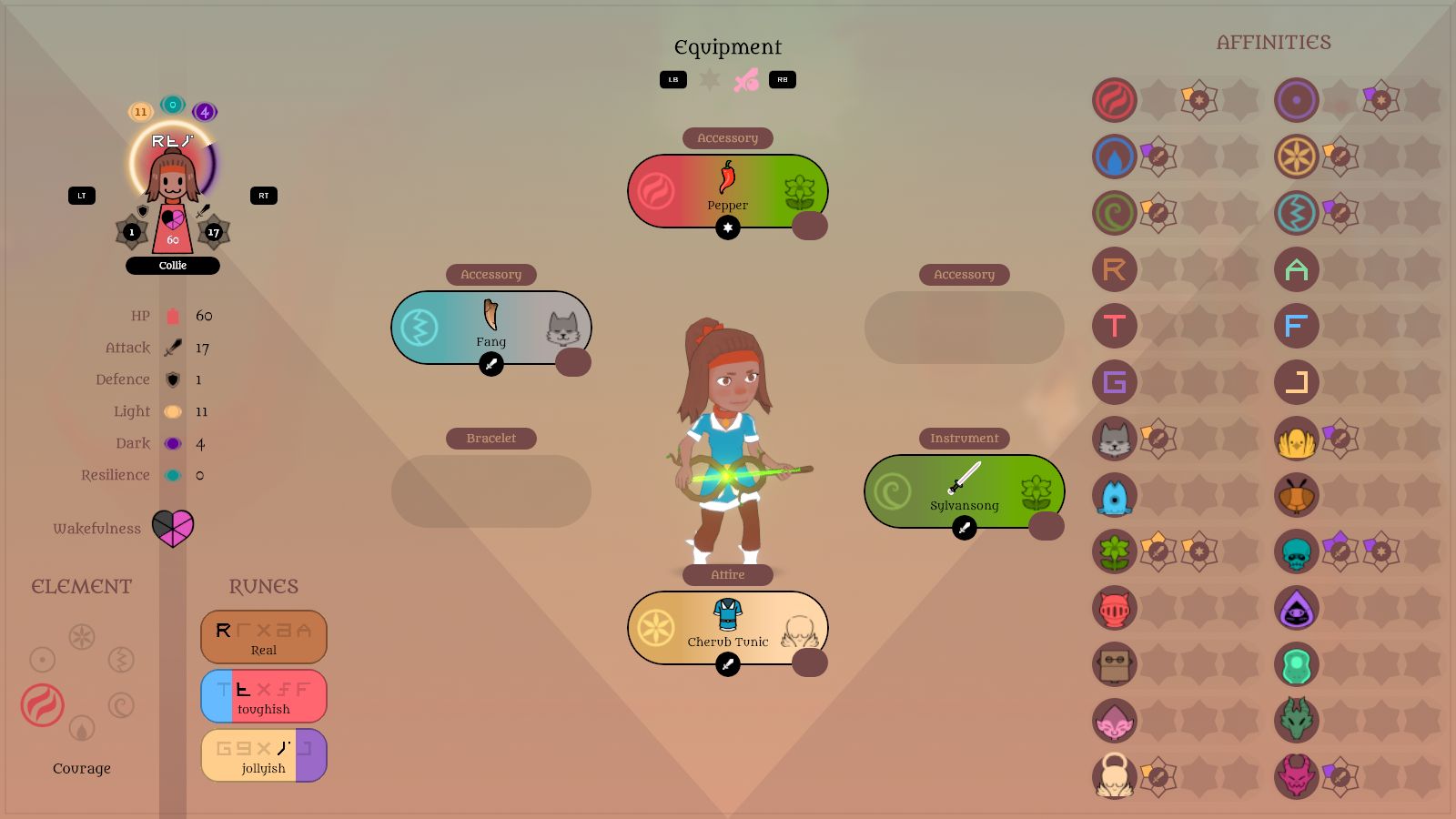
I revised it so that there are three different types of affinity: those that EMPOWER skills of that type, those that activate for any TARGET with that type, and RESISTANCE against that type. I feel that this layout probably reads better too than having the affinity asters on either side of the type icons.

The primary purpose of these affinities was so that I could add a variety of common accessories that affected them, as I feel that those would be small enough changes to not be game-breaking - each affinity increase would only multiply damage by a little bit - but more valuable than inventory junk you'd never use.

I dived in and set up the item code/data structures/whatever so that each item could be assigned a list of affinities of variable length. One item might increase Tough affinity by one stage, while another, rarer and more powerful one might increase affinity for ALL creature types by one stage, for example. But it felt too 'bitty', granular, hard to keep track of and tricky to come up with item concepts with such effects.


I wondered whether instead items could, like Skills, have an associated rune and element, or maybe creature type in place of either, and an affinity type - empower, target, or resistance - so equipping it increased the affinity for those two types (eg this Cherub Tunic would increase Empower affinity by 1 stage for Bliss and Angelic).

I wondered whether they could also decrease affinity for the 'opposite' types, so increasing your affinity for Angelic would decrease it for Demonic, say. That's a fairly common thing in games, in my experience. I shuffled around the order of the creature types so they're paired up in this display with one that feels like an opposite, and most of them worked satisfyingly well despite not having this in mind when deciding on them many months ago. The only one that doesn't really work is Aquatic (fish) vs Insectoid, though there are Pokemon type relationships that make as much sense, I suppose.

The elements work in a circular way, though, so they'd clash with the others opposing pairs here in a confusing way... unless I were to revise the elements to also work as opposing pairs - as it seems many of the less-ancient Final Fantasy games do - so Courage-beats-Fear-beats-Courage, Sorrow-Bliss, and Creation-Destruction... but that's probably a bigger revision than I'd want to make at this point, and a petty reason to do it.

I got to this point with these equipment revisions late on Friday evening, so I'm still very much in the middle of the experimentation process. Once I've figured this out, though, I think I'll be essentially done with major mechanics revisions, probably??

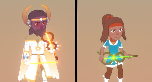
Oh, also, I added some new resonars for the first time, as a part of the equipment revisions, which don't have UI icons but they do have models:


I also wanted a figmon that used a debuffing skill, so I spent about an hour adding Coconoct, a reskin of the existing Coconatal which is a revision of an old monster design (it appeared in Taming Dreams) that I'd planned to include since designing monsters for this area last year, but never got around to until now:


I can't be bothered making a turntable animation this time!


So yes! Stuff! Good!

I also saw ∞ a thing on Reddit earlier in the week about some games that are coming to the Switch this year ∞, some of which caught my attention. I've been frustrated in the past about how people seemed to prefer the idea of me revisiting MARDEK over my new stuff, but the only ones that interested me among these games were those that were familiar to me, mostly in a childhood-nostalgia sense. Made me think about a faithful MARDEK remake/remaster again, though it's not like I can just drop this to do that at this point.

(I also got thinking a lot about the importance of having a catchy title logo, and how those things are even made!)

I want to play Breath of the Wild 2, and I was pleasantly surprised to see a Xenoblade Chronicles 3... though I've still yet to play the second despite spending many, many enjoyable hours in the first (I'd like to get the remaster of that as well, but I've yet to find the time, plus they're hardly cheap). I raised an intrigued eyebrow though at Chrono Cross, Klonoa, and Live A Live, all of which I've played and liked in the past but would never have thought were popular enough to make a comeback. Though I've heard the Japanese reception to Chrono Cross and Live A Live were much greater than in the West. Someone also wondered whether a Chrono Cross remaster meant a remaster or remake of Chrono Trigger was on the way too. I hope so, but again that brings up thoughts about who'd react to news of a MARDEK remaster in the same way... I wish I could just make one in a weekend or something!

Oh well. I hope people like Atonal Dreams, too, when I finally finish it in a billion years or whenever! (I'd still like to think it'll be smooth, speedy sailing once I decide on the current snags, but we'll see.)

Oh, and I need to decide on a PC, still, which I've told myself I MUST DO this weekend. Nobody made any suggestions on ∞ my latest post about it ∞, so maybe I'll just need to go with the choices I had there and hope for the best, despite my CRIPPLING UNCERTAINTY...

14 COMMENTS

MethEnjoyer7~3Y
Trying to parse my thoughts into something coherent is straining what writing skill I have to the fucking limit, so bear with me.

When it comes to why people still bring up Mardek to you, it's sort of two layered - there's familiarity and nostalgia, which itself wraps back to familiarity.

Mardek succeeded as much as it did because it had your personal touch, but was still very familiar - it riffed on things and was built on foundations that already exist, and are well known. When I got into Mardek I didn't play or even know any Final Fantasy game, which people seem to compare it to the most, but it still felt close enough to any other RPG I played that the whole experience was intuitive and simple to get into. The elements made sense; aside from FIG, I never really got that one, but it still functioned like the others, familiar, so I didn't really question it. The story was also familiar enough to not be outlandish; Rohoph and the other aliens were different, but that was about the extent of it.

Now there's a niche, however small, of people who've experienced Mardek, which makes it familiar, and want to experience it again; or more of it. Same principle behind this as what allows Game Freak to pump out the same game every 2-3 years. So, nostalgia, but I feel that the word familiarity describes it better. It's why I keep repeating it so much.

I think most fundamentally with gameplay mechanics, you can only go that far out of the norm before it starts becoming grating, unfamiliar; and that pushes people away. If you're not familiar with the game Hylics, go give it a look; despite how surreal it is, the gameplay is very standard. That's almost verbatim the wikipedia page description, too.

Pokemon has introduced a lot of gimmicks over the years, but it's been gradual, and the basic gameplay loop is still very easy to grasp; even a 5 year old can stumble through the game by clicking A until the bad man dies. No need to grasp the nuances of the 2013 VGC Baton Pass Lightningrod Raichu + Kyogre Thunder meta or whatever.

So, this whole disjointed text dump is sort of its own message, but it also leads up to my point - two criticisms I have for your current work. I'll add the disclaimer that these are my personal opinions, my personal thoughts, opined personally by my own person, but I think they're very likely to apply to the average joe.

First, the Myers-Brigg personalities - I think you're setting a very high barrier for entry right off the bat by including them in your game, let alone as an important gameplay mechanic. I never really "felt" them either, so it's an unfamiliar element that I don't like to boot.

Visually I also think that right now they just don't fit with the rest of the icons. You'd be better served making personality archetypes simple enough that they can be described with just an emoji or icon (I think you even did that in early Alora Fane, with the Bold and Fawn?) even if that means giving up nuance.
You can always make up for that with your writing, though.

You've mentioned the MBPT in blog posts over the years often enough that it's become something I associate you with (or with you), so I imagine you really won't want to remove it; but I think you should be aware and acknowledge that it's alienating for someone unfamiliar with it, and that has consequences.

The other point's more... contentious?
I will say I haven't really been too up to date on your projects since around 2014, only looking every half a year or so; but I feel something your current creations lack a bit of edge. Everything feels a bit too safe and soft for my taste. It can work for some genres, but I don't think a standard (J?)RPG format is one of them.

I read an article about Mardek earlier this week, in which the writer mentioned that you dared to make Steele feel like an actually terrible person; and that really resonated with me. The emotional weight you can achieve just isn't as intense when you don't have that contrast between the highs and lows. Doesn't mean you need every opposing force to be Kill Deathfuck the Puppy Exterminator & Real Estate Broker, or even a single one of them, just... a bit rougher, I guess.

If you do want me to continue my train of thought, there's still a bit I have to write about inner/emotional struggles as a central topic in media. specifically with Berserk in mind, if I'm already bringing up edge.
2
Tobias 1115~3Y
I've been wrestling with what I see as a familiarity/novelty tightrope for a few years now. Novelty and innovation seem to be pushed as these highly desirable things that lead to success by presenting something that's never been done before, but in practice it seems that people do just want something that's almost identical to something they've already experienced in the past, and they react with hostility to the unfamiliar, which is stifling for me as someone who loves playing around with new ideas.

I always find it odd, though, when this comes up, because I think back to all the RPGs I played and loved and got inspired by in the past, and how learning their often convoluted gameplay mechanics was just something I always expected. FFXIII is a good example of something that's hardly typical, mechanics-wise; I can't even remember how that worked! But each of the Final Fantasies had their own gameplay quirks (VIII's junction system, X's sphere grid, etc). Then there are games based on the various differing editions of D&D, which have mechanics that take some getting used to if you aren't already familiar with them, and which are very different to the generic JRPG ones.

Is it a modern thing that people just expect to completely understand everything with zero effort as soon as they begin?

I'm hoping that for the most part, Atonal Dreams will be familiar though, or at least the general gameplay loop will be intuitive for (J)RPG veterans, just with some little details - that are unlocked gradually rather than piled on the player from the start - which I'm hoping will be an interesting twist on the familiar - like the elements being mental rather than fire, water, etc - rather than completely baffling.

I'm particularly concerned about the Myers-Briggs-inspired (or more accurately Big-Five-inspired, but that's not hugely important) 'runes' system though, because personally I'm extremely proud of it - and would love a game with something similar - but other people have expressed reservations about it similar to how you said it's alienating.

I'm curious about specifically why it gives that impression to you. Is it because the letters convey no obvious meaning so you feel there's something difficult and elusive behind them that'd require frustrating mental strain to figure out? Is it because you already know their inspirations and also already know you don't care for personality psychology, so it's a pre-existing negative reaction? (An assumption there, but if that is the case, why doesn't personality psychology interest you?) Is there something else about it that seems complicated or mystifying in an unpleasant way? How do you think this mechanic works?

Using icons instead of letters is an interesting idea, and I wonder whether that'd make it seem less scary or whatever, but what I like about the letters is that lower case can be easily understood as a 'lesser' version, plus they're really easy to type out. I can imagine something like this appealing to people who love delving deeply into narrative-based lore stuff - speculating about characters and their relationships, etc - to the extent that they might even use these runes when thinking about their own characters (Mardek is probably RFJ!). Icons would make that kind of discussion more difficult, I think.

Re everything feeling 'safe and soft', that makes me wonder what you're basing that on! What I've shown of Atonal Dreams, or some other non-AD stuff I've made since MARDEK? I'd like to think the story of AD explores some intriguing stuff, that maybe some plot turns will even be shocking, but obviously it's tough to convey that from a few promotional screenshots, so there's not much I can do about it other than hope people are willing to go through the story when the game is done.

Also, I'm surprised people are writing articles about MARDEK!
1
MethEnjoyer7~3Y
I don't really have a good answer for why hypercomplication works for JRPGs, or their specific audiences. It's never worked for me, though; if I want a game that needs to be studied, I'll pick up a TTRPG, not a video game. Atonal Dreams is also visually not at all anime/eastern, very western, almost has that "tumblr art" feel to it, which means it doesn't -feel- like a JRPG. That means it competes in the western more than the eastern space. (before even going into language/publishing space limits)

there's a lot of MMOs with insanely cluttered UIs, and massively encumbered JRPGs still sell very well. I can't think of titles off the top of my head, but they're out there in droves. Still, I think it would be a mistake to try to apply the same standards to your product unless you rebrand it completely. (Atonaru Duriemuso?)

Personality Psychology's something that used to fascinate me around 6-7 years ago, but that's long in the past. I don't hate it, but it doesn't massively interest me anymore either. My issues are primarily with the practical side of things.

The runes are visually and mechanically just too different from the other elements, and too abstract, I think.
When I look at the aXG letters, the first thing I think is that it's a damage or exp pop - and I intuitively expect it to just go away after a few seconds. I'm sorry to say this, but I think right now they detract from the UI overall.

mechanically I'm of the mind all elemental type should be on the same track - even if WHAT the type defines varies wildly (four elements/creature type/mentality/hip to waist ratio), it should all be clumped in the same place. Right now the runes feel too detached.
So, for instance, a creature should be Fire/Choleric/Reptile/Agreeable, not Fire/Choleric/Reptile + (Agreeable).

In this aspect three runes feels like way too much, unless they're the only element that defines a human character. Right now there seem to be TWO tracks, and both of them can have multiple slots.
I can use gacha games as an example for why this is bad - our human monkey brain doesn't like calculating more than one step. in the same vein that these games use premium currency to make it harder for you to undestand how much actual money you're spending on something, having more than one elemental track makes it an incredible chore to figure out what your character even is.

That's how it looks like it works at a cursory glance, at least.

And yea, abstraction:

Something about Myers-Briggs just doesn't jive with me at all; it's hard to nail down exactly why. It might be that it feels a bit too wannabe-cerebral to me, like an armchair academic who says a lot of complicated words that mean nothing. It's definitely a personal issue, but I think it doesn't really sit well with most people.
It also comes with a certain negative cultural baggage at this point - first thing it makes the layman think of is the INTJ Stare meme.

The big five feels more practical, physical, something you can grasp. I think a layman (like meeeeee
1
Tobias 1115~3Y
That's interesting, about JRPGs requiring a certain look and feel (what I imagine you mean is a look that always screams 'generic JRPG' to me). But is Earthbound a JRPG? Is MARDEK? I'd be curious to ask on Reddit somewhere - r/JRPG would make the most sense - whether Atonal Dreams reads like one or not. I don't like Tumblr or its art style but I know why you'd say my work resembles that! I'd say it's just an evolution of MARDEK's art style, though.

The intention of Atonal Dreams' mechanics is to do away with esoteric formulae involving a bunch of obscure stats like 'Spirit' or 'Vitality' in favour of building huge multipliers by considering and understanding type relationships. Elements are fixed, as are creature 'species', but runes are set apart in that they can be changed mid-battle. So for example the Tame skill has a Feeling rune, meaning it's more effective the 'more Feeling' the target is, and when used on a target, it shifts that rune more towards Feeling, meaning it'd be a bit more effective when used on that target next. A boss might use a skill (maybe with a silly name like 'Sad Song') that shifts all your characters' middle rune towards Feeling, weakening their Tough skills... but actually empowering their Feeling ones. I love it because it feels more personal and mental than the purely physical focus of pretty much every other game's battling.

They have three runes to represent enough facets of personality to paint a relatively full picture without being overly complicated (I'd rather have five, but that's too many). Even when I was into the four temperaments, just one wasn't enough! They're not types, they're values on spectra.

I like the idea that it'd encourage essentially the same mental process that'd run when considering what gift someone might like, or how you should best respond to their comments to influence and not offend them, or something. Someone Tough (T) is more likely to respond well to an aggressive challenge (a T-runed skill) than someone 'Feeling' (F) would be.

I think the system is really elegant if people understand it, but the barrier seems to be in getting across how they work, maybe? In the game itself, you play around with the more familiar/obvious mechanics for a bit before runes are introduced at all, and when they are it's through some dialogue where you can choose an in-depth explanation of what they represent, or a brief bare-bones summary. I'll need to think of how best to communicate them in the 'promotional' stuff I'll need to start preparing soon.

I'd agree that they aren't represented especially well in the UI 'statues', and I've considered a bunch of options to improve that. Maybe I'll decide on one eventually.

Myers-Briggs basically is pseudoscience! But understanding it was an important stepping stone for me personally, which encouraged me to get my Psychology degree, where I learned that the Big Five is what they use in academia and it's got a lot of research behind it that suggests that's how personality actually works cross-culturally.

I was into MBTI for years and I've hung around Reddit for a while, but I've never seen the "INTJ Stare meme"!
1
MethEnjoyer7~3Y
fuck me, that text dump turned out MASSIVE. I thought that was just the width of the white text box making it look way longer than it is.
0
Tobias 1115~3Y
I prefer the blog format over, say, Twitter because it allows for long comments, which I appreciate!
0
MethEnjoyer7~3Y
I suppose another issue I have with the way you've worked in personality types is that it feels like a crutch. Putting aside that, to me, if you say "this character is INTJ" it means diddly squat, it also feels like a case of telling rather than showing.

If a character's element is Fire, Water, Dark, ANGRY, HAPPY, you're given a taste of what archetype they will either fill or put a twist on; the INTJ element is more akin to getting stuffed like a duck. Your characters' personalities will inevitably become apparent through their actions, words and thoughts, and slapping on a sticker describing who and what they are in this kind of detail kinda subtracts from that.

I think the best thing I can think of to illustrate my point is the cartoonist Ben Garrison - look at any of his cartoons and imagine if he DIDN'T slap a caption on every single object.
-
Another point that just popped up in my mind - I never really liked the Normal type in pokemon, but if you were to go with the 5/10 personality types, having a completely nondescript neutral or "normal" type would bring up some interesting implications. Either including such a type or not could work; in reality, there's no such thing as a 100% average person, and everyone has traits they're defined by. By adding a neutral option, the context shifts. Either the people with a personality element are the extreme, or the middle is. If there is no middle, then contextually being on the outskirts becomes normal. I think that fits your overall message and themes much better.
Unless; a "Normal" character could be an empty husk, devoid of personality; or someone who has a completely balanced personality, to an uncanny, unnatural degree, almost like some kind of buddhist ascendant state.
1
Tobias 1115~3Y
I just replied to your other comment, but this one makes me wonder: if a character has the runes AFG, are you seeing it as them being marked as the 'AFG type'?

The way it works is that there are three spectra, pairs of opposing traits:

Abstract - Real
(whether they have their head in the clouds or they're down to earth)

Tough - Feeling
('sensitive' would work better than 'feeling', but F works better than S; similar to MBTI's T/F or the Big Five's Agreeableness)

Grave - Jolly
(alternatively, serious or silly)

Characters have a rune value on a 5-point scale for each one:

A a x r R
T t x f F
G g x j J

So someone with xxx runes would be the completely balanced 'normal type' equivalent, I suppose.

I'm seeing them as "personality influencing gameplay", so for example "this character's really tough, personality-wise, so the aggressive skills they use are more potent than this other character who's soft and sensitive". Something like that. "Narrative influencing gameplay", rather than, say, "this character hits harder because he's taller and bulkier than this other one, and this one casts magic better because he's got a long grey beard and/or she's a girl".
0
MethEnjoyer7~3Y
That helped jog my memory, if memory serves you've been using the Jolly vs Grim slider as early as back in 2015-2016 with Taming Dreams.

Yes, especially with the additional explanation I definitely see AFG as an elemental affinity (or several of them). That reinforces my thought that you should streamline it so each character only has one Personality element they're tied to; this can reduce it to 7 types, one of each extreme plus neutral.

For synergies, you could just borrow Pokemon's STAB system; and, continuing the streamlining, you could make it so "rune" attacks put stacking vulnerability on the -6/+6 scale to that type rather than shifting one of the player's 3 different personality types.

I think the way you've set up the critters and the system as a whole makes the most intuitive way to go about it to give every character the same three types the critters already have - Emotional, Personality, and Body. Savitr would make sense as Bliss/Grim/Light(alien?). Or make a 'human' body type, I guess, though I dislike that idea a bit. Collie would make sense as a Beast body type.

That'd still exponentially more difficult to grasp than Pokemon types, since there's up to 3 to account for rather than 2 AND a lot of combinations aren't possible, but it'd be more manageable than the current setup.
1
Tobias 1115~3Y
The runes are essentially unchanged from Taming Dreams, though a big mistake in that was dumping a full explanation of them on the player right at the start. In the years since then I've been refining how to present them in a way that might allow players to see them as the elegant and interesting system that I do. Clearly I'm not at an ideal point with that yet!

I see the runes more like stats than elemental types, and the opposing-trait-pairs aspect is important.

Also, only the figmon have creature types - humans don't - and they only time they come into effect is with the 'affinities' I described in this post, which are basically equipment bonuses equivalent to a sword that deals greater damage to undead or whatever. They don't do anything in the damage formula usually.

In Pokemon, moves have a power value, a type, and they're either physical or special, and your opponent has two types and separate physical and special defence stats. So when selecting a move, you'd usually consider the type first, then maybe whether to use a physical or special attack if you had some awareness of your own physical and special attack stats and your opponent's defensive stats (which you usually wouldn't unless you had encyclopaedic knowledge of the game because they're not displayed anywhere).

In Atonal Dreams, characters don't really have numerical stats beyond basic Attack and Defence. They have a single fixed element, which are simpler than Pokemon types, and three runes, which can change during battle. If you don't have a skill with an elemental advantage over an opponent, you might have one with a rune advantage. If you don't, then you can shift the opponent's runes until you do. BUT that means that any skills you have of the opposing rune won't be as effective. I like that double-edged aspect a lot.

To return to a previous example, a boss might use a Sad Song skill that shifts all of your characters' runes away from T and towards F. They've not got 'weaker', they've just changed the flavour of one facet of their minds. Aggressive skills like sword slashes tend to have a T(ough) rune, so it'd be effectively reducing the damage you deal with those, BUT if you have any F(eeling)-runed skills, it'd be increasing the power of those.

I find that kind of thing way more interesting than just boringly getting linearly stronger or weaker.

For the most part, runes could be largely ignored during a casual playthrough. But paying attention to them would allow you to build huge combos to deal satisfying damage and master skills quickly (as damage = xp). I'm curious to see how people feel about it after playing the next alpha/demo/whatever.

I think I'll also experiment next with some alternatives for displaying them on the UI 'statues'.
1
MethEnjoyer7~3Y
I'd definitely like to see how how the system feels in action; could be I was completely off the mark and it's super intuitive. There's not really any way to know until then, though.
1
ElektrikMagenta20~3Y
If you wanna "fix" your creature type opposites wheel, you can just add some lore reasons for fish and insects to absolutely despise one another
1
purplerabbits148~3Y
After spending a few months completing Pokemon Brilliant Diamond and Shining Pearl. I can say that when it comes to remakes, I do not want a one to one remake with just visual updates. One of my biggest gripes with BDSP is that the movement can get weird at times. For example, I find it really grating that sometimes when moving though a one space wide area, you end up getting caught on the walls. The one space wide areas also are really annoying when in Mt. Cornet there's a ledge one one side and a wall on the other side, The movement occasionally makes it so that I need some precision so that I don't accidently walk off the ledge and need to go around the area again just to attempt to traverse the 1 space wide area again.

The graphics of BDSP are subject to whether it is an improvement or not and I personally love 2D more than 3D. But I do acknowledge that the cutscenes done in 3D are pretty cool. I personally find that the overworld character sprites to be the biggest downgrade. The extra big head chibis kind of hit the uncanny valley for me. The worst hit by it was Team Galactic's boss Cyrus. The chibi style usually conveys a "cutsey" style to the game, but that cutsey look is incompatible for who Cyrus is: a stoic and intimidating man. The battle sprite and animations when battling him are fantastic, but it is a shame that you don't get to see that aspect with him as much because the chibi style cannot convey that well. I suspect that the big head subconsiously translates to a "baby" in my mind and, well, a full grown gaunt man with no eyebrows isn't the picture of a cutsey child. Which funny enough, the player character worked alright for me with the extra big head, since it does match that they are not an adult and so do not clash as a chibi sprite.

Honestly, seeing that there was nothing substantially added to the game, I felt slightly cheated out of my money since I still have the originals and can still play it.

BDSP was also the first main-line Pokemon game where I encountered bugs. There were character overlaps bugs where an npc just overlapped the pokemon that was on the overworld, and there was a movement bug where I wanted to walk under a bridge but somehow ended up on top of the bridge instead. I have a tendency of playing games exactly as the narrative dictates which would most likely mean that I stay on the path and would be least likely to experience bugs. So those bugs are rather significant for me because it gave the impression the BDSP is...unpolished because the main paths should have the least bugs.

If I compare the remake of Pokemon Ruby and Sapphire to Pokemon Diamond and Pearl, I think ORAS as remakes done almost completely right. ORAS updated the graphics while adding onto the alternate timeline lore that arose from Pokemon X and Y. It was not a one to one exact clone of the first one, but I felt that I got something new out of it and got stuff that I missed out, aka seeing the Mirage Islands and other events that I missed.

The Delta Episode was cool in some places and got to fill in the events I missed at the time, Birth island and Deoxys, even though I hated Zinna with a passion. For the longest time I thought that Zinna was a kid that just did not explain her reasons because kid-logic, but turns out she was a full grown adult that suffered the tragedy of loosing a kid, yeah her sprite did not do that well at all. Which, makes it even worse since a full grown adult should have better communications skills that she has.

To me, seeing the diorama of the Battle frontier was a bittersweet nostalgia because the game acknowledges that the Battle Frontier is part of the legacy of the original games but that this is a remake of Ruby and Sapphire not Emerald. However, that bittersweetness was ripped away and replaced with rage, when the Battle Mansion from X and Y was just copy pasted into the game. True it did fulfil the checklist of some sort of Battle Frontier-lite in the game, but it just left me feeling like I was cheated since there was already work done for the Delta episode so why not have the battle frontier? Honestly, if the Battle Mansion was not included I would have left the game feeling more positive because I know it takes time to develop games and they probably had to cut the battle frontier because of time constrains. But the Battle mansion just feels...lazy.

Between ORAS and BDSP, I feel that my money was worth going into ORAS and that my nostalgia was well placed in spite of my grievances. BDSP just did not feel worth my money spent and was disappointing in the end.

So when it comes to nostalgia coming to an old game, having just updated graphics is not enough, there needs to be something more for it to be worth it. On a slight tangent, Dead Space is a game that is also getting a remake and I am questioning why that game is getting a remake. Horror games, ironically, tend to lend to better scares when the graphics are not great because the lack of details mean the human imagination has to fill in the gaps and nothing scares people more than themselves. Furthermore, the original game still looks fantastic in 2022 so an upgrade in graphics just doesn't make sense to me. Unlike say Final Fantasy 7 , I tried to play the original and omg I would understand why people would want an update in graphics. In fact, having an overhaul of the mechanics and interactions would be an improvement since there has been many advances in technology and game design.

After finishing BDSP I have started with Pokemon Legends: Arceus. I am really struck by how the game looks and feels like BotW. Though mentally I keep trying to climb up the cliff as Link and remember I am playing an entirely different game. I do agree that this a great direction for the Pokemon franchise needed to go. Funny enough playing Ledgends I am struck by a bit of Nostalgia, but I feel happier with this game in comparison to BDSP.
0
Falcon64~3Y
The final affinity display you arrived at definitely feels the easiest to read! The previous ones seem incredibly cluttered to me.

I like the idea of items providing these affinities, though not sure how I feel about them being randomly generated rather than preset. It kinda detracts from the feeling of getting a cool item for me, and makes them feel much more generic, but it might be just me.

The totem redesign feels much improved regarding the presentation of the relevant elements. They also feel much easier to read now!

I also really like the new resonar designs! I thought the characters' weapons/instruments wouldn't ever change in Atonal Dreams, so this feels nice.

Hopefully you arrive at something you're satisfied with!
1
Log in to comment!