DEVELOPMENT
2,794
Weekly Update - Implemented Elements Revisions & Shards!!
4 years ago
I spent this week revising Atonal Dreams to use the new elements, and I had the most productivity with and confidence about the project I've had in a long time!
So yes, in a welcome change from the slump that was last week, I did a ton this week! One of the reasons this game's taken so damn long is because even though I try to work on it every day, I'm often only able to get in 2 or 3 productive hours, but this week I did at least 6 every day.
(Every time I mention hours worked, I imagine people thinking "but I work 12 hours a day, you slacker!!" or whatever, but - as I've said before - how much of that is
doing work compared to
being present in the workplace? And how much of it is creative? I'd say creative generation is more mentally taxing than, say, repetitive actions. But this is just me worrying about my rare glimmer of happiness immediately being stomped on, I suppose.)
I had a rocky start to the week, though, due to doubts about whether or not I even
should replace the previous 6 elements + 6 runes with just 6 new elements that combine the two (I wrote a couple of posts on
∞ my Patreon ∞ as I worked through those doubts). But now that I've settled on the decision and gone through with the bulk of the implementation, I definitely feel that it was for the best, and the game's been significantly improved by it!
![]()
While trying to think of how to describe my general feelings about it, an image or trope that came to mind is what a few seconds of googling tells me is
∞ apparently called an evidence board or crazy wall ∞ -
∞ though TV Tropes went with 'String Theory', ha ha ∞ - where some somewhat-unhinged detective type spends months pondering over pinned newspaper clippings and the like trying to figure out
the mystery, then one day he clicks his fingers in some eureka moment and there's a flurry of camera cuts to him rearranging the pins to reveal that the murder sites formed the killer's face all along or something.
In my case, I felt like I spent years fiddling around with battle mechanics in search of something that felt
just right, and this shift to these new elements
does feel quite right in a way that nothing did before. It feels like I'm really wrapping things up now, like I
have the answer! - in terms of the gameplay, at least - and that's what's kept my motivation high all week.
I'd say spending time on the Belief side project the other week helped a lot, because for that I was able to distill the essence of the soup I'd been cooking up for eons into a new battle system written from scratch, without all the months of accumulated baggage from old, scrapped ideas. Much of what I did this week was trimming away those cluttered features to end up with something similarly streamlined.
![]()
But I should actually talk about what features the game has now!
A brief recap of
∞ a previous post ∞: I had six elements, which I'd revised once; the latest versions were Harmony, Languor, Passion, Discord, Viva, and Fear. They had oppositional and cyclical relationships, so Harmony was good against both Harmony and Languor, for example. In addition, I had six personality 'runes' which came in three opposing pairs: Real-Abstract, Tough-Feeling, and Grave-Jolly. Skills had both an element and a rune, and the damage calculations used different formulae for each one, giving the feeling of complexity and - as I realised recently - redundancy, as there was a lot of conceptual overlap between what the elements and runes were representing (both the Passion element and Real rune were loosely 'physical desires', for example).
![]()
I essentially combined the elements and runes into these six new elements, which come in pairs: Viscereal-Abstral, Discord-Harmony, and Gravitoom-Levitality.
(I had uncertainties about the names, like Gravitoom sounding goofy or Harmony and Discord standing out for not being portmanteaus like the others, but after playing around with ideas - and considering others' suggestions - over the past three weeks, I've decided to just stick with these (for now, at least).)
Because the elements and runes were such core parts of the game, changing them meant I had to change quite a few things!
![]()
I had to reassign elements to all the skills I currently have, for one (I also ended up rewriting most of the code for how skills work in the process). I wasn't sure about the colours at first - largely because they were different to what I'd been familiar with over the past few months - but they've grown on me!
I also had to change how the elements were represented. Previously, elements had a circular symbol, and runes had a letter. I considered having both for these, shown in different places, but it makes more sense to just use stylised letters, like runes had before, as shown here (which also took time to grow on me). These allow for showing mixed elements (eg "g" is a more diluted form of "G") more easily than with more symbolic icons like a fist or plant or whatever.
![]()
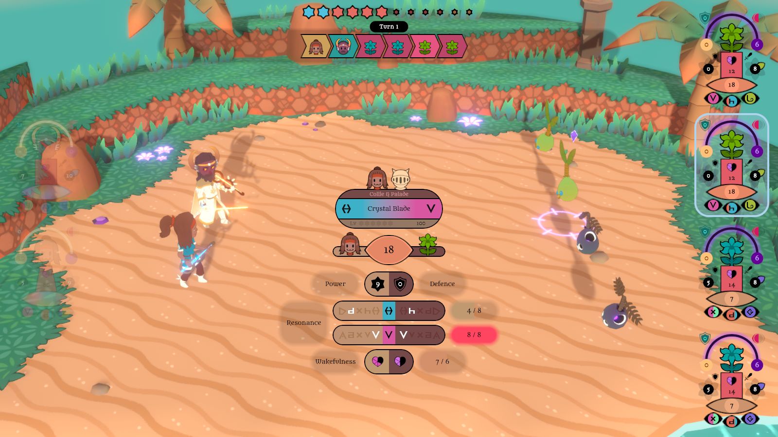
I revised - and simplified - the damage formula (and this predictor which shows what's going on). It's way simpler than most JRPG damage formulae, but I find that elegant, and it works well from my testing so far. It now looks like this:
![]() resonance
resonance is an integer value between 0 and 16 representing the closeness of the skill's two elements to the corresponding elements of both the user and target. For example, the resonance between H and D is 0 (completely different), between H and H is 4 (perfect match), and between H and h is 3 (close). The total of four values is used to give the 0-16 result. This can give a 0 value, but it would be very rare.
wakefulness is now used for damage multiplication again - as in Taming Dreams, where it first appeared - and I've removed the Mania and Slumber effects I had previously. The values are added to give a single number (eg 4 + 3 = 7 in that screenshot; count the pink heart fragments).
skillLevel starts at 0 for newly-acquired skills, and reaches 6 when they're mastered.
intensity is either 1/2, 1, or 2, depending on whether the battle music is calm, normal, or intense, like before.
other is additional but less 'fundamental' multipliers, like the 1/2 or 1 from succeeding with a reaction or not, the element of maelstrom battles, and whether shards activate (more on those later).
I feel like I've taken a lot of the concepts I was hoping to explore with this battle system through its many iterations - of matching your actions to your opponent rather than just spamming a general Attack button - and distilled them into something superior to what I had before!
![]()
Previously, you could buff or debuff Attack and Defence by up to six stages, shown with flower petals around the stats on the 'statues', but I never really liked how it worked, and had been wondering for a while what I could replace it with.
Wakefulness now serves as a kind of replacement since it effectively modifies both attack and defence; if you want to hit harder, you increase your wakefulness, but it comes at the cost of taking more damage.
While editing some of the code and UI stuff, I had an additional idea that directly replaces the (de)buffs from before:
elemental shards.
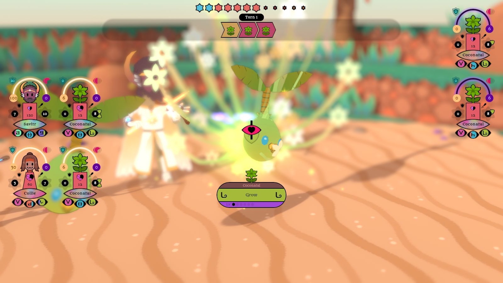
Now, characters can have up to six attack and defence 'shards' (six total per stat), each of which has an element; these are also shown as petals around the stats.
Attack shards double the power of a skill of the corresponding element once, then they break. Defence shards nullify damage from an element once, then break, essentially like the Null (Element) effects in MARDEK (which I always particularly liked... and stole from FFX, from what I can recall).
Some skills grant shards (Grow grants a Levitality attack shard, for example), and some (eg Crystal Slash) can break the opponent's shards before they get a chance to use them. Opponents can spawn with a number of shards, and equipment can allow your allies to start battles with shards too.
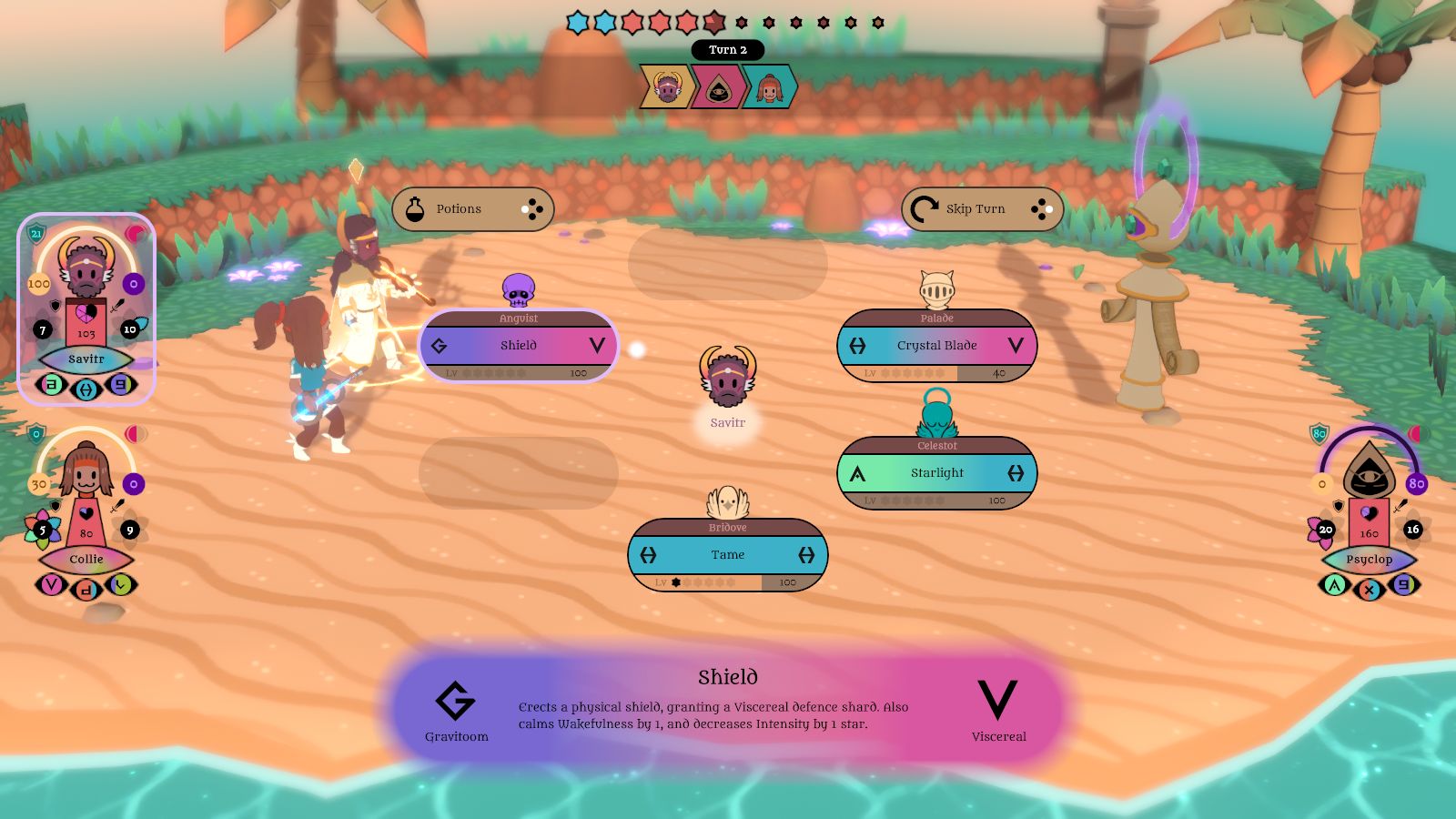
I feel it creates some interesting strategies, and makes some previously meh skills much more useful. For example, the Shield skill - which previously just buffed the Defence stat, which I never used because it felt useless to do so - now adds a Viscereal defence shard instead. Most 'physical' skills have the Viscereal element, so in effect it 'nullifies one physical attack'.
![]()
When attempting an attack that will break a shard instead of doing damage, the predictor shows an icon instead of the damage number, as seen here. This icon also shows instead of a 0 when the attack connects.
Anguists spawn with two Viscereal defence shards, meaning they'll endure two 'physical' hits without taking damage. Annoying! But a great shield for your own party if you tame them first, especially if their Presence is maxed out so opponents must target them.
Some opponents might spawn with a number of attack shards. Do you use skills to break those shards before they hit you hard, or tame them over to use their empowered attacks for yourself?
Many JRPG bosses charge up a powerful attack which you can potentially stop. Maybe some figmon could use a skill that grants them several attack shards, and it's up to you to break them in time or be broken by their empowered assault?
(Shard effects don't stack, so using a Viscereal skill with two V shards would double the damage and spend one shard, not quadruple the damage and spend both.)
![]()
I still need to redraw some of these icons!
I've revised how equipment works like half a dozen times over the course of development! I wanted each thing you found to feel worthwhile rather than like forgettable inventory junk, and experimented with things like complex passive effects, elemental affinities...
What I've got now is, like with the elements, simplified in a way that feels satisfyingly like a streamlining of the mess of ideas I had before.
Now, equippable items' effects are basic and familiar. Many just add simple additions to the Attack, Defence, HP, or Mental Defence stats. Others give slight shifts to the character's starting battle state. They might alter elements (eg h to H), starting wakefulness, or presence. Some grant attack or defence shards at the beginning of battle.
This Pretty Flower item, for example, won't have any effect on Savitr's elements because he already starts at H (max Harmony), but it grants a Harmony attack shard, doubling the power of his first use of Tame or Crystal Blade (formerly Brightblade), which can turn the tide of battle without being completely overpowered.
![]()
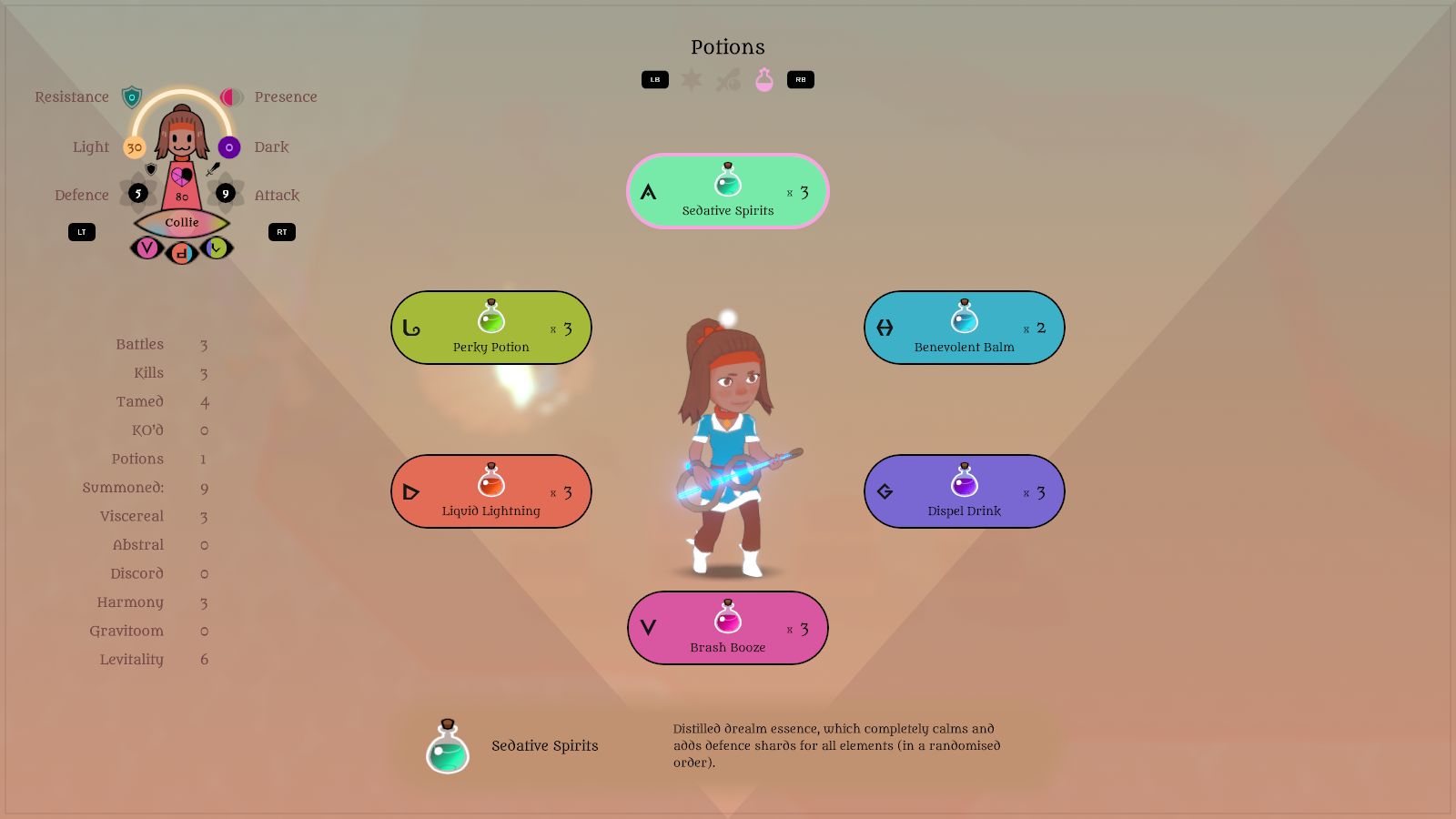
I also had to update the potions to the new elements. I like seeing all their colours together like this! I didn't have to change much, though the Viscereal and Abstral ones add attack and defence shards respectively now.
I removed the potion levels that I'd previously added to encourage their use, though. They just felt like inconsequential clutter, considering players are only likely to actually use a handful of potions over the course of their playthrough anyway.
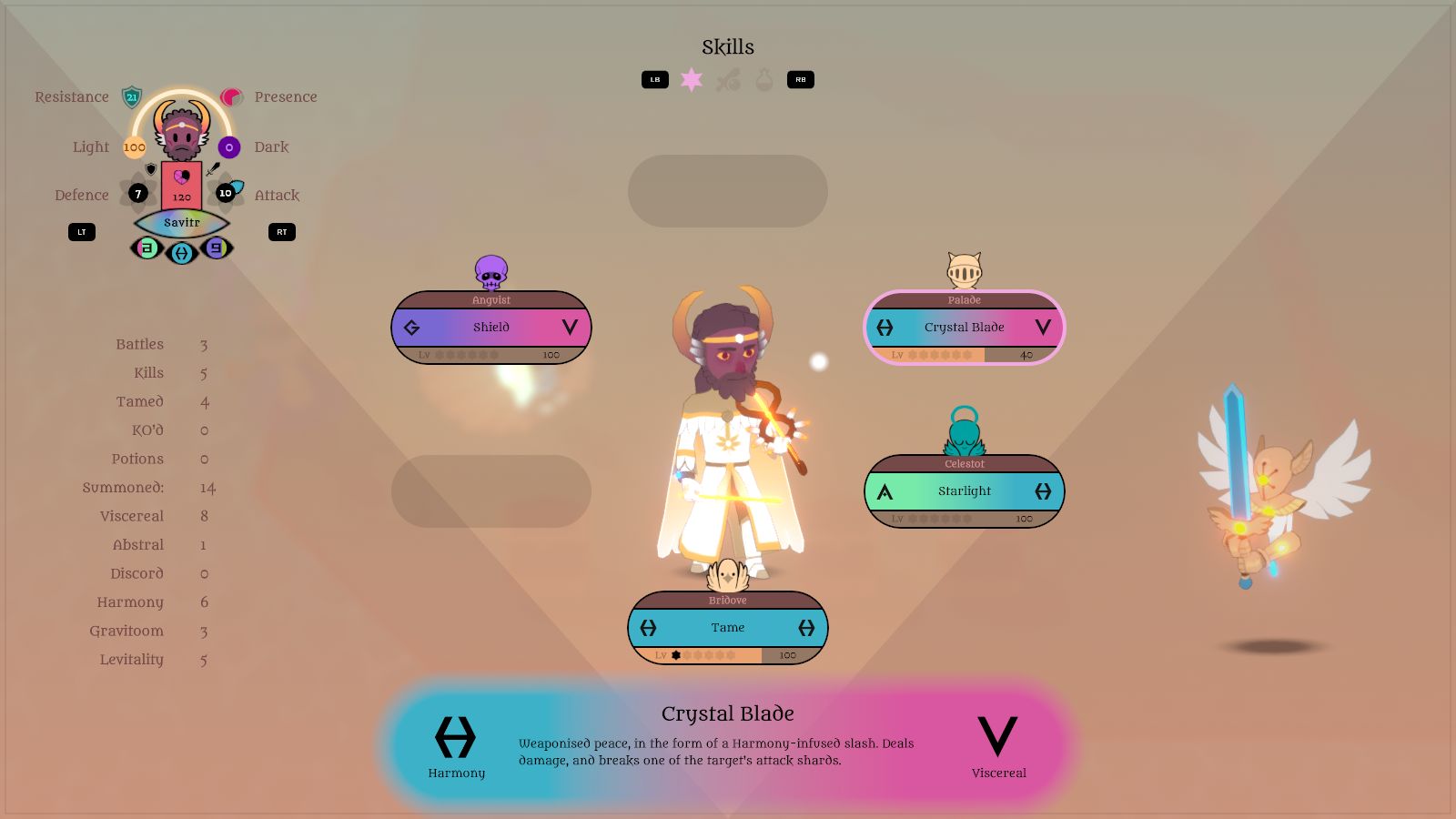
Previously, equipment shifted characters' 'affinity' towards elements, altering their damage with or defence against them, but I've pruned that out too. It left the area on the left side of this status screen completely empty, though, so now it lists what in the code are called 'accomplishments'. Many games track such things - MARDEK did, I think - and their only use would likely be for achievements. Mildly interesting data to know, though!
![]()
There are a couple of what I feel are big improvements that I can't really show in static images (I'd include a video or gif, but they take ages to make and the filesize ends up huge).
Previously, changes to states - wakefulness, presence, runes, etc - were shown as icon things, but they all appeared at once around the damage number. I've redesigned those (they look like eyes now, with a number of lashes to show the potency of the effect; just one (pair) in that screenshot), and they appear sequentially, which feels much better to me. Took some recoding of the way turns work though!
Also, the eye-shaped bit on each statue with the character's name was previously coloured according to their element, but now that they have several elements, it uses what's effectively a shifting soup of colours determined by the character's elements (so Savitr's looks more blue and Collie's more reddish). It reminds me of mood rings - if you're familiar with those! - and I like the effect a lot, though you'll have to play the game to see it in motion!
![]()
Oh, and I had to revise the Lore menu as well, though that didn't take very long. Now there's just one list with all the people and figmon, which I don't mind. Way more space for the model, too.
![]()
So that's a lot of stuff to have done in a week! There's probably more that I've forgotten to mention here too. I think I've done most or all of the mechanics-based changes to elements etc; it didn't take all that long.
Next, I'll need to go through all dialogue scenes - especially the tutorial ones - and modify those. Chances are I'll be entirely removing several tutorials, which isn't a bad thing since there were probably too many!
I'm really eager to get to it, too; I had to force myself
not to do more today (Saturday) to avoid burnout. And I've been replaying battles in a test area over and over beyond what's necessary for testing purely for the fun of it!
![]()
Also, maybe you didn't hear about this because nobody's really talking about it, but Her Majesty The Queen - the symbol of the UK itself - met her end the other day. I wrote
∞ a short post acknowledging it ∞, shortly after hearing the news, though it doesn't really say anything of worth.
Have I talked about Russel Brand on this blog before, though? He's an odd one. He used to be known as a chaotic, obnoxious comedian, infamous for his hedonistic escapades as much as for his actual act; a milder version of his antics can be seen in this clip, for example:
He always reminded me of a real-life Jack Sparrow, and I found him insufferable.
Recently, he's been fully embracing his surprisingly high Openness trait with a podcast you may or may not have seen; whether or not you interpret his videos as unhinged conspiracy theories may depend on your own degree of Openness.
I'm only mentioning this because YouTube's algorithm recommended this video he put out about the Queen's passing, and I found it particularly poignant and balanced:
Which I find almost as bizarre as the end of an era itself (what this former clown has transformed into, I mean).
Also, to follow acknowledgement of a monumental shift in human culture with something trivially mundane: I haven't bought a USB monitor for music composition after writing about that last week!!






6