Log In or Create Account
Back to Blog
DEVELOPMENT

11

1,319
Weekly Update - Tutorial Tips
2 years ago1,512 words
I recently finished the Live A Live Remake... but barely understood its mechanics, as has been the case with pretty much all RPGs I've played in the past. Annoying! Tutorials are the norm for modern games, and here's an overwhelming barrage of images showing all of the tutorials Atonal Dreams includes to hopefully explain its mechanics in a more satisfying way. But are they too much?? Not clear enough?!? I'd value your input!

I'm happy with Atonal Dreams' primary mechanics now, and I'm currently working through my list of things to clean up before the next alpha test.

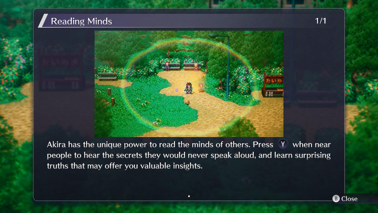
One part of that cleanup has involved revising all the tutorials. In what few modern games I've played, I've noticed a common format for tutorials: popups containing a video or image with text underneath. I recently completed the recent Live A Live Remake, so here's one from that, for example:


I played through the original SNES version years ago via emulator, a couple of times I think, and it was a big influence on MARDEK, from what I can recall. Also, how do you even pronounce "Live A Live"? I assume it's meant like "live a life" as in you get to experience several different perspectives, but "live" is not "life"! Liv a Lie-v?? Liv alive???


I think there were only a handful of these tutorial popups in that game, and they were very brief, touching only on things like this which didn't even need explaining (a "Y - Read Mind" hint already appears every time you approach an NPC) rather than more complicated or technical things.

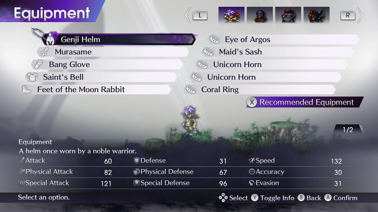
I don't know whether or not this remake kept or revised the stats-based aspects of the mechanics or not, because I never understood or remembered the mechanics of old RPGs. Characters have stats like this, though:


Characters also have a level. What's his? I don't know, it's not shown anywhere on this screen! And what's his name? Also not shown, for some reason! Why not?? You have to check a rarely-useful 'Formation' page to even see your party members' names!


Three attack stats? Huh? Why? They certainly weren't explained to me anywhere. But I notice there's a 'Toggle Info' button there. Will that explain anything?


That switches to this, which apparently shows resistances. Oh, he resists those things? I had no idea, and I don't know where they're coming from either. Weirdly, there's now an 'Icon Guide' button at the bottom that wasn't there before.


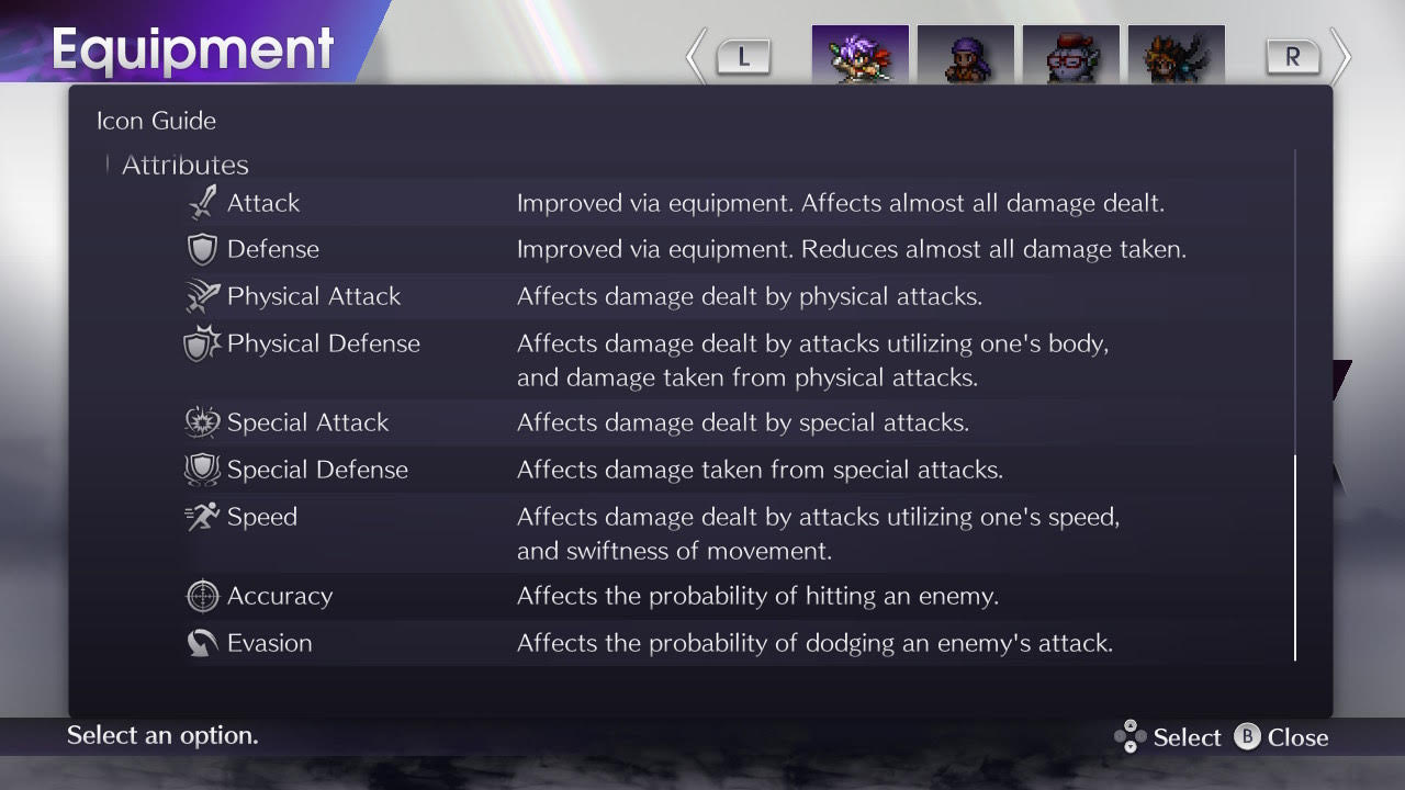
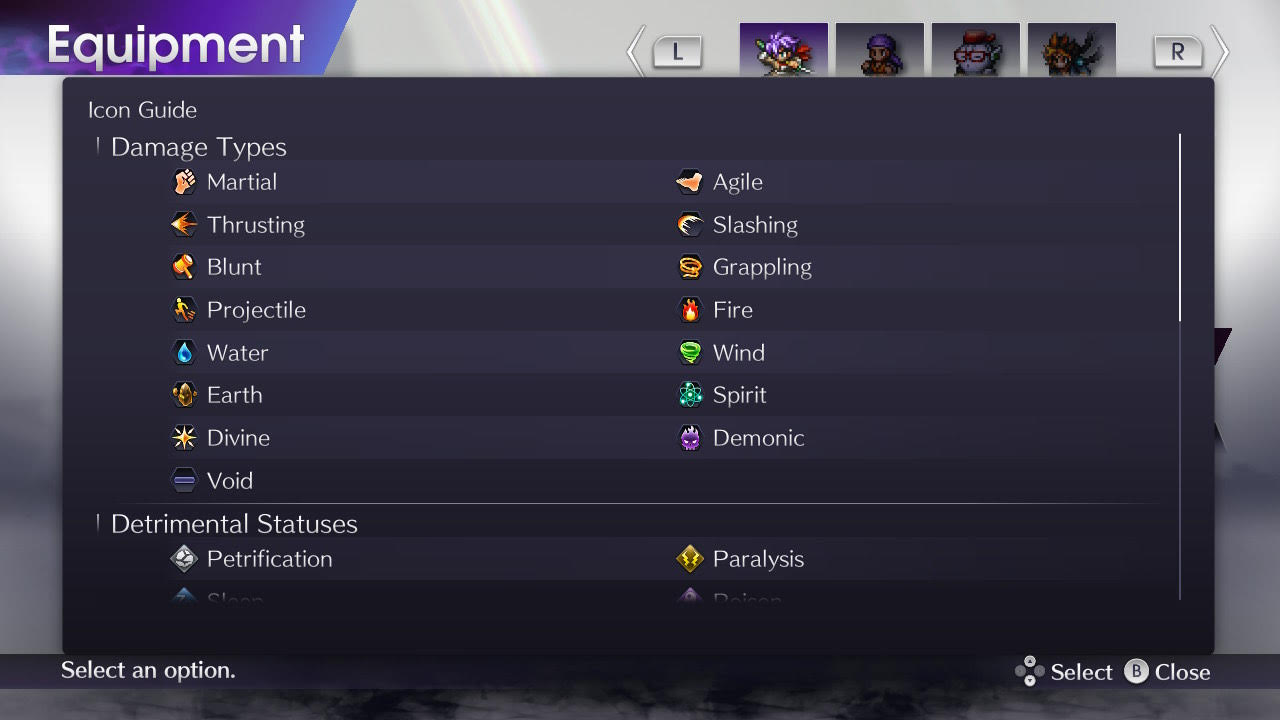
That brings up this thing, which - if I scroll to the bottom - 'explains' the stats (so why wasn't the 'Icon Guide' button on the previous screen where the stats were shown??). But does it? What does "affects almost all damage dealt" mean, exactly? Almost? What are the exceptions? And what are physical attacks? Attacks are marked with one of these many types, in many cases seemingly at random (if they were even in the original, I don't think they were shown to the player):


Which ones are physical? Who knows! The first seven, maybe? But that's just a guess. Or does it depend on the skill??

I spent about 30 hours in that world, and as I said, I've played the original through to completion a couple of times, but even after spending so long thinking about my own game's mechanics, I have little idea how they work in this. Skills seem to do apparently random damage even against the same enemy type, increasing stats doesn't seem to meaningfully increase damage output as far as I could tell, and my 'strategy' largely involved picking skills almost at random. That's how I always played RPGs in the past, too, though I can't say that it's very fulfilling.

(Interestingly, like in Atonal Dreams, characters' HP is restored to full at the end of every battle, and skills have no cost... though battles use a grid/chessboard-like layout, which you can move around, and skills have a range of adjacent or distant squares they can target. I just chose whatever skill I was in range to use, usually.)

So I wanted to do something different with Atonal Dreams. To make things clearer to the curious player so they can actually strategise and get satisfaction from choices deliberately and well made!

But obviously everyone's preferences are different, so I've been wondering a lot about whether I've explained too much, or whether just attempting to describe things opens up the expectation for things to be completely explained in a way I've failed to do!


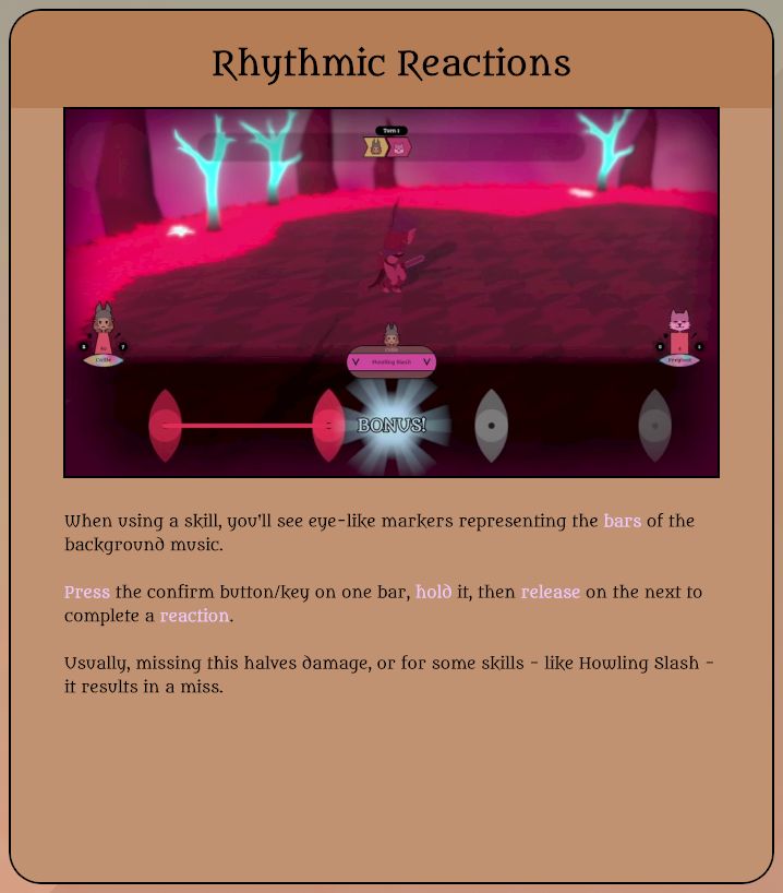
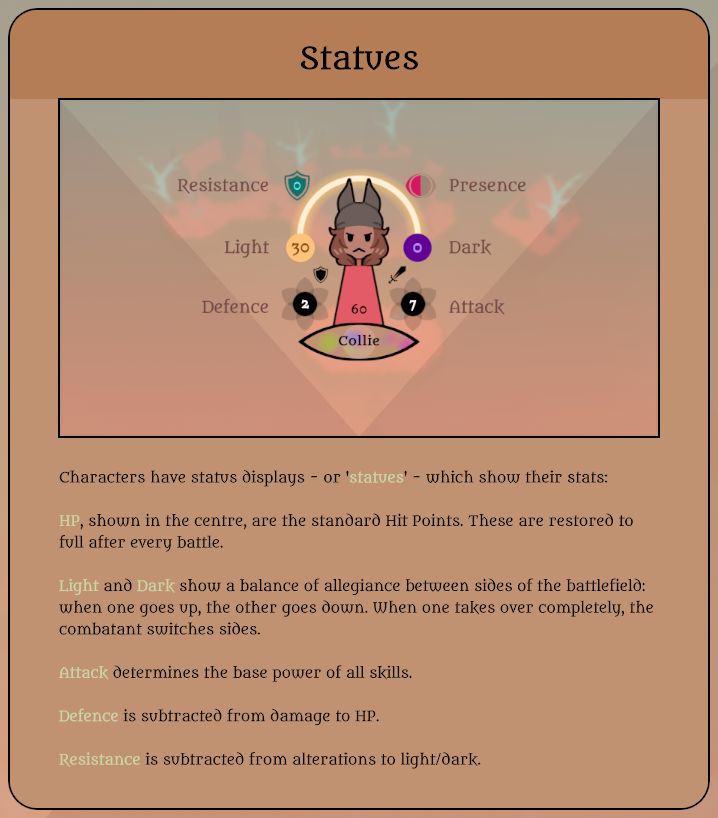
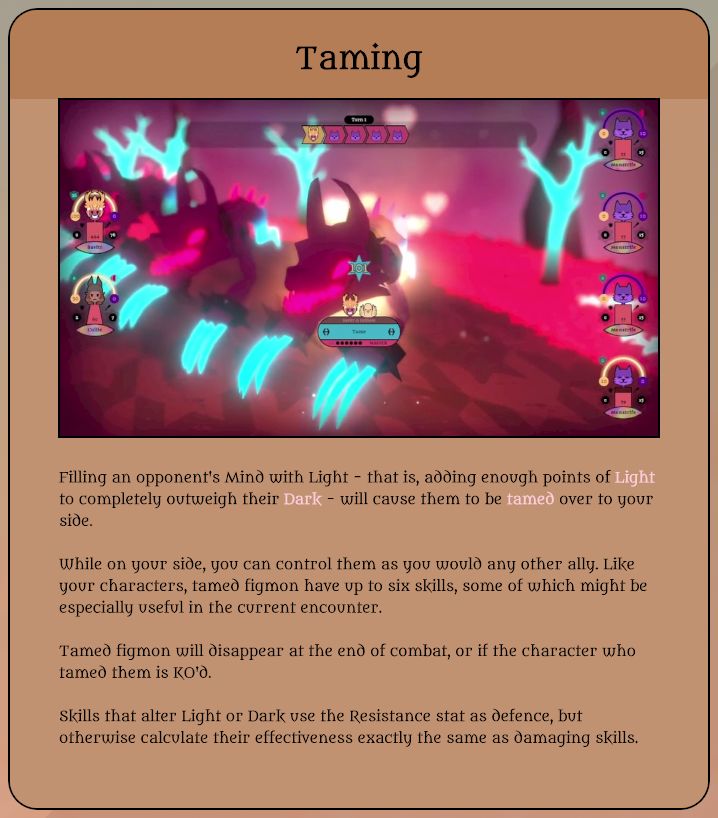
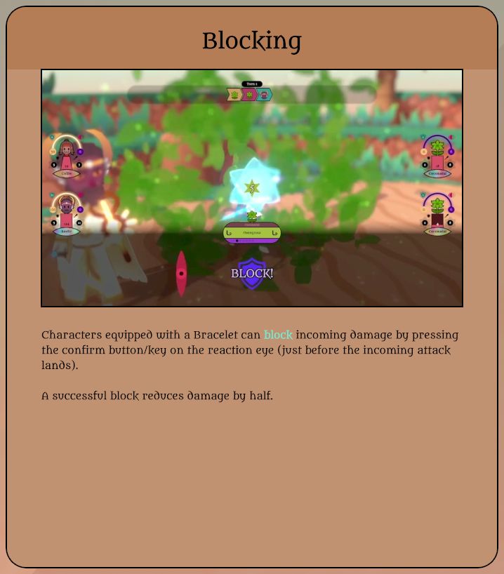
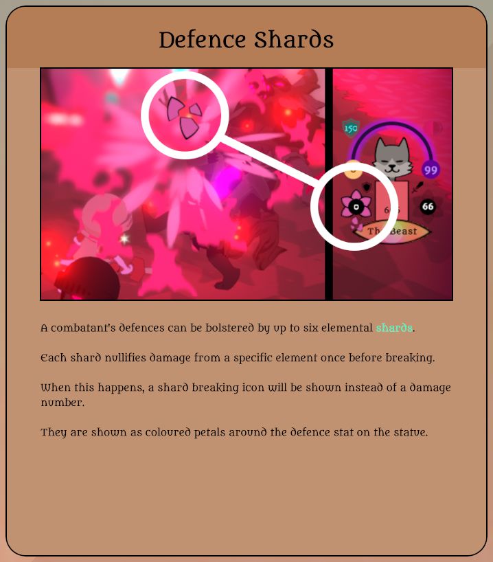
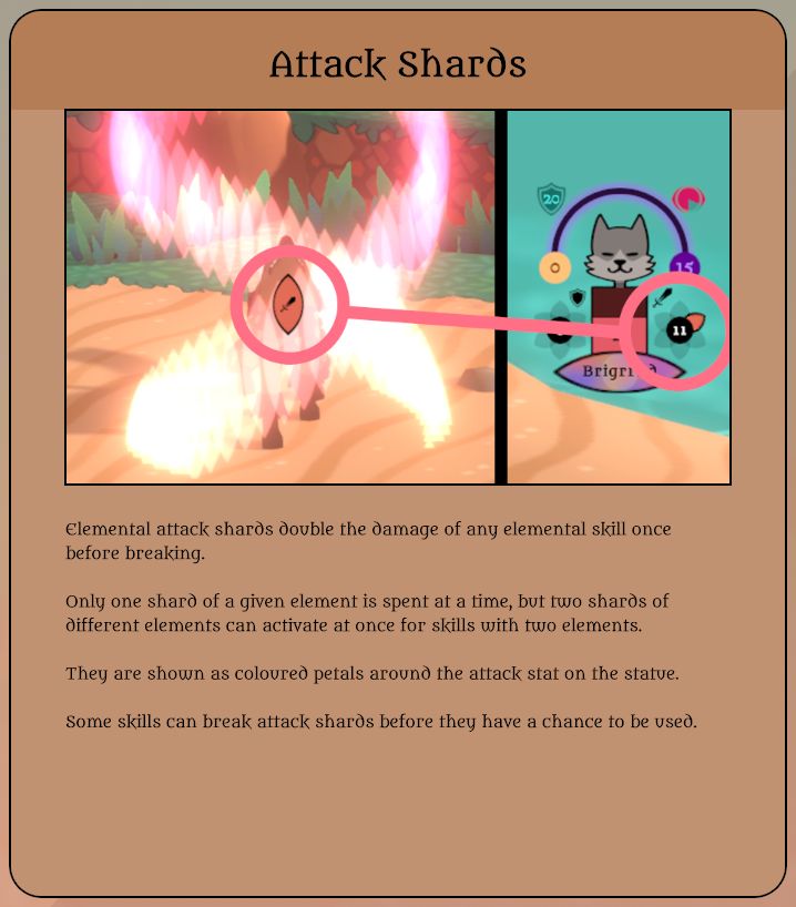
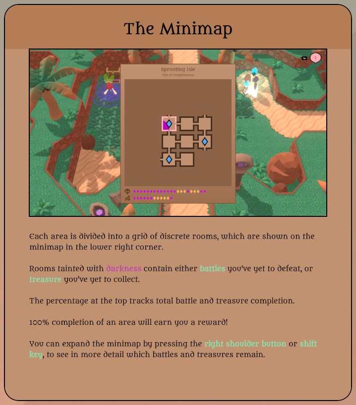
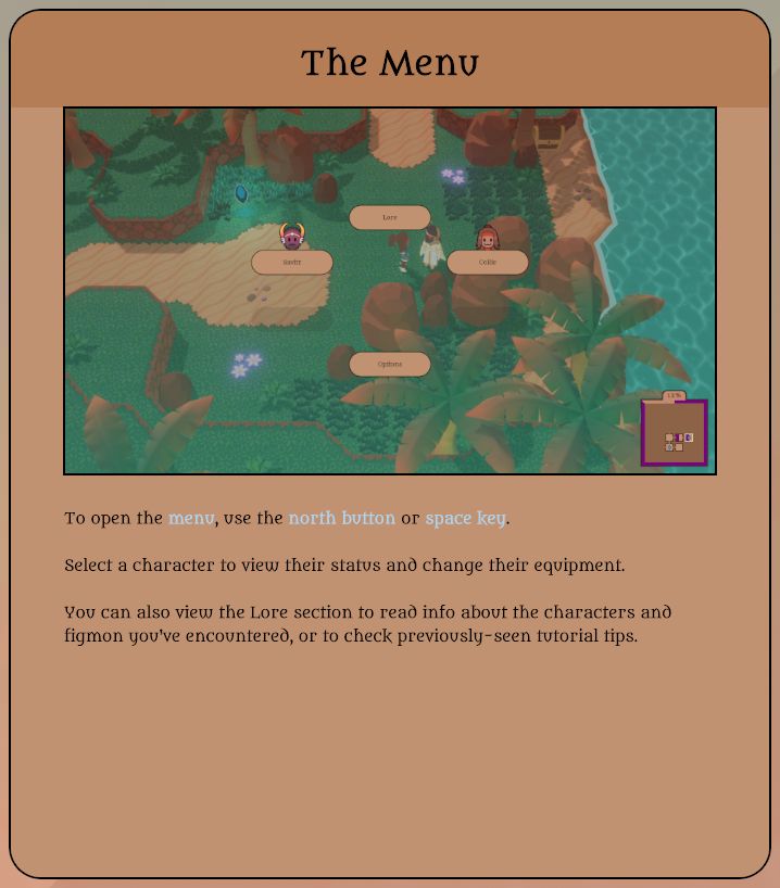
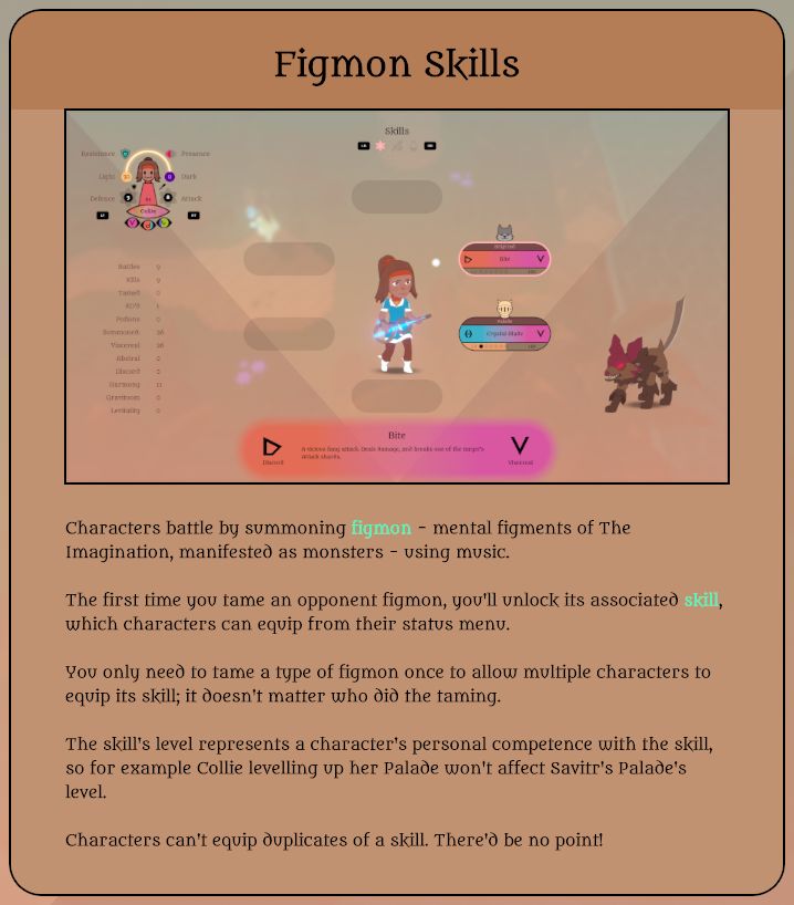
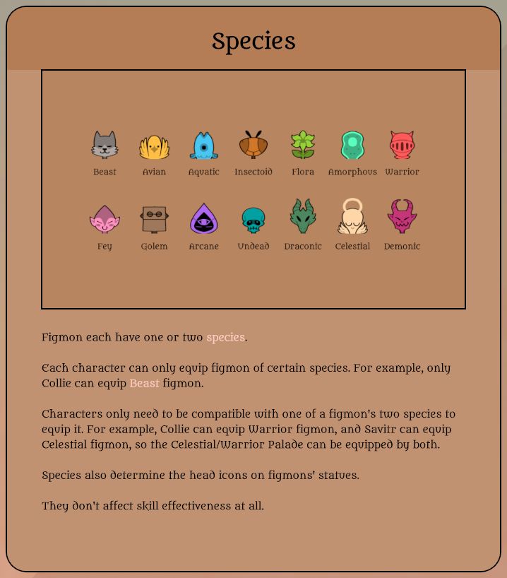
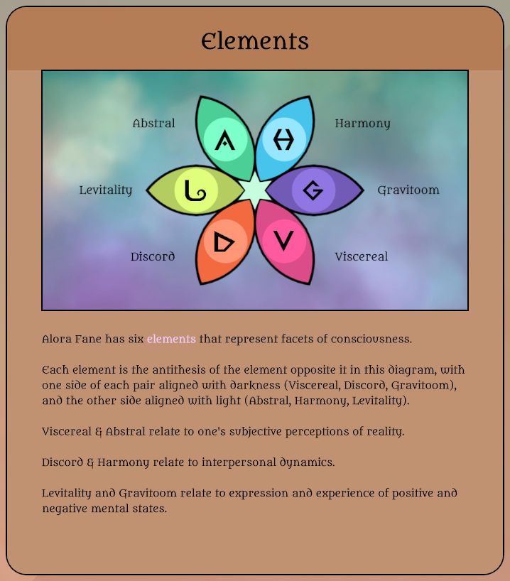
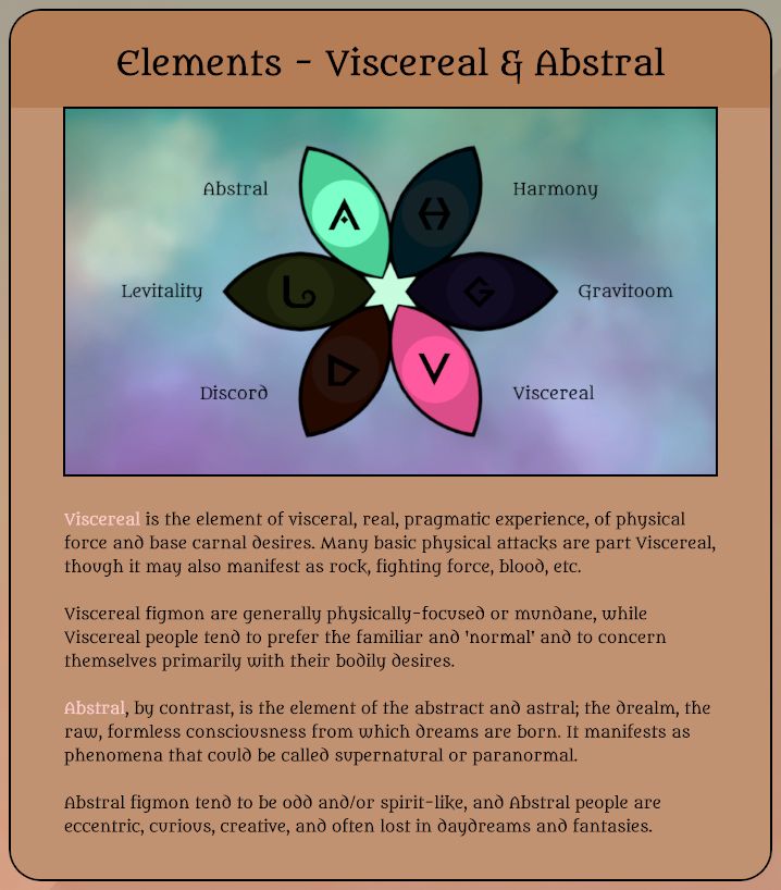
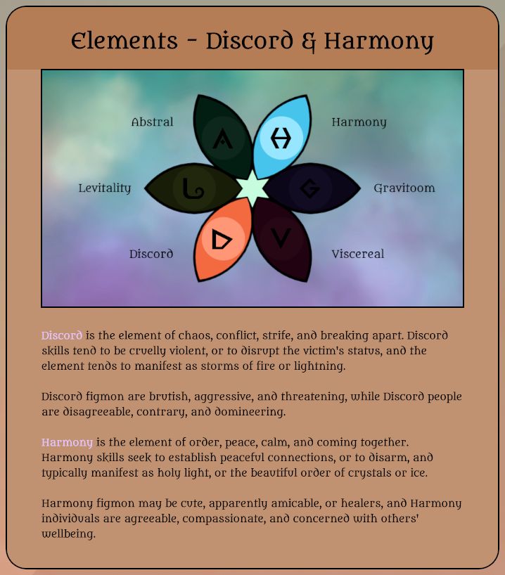
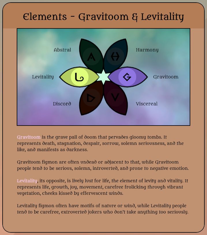
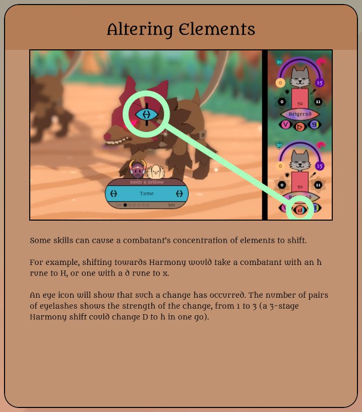
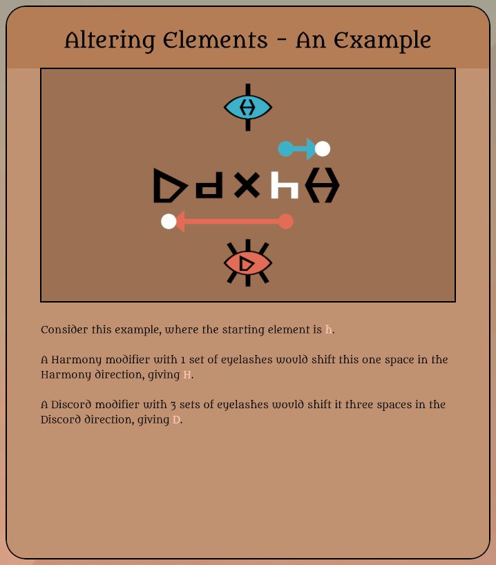
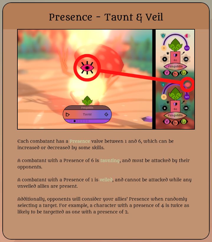
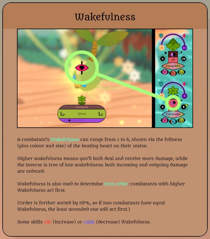
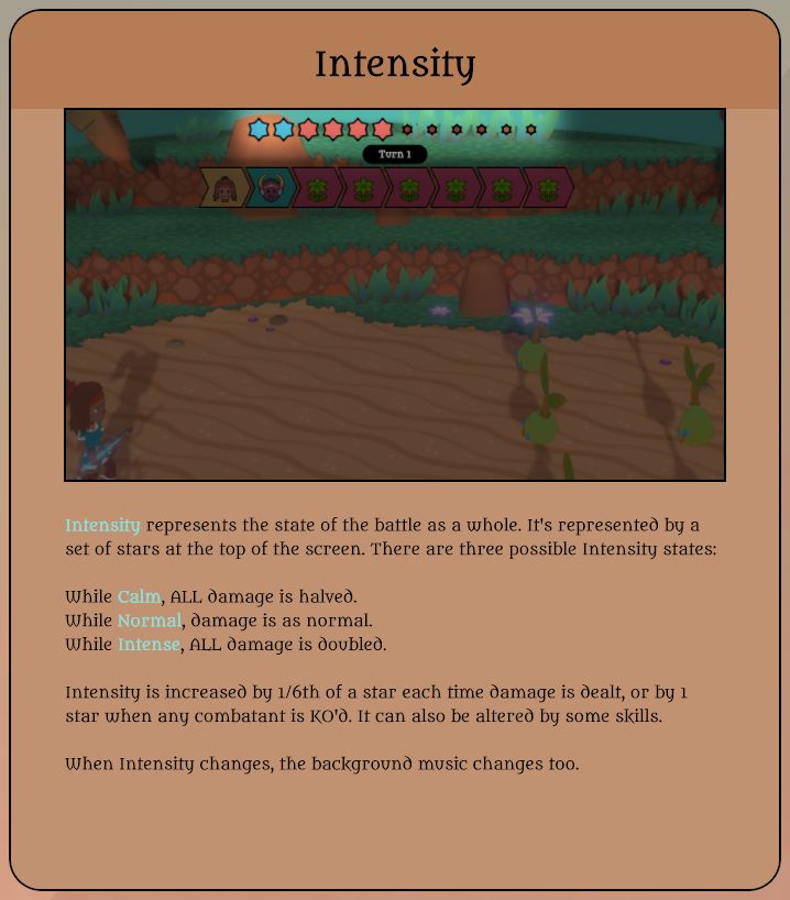
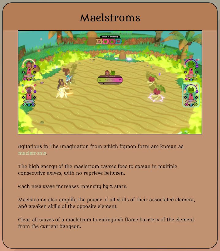
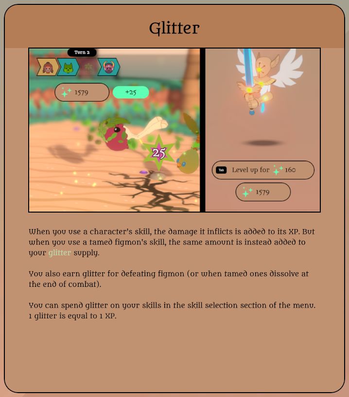
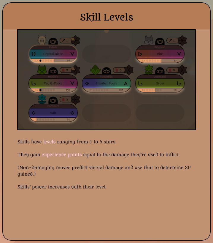
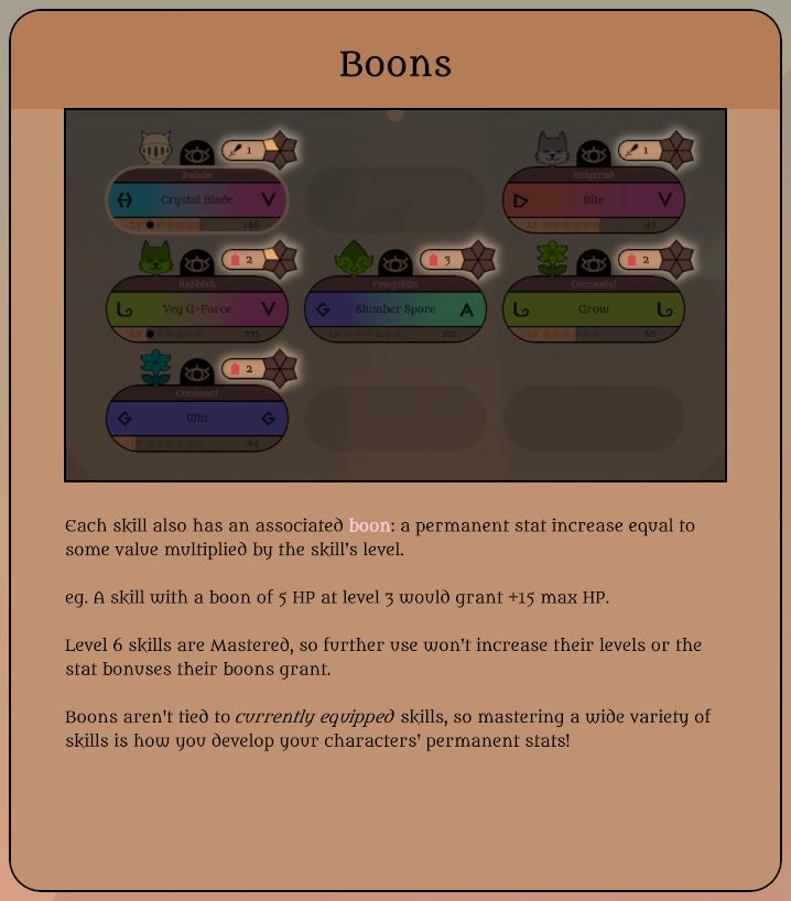
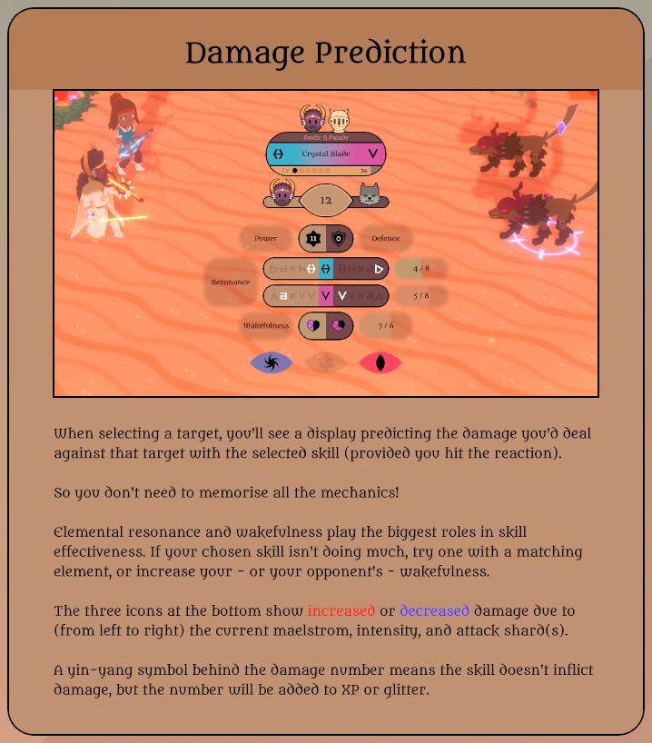
So here are the 28 tutorials (more than I thought) currently in Atonal Dreams. I know they're overwhelming when presented all at once like this! The proper context would have them shown gradually over the first couple of hours of gameplay. But this'll have to do for now.

(They're in .jpg format to keep the filesize down, so the quality's less than ideal. Also, highlighted text shifts between a rainbow of colours, which is why it's coloured differently across these static images.)

They're shown here in the order they're shown to the player (probably, unless all the various tweaks I've made changed a couple of them around):


This one uses a short video rather than a static image, though it'd be too much effort to represent that as a gif here!


This also uses a video.


This also uses a video, maybe unnecessarily?


I also recoloured the Brigrrnd figmon this week to better match the new reddish Discord element!


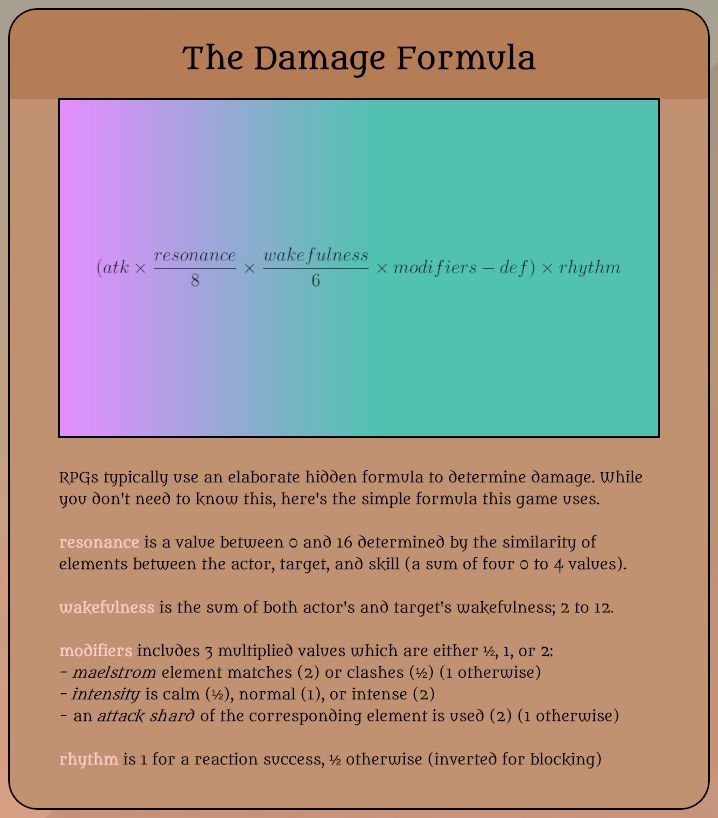
This is one I'm most concerned about being too much. Would people just see it as 'ew, math(s)!', and think they're expected to memorise and actively use this formula or something? Perhaps the only people who'd appreciate this insight into the behind-the-scenes would be a minority. Does it also disrupt immersion? Does awareness of and engagement with D&D's rules?


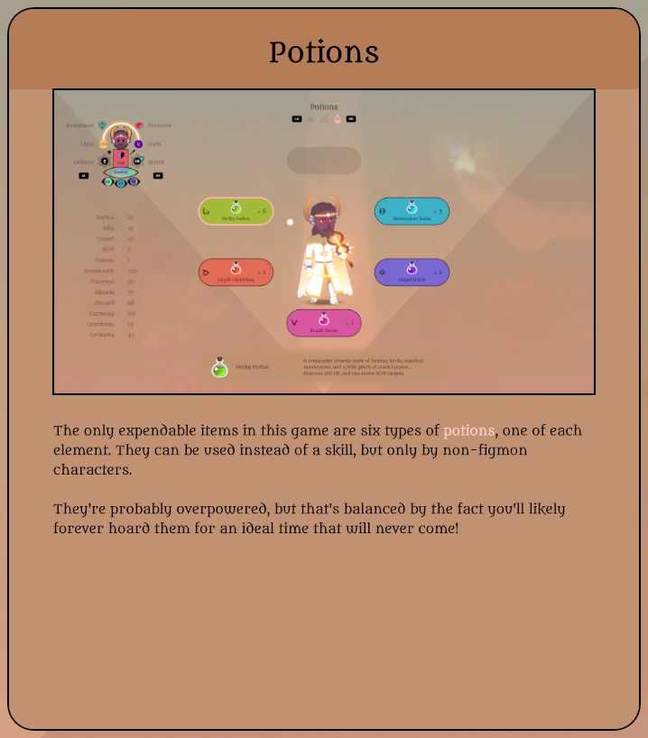
This image needs updating, but I need to draw the item icons first.


Phew! Congratulations on getting through all those if you did!!

I'm curious to hear how what you think of the level of detail seen in them! Too much? Too confusing?

Obviously the context would make a difference; you wouldn't be bombarded with this amount of information all at once in the game. So I'll be curious to hear from testers about that again during the next test.

The stuff I still need to do is largely tedious, nitpicky, or fixing weird bugs I don't know how to reproduce, and I'd say a lot of it isn't necessary to move on to the next stage...

So I think what I'll do is say I'll spend the next week on it, then run the next alpha the week after that. I'll ask for volunteers next weekend.


Quick personal note: My parents were away for two weeks, but are back now. Bleh. I miss the quiet and expanded personal space already. I need to move out.

I had long talks with a couple of my three remaining real-world friends over those two weeks. One mentioned her friends who are doing freelance web development, which I think I talked about last week?

The other - who I only talked to last night, in a video call - is living with her partner in her own place and working from home doing a tech job for decent pay... but she spent a long time talking about how frustrated and lost and unsatisfied she was by it all. It put some things into perspective, and made me appreciate how personally fulfilling what I'm doing now is, and dread how bleak the alternatives would be (hardly for the first time).

Do we toil away in poverty doing something we love, or do something we only tolerate in order to pay the bills? Most people do the latter because they have no choice.

I'll just have to hope that a Kickstarter - which I should do sooner in the coming months - will earn enough for the time I've spent on Atonal Dreams to have not been a complete waste.

I've also been thinking a lot about how I need to open commenting here and the Discord up to the public, I need to engage more on social media, since that's apparently crucial... but I've already talked about that a lot before. I'll need to focus on it in earnest once the game's ready enough to properly promote, though, which it almost is. About which I have very mixed feelings.

11 COMMENTS

Tama_Yoshi82~2Y
It's going to be difficult to judge whether the prompts are appropriate until fully immersed in the game. For one, not all mechanics will be dumped on the player at once, and not all of the mechanics will need to be understood (and especially not mastered) the moment that they're brought up.

The most recent JRPG I've played that had a lot of small bite-sized screens like this was Genshin Impact, and most of them I only turned to when I felt like I was missing something -- and Genshin is such a complicated game that I also found myself looking at fan wiki pages, which were usually more useful anyway!

It seems like communities tend to digest the obscure game mechanics better than the game tutorials do -- and it's not even uncommon for hidden game mechanics to be explained by the community (the fake randomness of Fire Emblem titles comes to mind, where a 99% hit chance in most FE games is actually closer to a 99.99% hit chance to minimize frustration).

My main reaction when looking at these cards is "Not now, but maybe later." Hopefully you have a neat menu that combines all of these cards in a way that's easy to find and search relevant items, and maybe a "NEW" system, for elements I haven't looked at yet -- those are common too! I reckon Genshin Impact didn't even throw all of its tutorial cards at the player, but merely had a non-focused flavor text (similar to an area title card, but on the side) that said "Tutorial about XXX available".
1
Tobias 1115~2Y
I specifically had in mind the sorts of people who write wikis and try to figure out damage formulae and the like, but I wonder what portion of the audience these even are?

I checked the Live A Live wiki while playing through that game to make sense of the mechanics... to no avail, as whoever had written it hadn't been entirely thorough. Which is why I like the idea of 'official' in-game explanations instead. That way the info is there even if the game is never big enough for that kind of devoted community to manifest.

I was surprised though that several alpha testers seemed to want everything perfectly explained the first time they saw it; so different to how I'd engaged with games in the past. That's been the main motivator behind this concern about tutorials. I'm not sure if that's indicative of changing times (I know games hold the player's hand a lot more these days) or just the sorts of minds who volunteer for testing.
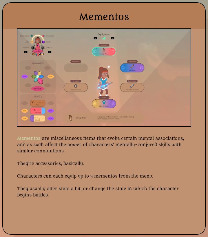
Ideally the mechanics of Atonal Dreams shouldn't need deeper fan analysis if they're all presented to the player like this, but I'll be curious to see how that plays out. Maybe it'd be like depriving curious fans of the chance to figure things out on their own actually!

Oh, and you can access all the tutorial tips you've previously seen from the Lore section of the menu, if you don't need them immediately but do want to check them later... though come to think of it, it's only viewable outside battle, which might limit its usefulness. HMM.
1
astralwolf92~2Y
Looks like things are coming together!
1
Refurin24~2Y
Typically I find pop-up tutorials annoying, even when they're useful, and would rather skip them and be lost than spend time reading how to play, and that seems to be a pretty common stance on them.

But tutorials that do a good job of presenting information naturally without feeling like a tutorial are tricky to get right, and also don't always work for everyone anyway.

All I can really say without playing anything and understand how much can be easily intuited is that there should definitely be an option to say "I do not want to read tutorial popups", and maybe some of the less crucial things like the damage formula can be entirely optional and just tucked in a help section or something.
1
Tobias 1115~2Y
The characters are set up explicitly as an experienced veteran who's training his apprentice, so the tutorials are interwoven with story and character bits. So they'll talk for several lines at the start of battles in a way that reveals something about both characters, then the popups appear at the end, summarising what was just explained by one character to the other.

I could have the first of these tutorial battles give the player an option to opt out of tutorials... but what would that skip, exactly? Just the popups at the end of the dialogue? Or the entire scenes, with all of their character development?
0
Refurin24~2Y
Just the popups is all I would want to skip, personally.

It's not tutorials themselves I'd be bothered about, assuming on subsequent playthroughs they are fast to skip through when they're no longer needed, just that popups themselves can feel very jarring and pull me out of the experience.

With the way it sounds like things are set up, people skipping the popups should still have something to go off of anyway, even if it's not super specific, so that probably helps a lot.

The kinds of people who skip tutorial popups are probably used to having to figure things out anyway.
1
purplerabbits148~2Y
I don't mind reading tutorials personally and gleaming information how it works is pretty cool. However, I don't actively think about the damage calculation unless the battles are tightly scripted and knowing where an obscure mechanic makes a huge difference. Typically, I get a general feel for something and apply "Do this action and you get bigger damage" type of thinking.

I know that people have a tendency to avoid reading so pop ups can be flow breaking, but getting people to understand things do require some reading. The biggest examples would be all the Five Nights at Freddy's fan games. They are all exposition on what to do to survive as narrated by a voice or given prompts that need to be read.

I remember watching this video that does in depth on what makes an imersive tutorial and those that break imersion, and furthermore what makes a good tutorial. [LINK] I find that Josh's statement about being able to test out new mechanics in a safe way before throwing in danger to be quite relavant with my experience when testing the Alpha. I remember feeling a slight annoyance that I kept missing the reaction times to defend against attacks until the middle of the playtheough when I manged to get the timing down once the Intensity slowed down enough that I could hit the reaction at the right time.

I think that the pop up specifically for glitter may be a bit too much, possibly? Currency in games is pretty standard so spending glitter to level up Figmon is maybe redundant. Although to be fair some people have missed very obvious things and complained so yeah.
1
Tobias 1115~2Y
Perhaps I should have looked at videos like that earlier! And I probably should watch it now... but it's almost an hour long and I don't have the time or mental energy at the moment, annoyingly. It's quite draining watching stuff related to my work, especially compared to watching mindless distractions.

Because Savitr is explicitly the experienced master who's teaching his inexperienced apprentice, Collie, I've interwoven the tutorial explanations with character-establishing dialogue... but I wonder whether or not that was the right thing to do.

And surely the genre and style of the game would make a huge difference? I only opened that video in a tab to save it to my (immensely long) Watch Later list, but I saw that it starts with Dark Souls (I think?), which would appeal to players in a hugely different way to Atonal Dreams! But maybe he covers a wide range of genres and there are commonalities I'm not even aware of...

I suppose I wrote the tutorials the way I did because things like damage formulae intrigue me as a developer, and because other testers seemed to want to know how things ticked in detail too... It's probably impossible to please everyone!

While currency like gold for buying items in shops is standard, I don't recall playing anything else where you collected something you could spend as XP on equippable skills! But maybe I've not played enough games.
1
purplerabbits148~2Y
Josh plays a wide variety of games as examples, such as Portal (an fps puzzle game), Deus Ex Human Revolution (an imersive sim game), Soul Reaver Kain (block puzzle game with hack and slash mechanics), and Dark Souls (hard core hack and slash game). The genere of the games don't matter as much when describing a tutorial, the evaluation on what makes a good tutorial should be on how well that tutorial does it's job at explaining the mechanics of the game.

Yeah it's fustrating when new information comes up after starting something that would have been very useful. Josh only posted the tutorial video like 2 months ago, would have been nice to link to you before starting. I have trained myself to watch all youtube videos at x2 speed so the near hour length doesn't faze me.

One statement Josh brings up that I think is relavant would be how there is a world of a difference when starting a game and going, "Oh god it's the tutorial" and contrasting with, "I love the beginning of the game. " With Portal as the example, Valve has such a seamless tutorial that you don't register that you are going through a tutorial. Only when Josh broke the tutorials down and replaying Portal did I realize how Valve did tutorials for each mechanic while seamlessly integrating it into the game, and how each mechanic doesn't need to be front loaded all at the beginning. Although with an Alpha and the beta testers, knowing how things work should be a priority since the beta testers are there to make sure things work as intended and it's efficient to have everything all in one place to test things out.

For me it seems like glitter is a fusion of both exp and gold. I've played Epic Battle Fantasy 3 - 5 and after each battle you get gold and exp points. You spend gold at shops and exp to learn new skills. I mentaly register both gold and exp points as "spend this currency and get something in return." So having glittler be both "gold" and exp at the same time is not strange to me. But to be fair, I know I play a lot of games so some logics come obvious to me.
1
Tobias 1115~2Y
Interesting; I've played and enjoyed Portal and its sequel, and the Legacy of Kain and Soul Reaver series (though why you'd describe it as a block puzzle game is perplexing to me, unless there's some new installment I'm unaware of; it's been years since I played those though).

Portal is an interesting example, because its story is literally about the protagonist completing gameplay tasks, so it makes perfect sense for GLaDOS to explain how they work without it feeling like Gameplay and Story Segregation (as TVTropes calls it).

I'd say Savitr teaching Collie is similar to that, hopefully, and the gameplay mechanics stuff is interwoven with the narrative rather than aside from it. A master of order teaching rules to someone born of chaos who wanted to escape it, but struggles to.

But I suppose I can only wait and see what players think.

And I still haven't watched that video, but should! When I find the time; I don't like watching things at 2x speed.
1
Falcon64~2Y
The second paragraph of the "potions" tutorial strikes me the most as something that sounds very unprofessional. A sentence like "this system is probably overpowered" makes it seem like the game is not a polished product, but something written on a knee that's been released to the public. Likewise, mentioning that players will probably forever hoard potions seems a bit weird, but not to the same level. It could be well-received as a "callout", maybe?

The math tutorial probably shouldn't be an unavoidable prompt, but something the player can access optionally if they want to. It could only exists in the archive for example, and you could add an extra sentence to the damage predictor tutorial to the effect of "an explanation of the full damage formula can be found in the archive if you're interested".

All the other tutorials seem fine to me for what they're supposed to be doing, though of course the full experience involves them appearing gradually throughout gameplay, which can't be opined on here. I do think they were paced well during the last alpha, and the issues people had were mostly with the pacing of the story bits rather than the tutorials, but I'm curious what the new pacing is going to look like!
1
Log in to comment!