GAMES
1,116
Horizon Zero Dawn - First Impressions
3 years ago
I finally got around to playing this game, and I want to write about some things I noticed in the first hour or two of gameplay and how they compare to concerns I've had about Atonal Dreams!
This game was released in 2017, and I remember being interested in playing it around that time, but it was only for the PS4, and I didn't have one of those. I waited a while for it to come out on PC, which it finally did in 2020... but it took many months for me to actually get around to buying it, and many more months after that before I finally started playing it! For the past few days I've been thinking "uggghhh I should probably start that game", which is a great attitude to have about the sort of thing I'm supposed to be making a living from creating myself, right??
Bleh, anyway. I don't want to write out some
thorough review or anything like that, especially since I've pretty much only just finished the tutorial (if it could even be called that), but, as always, I was seeing things as a developer and comparing it to my own work, so there are a couple of things I want to make a note of.
I typically play PC games sitting in my chair in front of the screen, but this time I experimented with sitting on my bed with the monitor on a desk at the end of the bed (in front of me).
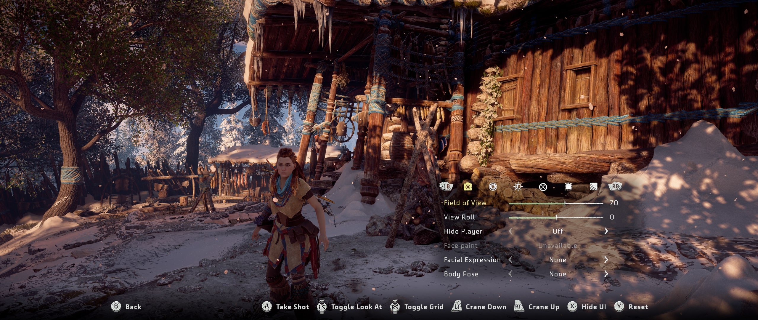
I tend to take a lot of screenshots of games I play these days, and I love how the switch has a screenshot button right alongside all the others. For PC games, I usually have to use some hotkey, though the Epic Games store - which I got this through - doesn't seem to have a screenshot feature. The game does include a 'photo mode' though, so I thought okay, since I'm playing with a gamepad from my bed, nowhere near my keyboard, I'll use that!
![]()
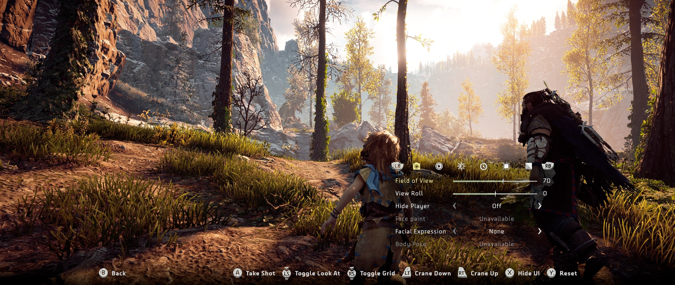
So the dozen or so awkward screenshots I took all have this UI in them because I only just realised there's a button to hide it. Pfft! I think this 'photo mode' is common to a lot of modern games? I get the feeling it appeals to the sorts of people who take selfies or are more engaged with the whole online gamer/streamer kind of culture or something? I don't care for it myself.
Something that's come up during the Atonal Dreams testing is font size: it's too small, more than one person has said. But I noticed that the text in this game is fairly small, and I could barely make it out from maybe a metre or two away. I wonder whether it's a standard sort of size, or if there's some setting for it that I haven't seen. (I also don't think I could have used the photo mode to take a picture of the menu? So annoyingly I have no images of that.)
![]()
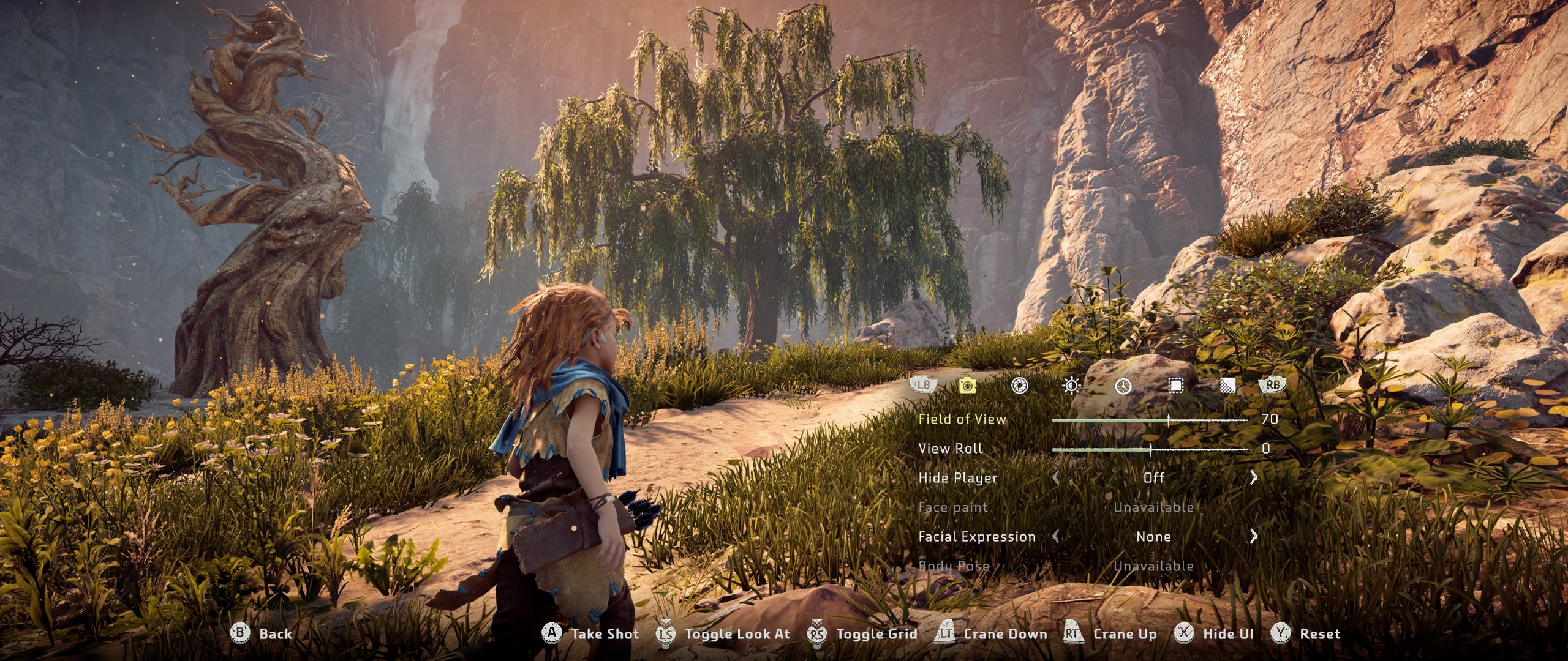
The technical graphical aspects of games are getting so impressive these days. This game's 5 years old, and I've seen posts on Reddit about how the sequel looks even better, but this one already borders on realism. It's astounding how technology went from Pong to this in less than a generation! (Hmm, apparently Pong is 50 years old. So this was made 45 years after Pong. Bizarre.)
Though... I can't say I'm a fan of the whole realistic look myself. Partly it's due to a feeling of "I can't make something like this myself" - I loved playing SNES games during the PS2/PS3 era because they evoked the opposite thought - but I just feel it's aesthetically really
busy, overwhelming, maybe, or...
![]()
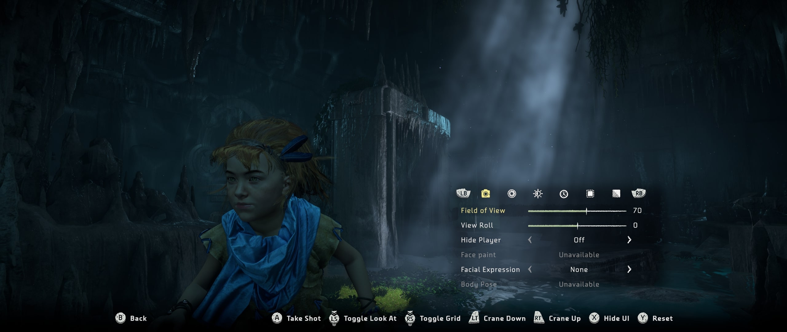
This is supposed to be a little girl. Looks to me like a middle-aged man with dwarfism or something.
Something I worried about with Atonal Dreams' characters - especially how their emoting works - is that they'd feel creepy, and/or like robots. But 'creepy and/or like robots' is exactly how I'd describe how I feel about the look of the characters in this. They look realistic enough, I suppose, but there's also something
off about them, and the way they emote and animate is, well,
obviously an attempt to simulate humans in a way I find unsettling.
I once read somewhere that perhaps we have this aversion to the Uncanny Valley because we evolved to be wary of our alien overlords when they're pretending to be human or something like that. Ha.
![]()
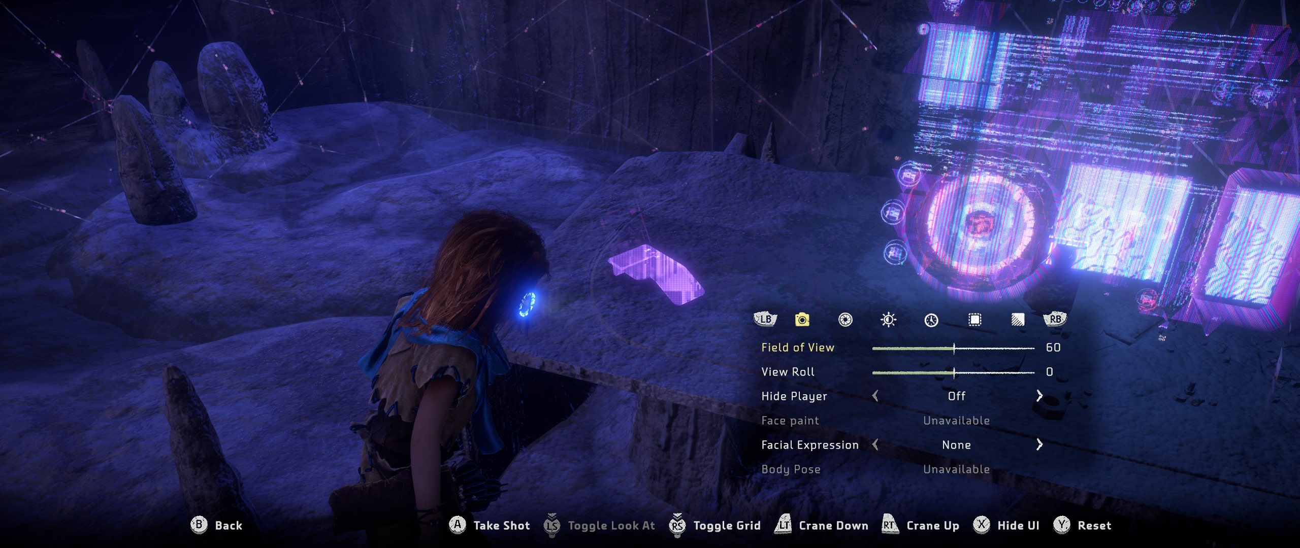
I take it for granted that the first hour or two I spend in a new game will be an overwhelming mess of confusion, where nothing is familiar enough to make any sense. That was very much the case here. I had little idea what was going on around me or what I was even supposed to do. There's this bit in particular where you get this... thing (Focus, I think it's called?) which allows you to see various techy overlays in the world, but in the area you find it, there are a bunch of purplish UI-looking things that seem like you should be able to interact with or at least examine them, but they're purely decorative (as far as I could tell). I think that's confusing, so early on; I would have preferred if only the things you could interact with were lit up.
I was surprised though by the length of this intro section where you're a child. Or before that, there's a cutscene where Aloy, the protagonist, is a
baby, so you just have to sit back and watch. Eventually there's a tutorial bit where you're taught how to hunt and such, but it felt frustrating to me because concepts are fairly quickly explained once, and you get very little opportunity to practice them because your... guardian guy (whatever he even is) is telling you to hurry along and not dawdle (I suppose I probably could have dawdled anyway, but still).
He explains how to craft new arrows, for example, but when I actually got around to
needing to do that much later, I couldn't remember it at all and pretty much had to figure it out myself.
I suppose it's reassuring, in a way? That even games like this - which I think was/is highly-regarded? - have tutorials that are very far from perfect. So maybe Atonal Dreams' isn't too bad after all.
![]()
It took me over an hour - or at least that's what it felt like, though it might have been much shorter - before I got to the point where I could just run around and experience the 'pure gameplay' of beating up enemies (machines in this) and such, and even then, once I actually had control I had to just run around through the pretty scenery lost for ages before I found any. I'd prefer to engage with that aspect of the gameplay as soon as possible to scratch the itch, as I've written about a few times in the past and have kept in mind when developing my own games.
![]()
Overall, I suppose the experience so far has reminded me of what I prefer and what I don't:
Rather than wide open worlds you can explore as you please without direction, but where you can very easily miss stuff, I prefer more rigid on-rails dungeons of limited scope, where you have distinct objectives and can achieve some kind of 100% completion without excessive exploration.
And I definitely prefer stylised, cartoony visual styles over attempts at achieving realism. Art allows us to bend reality to better appeal to our perceptions, after all. There's still definitely a lot of value in pushing art and technology like this - the results are undeniably impressive - but it's not a direction I'd be interested in going in myself as a creator even if it was possible for me to do so.
I assume the game will grow on me over time, though I need to get into the habit of assigning 'game playing time' into my days or something!



1