Log In or Create Account
Back to Blog
DEVELOPMENT

10

1,197
Weekly Update - Cover art finished; Doubts due to lack of childhood encouragement
2 years ago1,254 words
I finished some promotional art, which I'm proud of, but... did your parents ever encourage you in your pursuit of your interests?

I've been writing these Weekly Updates a few days late for a while - ∞ the last one was on Monday, just 3 days ago ∞ - but I'm writing this one early, on a Thursday, due to some doubts that I want to work through by essentially talking to myself here.

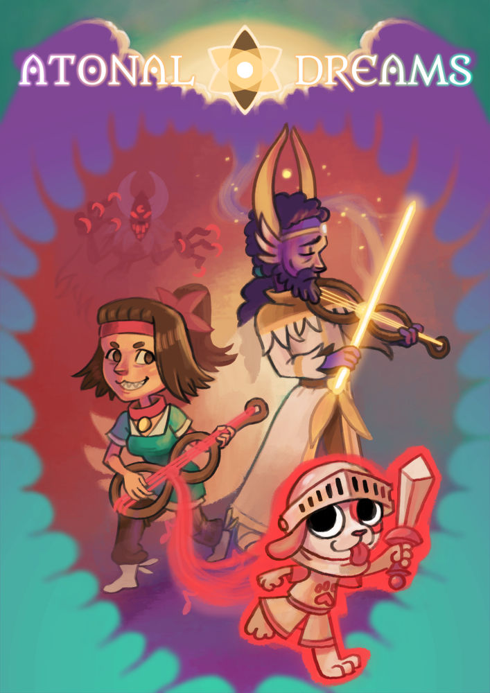
On Monday, I shared a sketch of a possible promotional 'cover art' image thing I'd started painting. I've now (probably?) finished that, and it looks like this:


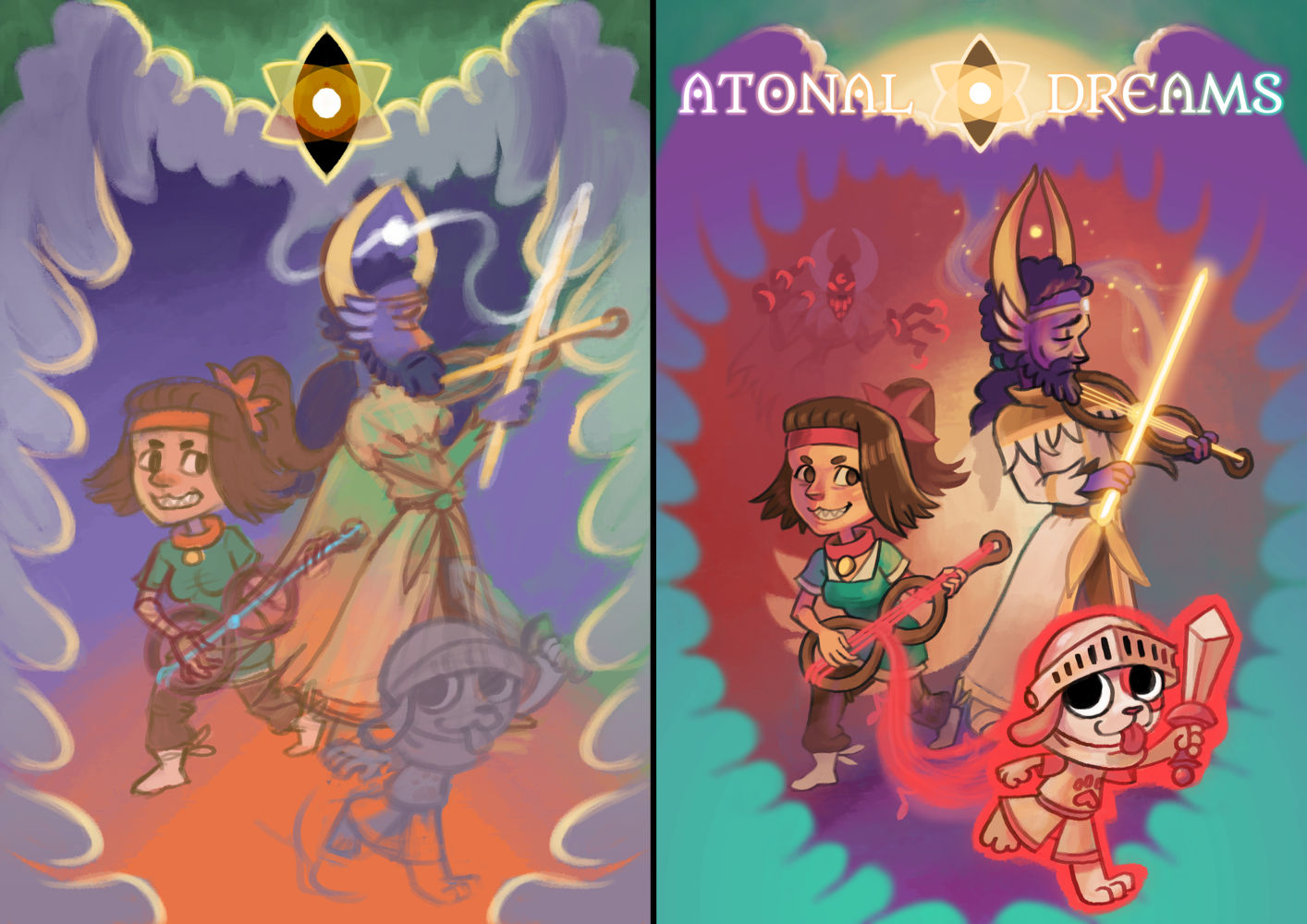
Here's a comparison between the ugly sketch and the finished version:


I've also posted a progress gif thing on ∞ my Patreon ∞.

I now finally have a proper stylised title, too, which is included in this... though it's in light text over a light part of the image, which doesn't work, so that might need some tweaking.

∞ According to a post on that howtomarketagame.com site I linked to last time ∞, the various 'capsule' images used to represent games on Steam are probably the most important part of marketing; the linked article talks about how a game got 20x more sales purely as a result of improving its capsule.

I'd always thought of 'marketing' as going out and promoting elsewhere, and I wasn't sure where... but I suppose it makes sense that a lot of people find games just by browsing the library in Steam directly, as you would when searching for something to watch on Netflix or whatever. So knowing that just preparing these capsule images would be such an advantage feels less like I have some insurmountable mountain to climb and gives me something directly 'actionable' to focus on.

The author of that site suggested paying a professional to do the capsule art, who'd charge between $500 and $1000. I tried to make it myself, as always.

And I think the result is comparable to something by a professional! Or am I delusional?


I'm really happy with it, personally, and proud that I - me! - have the skills to produce such a thing. It feels like all the years of hard work I put in in the past have manifested as something useful, and the thought that I can do high-quality work without having to pay someone else gives me a large amount of personal satisfaction.

(I also got wondering whether I could be one of the artists charging for the $500 - $1000 capsule art commissions...)

When we're proud of something we've made, it's natural to want to show it to other people. I thought I should share it somewhere on Reddit, but wasn't sure where; would it even be appropriate on r/drawing or similar? And posting in a gaming community feels like something I'd have only one shot at - posting it repeatedly seems like it'd annoy people - and I should prepare my game's store page properly before that...

So I thought I'd show it to the three friends I have first. I sent it to them a couple of days ago. None of them have replied. Not unusual - and one of them has in the past sent me her art which I take days to reply to - but... still at least a bit deflating.

I went to get food a couple of hours ago, and encountered my mum in the kitchen - the only time I ever really see my parents who I still live with - and decided to show her, naively assuming she'd be wowed that her own child could produce something so amazingly skilled or whatever. Or rather, I feel like I'm a disappointment, and hoped it might show that I have some sliver of worth after all, or something like that.

She stared at it for a second or two with no expression on her face, then asked me in a stern, dismissive, almost annoyed tone whether it was a game for children.

She's not remotely the target demographic, and she has no experience with games or the whole internet/pop culture world I've spent much of my life in - she wouldn't have a clue what a 'chibi' was, for example - so I can see how she'd assume that from the stylised character proportions, but...

Sigh. I wonder how many parents are supportive of their children's interests. Is it the majority, or just a few? I blame my father for my many anxieties and insecurities, but my mother's never exactly been supportive either. She's not overtly hostile towards me like some parents are, but I can only remember two times she's ever hugged me, and she never asks to see my creative work; on the handful of occasions I've tried showing her anyway, she's reacted much like this, with a kind of annoyance or impatience or something, or with criticism rather than ever a kind word. If she ever hung my incompetent scribbles on the fridge when I was a child, I don't remember it.

Her feelings about my work shouldn't even matter that much now that I'm (ostensibly) an adult, but I suppose the drive to please parents who've withheld positive reinforcement is something that sticks with us for a lifetime. The desire to make a parent proud motivating a character's entire adult behaviour is a common trope in fictional characters for a reason.

I'm really surprised that I've developed my creative skills to the degree that I have considering the lack of encouragement early on. I don't know why that is.


I can't actually use the image as-is for my Steam store branding, since it requires ∞ a bunch of capsules of awkwardly different sizes ∞. I drew each of the characters and things on different layers specifically so I could rearrange them for different sized canvases, and I've spent the morning working on that...

But this little thing just feels so deflating, just because it set off an avalanche of insecurities and feelings of unworthiness that have spent a lifetime building up, so now I'm left feeling like a tiny little child who'll never fit in or succeed because my primary caregivers never told me that I would.

(And of course the depressive episode I've been stuck in for months, which I thought I was seeing the tail end of, has turned around and pounced back on me at the smell of fresh blood... or something. Mixed metaphors.)

I suppose it's helped at least a bit just writing about it, but... I don't know. The doubts are hard to just push away, and trying to get back to work on this elicits a kind of disgusted feeling, or shame or self-loathing or something. The pride I previously had from looking at my art is gone, replaced with something like critical dismissal, and embarrassment. Hardly the ideal mental state to work on preparing something that's meant to be appealing enough to encourage strangers to spend their hard-earned money.

Maybe I'll hear from one of my friends and they'll be more impressed... or maybe my work is objectively poor, childish, they'll just talk down to me with pitying sweetness, as if I'm mentally handicapped or something.

I wish I could just disappear into a bubble and make stuff purely for myself. At least I like it...

10 COMMENTS

ElektrikMagenta20~2Y
The artwork looks great! The finished one has kind of a spiky leaf look to the red section compared to the sketch, was that intentional or did it just turn out that way due to the way you did the clouds/wings?

I think most parents do show more interest in their kids work than that, or are at least more outwardly affectionate, even those that probably don't really "get" the work being done. I would also definitely agree that the drive to please our parents is never really going to go away. Some of my most painful memories are of disappointing my parents over some objectively pretty mundane things, though they probably don't even remember the occurrences. Being able to look at your work objectively and not get caught up in negative opinions is important, but I get that it still hurts.
2
Tobias 1115~2Y
Interesting that you saw a spiky leaf shape in the negative space; it's just a byproduct of the cloudy wings (which are also supposed to look like a dream bubble or a kind of border you might see in a dream sequence). Shows that what I intend and see differs from what viewers would perceive though.

I'm sorry that you've experienced the pain of parental disappointment too. It's not something I ever really think about, really, though I suppose recently I've been feeling embarrassed/guilty about my failure to do necessary work, and have been thinking a lot where these issues even came from in the first place, and how much of it comes down to poor upbringing. For the most part I see my mother as the 'good one', a confidant even, and I suppose with this it was less about the situation itself and more like some realisation that I don't have a 'good parent' at all, or something like that. Very much an avalanche situation even if the specific incident doesn't seem like it should matter so much. 'Triggering', I suppose, though I hate that term.
0
spritebob10~2Y
I just wanted to share my opinion on your art! It did not receive a high marks from me in terms of first impression (that's my honest spontaneous reaction). But looking closer at it I like many parts of it (in isolation?). I think the idea behind the overall composition isn't bad.

However, first impression was the key factor here? If we trust my opinion to be representative for the average person, then there is still lots of money to be made! My solution for you is to indulge in creating alternative versions (featuring Pierce) and see what might come out of that.
1
Tobias 1115~2Y
While I appreciate your honesty, could you give more detail? What about it was inadequate? How could it be improved? Considering that this took like three focused days of effort, creating alternative versions would be a very non-trivial effort, especially if I don't even know what I'm aiming for (since I think this one's fine myself). I also don't think cluttering up the composition with too many characters would work well; just having three already feels like more than enough.
1
spritebob10~2Y
I'm guessing my initial reaction to pictures in general is influenced first and foremost by proportions. So maybe it's just a matter of getting those "right" in the first draft? If I am to hazard a guess for what I perceive(d) as "wrong" with the picture you made, it could perhaps be related to the scale and/or position of the pawnite? In contrast to it being in the foreground, I mean.

If you're able to sketch ideas fairly quickly I imagine it can be a fun exercise to try various ideas and see how well you can make them work! The goal you would be aiming for is to come up with something that leaves a better first impression. I'm moreover suggesting that achieving such a result really just boils down to paying more careful attention to proportions, somehow.
0
spritebob10~2Y
(Going a bit further into this, I notice the pawnite blends more in with the background in the first draft. It maybe looks like you hadn't quite commited to it? Some details are surely fine to fill in at the final draft stage, but the pawnite seems to not have been enough of a detail. At least the way you ended up solving it appears to have had, in comparison with the first draft, an unfortunate impact on the overall structure. I suppose this can be translated into some sort of lesson. Maybe this: Always take a mental note of what has been left to the imagination before proceeding from the planning stage, and if in doubt about some part, try fleshing it out a bit!)
0
Falcon64~2Y
I like it a lot! The negative space draws a lot of attention (perhaps because of the colour) and looks like a spiky heart, which from the previous comments seems like it might not have been intentional? The colour palette overall also makes it have a sort of "rock", "radical" feeling, due to how gaudy it is.

Essentially, Collie and the colours drew my attention first, and only upon studying the image longer do the elements like Savitr and the angel-cloud become apparent, and sit in contrast with the first impression. I suppose this might have been intentional!

As for your mother, you mentioned yourself how she's wholly unfamiliar with the gaming/anime/modern youth (sub)culture, so she lacks the proper priming to appreciate the merits of the piece. I suppose it's no different to how postmodern art looks baffling and hard to appreciate to most laypeople! While it's hard (if not impossible) to get rid of the feeling of wanting to obtain parents' acknowledgment, I suppose there's nothing to do but try to accept the logic of her simply not being the target audience.
1
Sumgato2~2Y
The clouds look a little weird in the finished version? Especially in the bottom left, there is something in the flat blue/green color blurring against the purple that doesn't feel right for me. Or maybe it is the shape. The clouds in the sketch, with their more defined outlines, look a bit better IMO.

Other than that I like the artwork, especially the pawnight.
0
360K11~2Y
Since you're asking for feedback from other people, here's my two cents:

Overall, I like it. It's a lot better than the early image, especially in terms of the expressions; I get an idea of each character's personality a lot more from this image. It's simple, but the way the image is laid out shows the basic concept of the game well: it's cartoony, it's fantasy-themed, and it somehow involves playing music and summoning monsters. At least, that's what I would guess based on this--I'm not sure if that's accurate.

The font/title is interesting--I agree that you should probably make more room so the letters aren't in front of the bright background color. I like that the capital A's look like the Annunaki from Mardek, although I have no idea whether that's intentional or if they even appear in this incarnation of the story!

I agree that the background looks like a spiky plant--I definitely saw a Venus flytrap before I saw wings. It looks cool on its own (it's a clever but obvious way to show the characters being in some sort of danger) but apparently isn't intentional.

The dog with the sword has more solid dark colors than anything else in the image, which made me notice him first. That's probably a good thing, since I like his design and (not to be cynical or anything) having a cute animal character be the most eye-catching thing in the image will probably be good at getting people's attention.

The only thing I don't necessarily like is the demon thing in the background. It doesn't match the artstyle of the rest of the image and looks closer to the battle sprites in Mardek. So that's cool and nostalgic for me, because hey, Mardek! but on its own it doesn't really fit in. It's also just not as interesting to me conceptually; the other three all have a lot of personality and it just looks like a generically malicious demon.
1
Spectre35~2Y
ust giving my honest opinion here about the cover art so I'm not going to sugarcoat anything. Keep in mind that I'm not some successful artist so don't take it too seriously.

I would say that I do like art a lot. I like the color of the characters, their weapons, and their expression. Especially Sativr's bow and the Pawn's silly face. I like the title font type and the logo as well.

Now for the things I don't like. First like you've said, the color of the title needs a bit of tweaking. It needs a little bit more contrast. The same could be said about the logo. The cloud wings look quite 'overwhelming' because it seems to me the wings are almost completely 'trapping'/'confining' the characters inside and it is a bit suffocating to look at.
The second is that the almost solid block of color at the bottom corners looks like wasted space to me and it also contributes to the 'confinement' feeling as well.

Overall this looks good IMO. Would a Steam game with this cover art get my attention and click? Absolutely.

And please don't be discouraged by your mom's opinion as she doesn't know what modern gaming is like. Your work is good, keep up.
2
Log in to comment!