Log In or Create Account
Back to Blog
DEVELOPMENT

9

2,444
Atonal Dreams Weekly Update 13 - Dynamic Battles!
4 years ago - Edited 4 years ago2,241 words
I've given battles a dynamic camera which makes them feel much more lively! This post also contains a description of the battle mechanics.

I've rearranged the furniture on the main page! I wonder how many people even visit the alorafane.com main page though!! There are probably analytics but I can't be bothered checking them!!!

Also, last week was Weekly Update 5, this one's 13. That makes sense. I was looking through my old blogs with the outdated-but-I'm-still-using-it-anyway ∞ 'MARDEK Remake' tag ∞ the other day, and it looks like ∞ this post, from 13 updates ago ∞ was where the idea for Atonal Dreams first started forming. So let's say this is week 13, then, even though I'm making use of a lot of what I made while this was still Divine Dreams, so it's not that simple. Whatever!

Anyway, this week I've been mostly focusing on battle stuff... again. I'm trying to refine how battles work since they are the primary gameplay feature, so it makes sense to get them right before properly starting on any of the story content. Everything takes time though, often much more time than I expect it to.

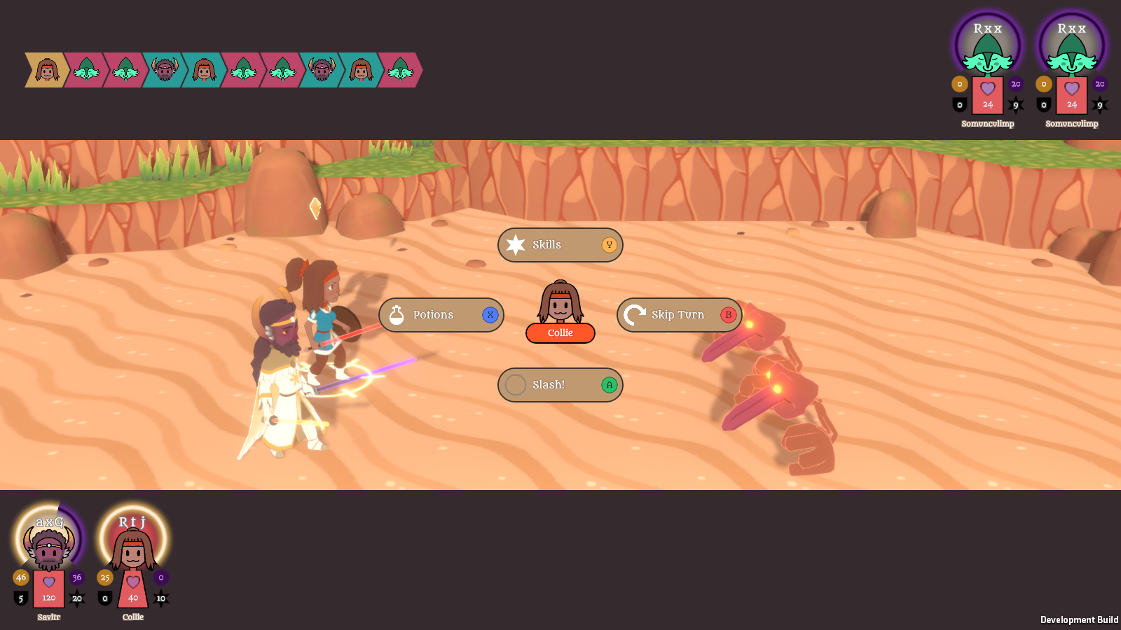
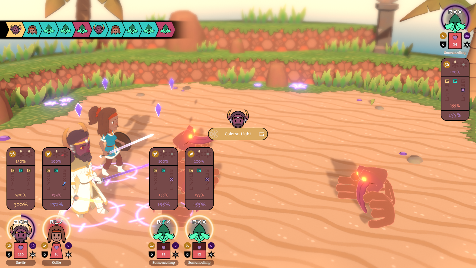
Before I ramble on about technical minutiae, here's a video of how battles currently look (as a shorter silent gif thing that'll show up as the hopefully-eyecatching preview, and the longer version with sound on Youtube):


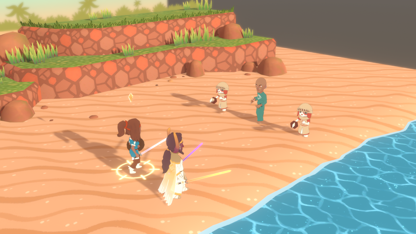
There's still a lot to refine! As you can see, though, I've added a dynamic camera, which I feel gives the game a whole lot more life than the static one I had before.

I shall now ramble about the specifics of that.


Battle Arenas

Previously, battles looked like this:


Though I was using 3D, I kept the camera fixed, largely because it's technically way easier, but also to be reminiscent of old JRPGs, including MARDEK, which, being 2D, obviously had their 'cameras' fixed in place. Plus I saw that a lot of indie and simple 3D turn-based JRPGs got away with not moving the camera, so I felt I could also get away with it and people wouldn't mind.

I remember way back in the ancient days when I played the Sonny Flash games, which I saw at the time as rivals to MARDEK, and noticed that though they were also 2D, they did move their 'camera' around to make battles feel a bit more alive. I considered doing the same at the time, but ended up deciding it was more trouble than it was worth.

The desire to do something with my battle cameras stuck with me, and making the jump to 3D presented a perfect opportunity for that... though I was aware that the geometry of the 3D battle background presented limitations.

The battle background in that screenshot looks like this outside the camera bounds:


It works okay since the camera never moves, but moving even slightly to the side would give a look into the void:


You'd also see the void if your screen resolution was wider than the intended one.

I was aware that even Playstation-era RPGs used round battle backdrops to get around this, and several times I tried to find ripped models of these to use as reference, without any luck. Seems they're not interesting enough for most people to talk about or rip. I tried to pay attention to how the backdrops were made in both modern games (eg Pokemon Sword) and old ones (eg the PS-era Final Fantasies), but never seemed to muster the confidence to dive in and attempt my own similar scene since it seemed like I'd be fumbling around blindly and it'd end in failure and wasted time. I just kept thinking about it for months.

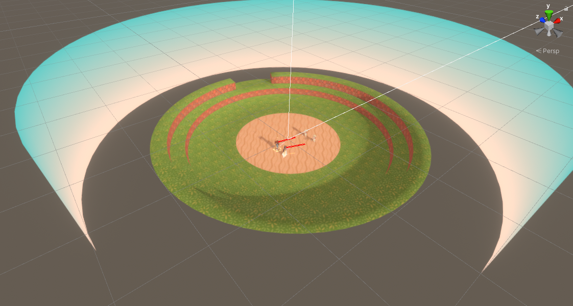
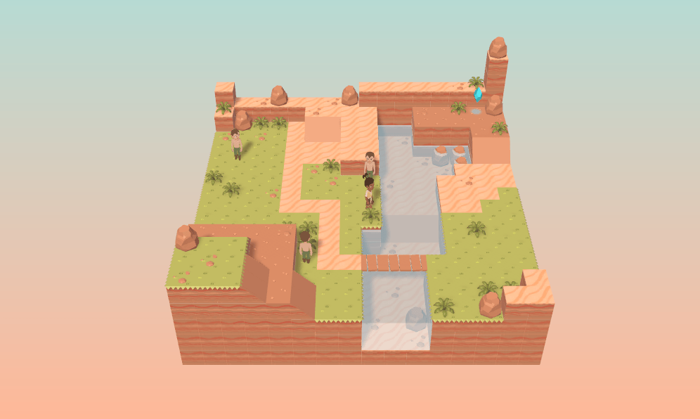
This week, with the thought eating away at me yet again, I decided to at least give it a go to see what I could come up with. At first I had this perfectly round arena:


It wasn't very promising though. It took longer than it seems it should have to make, and the results are far from impressive. To get it looking presentable, I'd have to spend way longer than I'd like tweaking geometry.

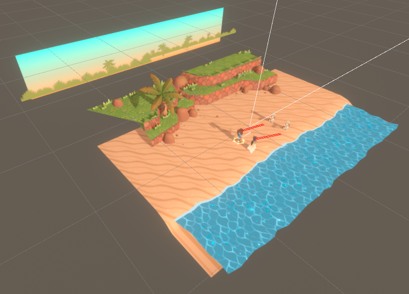
The biggest issue is knowing what to do about the objects in the distance. With the fixed view, I had a sky and some flat, cutout trees to hint at a larger environment, but the end of the 3D cliffs was always irritatingly obvious to me. With a fully round arena, I'd have to build geometry on all sides, which would be a nightmare from a creative standpoint and it'd mean there were more triangles for the game to draw, which might cause slowdown (though I'm using such low-poly models that that's unlikely, but still).

An idea hit me, though. I remembered back to early Divine Dreams development, where I was playing around with designing the areas as dioramas floating in a void, like this:


Perhaps I could try a similar thing with the battle backdrop? It was worth a try, I thought. I could always scrap it if it wasn't working out. We never know unless we experiment!

So experiment I did, and I came up with this:


I was surprised by how much I liked the result! Not just how it looks, but the process of making it too, as I didn't have to worry about adding to anything other than the little chunk of land that I had.

You could say that it fits because during battles, the characters aren't focused on anything other than the immediate vicinity so it's like the world disappears... though if you look at the video, the fading and background gradient mean it's not even all that obvious it is a diorama anyway, especially on the ocean side.

This - like so many aspects of game design - is probably something the average player wouldn't care about (I mean, Pokemon got away with setting its battles in formless voids for generations), but it's been a big "how would I approach that??" question in my mind for ages now, so it's really satisfying to have a solution I'm pleased with!


Battle Mechanics

I got an email during the week from someone making suggestions about how to improve the game's user interface, and it was clear I hadn't effectively communicated the fundamental gameplay mechanics very well, so what all the symbols meant wasn't obvious. He said he'd checked this blog to find a post describing them, but there didn't seem to be one, so I ended up writing out a long explanation of the mechanics to him. Since that's fairly fresh in my mind, I thought I'd write out an explanation here too, especially since I also added some helper UI things this week to hopefully remove a lot of confusion.

(I should also add this information to the ∞ Atonal Dreams info page ∞ at some point; that page needs updating with new content in general anyway since a lot has changed in the weeks since I wrote it!)

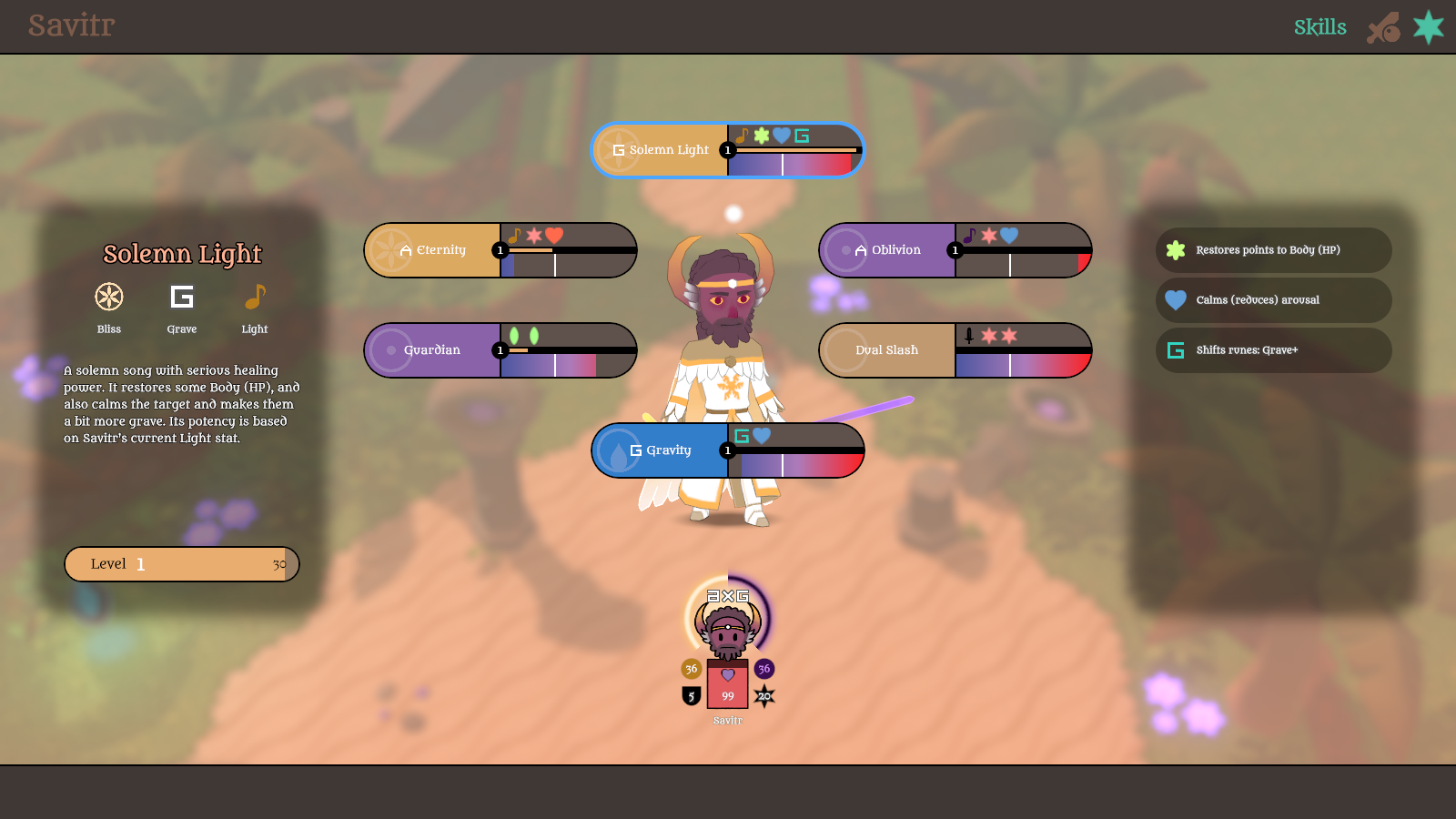
Here's what Savitr's skills look like on his status screen:


Characters have the following numerical stats, which are improved by equipment:

Body, which is essentially HP.

Mind, which is divided into the Light and Dark stats. These are always opposed, so adding to one depletes the other. Savitr here has 36 in each, so if he 'gained 10 light', his light would become 46 while his dark would become 26. If a monster turns fully light, or an ally turns fully dark, they convert to the other side.

There's also Attack and Defence.

Skills use either the Attack, Light, or Dark stat as their 'attack stat', and they calculate their damage by multiplying this stat by rune and element modifiers and subtracting the target's defence (except on skills which ignore defence, which most - but not all - magic does).


Characters have an arousal value, shown non-numerically by the speed, size, and colour of their beating heart. A bar in the centre of the battle skill selection menu makes the exact value clearer (for the current actor). Arousal ranges from 0 to 100%. Arousal determines turn speed, and also which skills are accessible. The blue-red (cold-hot) gradient on skills shows the arousal range for which they can be used. There are no other costs for using skills.

As an example, Savitr's Oblivion and Eternity skills deal big AOE damage, but they're only accessible when his arousal is either extremely high or extremely low, and each of them either lowers or raises his arousal by 50% to return the value to roughly the middle, preventing easy consecutive use.


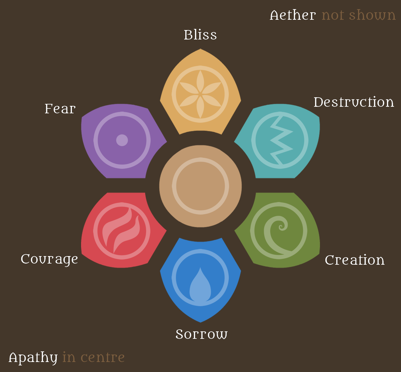
Characters have elements, which... I've been using for years, but the only image I have showing the relationship between them seems to be from like 2013? So I just made another:


All creatures and skills have an element, and these elements are fixed. Each element is 'strong against' - that is, gains a 150% power advantage against - either itself or the one one step clockwise on this diagram, but it's 'weak against' - a 50% power drop - the element one step anticlockwise.

So a Fear skill would be especially useful against both Fear and Bliss opponents, but not so much against Courage ones.

Apathy and Aether don't have any relationships with other elements.


Additionally, characters have three runes, which represent their personality traits, and which are also used to multiply the power of any skill that has an associated rune (not all skills do). They come in three opposite pairs: A(bstract)-R(eal), T(ough)-F(eeling), and G(rave)-J(olly). Unlike elements, which are fixed - they represent the flavour of consciousness the person or monster was primarily born from - runes can change, and many skills modify them during battle.

Runes are likely the most unfamiliar and at-a-glance perplexing game mechanic in this game, but I don't think they're especially complicated once you wrap your head around the essential ideas behind them.

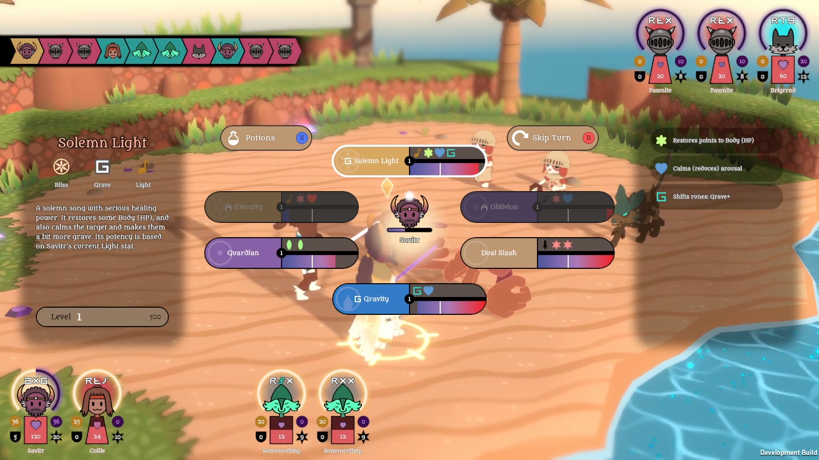
The thing I added this week should hopefully help a lot:


These (probably toggleable) UI helper things only appear when you're selecting a target, and they show how the damage will be calculated. They also show the stat being used as the attack stat, in the upper left; Light in this case.

At the top is the element, which can be either 50%, 100%, or 150%. Originally I just had it show the glyphs, but by showing their position in the cycle, the player doesn't have to memorise any specific elements, just the simple 'same or clockwise bonus' relationship.

The runes are next, and you can see from this what's going on with rune comparisons. The left column is the actor's rune, the middle is the rune of the skill (which will always be capital, and as such can only ever be at the top or bottom), and the right column is the target's rune.

The closer both the actor's and target's runes are to the skill's rune, the greater the multiplier.

So here, Savitr's using a G skill, so the thing for Collie shows his G-rune as a perfect match, while Collie's j is four steps away, giving a 132% multiplier.

Much of the typical fantasy elements stuff is about 'defeating' in some sense; fire "beats" air because it burns it up... or maybe it "beats" water - as is the case in some other games - because it evaporates it. Or does ice beat fire, or vice versa? Or are ice effects just included in water?? It's different for every work that includes these supposedly commonly-understood classical elements.

Runes, though, are more about resonance, harmony; whether or not what you're trying to do fits with who you and your target are.

Imagine a dour, surly, serious businessman trying to tell silly jokes to a bunch of other surly, serious businessmen during a meeting; this would be like a G-runed person using a J-runed skill on G-runed targets. He's going to seem awkward trying it, and they're not going to enjoy it! A comedian (J) telling jokes (J) to a meeting of other comedians (J) would be much more effective.


So even if this system seems complicated, it's really not. The basic damage formula is literally just attack stat x element modifier x runes modifier (if applicable) - defence (if applicable).

I love this system and I really want to get it out there in a finished game, though I do wonder a lot how open to it other people will be. We'll see!


I also spent a big chunk of the week fixing random bugs that manifested (skills just failed without throwing errors; I essentially ended up rewriting the tangled code that's built up over the past few months of revised decisions), and adding animations and particle effects. Some of those still need doing.

But I'm definitely nearing the point where I can have a demo on Steam. I don't want to say how far off that is since my predictions are usually laughably inaccurate (the roadmap bar's been at a standstill for a while since I've still yet to complete the vague milestone goals assigned to it), but it doesn't feel too far off!

9 COMMENTS

Maniafig222~4Y
I didn't comment on last week's blog!! I guess I might've been having somewhat of a slump lately, which is why I've not really been commenting much. I think I'm getting over that, thankfully!~

I'll keep my thoughts on last week's blog short!

-User Interface is an important element of gaming that often goes unmentioned, but a better user interface does make for a more enjoyable experience, and a better game overall! I think your tinkering with the UI was for the better, I especially like how much clearer you made the effects of skills by showing off their various effects with appropriate symbols.

-Skills all having a body/mind cost is something I'm glad you removed! Body costs in particular are weird, I can't think of any JRPG where all skills cost HP, it's usually a drawback or feature of specific skills! Limiting skills by arousal is also interesting. Sometimes you gotta save a finisher till the climax!~

-The new title screen looks nice! Very cyanish and turquoiseish. Yes. Ish.

-You mentioned uploading the Dreamrealm music to Patreon, but didn't!

Ok, and now on to this blog itself!!

I personally always visit the site through tamingmind.com so I never really see the homepage. It looks nice, though!

I'll comment about the stuff in the video bit by bit...

-I really like the diorama approach! It looks good, and it seems to fix a lot of issues and be simpler to make! That's a win for everybody, I think!

-I like how the camera zooms in and pans during attack animations, that is a lot livelier than just having it be constantly still! The way it cuts when enemies take consecutive turns is a bit jarring though, but you did say it's still a work in progress!

-The camera moving and spinning while selecting your actions and targets is really disorienting and confusing. Was that just to show off the diorama feature? If there was an option to make the camera perfectly still when selecting targets I'd immediately enable it!

-I recognize that dog chomp sound from Dog's Life!! [LINK]

-The way the music completely cuts out during the music taming sequences is somewhat jarring. I'm not sure I'm sold on the mechanic, does it add to the game? It seems like a halfway measure between having a simple no-frills system and a system like MOTHER 3 where it matches the music.

-The Pawnite and Somniculimp animations are cute! Cute is good, of course.

Ok, then on to mechanics talk. I'm already familiar with most of this stuff!

I'm guessing every character's arousal shifts equally and everybody has basically between 0 and 100 arousal points. So it's not like Collie has between 0 and 50 whereas Savitr has between 0 and 200 and Collie's affected 4 times as much by arousal changes, right?

THE DESTRUCTION PETAL ISN'T FRACTURED!!

I'm glad you've moved back to having sentiments be weak to themselves, that makes more sense than them resisting themselves given the lore of the setting!

Are Apathy and Aether similar to Physical and Thauma from MARDEK, or are there physical Aether attacks and Apathy spells?

I'd always imagined sentiments were like you said, they're the construction stuff that a person or thing has most of. So everybody has a bit of every sentiment in them, but a Bliss person has a higher concentration of Bliss for example.

It took me a bit to parse what all the parts of the effectiveness indicator mean, but now that I get it, it does look very useful! Something I wish we had during Taming Dreams was an indicator such as this that explained why an action was ineffective. I'm also glad it just straight up shows percentage modifiers, since it was never clear how much each individual element mattered in Taming Dreams. It's much clearer here!

I suppose skills that don't use runes just won't show the middle part of the indicator? I've also wondered whether there's skills that are more effective the mode to the middle someone's rune is. Or skills that rely on multiple runes, like one that wants the user to be Real but the target to be Abstract, or the user to be Jolly and the target to be Tough. Probably not until some point where the players should be intimately comfortable with the system! But humans are quite complex like that, some jokes probably work better against Grave people, so long as they are a specific type of joke.

Is there a way to see someone's current arousal percentage? It'd be annoying if you raised someone's arousal by 50% hoping to use Oblivion, but you wind up at 85% instead of 90%.

Is there a downside to having high arousal? Usually in JRPGs like these, you want to maximize your amount of turns whenever possible, meaning you wouldn't want to use actions that lower arousal unless you can quickly raise your arousal afterwards.

Anyway, yes! Good to see you're making progress! I think the changes to the UI and the switch to the diorama battlefields are for the better!
4
Tobias 1115~4Y
I had noticed, and was wondering if you were okay! I was going to ask, but of course it's natural for me to assume the reason was because of some fault on my part so I didn't want to awkwardly ask if that was the reason... I hope you're feeling better now, at least, and I'm glad to see you commenting again since I appreciate them a lot!

Oh right, I did forget to add that thing to Patreon! I might as well do that now.

Several people have commented that the camera cuts seem jarring, which is surprising to me and not something that I noticed. I've been struggling to think of how other games do it, and I should probably have a look at a few... I'm sure I've seen games with dynamic battle cameras a lot, but just never paid any attention to them before.

The rotation originally was to show off the diorama, though personally I like it as battles never feel still and stagnant. It's not like that while selecting a target - that'd be absolute madness - just while you're selecting a skill so your eyes are focused on the skill buttons. Once you've selected one, it is completely still while selecting a target. It'll be interesting to see how these things feel while playing the game rather than just watching videos; I'll wait until then before changing/disabling things.

The chomp sound I used was something like "cartoon chomp sound effect", the first Google result for that, so it's interesting to see that used elsewhere! I originally used it for the silly eating mechanic because I felt it was such an iconic but stupidly unrealistic sound that it was inherently funny. Now it probably seems out of place for this Bite skill!

Several people have commented on the music cut being jarring, and I'm wondering whether that's going to be a feature I'll end up completely removing. It'll be a shame, though, since the whole 'music = magic' thing is so deeply tied into everything now that I don't know how I could implement it instead. Would they play melodies without player input? Wouldn't that just create the same issues anyway since it'd clash with the background music? I'll wait until the demo and see if people enjoy playing with it or not. Personally I find it fine, but it's hard to gauge how fun anything is when I'm so busy making/fixing stuff all the time.

Everyone does have between 0 and 100 arousal! (Or technically 0 and 1 in the code, and it's stored as a float value, meaning someone could have 0.35324266 arousal or something, potentially.)

I'm unsure if there could be Apathy magic or Aether physical strikes! If magic is born of emotion, then it wouldn't really make sense for magic to be devoid of emotion... HMM.

Examples like dark humour using J but targetting G are interesting, though I think I should stay away from overly complicating things like that since I can imagine people complaining that things are too confusing already!

You can guage arousal by the beating hearts, but I know it's imprecise. A bar shows up in the centre while you're taking your turn, but that only shows the value for the current actor. Another possibility is making the hearts into bars (so they fill up with colour), or something, but there's nowhere to cram in the numbers which I wouldn't find to be too cluttered.

That's a point about high arousal lacking downsides. You could say that it denies access to certain skills (Savitr loses access to his heal above something like 90% arousal, for example), but maybe that's too minor. I could always do something like Taming Dreams where it modifies offence and defence, since I do like that, and I could even have it shown explicitly on the UI things ('predictors', as the code calls them), which would solve the displaying-arousal issue, hmm... Maybe?? Or maybe that'd just be overcomplicating things...
2
codyfun12329~4Y
The somunculimp's slap is amazing. That is all.
2
WhoamI1~4Y
Hey Tobias, I'm excited to see all this coming together, and I hope you're doing, well, as okay as you can in this whole global situation.

Anyway, I had opinions about this latest demo and was told I should share them with you. I hope they're helpful.

Right off the bat, I like the more dynamic camera, though there are parts of it that I am a bit nitpicky over. As shown in the current battle demo video, combat looks to me simultaneously too slow (enemies attacking) and too fast (the camera shifting).

I think Collie and Savitr's attack animations are at a good speed. They seem fast and to the point, which is excellent! Enemy attacks seem slow in comparison, I found myself hoping for a button that fast forwarded through enemy attacks, which is really weird, since they seem to take around the same amount of time. Maybe I'll get more used to that in time.

I think the camera suddenly cutting towards the static angle for targeting is a little jarring, and I think I would have preferred the camera to shift over towards that angle as you enter the targeting portion of the turn. It's probably not as easy as that sounds, though. It also seems like an odd choice to have the camera continue to rotate as you're selecting actions (Is that done to show off the diorama?). I would have expected that the camera would slow down and eventually stop once it reaches a certain angle. Other than that, I think that the dynamic camera adds a lot of liveliness to battles, and I really like that the clockwise or counterclockwise rotations given to it depends on if it's the enemies or allies attacking.

I'm still not used to the music cutting out for spellcasting, and I'm not sure that I will get used to it? It still catches me by surprise. I certainly have less exposure to it than you do, though, so maybe it'll make more sense in time as well.
2
Tobias 1115~4Y
Interesting that you feel Collie and Savitr's animations are fine, but the monsters' are too slow; they're literally the same speed, they have to be for the code to work as intended. I feel that a lot of the perception is likely to be different playing the experience rather than watching the video. I know I find that these videos drag on a bit compared to when I'm actually playing the game myself. It'll be valuable to see how people feel about it when they're able to play the demo, which shouldn't be too far off.

Someone on Patreon also suggested that the camera should shift instead of cut, but personally I feel that'd be extremely nauseating, especially if it happened at the speed it'd have to to avoid it feeling even slower. Camera changes are something I've never paid close attention to in other games, but I think cuts are more common than not? Or at least Pokemon does that, which is the only one I can think of at the moment. As for the rotation, personally I like that since it keeps things feeling alive (the alternative would be a fairly still screen), but if people don't like it I could remove it.

I'll try slowing the music muffling speed, though I'm getting the feeling the music mechanics are something I'll end up having to cut because of complaints...
2
Spectre35~4Y
This looks very promising. Here's my brief opinion about this blog post.

Camera angles- Both static and dynamic ones work fine for me. Just that the dynamic one moves a bit too much for my preferences. And Savitr's reactions seem to be too short.

Battle mechanics- The battle mechanics seem to be very complicated and daunting at first but it makes a lot of sense after reading this post. The rune popup is very useful to gauge the effect of skills.

Edit- These are the camera angles that I find weird/unnecessary, 1. Beginning of the battle. 2. Tamed monster moving. 3. Casting skills (especially when casting on friendly units)
1
Dingding32167~4Y
Might write more later but just wanted to point out: "So here, Savitr's using a G skill, so the thing for Collie shows his G-rune as a perfect match, while Collie's j is four steps away, giving a 132% multiplier." I think you meant Savitr the first time you wrote Collie!
2
Tobias 1115~4Y
That's actually accurate, just poorly-worded! I meant "the predictor above Collie's statue (to use the names the game uses for these things) shows Savitr's G-rune as a perfect match to the G rune of the skill, while her j is four steps away". It's easier to make sense of in game-than to describe this stuff with words!
1
MontyCallay101~4Y
I really like the animations you've been showing off! I'm not exactly sure how smooth they're going to feel when playing the game, but they get the job done!

And it's cool to see that you've gotten rid of the black bars! That probably made the switch to panorama style battles a bit easier. Those certainly make looking at the screen a bit more engaging! I don't mind the camera cuts that much, personally. But it's good to see that it seems to switch back to a fixed perspective for selecting characters, though. For some reason, the GIF is actually more high-res than the video for me!

I think you've shown this before, but the way certain skills use melodies is funny! Almost like Sindrel Song integration :)
1
Log in to comment!