DEVELOPMENT
2,530
Weekly Update - Preparing for Steam
5 years ago
I've started putting Atonal Dreams on Steam so then I can start accumulating wishlists and run an alpha test before moving forward, but it's tough knowing how to present it, especially without feedback...
I've been dragging my feet getting to this point for ages, for various reasons. Health issues for one, especially building up to the brain scan I finally had this week (
∞ blog post ∞), but those health issues - mostly anxiety-based - likely come from a place of fear that comes with the vulnerability and uncertainty about releasing something I've spent months slaving over into the world. I was similar with Memody: Sindrel Song.
It's not as if actual release is anywhere close though, to be clear. I need to get some feedback on what I do have currently, but then I'll use that to refine the mechanics, and will have to spend several months more building the rest of the game's content. I can't predict how long that'll take.
It's such a long process, though, and it can't be the most exciting thing in the world to follow. I mean there are in-progress games I'm interested in playing, but I don't actively keep up with every step of their development; at most I might check their relevant websites/store pages every few weeks or months to see if they're out yet. I don't engage with the developers. So I'm grateful that some of you do read these blogs and take some kind of an interest in the process.
I recently updated the main alorafane.com page with info about Atonal Dreams, an attempt at presenting it in a way I hope is interesting, especially to people who know nothing about it or my previous work (I'm aiming to target more than people for whom MARDEK was their childhood, after all)... but nobody commented about it, which I suspect is because pretty much everyone who views this blog has likely been following it for a while and feels they don't have anything new to say. Or at least that's my guess, or maybe hope, since the alternative is that nobody cares at all and I'm wasting my time.
It's frustrating though that I feel I need reassurances constantly that what I'm doing is even worth it, because it's not reasonable to expect that from people. I should be (and am!) grateful I get any attention at all, and that so many people are supporting me on Patreon (that means a huge amount), but I keep wondering whether that's just out of appreciation for fond MARDEK memories from their younger years rather than interest in what I'm doing now. Maybe Atonal Dreams will be no more successful than Sindrel Song, if even that.
I mean I'd hope for more since it's a more familiar genre, and I'm trying harder with promotion this time, but it's never really possible to accurately gauge these things in advance, so all I can do is wonder. Which tends to lead to worrying about the worst possible outcome.
![]()
I rarely buy new games myself, and when I do it's usually because I know something about them from elsewhere so I don't gauge them based on what I see on their Steam page. Some people must though - a lot of sales presumably come from strangers who've been shown the game by the algorithm - so it's important to present the right information to pique potential players' interest and convince them to open their wallets.
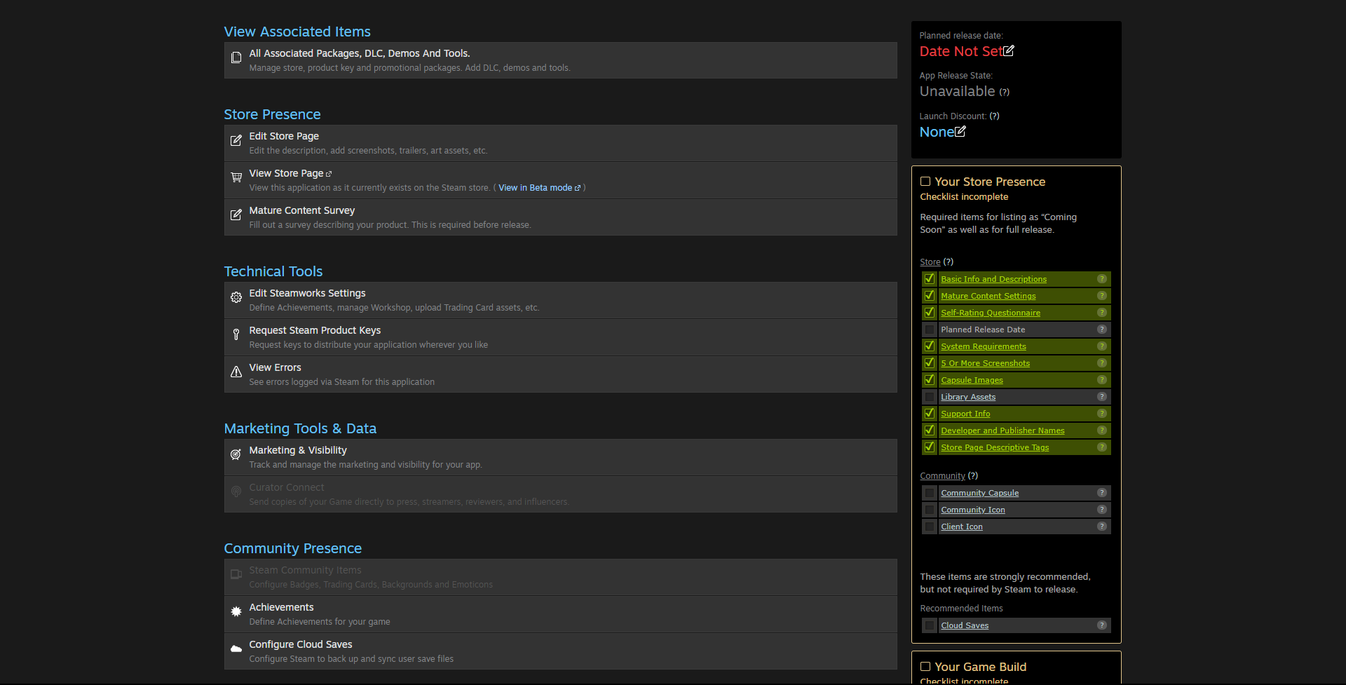
I've mentioned before that the submission process to Steam is tedious, because it is. There are a bunch of forms to fill in, spread out over a ton of different pages, in a way I find very irritating. For example, this hub page leads to several others:
![]()
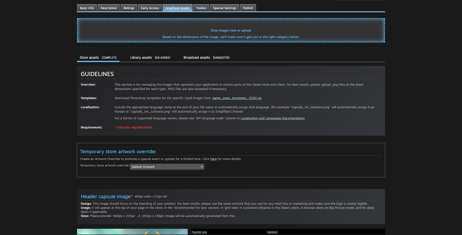
Several of which have their own set of tabs which open essentially different pages:
![]()
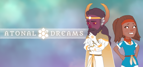
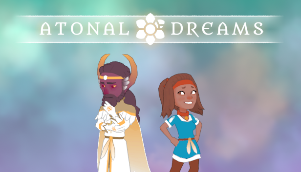
So it's not like there's one linear form to fill out and that's that. Thankfully there's a checklist to keep track of what you still need to do; you can see how much of this one I've finished there. One of the bits that annoys me most - and which I still haven't finished - is making a ton of these 'capsule images' for promoting the game across the site, with bizarrely specific resolutions like 231x87px, meaning you have to create each of them separately rather than just making one image then scaling it (they then apparently scale the images on the site
anyway though; the header capsule is required to be 460x215, but displays at 324x151 on the store page, for example). Here are some I've made so far:
![]()
![]()
![]()
These weren't too difficult to
make - I just had three elements (background, logo, figures) that I shuffled around and scaled - but it was tricky to decide what to include in them, plus they feel too spartan, maybe; not appealing enough. I'm thinking of them as temporary at the moment since the game's not done, so I can change them later, but I'll need to decide what to do about them at some point. It feels weirdly stressful, more than it should.
Some (a lot of?) games use painted concept/promotional art - box art, essentially - for these, but personally I find that misleading if that's not remotely representative of the in-game graphics. I've been considering it though; I wanted to do some kind of symbolic painting that shows the backstory in a single image for the alorafane.com main page anyway (where the logos are currently), but deciding to do that and actually doing it are very different things! I want to draw more, but I struggle to find the time and mental energy, as with a lot of things these days.
I also became very aware that I don't really have a logo as such, at least not a snazzy one. I'm just using a font (which I didn't make) that I use elsewhere in the game, and the aster (and those bars, though I didn't include them in the smallest image because they reduced legibility, which annoys me because now they're not consistent). I tried making a separate one, but got frustrated and didn't finish it. How do people even learn how to make logos? Why does every single game - even solo projects - have a fancy logo?? It's like signatures, which everyone seems to have an interesting one of but which I never had for whatever reason!!
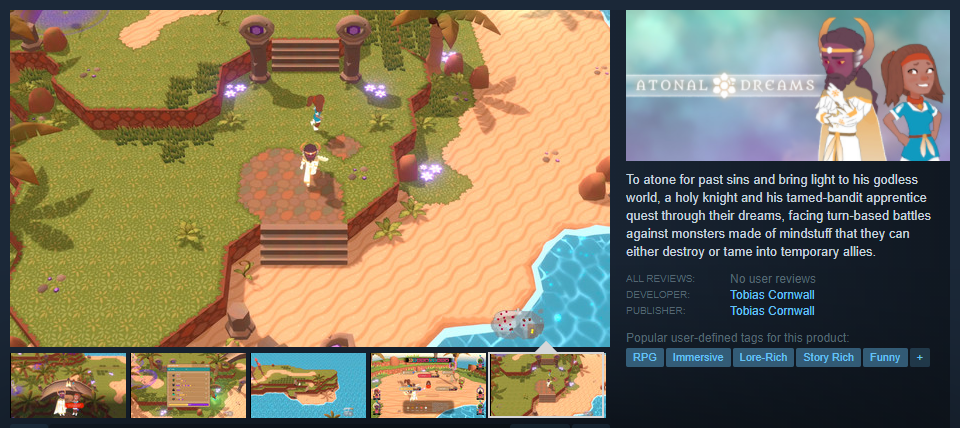
The store page also requires screenshots, which only took a few minutes, as well as short and long descriptions, which didn't. They've been tricky, and it's why I was interested in feedback for the attempts on the alorafane.com main page, and felt uncertain because I never got any. I have this for the short blurb currently:
![]()
To atone for past sins and bring light to his godless world, a holy knight and his tamed-bandit apprentice quest through their dreams, facing turn-based battles against monsters made of mindstuff that they can either destroy or tame into temporary allies.
Writing something short like that which makes sense and is appealing seems to be an art in itself, and one I'm not exactly practiced at. I
think this nicely encapsulates the key points of the experience (it starts off with story and characterisations, hints at the most interesting gameplay aspect), but it's hard for me to tell as the one who wrote it.
It also took a lot of iterations to get to this point, not just while sitting down and actively working at this little bit of text, but also from previous attempts like writing the alorafane.com main page and the old Atonal Dreams info page. I think that new one is better than
∞ what I had a few months ago ∞:
Atonal Dreams is an immersive indie turn-based RPG that blends surface silliness with a deeper exploration of the nature of reality, the afterlife, and coping with mental trauma, in which an angelic alien-devil knight travels with his spunky dog-girl apprentice/fangirl to a monastery full of monks who ponder what lies beyond life's end.
Set in a world where emotions manifest as monsters and magic, the game explores our conflicted hero's painful guilt and hopeful devotion as the realm of dreams confronts him with the demons of his past.
So hopefully the new one's better than that old one??
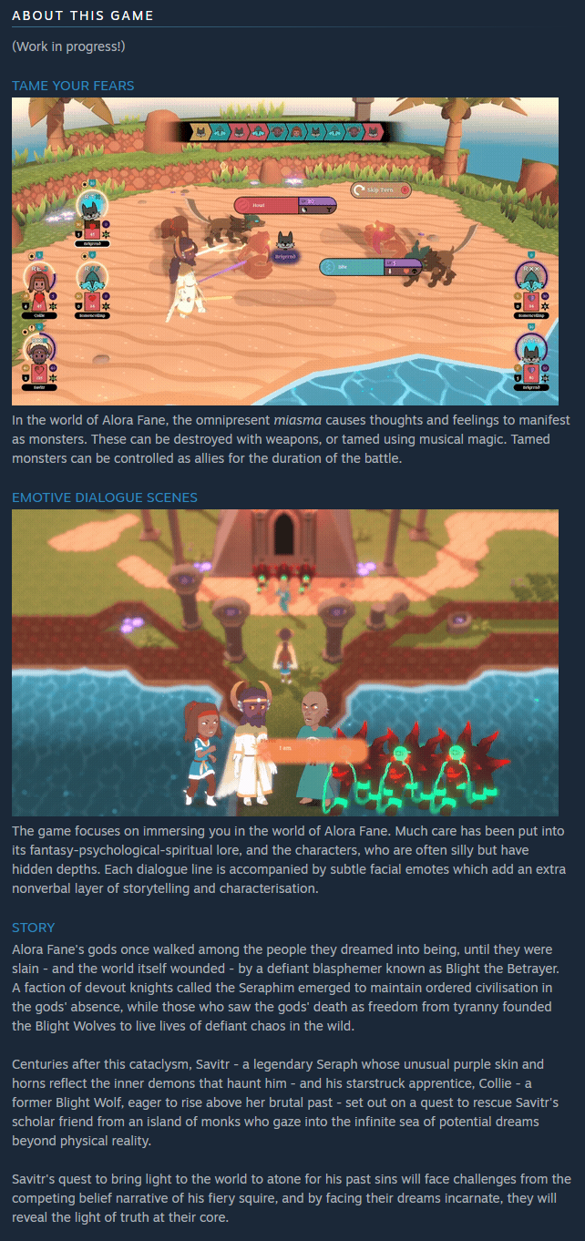
Here's what I have for the long description currently, though I haven't devoted the time to refining it yet:
![]()
Some clumsy sentences there!
The Story section is something I wrote a week or two ago which is also on the alorafane.com main page. I'm not sure whether it's worth devoting space to it on the store page like that though. I've seen other games which mention far blander stories on their store page ("an evil wizard from Gandralavar invaded Baradrumia and you must stop him"), but I wonder whether players care. I'm someone for whom story is very important, but I don't recall reading a game blurb with a story that interested me (though as I said, I don't buy many games).
I also wondered whether the story should go before or after the gifs of major gameplay features; after seemed best? I'd like to include a corresponding image, if I can make one (a screenshot or gameplay gif wouldn't really fit there).
Other games I've seen include bulleted lists of features, but I feel that'd be more suited for an action game while presenting the story gives a better idea of what kind of game this is? Maybe?? But this is the sort of stuff I'd really like to hear others' thoughts about.
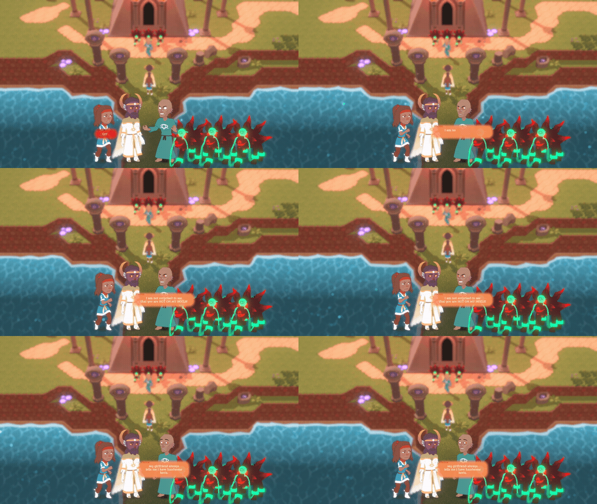
Having some animated gifs in this section seems to be popular and important, and I spent the bulk of Friday trying to prepare a couple of these. This involved using a video editing program (DaVinci Resolve, which is powerful and free) to (laggingly) cut up a 10GB recording of a playthrough I did recently, into a couple of ideally-10-seconds-or-less clips. And I couldn't even manage that; I ended up with these two gifs, which I think show the most remarkable parts of the game, but one's over 10 seconds:
![]()
![]()
Gif files tend to be significantly larger than the videos they're created from, for reasons that elude me... or at least mine are. I don't know if there's some trick other creators use that I'm just not aware of, but I've tried several different free converters and they all end up with large filesizes. For example, that first gif is 34.8MB, the other's 4.35MB. ~4's fine, but over 30's concerning. Attempts to compress them just reduce the quality to unacceptable levels.
I suspect it's due to the length though, for the longer one (I think it's like 16 seconds?). I felt it was important to show the whole taming process and how you can use your tamed monsters to attack with, since it's relatively unusual but I feel showing it in action could convert people, but would anyone even look at it for long enough? Is this too slow? Should I just use ultra-quick cuts that are more spectacle than actual demonstration? Would that even suit the feel of the game?
The gif showing off a dialogue scene includes dialogue that's too blurry to read. Which isn't great. But the only alternative would be to trim it, which isn't trivial and which might be misleading. Is that worth the effort? Again, would anyone actually care, or is it more about hinting at something since people's eyes just skim over all this anyway, and I'll be including a higher-resolution trailer and screenshots? I don't know!
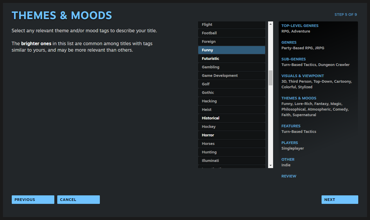
There's also a (new?) tags wizard, where you can select from a bunch of preset tags to apply to your game. I felt indecisive about this, but chose these:
![]()
I wouldn't have come up with many of these myself ("Turn-Based Tactics", "Cartoony"), but I just tried to choose all of the ones that applied from the lists I was provided.
I wanted to include 'Spiritual', but that wasn't an option (says a lot about games as a medium?), though specific things like 'Transhumanism' and 'Lemmings' apparently were? I had to go with 'Faith' and 'Supernatural' instead.
![]()
I did try looking at what some other devs did.
∞ This one - Kaze and the Wild Masks - was the first one I saw when checking the devs I follow on Twitter ∞; seems it's just been released (and has 36 reviews as I type this, which is a lot for an indie game in less than 24 hours!).
The long info section for that has only scant information; it's mostly dominated by three very short gifs that are windowed in an appealingly stylised way, meaning you don't actually see a full view of the game as you would when playing it. But maybe that's better? Since it's an action platformer, these gifs are quick, snapping between action scenes, in a way that wouldn't be appropriate for - or at least representative of - Atonal Dreams.
Its short blurb says:
Go on a journey as Kaze in this 90’s classics inspired platformer. When the Crystal Islands get cursed, Kaze needs to save her friend Hogo while facing enraged living vegetables. Find the Wild Masks to unleash the powers of the legendary guardians and master land, sky and sea.
Who or what is Kaze, other than the protagonist? Is the story important enough to come before the gameplay features for a game like this? Does the friend's name need to be mentioned at all?
I say, overly critically, even though this is perfectly fine, just because I've been having to think such things about what I've been writing myself!
I also notice a bunch of announcement posts on that page, which I wasn't even aware were a thing. Do other devs do this? Am I not doing something I should by ignoring them? Do they make a difference? I also notice a video of the dev playing the game that comes up at the top, which seems to be some realtime stream (so it might not be there when you see this). All things that may or may not aid in engagement.
I notice it has a separate publisher though; maybe they handle most of this, and it's unreasonable to expect from a solo dev?
![]()
Oh, I also need to decide on a release date before I can set the game to Coming Soon, which is annoying because I have no idea. I've seen other games with something vague there like 'Q3 2022', but I'm not sure how to do that; the entry field only seems to accept a date. I'll have to figure it out.
This shouldn't have taken as long as it has, but in case it's not obvious, all the
uncertainty makes it feel like wading through treacle. Should Atonal Dreams be marked as Mature, purely for some off-colour humour? The mature settings suggest not and I don't think I did for MARDEK or Sindrel Song, but, but...??
Bleh... I should finish it soon next week, Monday hopefully, but then the store page needs to be reviewed by Valve, which apparently takes up to several days. Then I'll need to use Patreon or Discord or something to recruit some alpha testers... so I hope some of you are actually interested in that and willing to give useful feedback! I really need to know whether the game's enjoyable as-is before devoting more weeks of work to it. There are some mechanics I'm iffy about myself, so I'll probably write a post about those at some point, maybe on Patreon.
I don't enjoy this phase of development, obviously! But I'm getting through it, annoyingly slowly but surely...
![]()
Oh! Album! I don't have one yet. I think I might make a new post category for them and upload one tomorrow... I haven't even assembled the files yet. I wanted to post this a bit earlier than usual just in case people might provide some feedback before I get back to this on Monday.



8