Log In or Create Account
Back to Blog
PERSONAL

10

1,133
Weekly Update - A Follow-Up Re Atonal Dreams Box Art
2 years ago1,720 words
A second post this week with some thoughts about art I drew a few days ago, and the kind of feedback artists hope for when showing other people the fruits of their hard work.

∞ I wrote a Weekly Update a couple of days ago ∞, partly so then I wouldn't have to worry about it on the weekend... but it's the weekend now and I'm worried about stuff anyway so I'm writing another.

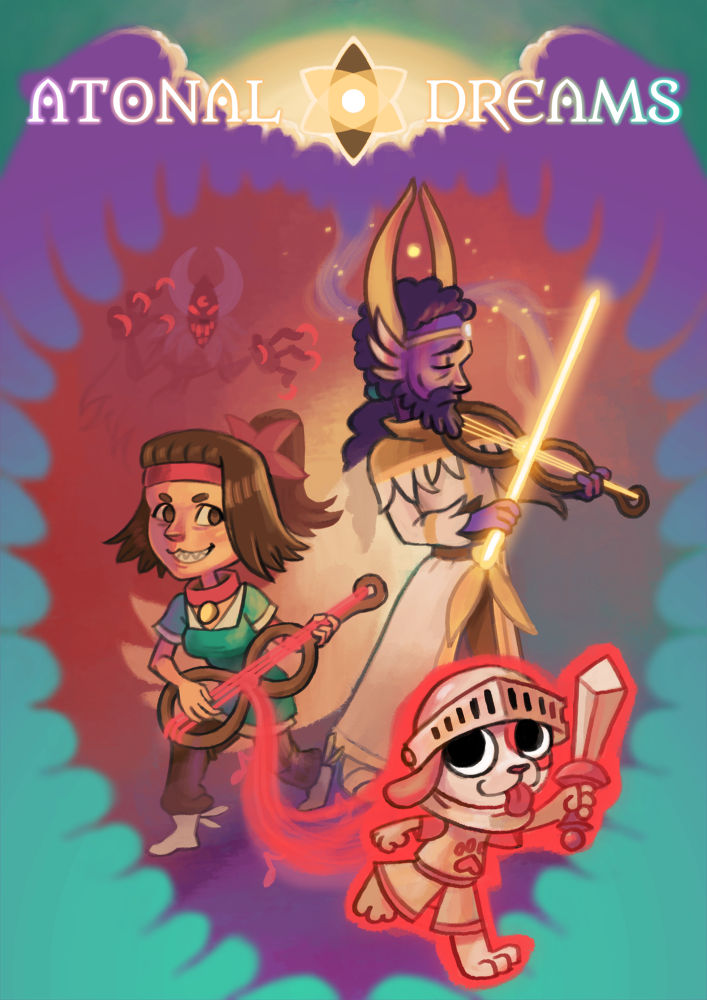
In that post, I included this image, which I'd spent maybe three days painting:


I was really proud of it when I finished, eager and excited to show it to other people in the hope they'd be as wowed as I was... but instead the responses (or lack thereof) have just killed my confidence and exacerbated the depressive slump I was already in. I spent all day yesterday in bed, suffocated by dark fog. Metaphorically, obviously. So that's great.

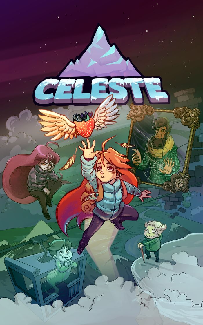
I've been thinking about it a lot, and a few things have been bubbling up in my mind. One is how it compares to other art with the same purpose; here's an equivalent image for the game Celeste (which I've still not actually played, so I don't know what elements in the image correspond to):


I'm surprised by a few elements there: the skill level of the art (which is better than mine, but feels close to my own skill level in the way most professional art doesn't; ∞ the official art for Breath of the Wild ∞, for example, is far beyond what I'm capable of), the number of characters, how small they are, the amount of empty space at the top. It has a better composition than mine, though a big part of that is due to having a single protagonist who can be the primary focus, while I felt just focusing on Collie OR Savitr wouldn't be right so my own composition is more cluttered. It's a great example of how the light/dark contrast and saturation draws your eyes to a single point, while the other stuff fades into the background!


Another thing I've been thinking about, more than that, is just that I suppose non-artists, who don't have much or any experience creating things and showing them off in the hopes of receiving feedback, just haven't developed the mental pathways for giving the kinds of feedback that artists want.

I'm subscribed to some art channels on youtube, and I want to include a couple of videos that I saw recently. They're long and I'll be surprised if anyone actually watches them, but... well, they're here anyway:


In this one, the channel owner - who draws a lot of fakemon (novel Pokemon designs) - invited over fakemon artists from other channels, and they share and comment on each other's creative interpretations of the same prompt.

The most notable part - and why I'm linking to it at all - is how they respond to each other's artworks. They're not all of equal quality, and I get the feeling they all sense who's more or less skilled among them, but they're all quick to respond with initial amazement - 'wow!' - followed by detailed observations about things that they like or are impressed by. Most of the video is made up of this supportive commentary!

I find myself hypervigilant for negative comments while watching these interactions, and I'm not sure whether that's due to my innate neuroticism, social anxiety, personal history of receiving negative comments, current depressive episode, or whether they're all similarly tense. I noticed one of them made a comment that was just slightly critical (something like "with a few little tweaks, it could-", as if it wasn't perfect as is), and flinched; I also wondered whether any of the others were internally flinching, as people might in a group setting where someone made a remark bordering on offensive/racist/whatever... though depression does put everything through a dark filter.


This other channel's run by four artists who are long-time friends, so the atmosphere is more relaxed, though it's interesting watching the delicate dance between banter about the crude, ridiculous things they comically draw (in that video, they're drawing random cartoon characters as absurd couples; 'crack shipping/pairing', I think it's called?), and genuine support for each other's artwork despite their varying skill levels and approaches. They're quick to praise details they notice, and very careful to not make remarks that genuinely put down a person's technical execution, or to apologise clearly if they say something that comes close.

I envy people like those, who have friends - or occasional guests - who've walked the same journey and as such know what feedback they would want and are able to give it in kind. I don't know anyone to share creative stuff with these days, and posting in public drawing places like deviantART, Reddit, Twitter etc is more likely to result in no or 'low quality' feedback because those capable of giving higher-quality feedback are generally busy with professional pursuits... maybe.


That said, it's important to get the honest feedback of non-artists too because they'll be the bulk of the audience, and the ones I'll need to convince to hand over their money for my work.

Several people commented on the previous post, which I appreciate, and they were in this vein. Not purely flattering - though I appreciate that some people cared enough to include some praise - but a more accurate gauge of how an audience might respond. Useful, valuable.


Still, I suppose it's important to have a good balance between that cold, realistic, practical, work-like critique about the art as a potential money-making product, which drains energy and motivation, and positive encouragement about the art as a baring of one's soul and a manifestation of years of practice, which renews them, and my seesaw is currently jammed by the massive weight on one side and the few feathers on the other... or something.

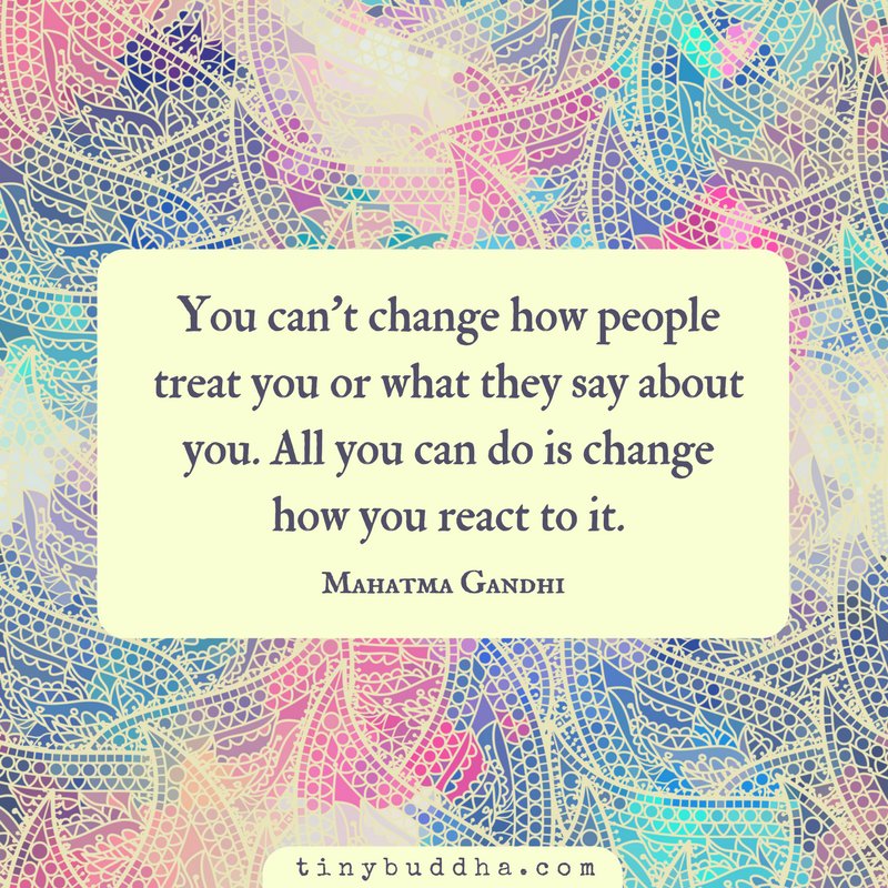
Ultimately, though, we can't control how other people behave, only how we respond to it, as some saying or quote goes that I'll now look up...


Yes, that. I wonder if Gandhi actually said that. It's the sort of thing they mention in mindfulness/anxiety therapy help groups, which is where I learned about. Valuable to know, but easier said than done, since our mental states are so profoundly influenced by subconscious factors. Like how you can't just 'be confident' unless you have some positive memories to anchor the feeling in.

I'll need to come to a decision about this art of mine so then I can make the capsule images for Steam, but just looking at my art to include in this post hurts (I've been mostly averting my eyes from it), so... I don't know. I might just have to redraw it. Hopefully my mental state will have improved a bit by Monday, though if not I suppose I'll have to focus on something else for a while, like technical changes based on tester feedback (bugs etc), or maybe I should take that end of year break I've mentioned in a few posts then seem to forget or change my mind about by the next week.


Actually, while writing this out, I calmed down a bit, and thought maybe it'd be worthwhile to explain what I was trying to achieve with the image. Here it is again:


...I just typed out a thorough description of what exactly all the elements and motifs mean, but I suppose a lot of it is stuff that'd make sense as you progressed through - or even finished - the story, but which might feel like spoilers now. Which is a shame; on the one hand, I'm proud of how much story and meaning is crammed in here, but it's lost on other people so the image feels far less impressive, but there's no way to get around that without spoiling everything!


I suppose one thing I'll at least kind-of describe is that the eye (yes, 'eye') motif which is used throughout the game is also used throughout this image. The overall composition is (vaguely) shaped like a vertical eye, with a bright pupil. It represents the separation between the waking world within (reddish/purplish, Viscereal element colour), and the drealm which surrounds it (teal, Abstral element colour); the border is meant to look like clouds, angelic wings that embrace but also imprison, and like the bubbly/cloudy border you might see for a dream sequence, or a thought bubble (though inverted). The bit at the top has a horizontal eye of light surrounding a sun-like aster icon which represents both the world and a particular character, and would also likely be used as the game's icon.

I've also used crescent moons - another recurring motif - in a few places, such as the Pawnite's eyes (subtly). Collie's collar should probably use that symbol, actually...

And the demon-like thing looming faintly in the background is the main villain (kind of), who I designed specifically for this, though that wouldn't be immediately obvious to a first-time viewer. I don't know who anyone in that Celeste image is, though.

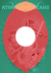
I'll likely need to fiddle around with - or redraw - it anyway, since the dominant colour here is red, which seems to be more associated with action games, and the composition doesn't work for the assortment of different resolutions of the capsules I need to make; for example, this was me trying to rearrange elements into this resolution before giving up:


So... bleh. I like making things, but I don't like the seemingly impossible task of trying to perfectly appeal to the harsh preferences of strangers who either aren't familiar with the challenges and toil of the process, or don't have any reason to care about the human elements behind the creation, just the results they can consume. I'm just trying to work through it as best I can, despite the annoying mental issues.

10 COMMENTS

Kalin24~2Y
This reminds me of an article I read recently:

[LINK]

It's about writing, not art, and specifically SF/F workshops in the US, but it explains where we got the idea that new writers need criticism instead of encouragement.
0
Tobias 1115~2Y
That's long and mostly irrelevant to me so I only skimmed to find the relevant bits, but this stood out to me:

"What identifies herself as a mentee of Knight, expressing heartfelt gratitude for how he shaped her writing career. But before that, a critique of his literally made her decide to quit writing for good. Only in a chance meet-up with Knight at a department store did he convince her to come back"

Realistic critique allows you to shape something into a good product that others might enjoy. But without positive support, there's no motivation to keep trying. I used the example of draining and recharging energy respectively in the post, or a seesaw; it's important to find the right balance.
0
Astreon152~2Y
I think the main issue here is that you know the game, you know what you meant to depict through that drawing, so you immediately see the intent and the innuendos behind that picture.

Someone else might not.

For instance, i totally do NOT see an eye in the central red shape. It's more like a heart ? The main reason is the middle top part of the shape: the purple thread thing splits it a bit, when it should be pointy like the opposite side to make me think of an eye.
Also, from my perspective there are too many dendrils to visualize an eye.

I don't even visualize the wings enveloping the characters anymore. I used to in the first drawing, but now I see the characters in a heart shape with a huge cloud in the background, topped by a sun/eye. If i concentrate i end up seeing the "wings", but that's not what hits my perception at first.

The most distinct part for me is the eye at the top, which i see both vertically and horizontally (the yellow sun being the outline of the horizontal eye).

As far as making me understand what the game is about, i imagine the game being about having the characters play music to summon pets, or something like that). But without anymore hints i can't figure out the exact style of the game.

Overall, i think the image is beautiful (the characters faces are very detailed and realistic looking, it's striking), but i can't really figure out what i'm looking at.

As a comparison, i'll describe the Celeste picture you posted. Note that i don't know what kind of game it is and haven't checked, so as to not be influenced.

The way I perceive Celeste, i see a platformer RPG with a dark plot and an overall tragic scenario. Platformer, probably because the MC is jumping to catch a flying strawberry (Mario type platformer immediately came to mind). The other stuff because of the way the rest of the characters look, and because the colors are very dark (dark green, black, grey..., the only "light" elements that hit my eye are Celeste's hair and maybe the moutain/title).
I don't have a clue if this is accurate.

Though i also find the picture beautiful, i feel like it's nothing exceptional because i've seen such style in many graphic novels / mangas, etc (at least as far as character design is concerned). Your picture feels more like a painting than a drawing, and more unique.
1
Tobias 1115~2Y
There's something I noticed with testing too, where at least some people seem to want to know everything instantly and expressed frustration if there was anything not immediately obvious. I like the idea of including stuff in this art that isn't immediately obvious, but which players would come to appreciate in time... though I suppose I'm seeing it too much like an artist and not enough like some marketing person because I'm the former and not the latter. I'm trying to communicate messages rather than sell something.

It bothers me that the big eye doesn't read as such because it's not pointy at either end, but there wasn't a way to retain that while keeping the other elements. I'll probably need to just scrap the wings and overall layout anyway because of the varied resolutions of the capsules I need to make.

You say that Celeste's image communicates a dark plot, tragedy, etc, but I was trying to communicate dreams, being trapped and also watched over by an angelic-like being, etc with mine. Are there degrees of abstraction, though, with lower ones - eg 'darkness' or 'tragedy' - being more accessible and 'acceptable' things to convey because they're easily understood, while the stuff I was trying to communicate was too obscure? (Fitting for the game, though, I suppose.)

How would you indicate that something was an RPG through a singular image? I really wasn't sure myself.

Maybe it'd be worthwhile if I collect a few of these for different games in a post. Many just seem to be a character standing in a void, with no indication of the genre at all.
0
Astreon152~2Y
I think that in order to make viewers imagine the game is a RPG, you have to depict something an RPG trope, something that would make them recall a well-known RPG.
A bit like how the Celeste picture made me think of a "Mario like" because of how she's jumping to catch that strawberry. But if the game itself has no platform action whatsover then i guess the picture is poorly conceived for making me think so ?

In your picture, i understood that the characters were being overlooked by the "eye in the sky". In the first one, where it was clearer that there were wings embracing the characters, i also understood that it came from said eye in the sky, though there was no way of knowing if it was threatening or protecting them.

As for dreams, i know what the game is about yet i totally missed that. Probably because the "ethereal threads" aren't linked to the characters' heads ? Maybe the pawnite should come out of the girl's head and not her instrument ? That would also maybe lower the possibility of someone thinking it's a music game.

Finally, i think that Celeste picture"s intent may be easier to grasp because the ideas it conveys are more literal that yours ? You picture is both more artistic and deeper, so it's harder to interpret ?

Then again, the gist of it is that the way your picture is gonna be perceived is VERY subjective and will vary massively according to each viewer.
Maybe having several different drawings depicting different aspects of the game will be helpful, because their addition will direct the viewer toward a specific goal, thus reducing the risk of them having misconceptions about what the game is. And you have to make several of those capsules anyway ?


1
Tama_Yoshi82~2Y
I think my favorite part of the artwork is the top.
The way the golden light acts on the wings as a back-light, giving it volume, in a sort of ominous way... And the font. Did you create the font yourself, I forgot? Because I'd seen some videos about how to make good, balanced fonts, and this one really comes off as professional, which is neat since it's one of your main logos. The font really has its own unique personality, distinct and all.

Have you considered back-lighting the rest of the wings with the red/purple glow of the "frame"? I'm thinking it works really well with the top of the wings.
1
Tobias 1115~2Y
I didn't make the font - it's called Metamorphous, and I've been using it for years, on parts of this site for example - though for the main logo I modified the A's. I used to make my own pixel fonts! But making vector fonts is trickie, and I've never devoted the time to learning the necessary skills.

The wings were meant to be aethereally apart from the world in the way a cloudy border of a dream sequence would be (is that a dead trope now? Can't remember the last time I saw it in use), though if people are seeing it as a spiky heart instead of that, maybe a cast light would remedy that somewhat... though I'll likely just remove the wings anyway since I need to fit to the various capsule resolutions.
1
360K11~2Y
After looking at both the Celeste image and yours for a while, I'd say I like a lot of the same things about both of them. The characters in both have a lot of personality in a way that makes me want to know more about them. Before I actually played Celeste, seeing this image made me want to know more--why's that guy in a mirror? What's up with the ghost dude in that little...whatever you call that zipline thing? Their expressions and the way they're drawn give them enough personality that I want to play the game (which I did) and see more of them.

And your image gives a lot of the same vibes! I have at least a vague idea of who these characters are, of course, but I still want to play the game and find out more about them, and I feel like that would be the case even if I were just scrolling through Steam and seeing this picture with no prior knowledge. I get a basic idea of their personalities--one more goofy and lighthearted, the other more serious and perhaps melancholy. It's enough to get invested in them with very little information.

And although I didn't really notice it at first, I can definitely see the crescent moon and eye motifs, which I like. If I had only one suggestion, it would be to highlight those patterns more; I like them a lot now that I've had them pointed out, but I didn't really see them on my first glance.
1
Tobias 1115~2Y
I appreciate the positivity.

Since I've never played Celeste, I'm assuming the characters in the image are specific quirky NPCs you briefly meet along the way, solve some quest thing for, then move on? That's how a lot of those games tend to work, after all. How much of the overall plot - if any - is communicated there? Is it anything more than "these are some things you'll see along the way"?

I suppose I was approaching mine like some kind of pretentious ~artist~, hiding meanings that'd require more of an in-depth or later look, though maybe that's not wise for something meant as a marketing tool. The point should be to present something the player wants to find out more about, but it should probably be more clearly presented as such. I don't know. It's difficult.
1
360K11~2Y
Well, avoid reading this comment if you don't want spoilers for Celeste, although (spoiled or not) I'd recommend playing it because it's a really fun game.

The overall plot is relatively simple: the woman in the middle is Madeline, who has decided to climb Celeste Mountain as a way of essentially escaping her dead-end life and giving herself a meaningful goal to work towards. The other characters are:
Granny (in the lower right), an old woman who lives on the mountain who you'll run into a few times over the course of the game.
Mr. Oshiro, lower left, the ghost of a hotel owner who refuses to accept that his once-popular hotel on Celeste Mountain is now a ruin and that he's dead. He's the boss of one of the levels.
Theo, upper right. He's another mountain climber. Madeline runs into him several times over the course of the game, and one of the later levels centers around helping him escape what's called the Mirror Temple (thus the mirror around him).
Upper left is "Badeline" (although that's more of a nickname, and I don't think it's ever used in the game itself). She's probably the most important of these four characters; the idea is that Celeste Mountain is magical, and that it brings the fears and thoughts of those who try to climb it to life--not unlike the way miasma works in Taming Dreams and Mardek. "Our internal battles become external," that sort of thing. Badeline, who refers to herself as "part of you", is made up of Madeline's anxiety, gender dysphoria, and all the other parts of herself that she's trying to escape by going on this whole mountain climbing trip in the first place. She serves as a recurring boss for the first half of the game, chasing you through platforming areas and killing you on contact, at the end of which she knocks Madeline back down to the base of the mountain. The second half of the game is essentially about Madeline realizing she has to accept and deal with those parts of herself, with a level where you chase down Badeline while she fires projectiles and runs away. In the end, Madeline catches up to and accepts the parts of herself that she's been trying to avoid, which (in terms of gameplay) gives you new abilities that you need to learn to use to reach the top of the mountain.

All of which is a long way of saying that no, the plot is not really shown in this image at all! You can tell that something mirror-related happens to the guy in the upper right, and you could probably guess that the character in the upper left is an "evil twin" or something of the main character, but outside of that it doesn't really give away much detail about the plot. I don't know if that's the sort of thing you want to go with, and I don't know the story of Atonal Dreams well enough to say whether your image shows the plot or not, but it's something to consider.
0
Log in to comment!